Studio dei prompt
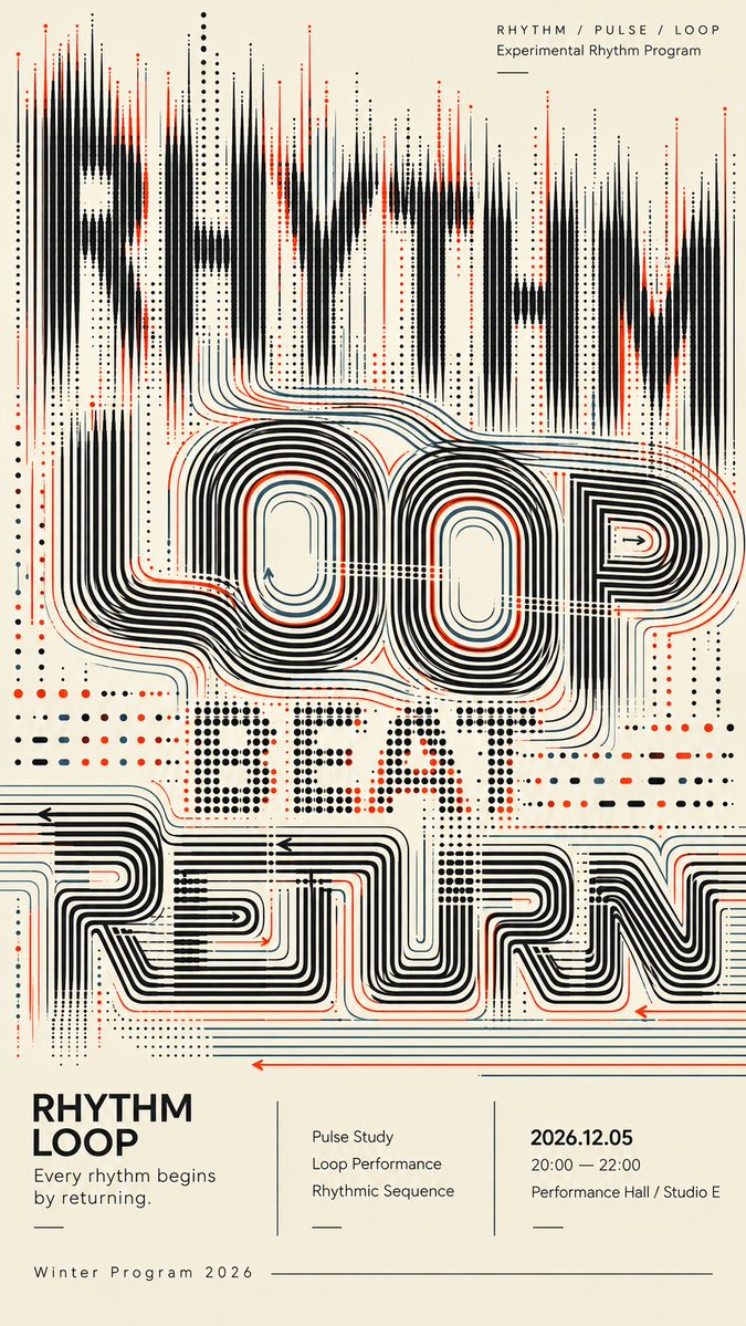
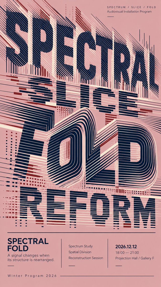
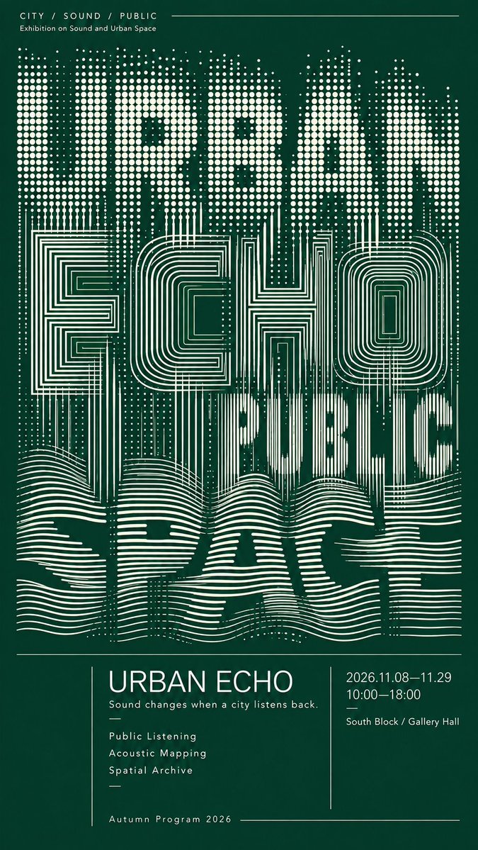
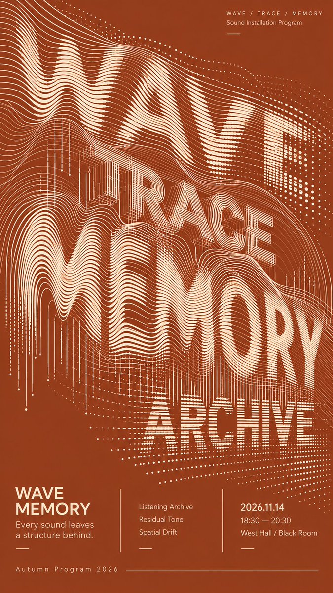
Rendi “Poster sperimentale di tipografia con parole geometriche sovrapposte” tuo
Le parole sovradimensionate sono costruite con anelli, fasce tagliate, griglie di punti e linee fluide invece che con lettere piene. Le lettere restano in parte leggibili mentre le strutture si sovrappongono e si fondono l'una nell'altra su una palette sobria a due toni.
 Prompt di @MrLarus
- Compila i campi qui sotto.
- Guarda il prompt aggiornarsi a destra.
- Copialo oppure aprilo in uno strumento per immagini.
Prompt per immagini
TITLE: [poster title] CONCEPT WORDS: [3–4 related words] BACKGROUND COLOR: [color] PRIMARY COLOR: [color] ACCENT COLOR: [color] TYPOGRAPHIC STRUCTURES: [loops / sliced bands / contour lines / dot grids / flowing lines / return paths] EVENT TYPE: [exhibition / cultural program / sound installation / live performance] EVENT INFO: [date / time / venue] FORMAT: 9:16 vertical poster Create a sophisticated experimental typography poster where oversized English words become the main visual composition. Use 3–4 conceptually related words and build each text layer from a different geometric structure rather than applying effects to normal solid typography. Explore systems such as continuous loop contours, sliced horizontal bands, folded line fields, regular dot grids, architectural contour structures, flowing parallel waves, and long return paths. Let the typography overlap, compress, crop, and pass through neighboring layers. Different systems should transition naturally into one another: dots can extend into lines, lines can bend into loops, sliced bands can become folded contours, and flowing traces can gradually dissolve or reorganize. The letterforms should remain partially readable while also functioning as abstract graphic structures. Slightly reduced readability is acceptable when it creates stronger visual design. Use strong density hierarchy: combine highly concentrated regions, medium-density transitions, and deliberate negative space. Avoid filling the entire poster with the same texture. Keep every line, dot, curve, and contour clean, sharp, smooth, and intentional. Maintain consistent spacing and clear directional logic. Avoid accidental broken lines, fuzzy edges, random noise, messy moiré, glitch artifacts, or low-quality AI rendering. Use a restrained color palette with one dominant background color, one primary typography color, and only limited accent colors. Reserve the lower 25%–30% for a refined editorial information section containing the title, a short concept sentence, 2–3 program items, date, time, venue, and program name. Use clean modern sans-serif typography, thin divider lines, asymmetric columns, and a cultural-poster editorial grid. The final poster should work at three distances: a strong abstract composition at thumbnail size, recognizable layered typography at medium distance, and rich line-based detail up close.
Prompt condiviso su X da @MrLarus. Tutto il merito va al creatore.
Altri prompt che puoi personalizzare
 Tavola di design per uno studio web giapponese in stile nordico
 Poster di viaggio con strada cittadina a linea continua in stile line art
 Poster di viaggio in linea con la vita di strada di Tokyo
 Layout in bianco e nero per un report di bellezza del viso
 Guida alla lettura della mano in contorno, bianco e nero
 Aggiungi la tua fotoPoster del sistema di identità di marca su sfondo scuro
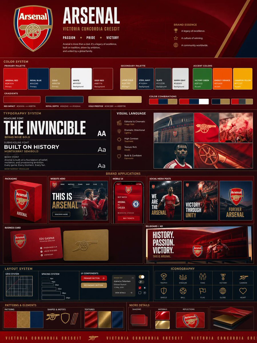 Aggiungi la tua fotoTavola di identità di marca dal logo, con palette e mockup
 Illustrazione minimalista a linee con accenti di colore