Prompt per immagini Prodotto e pubblicità Personalizzabili
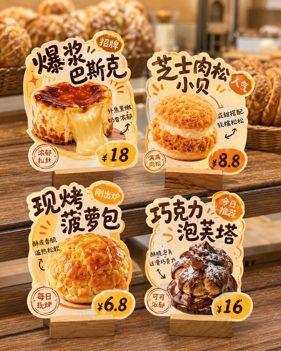
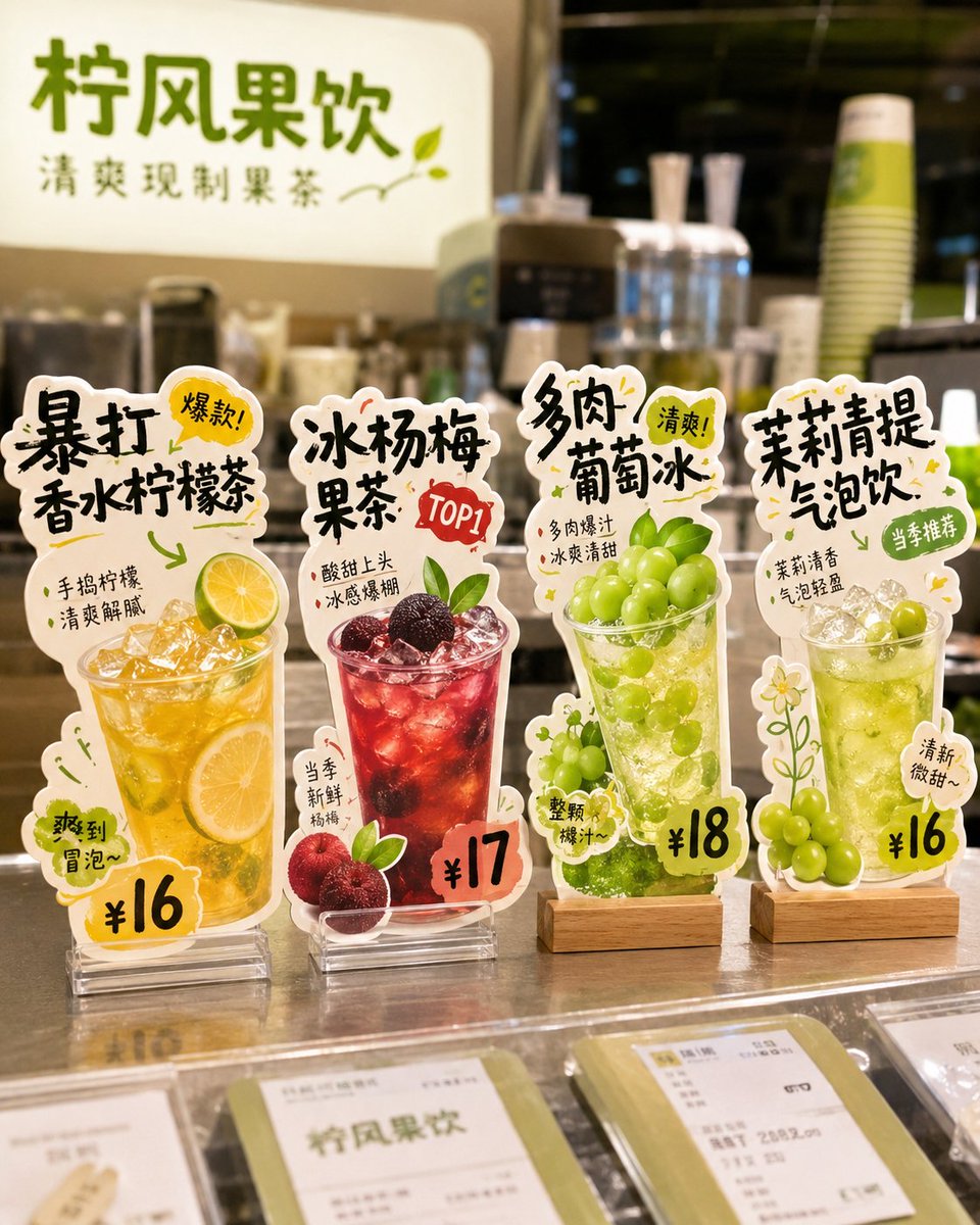
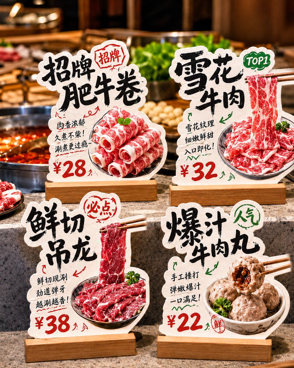
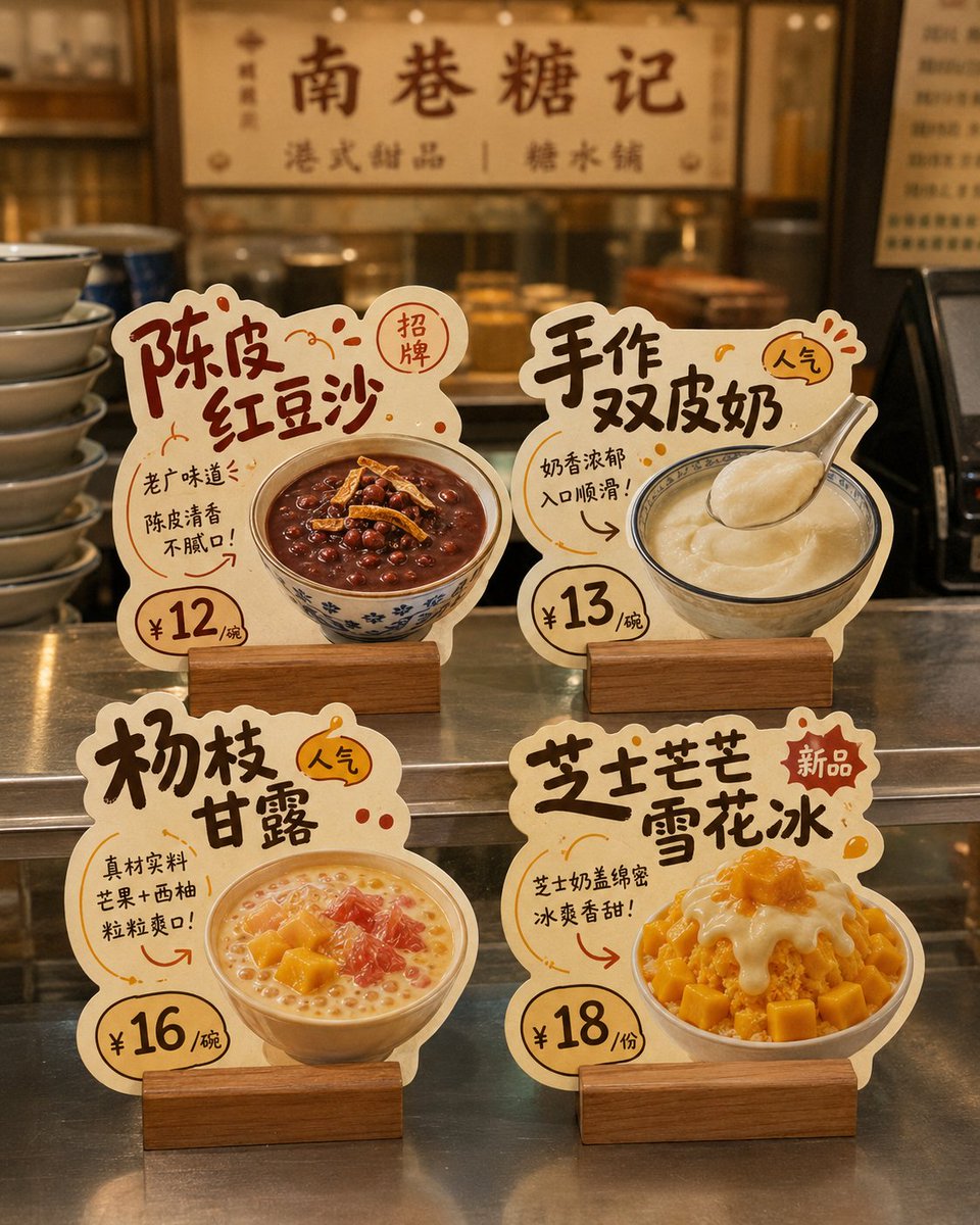
Cartellini da banco sagomati con consigli sui piatti
Quattro espositori separati in cartoncino su sfondo bianco neutro, ciascuno dedicato a un piatto con nome, prezzo e un breve punto di forza. Ogni contorno è ritagliato sulla forma del cibo, così il set sembra un kit espositivo da negozio già pronto.

- Modello
- GPT Image 2
- Tipo
- 4 immagini
- Proporzioni
- 4:5
- Condiviso
- 28 mag 2026
- Mi piace su X
- 115
Nome del marchioDirezione cromaticaProdotto 1Prezzo 1Punto di forza 1+9 altro
Prompt per immagini
3,115 caratteriGenerate a design showcase image of "store die-cut tabletop cards." The background must be pure white, and the whole thing is intended for later cutout and individual splitting. Core requirement: This is not a real-scene store poster or a scene display image, but a white-background layout image. The image shows 4 independent "store die-cut tabletop cards / dish recommendation standees / hit-product recommendation cards," so each card can be cut out and used separately later. Design around the following: Brand name: [brand name] Store type: [type, e.g., hotpot restaurant / dessert shop / tea drink shop / bakery / snack shop / café] Overall style: [style, e.g., handwritten POP feel / down-to-earth liveliness / fresh fruit-drink feel / Hong Kong-style dessert feel / warm bakery feel / cute and healing] Main color: [color direction] Product list: 1. [product 1] / [price 1] / [selling point 1] 2. [product 2] / [price 2] / [selling point 2] 3. [product 3] / [price 3] / [selling point 3] 4. [product 4] / [price 4] / [selling point 4] Image requirements: 1. The entire image has a pure white background, clean, simple, unobstructed; no store environment, no tabletop scene, no holding hands, no people, no prop backgrounds. 2. Show 4 independent tabletop cards in a 2×2 arrangement, with a tidy and clear layout, enough spacing between them, no overlap, for easy individual cutout. 3. Each card must be fully presented, with clear edges, a defined outline, and a strong die-cut feel, not an ordinary rectangular card. 4. Each card centers on a single product, highlighting the food's main visual, product name, price, short selling point, and tags such as featured/new/TOP1/popular. 5. The card style should look like a small recommendation standee a real store would use, commercial and practical, not an illustrated poster or coursework layout. 6. The material should look like thick cardstock die-cut shapes, optionally with a base, but the base should also be simple, complete, and easy to recognize. 7. The typography leans toward handwritten POP feel, bold-title feel, friendly and down-to-earth; you may add a few arrows, stamps, annotations, small tags, and decorative symbols, but not too cluttered. 8. Each card should have strong product recognizability and different die-cut outline variations, designed according to product shape, text flow, and ingredient elements. 9. The food should be appetizing, realistic, and appetite-inducing, suitable for food-service stores. 10. The overall visual must be refined, unified, and complete, like a small set of store die-cut tabletop cards ready to deliver to a client as reference. Special emphasis: - The background must be pure white - Show only 4 cards - No real store scene - No tabletop set design - No complex shadows - Do not assemble into a poster - The focus is that each die-cut card can be cut out individually The final effect should look like: A pure-white-background design showcase image with 4 independent store die-cut tabletop cards neatly arranged, each complete, clear, easy to cut out, and ready to be split and used directly.
Come usarlo
È stato condiviso come prompt per GPT Image 2, quindi inizia compilando il nome del marchio, il tipo di negozio e le quattro righe di prodotto con i relativi prezzi. Mantieni lo sfondo bianco puro e la spaziatura 2 per 2, perché rendono più semplice ritagliare ogni cartellino in seguito. Cambia lo stile POP scritto a mano o il colore principale se la tua vetrina ha un aspetto diverso, e lascia i contorni sagomati legati alla forma di ogni alimento.
Condiviso pubblicamente su X il 28 mag 2026. Tutto il merito di questo prompt e del suo risultato va al creatore. È tuo? Chiedi un aggiornamento o la rimozione.