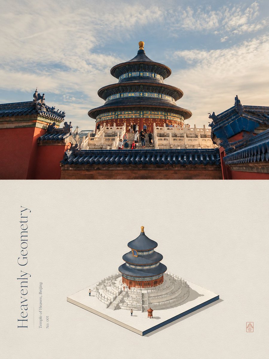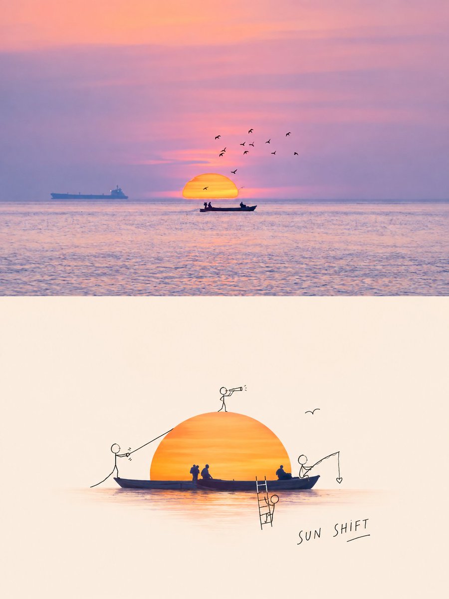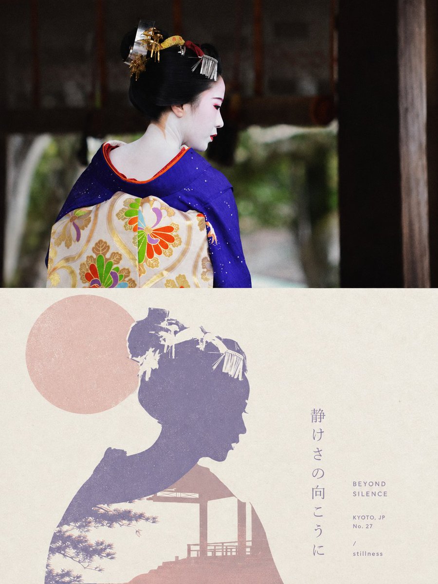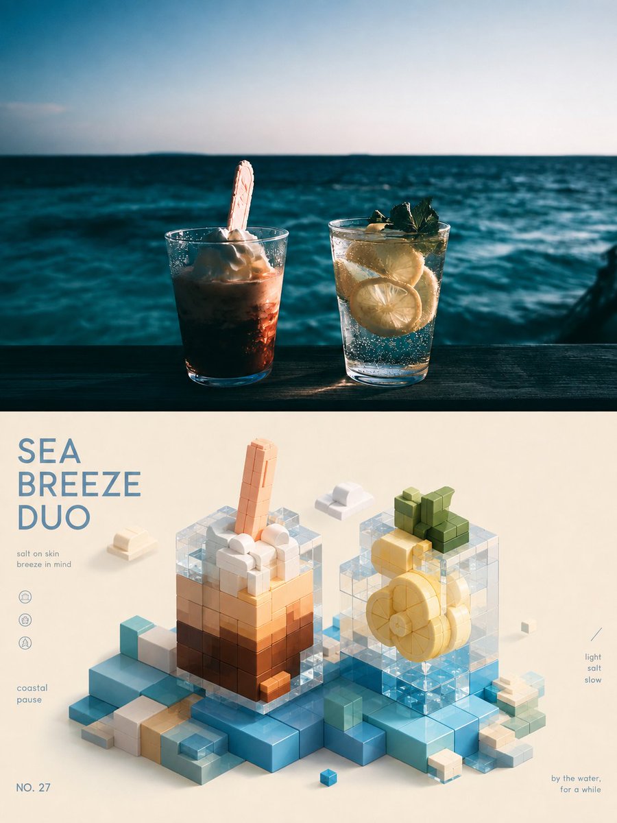
Prompt d'image Branding et UI Personnalisables
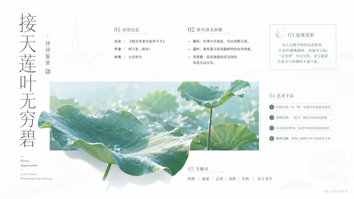
Prompt de diaporama aux textures chaleureuses pour supports de cours sur la culture chinoise
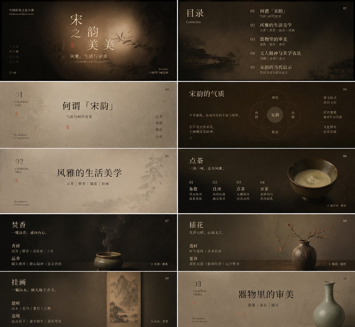
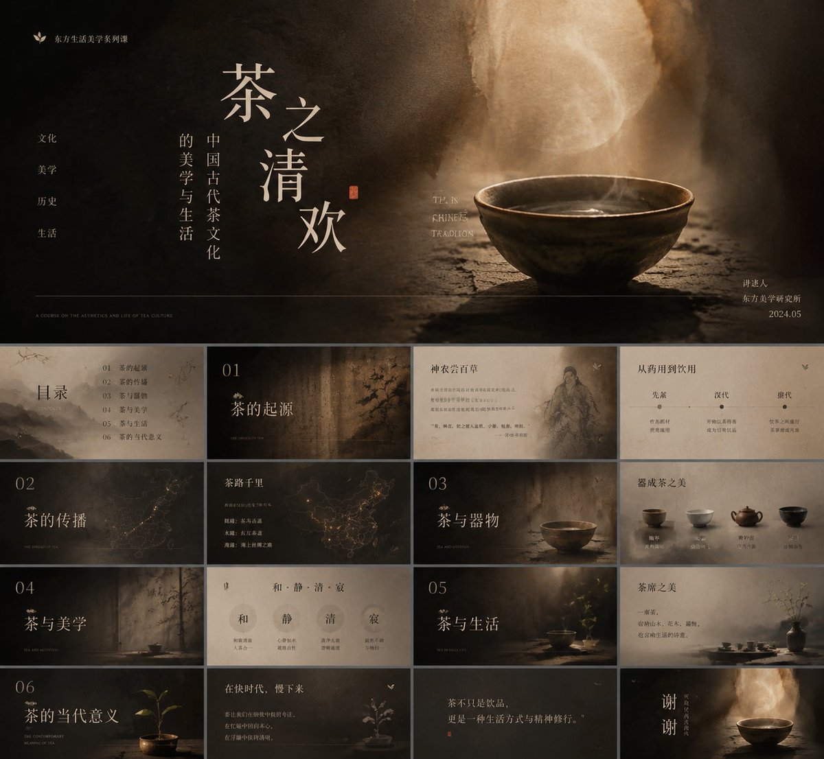
Un ensemble de diapositives pédagogiques à faible saturation, où un titre chinois à empattements et aux traits fins flotte sur un matériau chaleureux et usé, comme le papier, le bois ou la fumée. De petites étiquettes en anglais et des notes de bas de page sont placées sur les bords, si bien que chaque diapositive se lit à la fois comme une couverture et comme une page de rapport.

- Modèle
- GPT Image 2
- Type
- 2 images
- Partagé
- 19 mai 2026
- J'aime sur X
- 303
Sujet du coursPalette de couleursPolice du titre
Prompt d'image
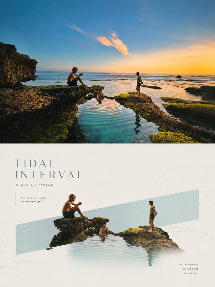
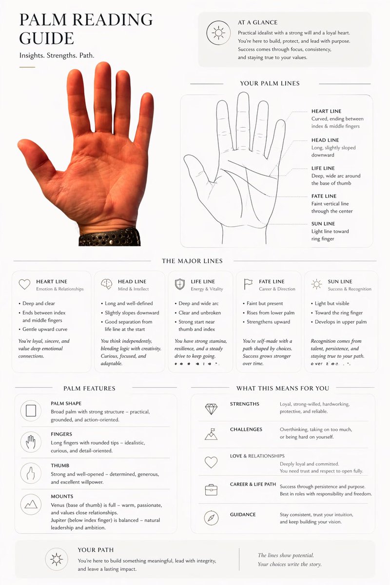
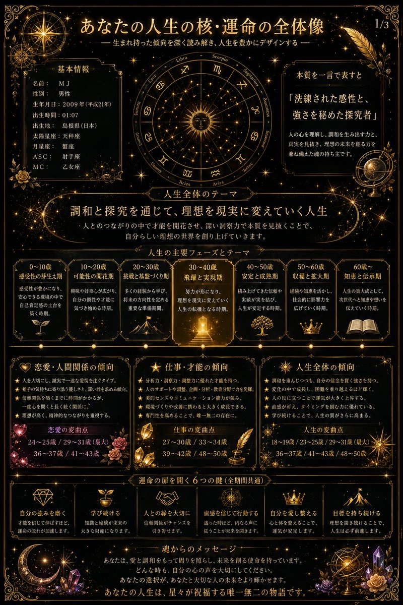
4,190 caractèresTurn this aesthetic into a transferable way of generating visuals: the image shouldn't grab attention with sharp objects, but let the subject, information, or product slowly emerge from a warm material steeped in time. Keep low-saturation, low-noise, soft-focus tonal layers throughout; the background can be wood grain, paper fiber, leather, clay, smoke, fabric, rock face, food texture, a data underlay, or abstract space, but all should show tactile thickness, a faint sense of rotation, and dark edges, so the center is gently lifted by a restrained diffuse light. Don't make a template poster, and don't let decoration speak louder than content; every element should look naturally deposited — quiet, mature, understated, and memorable. Type is the main shaping force of the image. Chinese titles should use a slender, lean, breathing serif (Song) with a scholarly air, slightly loosened tracking, airy leading, allowing words to be split, offset, and layered, so the text blocks float like a set of specimens or fallen leaves — not fully aligned, yet with inner order. English, numbers, notes, and small labels use lighter serif or condensed faces as rhythmic pauses and side-notes, tiny in area but precise in position. Between main title and subtitle, build a contrast of size, language, and light-dark: the large Chinese carries emotion and poetry, the small English or numbers carry explanation, time, category, ranking, metrics, source, or a faint rational echo. You may add a minimal symbolic graphic, line, leaf, dot, emblem, or data marker as a visual pivot — no cute icons, and don't steal weight from the text. The color system is organized as "dark air + warm subject + low-brightness text + small-area semantic accent." Keep the light-dark relationships and soft edges among the reference's amber-brown, caramel, smoke-black, and cream, but the colored part changes role by actual content: knowledge, report, finance, and tech themes let the accent be cooler, cleaner, more like a glimmering annotation; food, lifestyle, solar-term, and culture themes let it be warmer, oilier, or papery; medical, environmental, and public-good themes let it be cleaner, paler, more breathing; commercial launches or covers let it be sharper, more concentrated, on a minimal area. The large color fields of the background stay restrained; the accent color doesn't spread into full-screen decoration but takes on the emotional pivot near title junctions, key numbers, legends, labels, buttons, or visual focus. Text colors are mainly ivory, old-paper white, pale gray-gold, or matte light tones, with detail kept in the shadows, avoiding hard cuts of pure black or white. The layout follows an order of central concentration with quiet complement around the edges. The center can hold the title, core data, product outline, figure's pose, a chart conclusion, or the main visual object, with slow, shadow-wrapped space left around it; at the top, a little brand, series name, chapter name, or short phrase; on the sides, bracketed annotations; at the bottom, a hair-thin divider, short English, footnote, source, metric note, or a line of dense small text weighting the image, so the work reads as both a cover and a page of a premium report. The reading path enters through the large central text, pauses briefly at the graphic or accent color, then settles to the bottom information layer; density decreases from center to edges, and edge information should be small, stable, and precise. For charts and rankings, let the data be tucked into this serene material, with key numbers becoming part of the poetic title; for PPT or reports, let chapter titles, key conclusions, and supporting notes form a soft but clear hierarchy; for products, figures, food, architecture, or natural objects, capture contour, material, shadow, and negative space rather than copying the original subject matter. Now apply this aesthetic to my actual content and let the image grow into the form it needs. This time's theme: plan a knowledge topic suited to this prompt style, then build PPT courseware around it, ideally on a small sub-direction of some traditional Chinese culture. At least 10 images.
Comment l'utiliser
Ce prompt a été partagé comme prompt pour GPT Image 2 et est conçu pour créer une série de diapositives plutôt qu'une affiche unique. Conservez les consignes sur la typographie, le matériau aux bords sombres et la couleur d'accent sobre, car elles portent l'ambiance apaisante. Remplacez le thème traditionnel de la culture chinoise par votre propre sous-thème, comme le thé, la calligraphie ou un terme solaire, et remplacez le titre d'exemple et les étiquettes par le nom de votre leçon. Utilisez le résultat comme un jeu cohérent de pages de couverture et de chapitres pour un cours court.
Partagé publiquement sur X le 19 mai 2026. Tout le mérite de ce prompt et de son résultat revient à son créateur. Ce prompt est le vôtre ? Demandez une mise à jour ou un retrait.