Prompt d'image Branding et UI Personnalisables
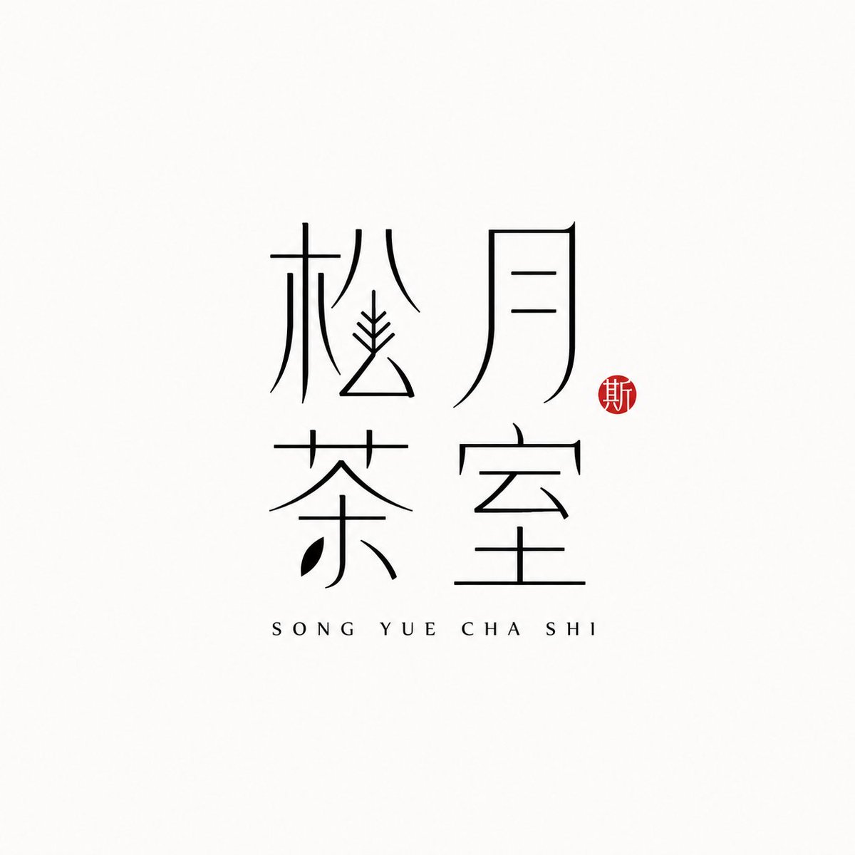
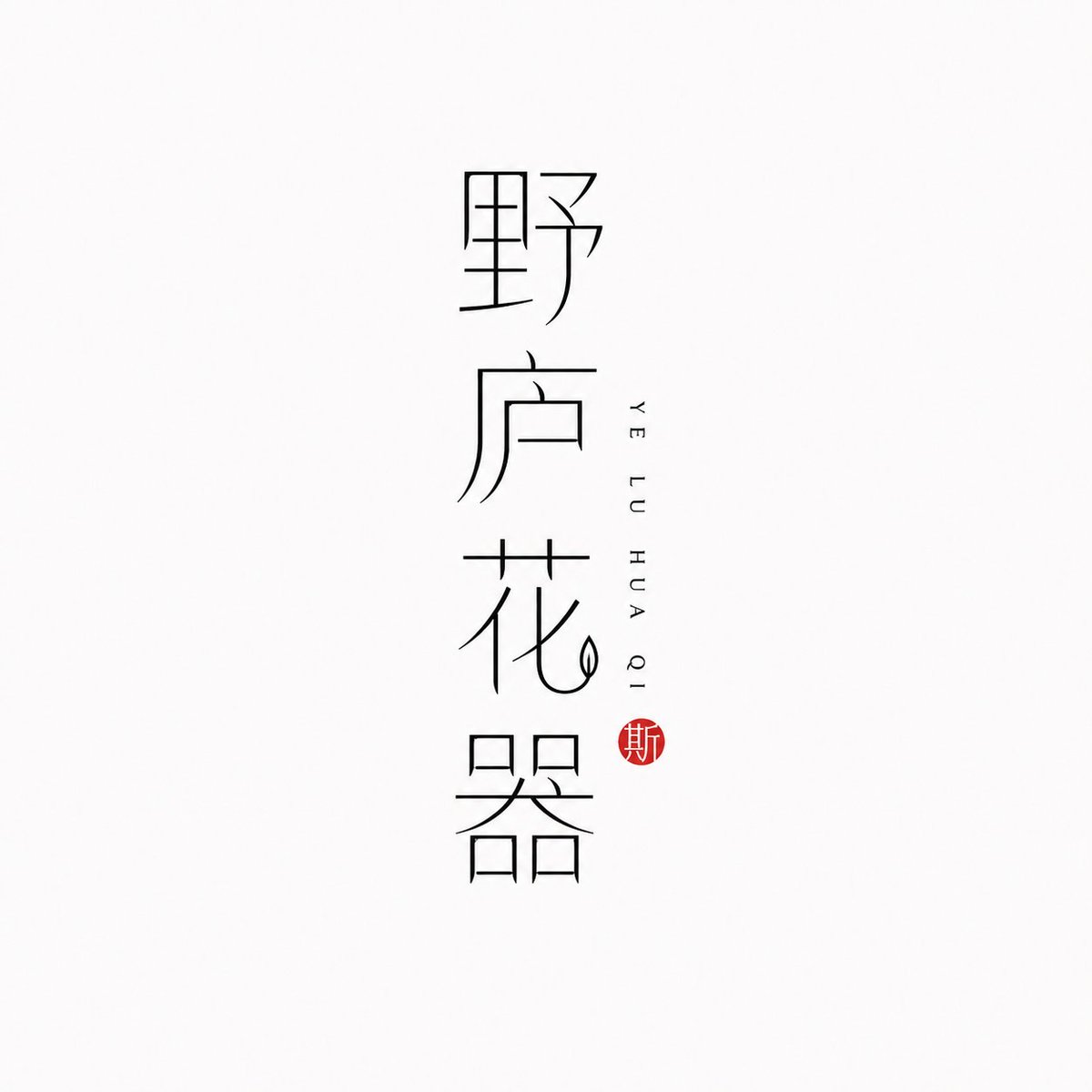
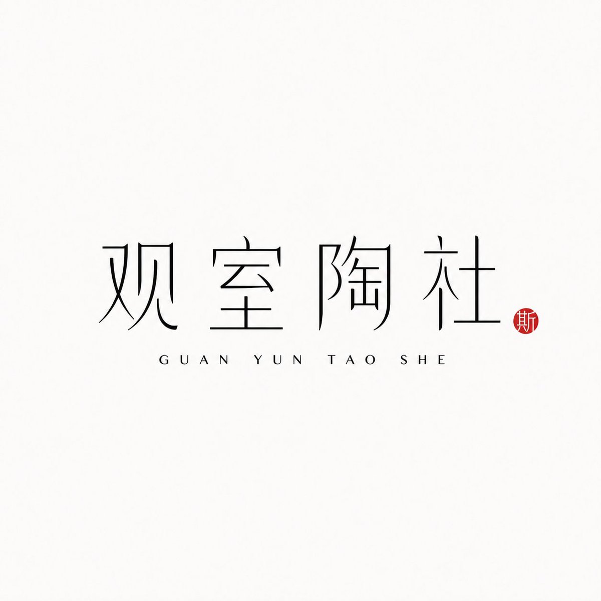
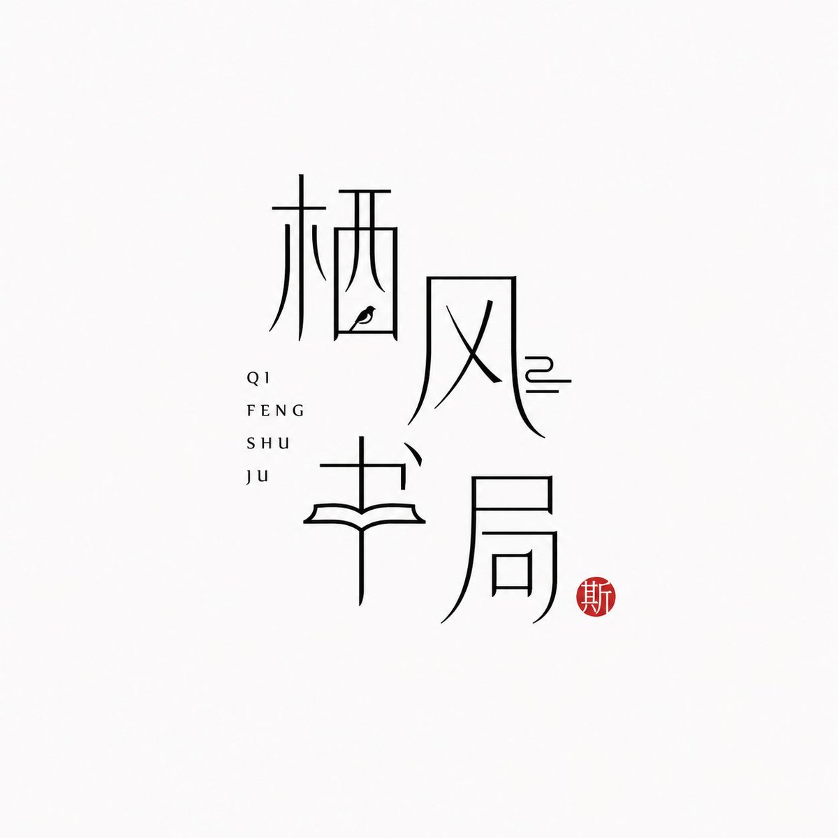
Logo de marque en caractères chinois au trait fin
Le nom de la marque en chinois devient lui-même le logo, tracé en fins traits noirs sur un fond presque blanc. Le pinyin figure discrètement à côté, et un petit sceau vermillon apporte une unique touche chaleureuse, pour une allure orientale calme et moderne.

- Modèle
- GPT Image 2
- Type
- 4 images
- Format d'image
- 1:1
- Partagé
- 25 juin 2026
- J'aime sur X
- 97
Nom de marquePinyinMise en page
Prompt d'image
1,778 caractères[Brand name]: [Auxiliary pinyin]: [Brand direction]: tea house / flower vessel / ceramics / bookstore / fragrance / objects / guesthouse / Oriental lifestyle brand [Layout structure]: 2×2 grid / vertical / horizontal / staggered interweaving [Mood keywords]: cool-serene / restrained / refined / whitespace / modern Oriental / thin-line typography Generate a "Thin-Line Oriental Typographic Logo." The whole is a minimalist Chinese typographic logo on a white or very light gray-white background with abundant whitespace. The main subject is neither an illustration nor a graphic, but the Chinese brand name itself designed as a visual mark. The main Chinese characters use black thin-line strokes — slender, light, restrained, and cool, with a modern Oriental feel. Some strokes may receive slight geometric reconstruction, elongation, broken strokes, displacement, or whitespace treatment, but the whole must keep readability and consistency and must not become illegible scrambled characters. The core is "typography as logo": the Chinese brand name itself is the main visual, while pinyin or English serve only as auxiliary layout. The pinyin can be placed below, to the side, vertically, or interwoven beside the main characters, with wide letter spacing, staying refined, quiet, and restrained. Add a small vermilion seal-carving-style stamp; its content can be a single character in an antique style or an abstract ancient seal symbol. The seal is only a finishing touch — it must not be too large nor steal the main visual. The overall effect should look like a real brand's modern Chinese typographic logo: clean, flat, design-driven, with a sense of series, suitable for brand proposals, storefronts, packaging, social media avatars, and visual system extension.
Comment l'utiliser
Partagé comme prompt GPT Image 2. Remplacez les champs entre crochets du nom de marque et du pinyin par les vôtres, et conservez la typographie au trait fin, les larges espaces blancs et le petit sceau, car ces détails portent le style. Choisissez une orientation de marque, comme salon de thé ou parfumerie, pour guider l'ambiance, et une mise en page, comme une pile verticale ou une grille 2x2. Le logo final convient bien à une enseigne, au recto d'un emballage ou à un avatar de réseau social.
Partagé publiquement sur X le 25 juin 2026. Tout le mérite de ce prompt et de son résultat revient à son créateur. Ce prompt est le vôtre ? Demandez une mise à jour ou un retrait.












