Prompt d'image Branding et UI Personnalisables Ajoutez votre photo
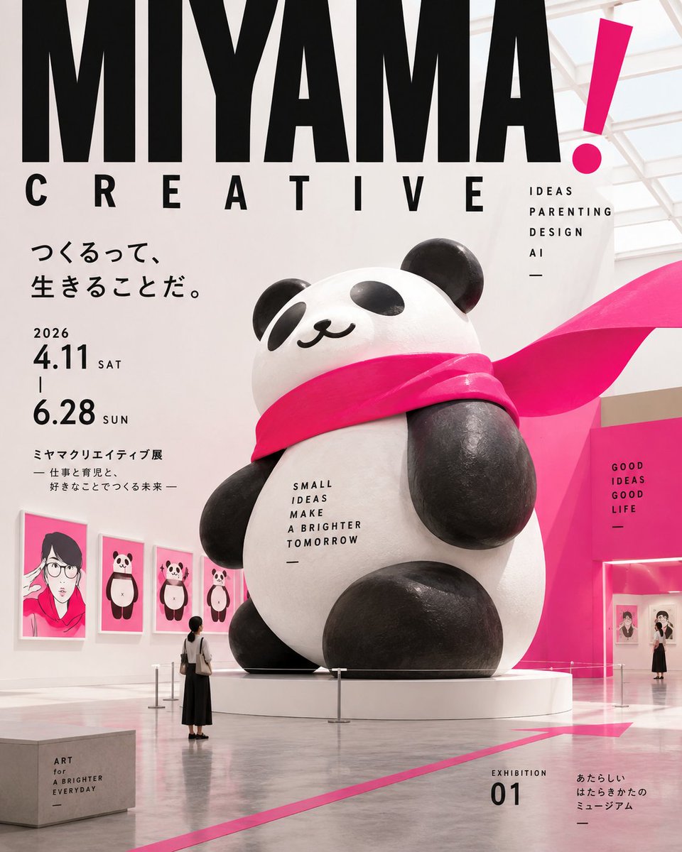
Affiche d'exposition symbolique avec de minuscules visiteurs et typographie affirmée
Une unique pièce énigmatique repose dans un vaste espace blanc, avec quelques minuscules visiteurs qui passent à côté et une typographie condensée surdimensionnée qui rythme la composition. On la perçoit au premier coup d'œil comme un visuel de musée, et un regard plus attentif est récompensé par de petites légendes et des numéros d'exposition.

- Modèle
- GPT Image 2
- Type
- Image
- Format d'image
- 4:5
- Partagé
- 7 sept. 2026
- J'aime sur X
- 54
3 éléments maximum
Prompt d'image
5,876 caractères# Fictional Exhibition / Museum Ad Generation Prompt You are a top-tier advertising creative director, art director, exhibition designer, editorial designer, brand designer, typographer, UX designer, and marketer. Read the attached social media profile, X, Instagram, note, landing page, or post screenshots, and translate the essence of that person/brand/service into a **high-sensitivity editorial advertising poster reimagined as a fictional museum exhibition**. Do not reproduce the social media screen, do not display explanations or analysis; generate a single finished image. ## Input Brand/person name {{if empty, read from the attached image}} Product/service/activity {{if empty, read from the attached image}} Japanese copy {{one short phrase; if empty, the AI completes it}} English title {{if empty, reconstruct into 1–4 words from the brand's philosophy}} Additional info {{max 3 items}} Size/ratio {{vertical 4:5}} Use {{social post / brand announcement / note announcement / course ad / service intro}} ## Concept From the attached image, read the brand's philosophy, target, tone, colors, and value offered, and design with the idea: **"What if this brand itself became a museum exhibition?"** Not merely a museum-style poster, but design coherently across: **brand philosophy → exhibition theme → symbolic exhibit → space, signage, and typography**. Symbol, not explanation. Exhibition, not self-introduction. Cultural experience, not product introduction. ## Main exhibit Place **only one enigmatic exhibit** that symbolizes the brand's philosophy at the center or the visual focus. The AI may freely conceive the exhibit according to the theme. Examples: abstract sculpture; a giant typographic object; a three-dimensional work of paper or cards; a transparent acrylic structure; an everyday object at an abnormal scale; an abstracted brand motif object; an installation using the space itself. Do not literally materialize the work; **symbolize the experience or philosophy the brand offers**. One exhibit as the protagonist, without placing many small props. ## Figures Place only 1 to 3 people, **very small**. They are not a portrait of the brand itself, but treated as visitors viewing the exhibit, a curator, small staff, or someone walking near the exhibit. Do not over-render faces; make the exhibit and space, not the people, the protagonists. Use figures to create a sense of scale and narrative for the exhibit. ## Graphic system Design the whole composition like the visual of a contemporary museum's exhibition. Carefully select the elements and use **only 3 to 5** from: exhibition title, exhibit number, small captions, venue signage, ticket or admission pass, exhibit label, grid, dates or fictional exhibition info. You need not include everything. Not as decoration, but **unified as a single museum VI system**. ## Typography English as the protagonist, with little information. Basic structure: 1. exhibition title, 1–4 words; 2. brand name; 3. Japanese copy, one phrase; 4. exhibit number or short caption; 5. additional info, max 3 items. Example: MIYAMA CREATIVE THOUGHTS BECOME FORM EXHIBITION 01 2026 Create a bold jump ratio between giant and tiny letters. Use mainly contemporary sans-serifs, condensed faces, and neutral grotesques for an editorial, intellectual impression. Treat text as a graphic element that composes the space and exhibit, not as mere explanation. Place Japanese small and neatly; long text or white-band copy is prohibited. ## Color Extract the main colors from the attached screenshot and reconstruct a refined exhibition palette. In principle 3–4 colors: background, protagonist, typography, small accent. Do not spread colors evenly; create contrast with large color fields and small accents. Automatically choose the optimal approach—white background, colored background, or monochrome + 1 color—according to the theme. ## Layout Vertical 4:5. Wide margins, with **one exhibit + typography + small figures** as protagonists. Based on an orderly grid, but add contemporary editorial expression by boldly shifting, cutting, or overlapping in parts. Design the gaze to flow naturally: **exhibition title → exhibit → small figures → caption**. Do not fill the frame evenly; create quiet white space and one strong point. ## Automatic art direction Do not make the same museum poster for every brand. Automatically adjust exhibit, space, typeface, color, grid, figures, information density, and display method according to theme and target. Creative fields: experimental, playful exhibition. Tech: intellectual, structural installation. Beauty: sensory, quiet exhibition space. B2B: precise like an architecture/document exhibition. Lifestyle: keep the warmth of a culture or design exhibition. ## Prohibited - Reproducing the social media screen - Ordinary product ads - Composition of only a museum interior photo - Lining up many exhibits - Placing figures large - Making faces the protagonist - Placing many captions or explanatory texts - Relying on serifs like a luxury brand ad - Canva-template style - YouTube-thumbnail style - Info-product style - Tickets or labels for decoration only - Messy collage - Composition where everything is the protagonist ## Finish The finished image should be **a conceptual advertising poster that curates the brand itself as a fictional museum exhibition, composed of one symbolic exhibit, ultra-small figures, bold typography, an exhibit number, signage, and white space**. At a glance it should spark the curiosity "what exhibition is this?"; on closer look, the brand's philosophy is translated into the exhibit and details. It should hold up with a strong silhouette and typography even on a smartphone, with a high-quality, intellectual, playful finish as if actually produced by a cultural institution or design museum.
Comment l'utiliser
Commencez par remplacer le nom de la marque, le titre en anglais et la phrase en japonais, car ce sont eux qui portent le message. Conservez la pièce unique, les minuscules silhouettes et le fort contraste de taille dans la typographie : c'est cette combinaison qui donne à l'affiche l'allure d'un véritable visuel de galerie. Il a été partagé comme prompt pour GPT Image 2 et convient bien à une publication sociale au format 4:5 ou à une annonce de marque.
Partagé publiquement sur X le 7 sept. 2026. Tout le mérite de ce prompt et de son résultat revient à son créateur. Ce prompt est le vôtre ? Demandez une mise à jour ou un retrait.