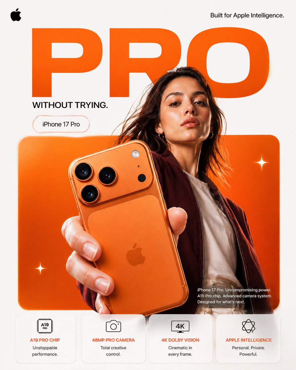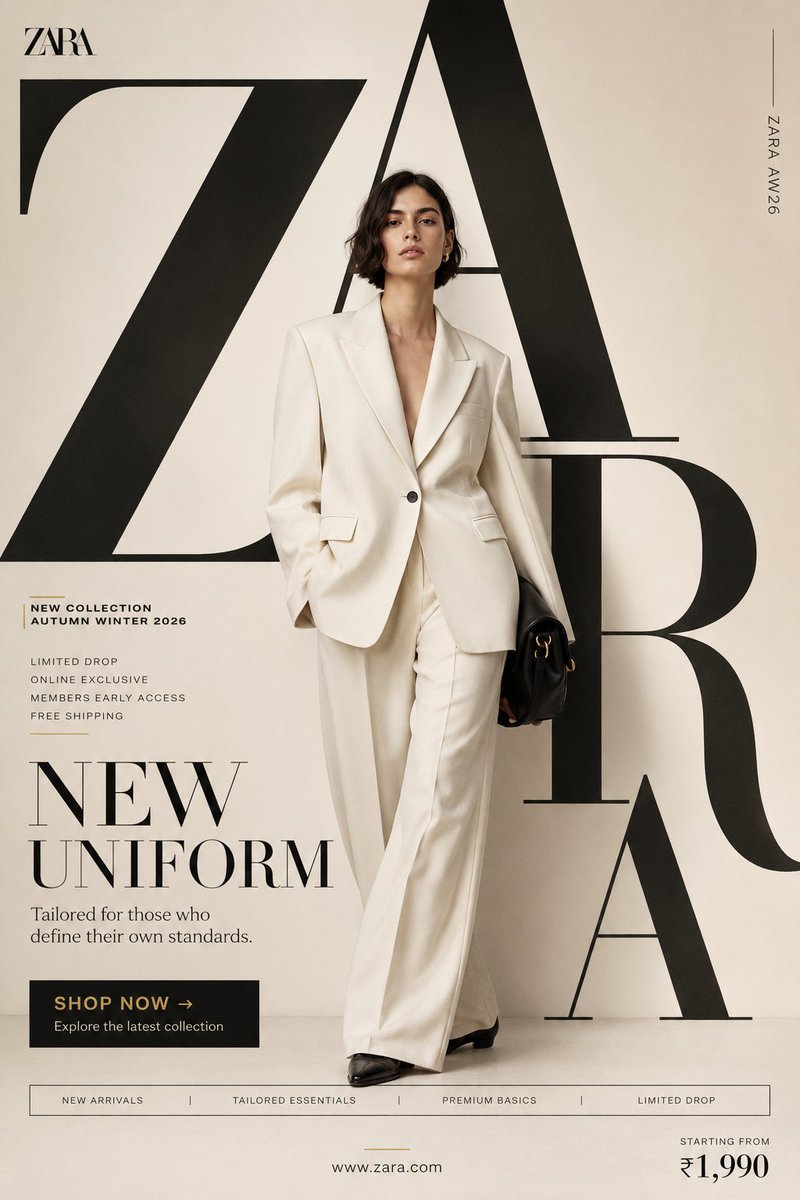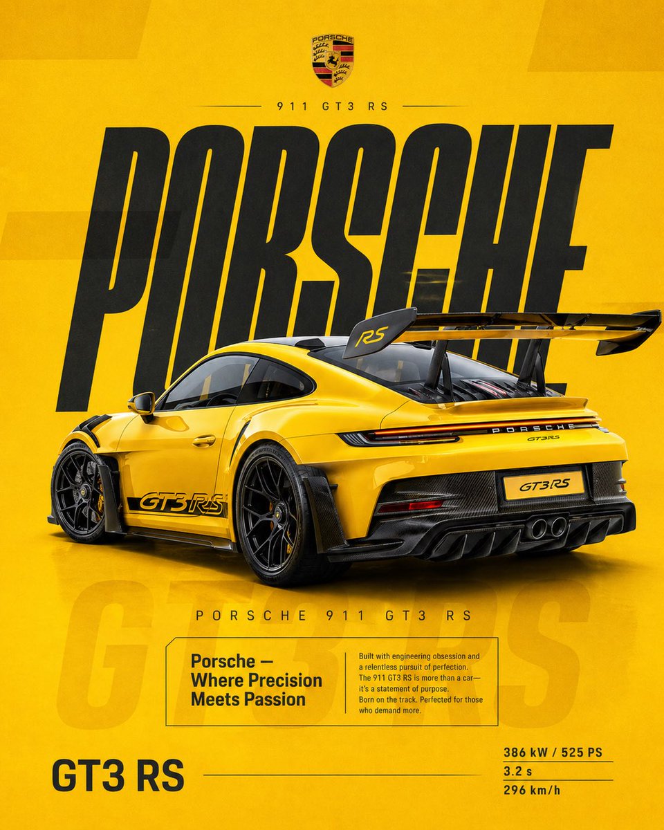


Prompt d'image Produit et publicité Personnalisables
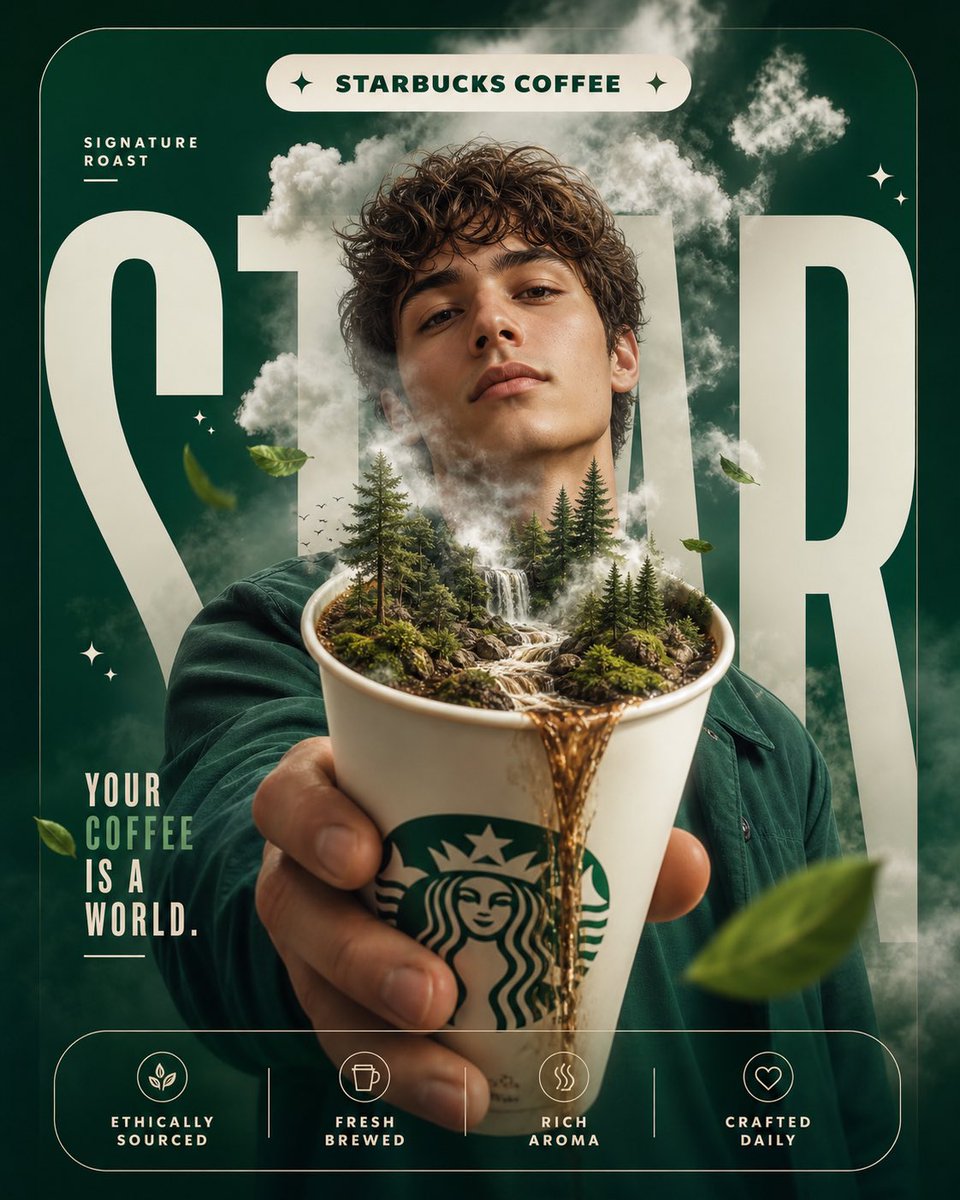
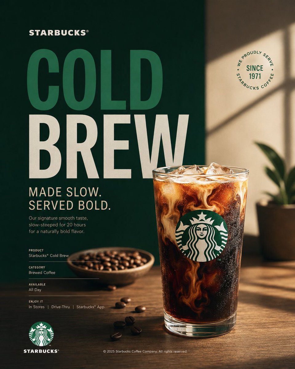
Affiche de campagne Starbucks avec produit phare café
Une affiche verticale de campagne construite autour d'un seul produit phare café dans les couleurs vert, blanc et noir de Starbucks. La typographie éditoriale côtoie une photographie de studio épurée, si bien que la pièce se lit comme une publicité sobre et haut de gamme plutôt que comme un prospectus commercial surchargé.

- Modèle
- GPT Image 2
- Type
- 3 images
- Format d'image
- 4:5
- Partagé
- 16 août 2026
- J'aime sur X
- 42
Nom de marque
Prompt d'image
1,773 caractèresAct as a Senior Brand Art Director, Editorial Poster Designer, and award-level Visual Identity Designer creating a premium vertical promotional poster for Starbucks. The final artwork must feel like a professionally art-directed advertising campaign and a Behance-featured graphic design project — sophisticated, concept-driven, commercially believable, visually restrained, and executed with exceptional typography, photography, composition, and brand consistency. The poster must be deeply rooted in Starbucks’ real brand identity — its documented colors, typography character, Siren identity, coffee culture, packaging language, campaign history, product presentation, and contemporary visual expression. IMPORTANT LIMITATION: Do not attempt to generate real identifiable people by name. Use a realistic fictional figure only when a human presence strengthens the concept. The figure must look natural, contemporary, and completely consistent with Starbucks’ visual world. [Includes PHASES 0–11: brand intelligence with strict brandbook accuracy; color system using Starbucks Green #006241, White #FFFFFF, Black #000000; typography character; real campaign language only; documented brand facts; 4:5 vertical poster architecture with NO split screen, NO vertical division, NO two-panel composition, as ONE unified visual composition; hero product at 35–55%; conceptual art direction; 2–5 word headline typography; product+typography integration; informational micro-typography; logo signature and placement; premium commercial photography and material rendering; composition principles with clear hierarchy; Behance-featured quality; tech specs — 4:5 vertical aspect ratio, no fake slogans, no invented brand facts, no identifiable real people, no excessive effects.]
Comment l'utiliser
Remplacez d'abord le titre et le nom du produit, en gardant la ligne courte de deux à cinq mots pour que la typographie reste forte. La palette vert, blanc et noir et la mise en page sobre portent le style, donc conservez-les si vous voulez l'univers de la marque. Il a été partagé comme prompt GPT Image 2 et fonctionne bien en publication sociale, maquette d'impression ou pièce de portfolio au format 4:5.
Partagé publiquement sur X le 16 août 2026. Tout le mérite de ce prompt et de son résultat revient à son créateur. Ce prompt est le vôtre ? Demandez une mise à jour ou un retrait.