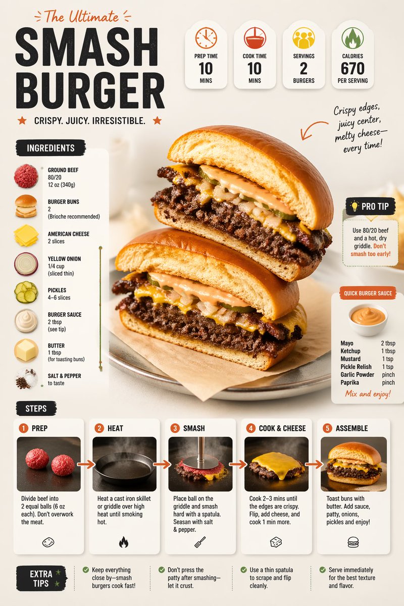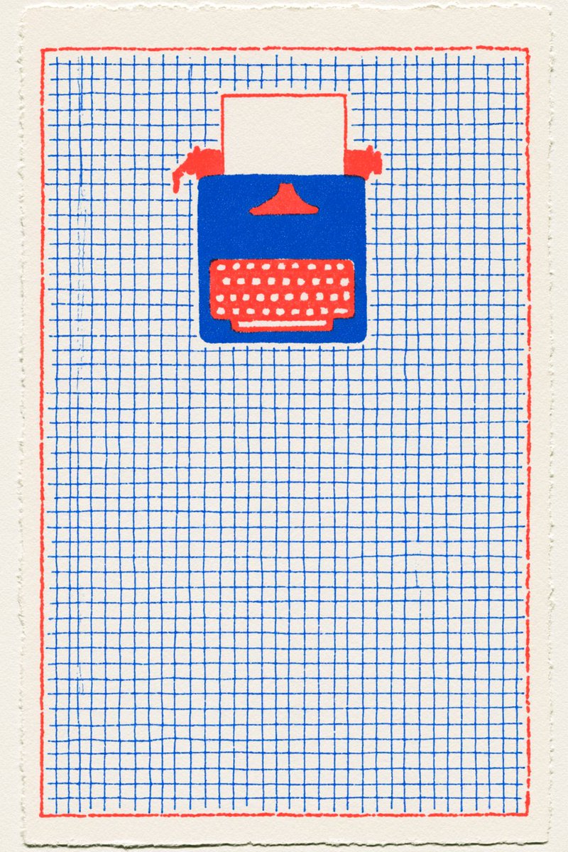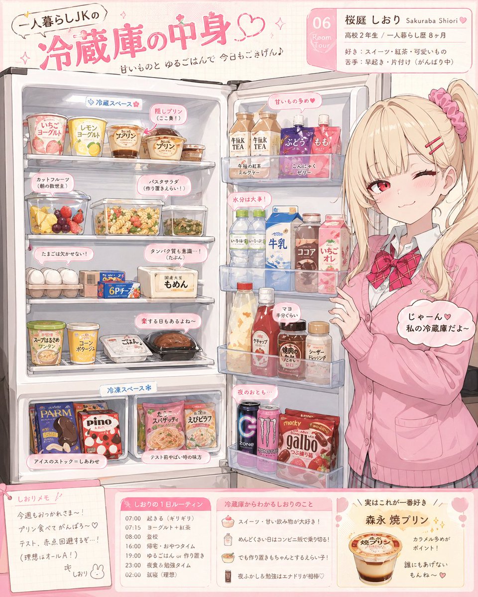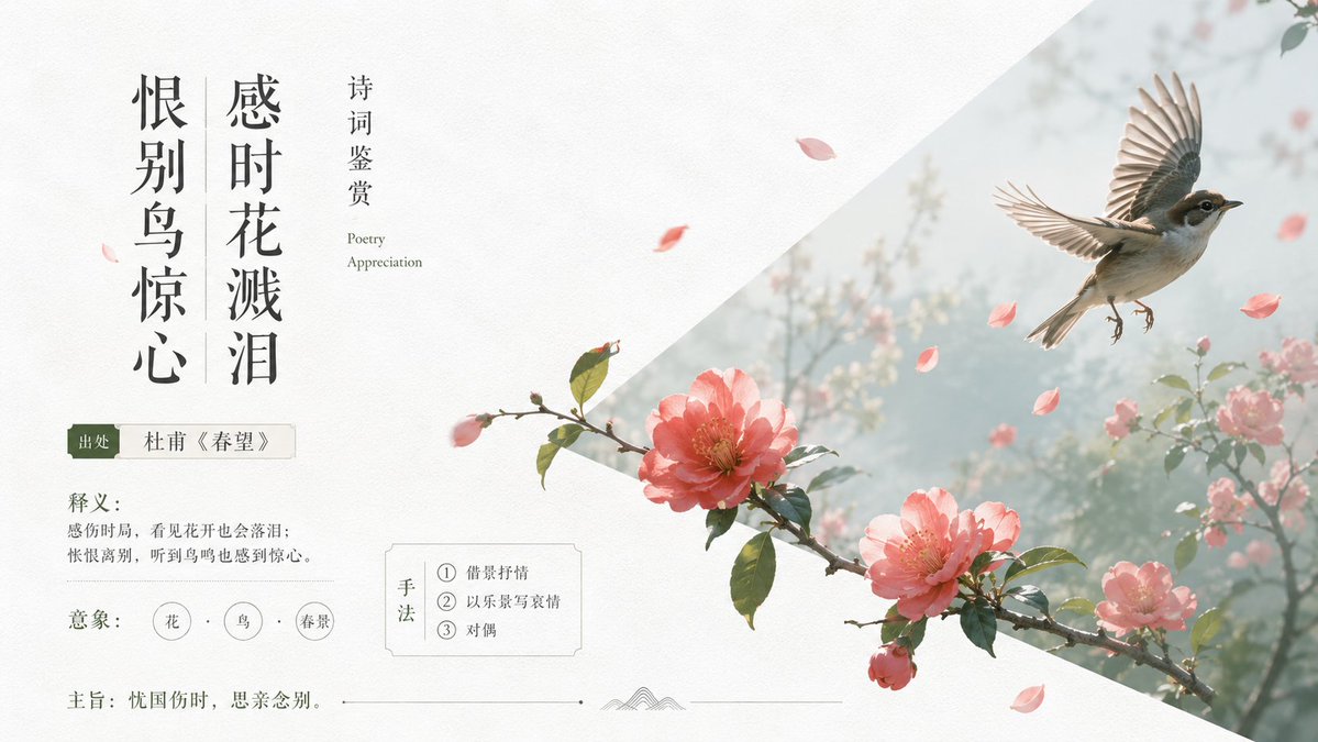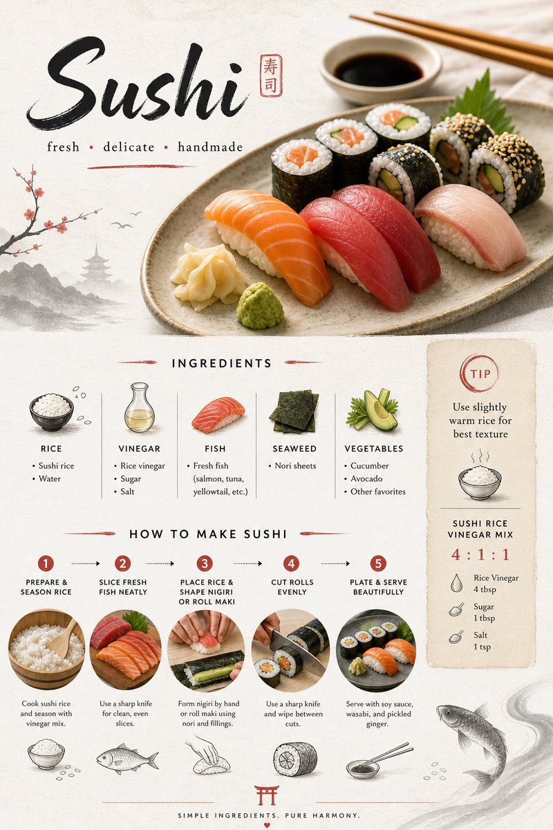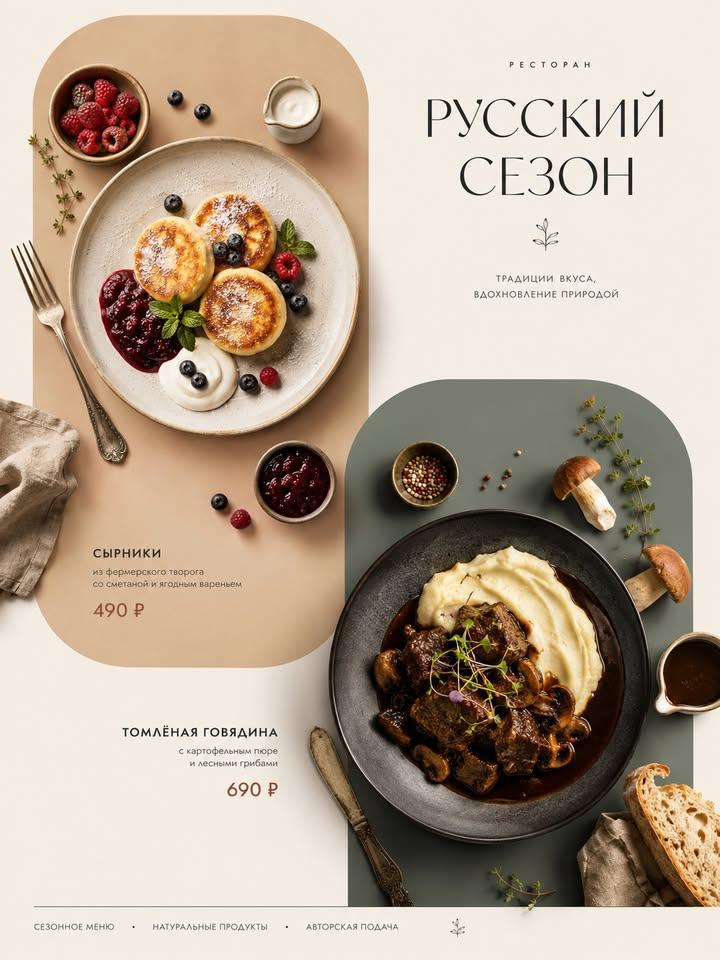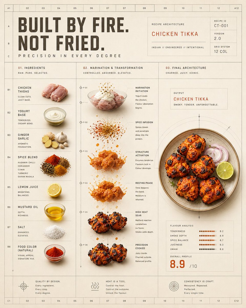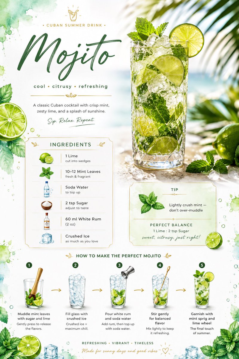
Prompt d'image Food & boissons Personnalisables Ajoutez votre photo
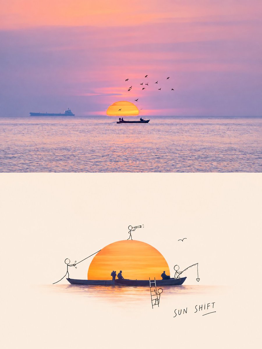
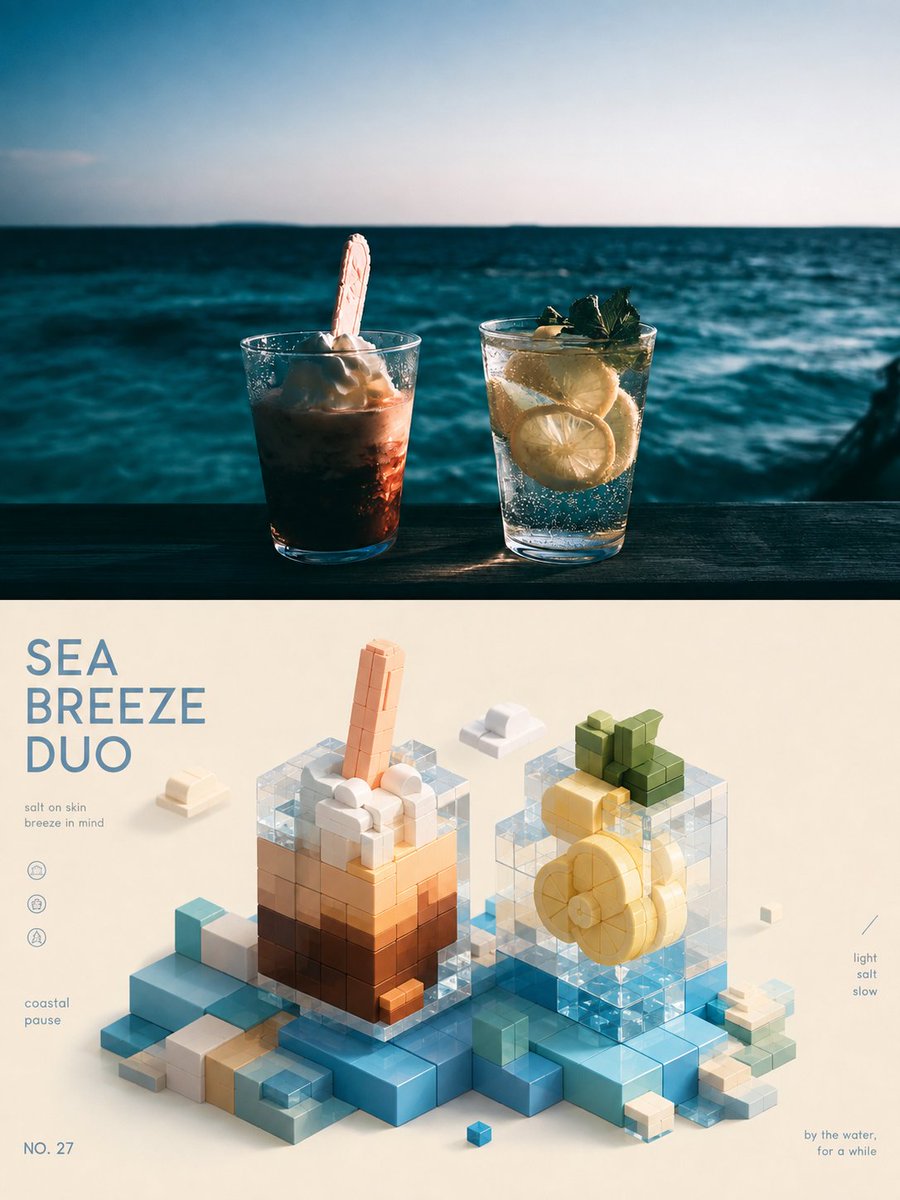
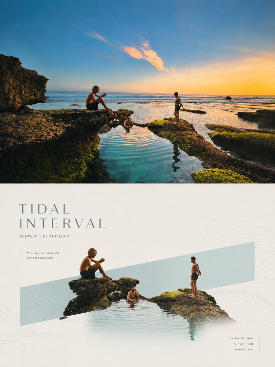
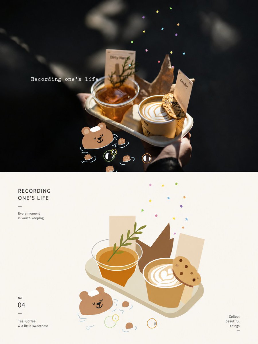
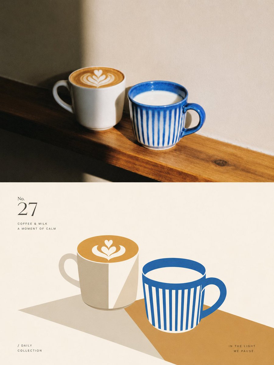
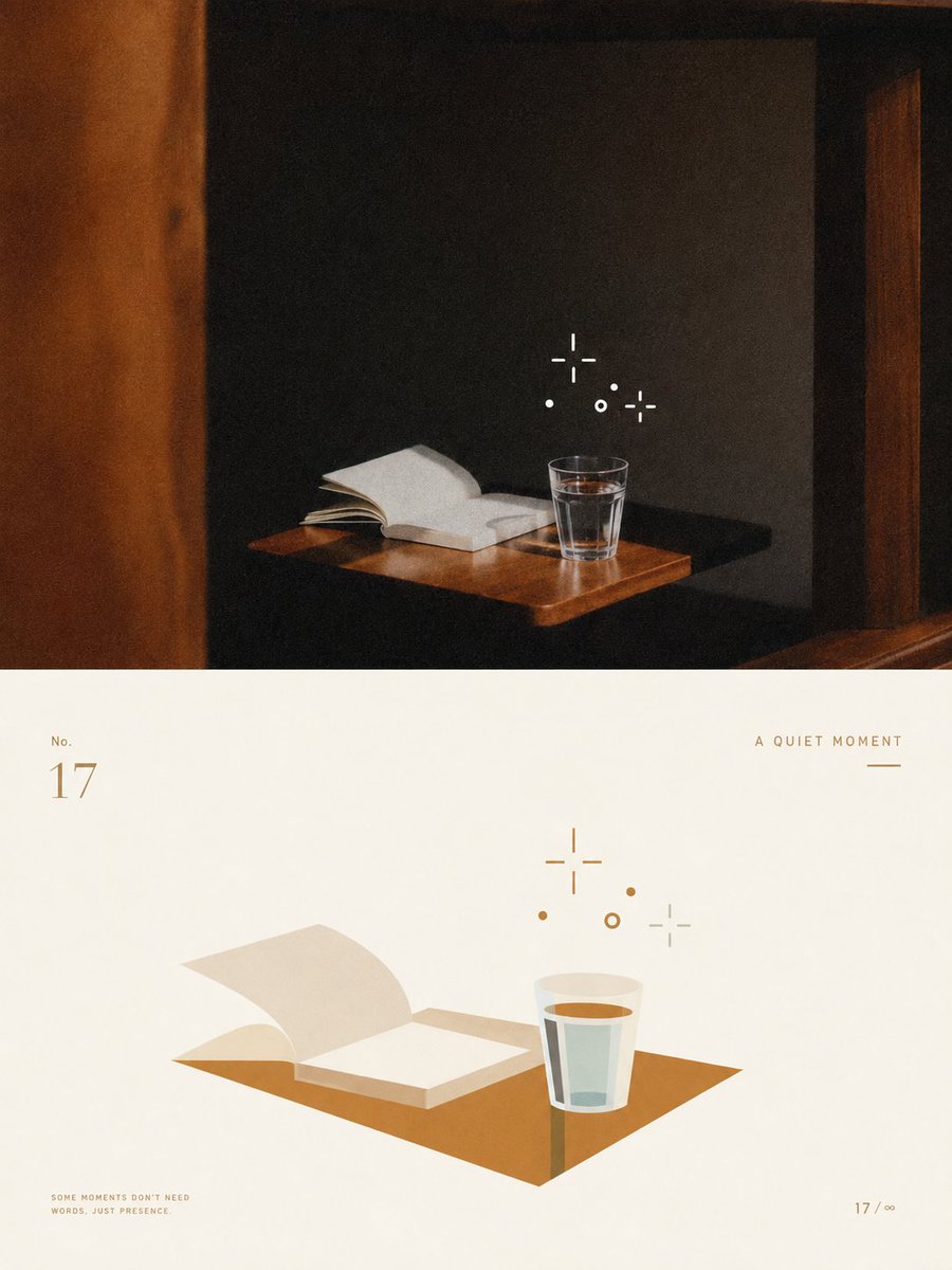
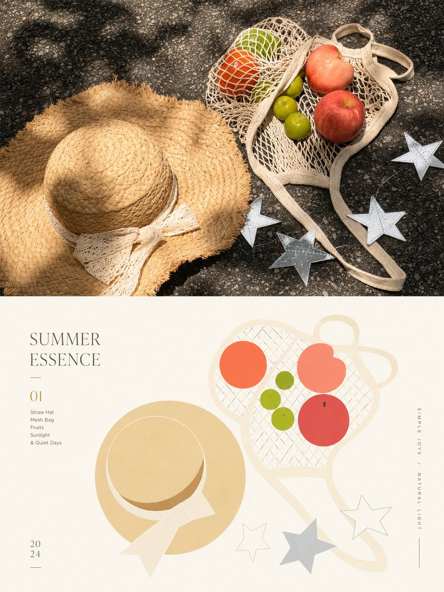
Affiche portrait scindé avec palette géométrique apaisante
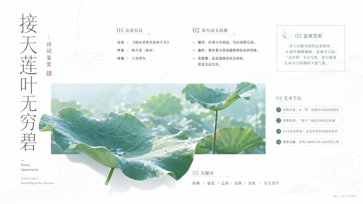
Une affiche 3:4 divise une photographie en deux moitiés égales : l'image d'origine reste nette en haut, tandis qu'en dessous le même sujet réapparaît en aplats de couleur et contours épurés. Des couleurs douces et fraîches tirées de la photo gardent le résultat calme et agréable à regarder.

- Modèle
- GPT Image 2
- Type
- 4 images
- Format d'image
- 3:4
- Partagé
- 31 août 2026
Style d'afficheSource des couleurs
Prompt d'image
3,477 caractèresCreate a separate, standalone premium design poster for each photo I upload. Do not combine multiple photos into a collage; output each photo individually. Use a 3:4 vertical composition, divided into two sections with a strict 1:1 height ratio, each occupying exactly 50% of the image. In the upper half, preserve the original photograph, including the subject's identity, structure, pose, authentic texture, natural lighting, and original color atmosphere. Apply only subtle, refined color grading to give it the quality of an art magazine, independent publication, or exhibition image. If necessary to fit the format, the surrounding background may be naturally extended, but the subject must not be stretched, distorted, or altered. In the lower half, extract the most recognizable subject, silhouette, structure, pose, and narrative relationships from the original photo, retaining only the core image and outline most worth remembering, and reconstruct them into a geometric, flattened artistic expression. Do not use realistic illustration, and do not replicate the original image's details. Instead, use simple geometric shapes, flat color blocks, clear contours, fine lines, and negative space to compress complex information into a small number of key visual elements. The most essential identifying features of the original subject must be preserved so that it is immediately recognizable as coming from the same image above. The composition of the lower half should be more professional, with strong attention to layout order, visual center of gravity, hierarchy, positive and negative shape relationships, the rhythm of empty space, and the balance between image and text. The subject may remain centered or be slightly offset, but the overall composition must be balanced, restrained, and quiet, avoiding visual clutter. Use an off-white background or an extremely pale tone intelligently matched to the original image, with generous negative space, so that the subject feels like a distilled specimen of memory placed within a clean, rational layout. Extract the brightest, freshest, and most life-filled colors from the upper photograph, then reorganize them into a clearer, softer, more healing palette. Increase the overall brightness and color purity, creating an atmosphere through light, clean, warm overall color relationships. The color blocks should be vivid but not harsh, with a soft, fresh, quiet, yet vital visual feeling. Avoid dirty grays, dullness, aged tones, heaviness, fluorescent colors, and cheap candy-like color effects. Text may be added sparingly, including a simple title, numbering, or micro-annotations, arranged naturally in relation to the subject and the negative space. Typography should be restrained, refined, and editorial in feeling, like the small labels used in international design studios, architectural posters, art exhibition posters, or high-end brand visual systems. It should never overpower the image, but instead help establish a more elevated visual order between text and graphics. The overall style should reference international design studios, architectural posters, art exhibition posters, and high-end brand visual systems, presenting a visual effect that is sophisticated, modern, elegant, restrained, geometric, flat, and strongly healing in tone. Avoid excessive filters, cheap plastic textures, cartoonish qualities, an overly computer-generated look, templated effects, and meaningless decoration.
Comment l'utiliser
Importez une photo d'une personne ou d'une scène, car le prompt est conçu autour d'une seule image et demande que chaque photo soit générée séparément. Conservez l'instruction concernant la division stricte 50/50, la moitié inférieure géométrique et plane et la palette douce, car ce sont elles qui portent le rendu. Modifiez le titre et la petite annotation selon votre projet, et envisagez de l'imprimer comme affiche indépendante ou publication sur les réseaux sociaux. Il a été partagé comme prompt pour GPT Image 2.
Partagé publiquement sur X le 31 août 2026. Tout le mérite de ce prompt et de son résultat revient à son créateur. Ce prompt est le vôtre ? Demandez une mise à jour ou un retrait.