

Studio de prompts
Personnalisez « Affiche de récital de piano solo avec titre brisé »
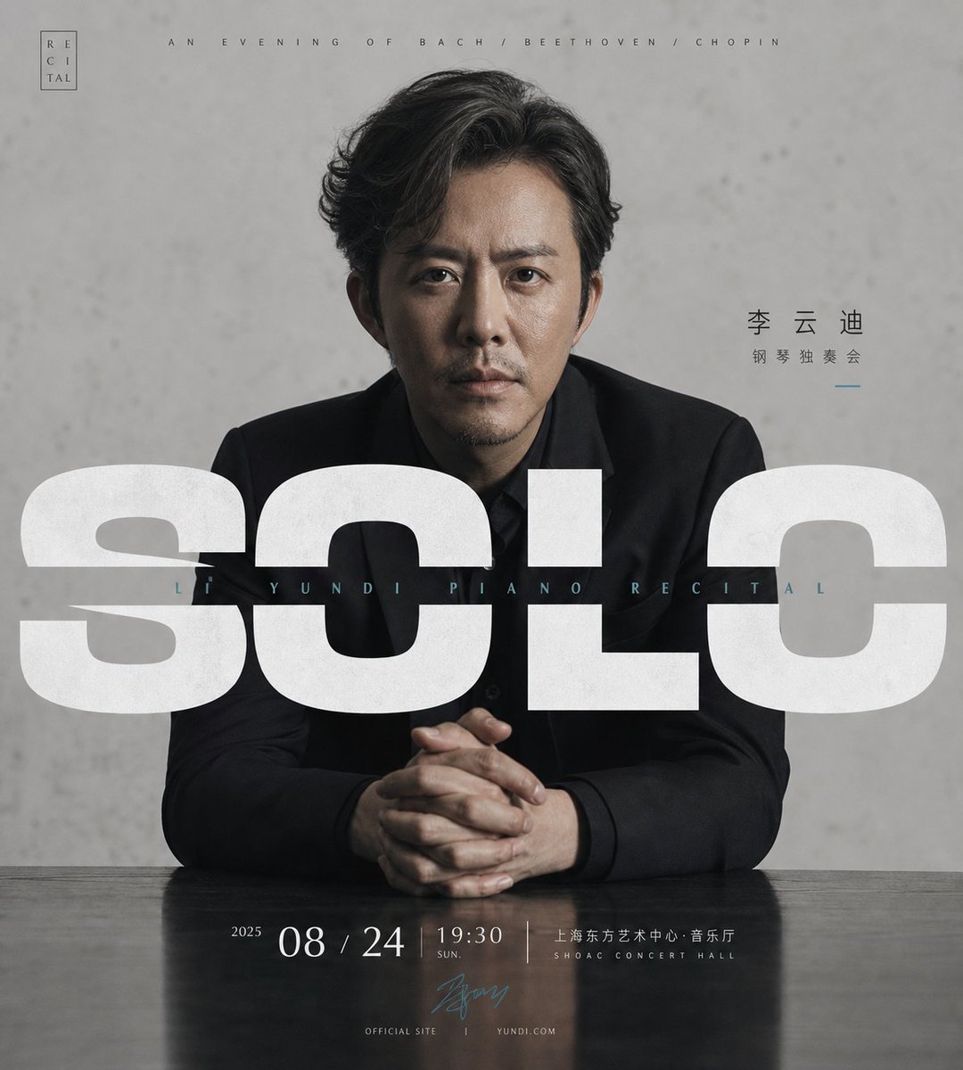
Un gros plan d'un pianiste d'âge mûr assis de face devant un mur gris et calme, tandis qu'un titre surdimensionné et brisé traverse le milieu du visuel. La tension entre la typographie et la silhouette donne à l'affiche une présence sereine, presque rituelle.
 Prompt de @xiaoxiaodong01
- Remplissez les champs ci-dessous.
- Regardez le prompt se mettre à jour à droite.
- Copiez-le, ou ouvrez-le dans un outil d'image.
Prompt d'image
Around any subject object, generate a restrained, solemn poster with a sense of live presence: the subject occupies the center as a close-up frontal main form, stable in posture, its gaze or core slightly paused; the background keeps a large area of quiet negative space with subtle real texture, while a natural supporting plane or info baseline at the bottom anchors the weight. The strongest visual move is an oversized headline crossing horizontally through the subject's midsection, set in a heavy geometric sans-serif treated with breaks, cuts and voids, creating an image-text tension of being covered by the subject yet pressing down on it in return; above the headline a tiny thin caption line, a wide-tracked subtitle embedded inside the headline or on its axis, a few subject-derived words to the side, and at the bottom, in tight small type, date, place, signature or parameters; the reading order runs from the subject's aura, to the huge broken type, to the bottom info. Colors are drawn from the subject's own material, mood and scene semantics, keeping a role relationship of a large low-saturation neutral ground, a darker structural subject color, clear high-brightness info text and a few calm accents; clean value layers, controlled saturation, a translucent quiet background, shadows with thickness but not muddy, yielding a calm, precise, ritual-like professional finish. Leave restrained margins and a tiny seal-like mark in a top corner; avoid festive decoration and illustration, keep real photographic texture, bold but not noisy typography, all text in spatial overlap and hierarchy with the subject. —————— Subject: close-up portrait poster of a middle-aged pianist, keeping a quiet gray wall and desktop support Release use: main visual for a solo piano recital and social-media teaser image Text to keep: giant broken headline "SOLO", subtitle with the pianist's name, date and place Size: vertical 9:10
Prompt d'image
Around any subject object, generate a high-recognition information visual: build the first-glance impact with a large, bright, clean subject-derived ground color that occupies most of the frame and is pushed to the edge by a huge cropped arc or circular color block, creating strong graphic pressure and clear negative space. The core subject imagery does not fill everything but is embedded into two circular windows of different scales in a calm monochrome, dot halftone or fine-grain treatment; the main window carries the most important person, product, symbol or concept, the secondary window acts as a rhythmic echo and narrative supplement, and the two circles may partly overlap or be cropped by the edge. The text uses a heavy, compact, massive sans-serif Chinese headline forming a large black information block on the left or main reading zone, secondary info in smaller layered type, with black labels and light info boxes at the top building a course-card order. Add a little precise geometric decoration: ruler ticks, dot matrices, dashed diagonal connectors, short emphasis bars, outline icons, giving a rational feel of exploration, measurement and interface, but decoration must serve the reading path. Colors are drawn from the subject's own material, mood and semantics, keeping a role relationship of a large high-brightness ground, dark structural text, low-saturation monochrome imagery and very few high-saturation accents; overall bright, brisk, clean, sharp, clearly contrasted; accents only in small signal points, avoiding even distribution. The finished feel should read like the bold visual of a design course or innovation topic, high in information density but clear in hierarchy, where circular imagery, heavy black headline, measurement-like geometry and bright ground together form the memory point. —————— Replace with: a product-design innovation talk, featuring a visual-design instructor and a guest product manager Usage: the header image of an offline salon sign-up page, also suitable as a community-sharing card Text requirement: headline highlighting "Exploring the Path of Product Innovation", supported by date, place and two agenda items Size: vertical 3:4
Prompt d'image
Around any subject object, generate a calm, solemn, information-rich text-image visual: the subject's main form occupies the center at large scale in close-up, with high-contrast, low-saturation documentary imagery texture, its edge cleanly cropped and forming a strong foreground-background relationship with the bright negative-space area behind; the outer layer supports the frame with a large dark structural field derived from the subject, making the subject look pushed out of a quiet dark field. Use an ultra-thin light line frame around the subject to form an open quotation container that both encloses the subject and leaves a breathing margin, with one corner turning into a speech-bubble fold or directional turn, creating the memory point of "the speech is framed yet still extends outward". The text is part of the composition: the core short phrase sits on a semi-transparent dark info layer near the subject's lower half, medium size, tight leading, left-aligned, forming a restrained pause; the subject's name or main title, in heavy sans-serif, sits at the lower visual center of gravity, clear, weighty, with enough air between letters; a small but striking quotation-mark block can be added as a rhythm anchor. Colors are drawn from the subject's own material, mood and cultural signals, keeping a role relationship of a large dark structural field, a clean high-brightness central negative space, low-saturation subject imagery and a few light info lines and text; the whole stays calm and precise, with clear light-dark and clean edges, the dark must be translucent and not muddy, the light areas bright but not glaring. The background builds no complex scene, only serving hierarchy, authority and the reading path; the texture may have subtle image grain and transparent overlays, but must not weaken the clear order among frame, text and subject. —————— Replace with: a frontal portrait of a company founder or speaker, calm and restrained in temperament Usage: course teaser, public-account cover or opinion card for social feeds Must keep: open quotation frame, semi-transparent text layer, person main title; size vertical 9:16
Prompt d'image
Around any subject object, generate a clear, strongly ordered information visual: the eye first reads two central tall rounded-corner panels, like cut-open windows, each carrying a core focus of the subject, drawn from the subject's person, product, symbol or material form, using close-up cropping and exposed edges to form a dual-focus dialogue; the two windows are laterally offset, similar in size but different in pose, with a narrow quiet negative-space axis in between holding a little slender vertical text or phrases that link the two foci like a book spine. The background keeps a large bright high-key ground color with a very faint, low-contrast repeating geometric texture that only provides a cultural feel, order and a slight paper layer without stealing the show. The title area uses a heavy, wide, flattened bold face in tight setting, becoming the strongest visual weight at the bottom; above the title a medium size sets the event or theme description, below it a thin info strip collects subtitle, date, place or notes, and at the bottom a light info bar receives secondary data, making the reading path go from the dual focus to the main title and then to details. Colors are drawn from the subject's own material, mood and cultural signals, keeping a role relationship of a large bright clean ground, a few saturated accent planes with clear edges, a dark text skeleton and a light info base; the whole should stay clear and quiet, bright and clean, clearly contrasted, with the accent concentrated only in the focus windows and key info, avoiding dirty gray, retro yellowing or excessive decoration. The finished piece should read like the restrained visual of a public cultural event, with ample negative space, precise hierarchy, image and text interlocked, rather than an ordinary collage or a crowded flyer. —————— Event direction: poster for a humanities lecture or a filmmakers' dialogue, keeping two person windows and the central-axis vertical phrase Publishing scenario: campus public account, cultural-center event teaser and on-site wayfinding, all directly usable Text content: main title "Humanities Lecture", with date, place and guest names below Canvas size: vertical 9:10
Prompt partagé sur X par @xiaoxiaodong01. Tout le mérite revient à son créateur.
Plus de prompts à personnaliser
 Affiche sportive d'annonce de transfert de Julián Álvarez au Barça
 Modèle d'affiche photo en lettres bloc ensoleillées
 Affiche de chiffre d'anniversaire sculpté avec un enfant qui émerge
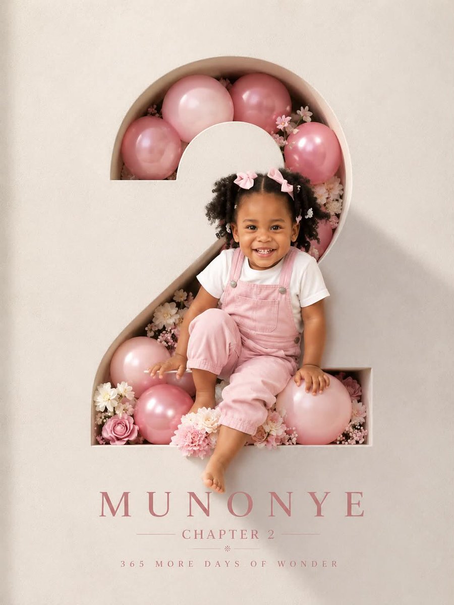 Affiche d'anniversaire en chiffre sculpté avec enfant qui surgit
 Ajoutez votre photoAffiche en deux parties avec photo et miniature isométrique en papier
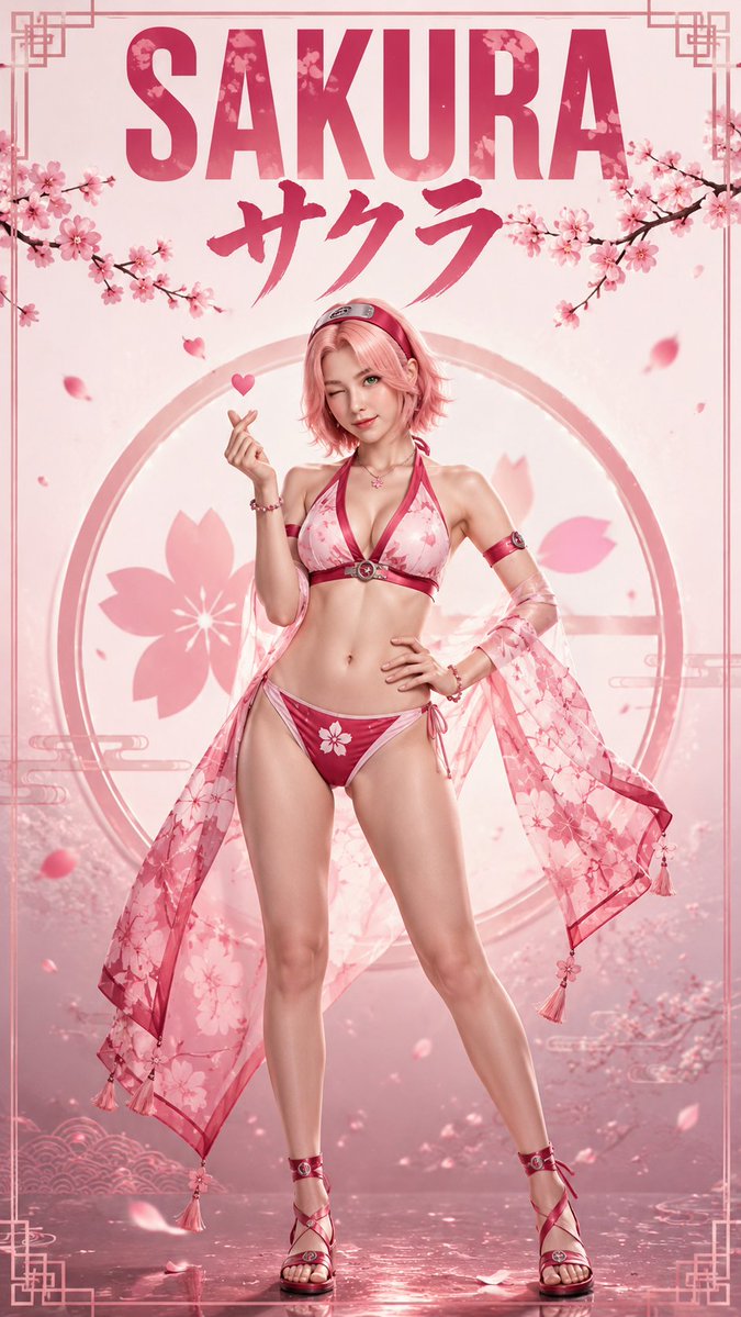 Des héroïnes d'anime en affiches de mode réalistes
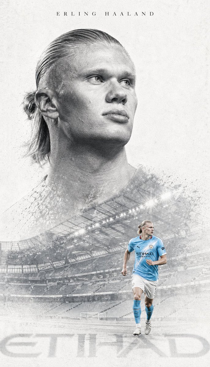 Affiche éditoriale grise à double exposition pour un attaquant
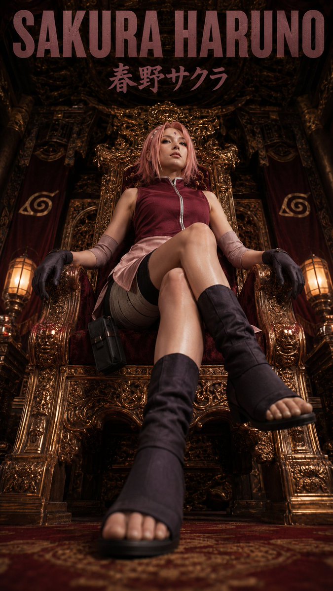 Affiche de mode avec personnage d'anime sur un trône