Prompt d'image Produit et publicité Personnalisables
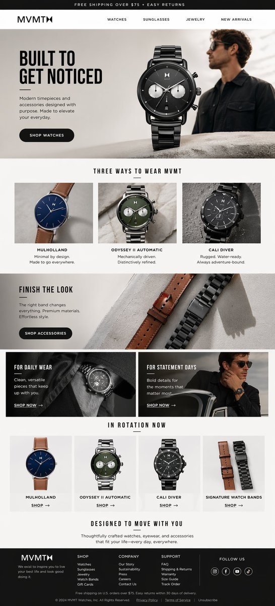
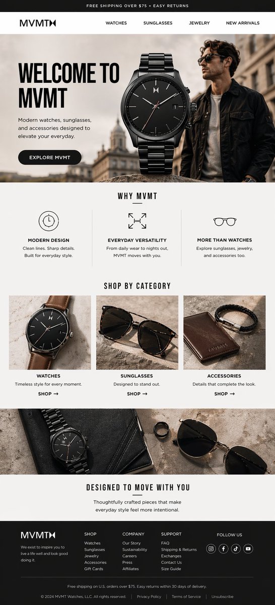
Maquette d'e-mail de bienvenue pour une marque de montres MVMT
Un e-mail de bienvenue e-commerce élancé et soigné, avec une montre noire en vedette, des tons éditoriaux neutres et des sections claires qui présentent la marque et invitent à parcourir la boutique. La mise en page ressemble à un vrai e-mail de boutique premium plutôt qu'à une campagne promotionnelle.

- Modèle
- GPT Image 2
- Type
- 3 images
- Partagé
- 22 avr. 2026
- J'aime sur X
- 73
Nom de la marqueNom du produit
Prompt d'image
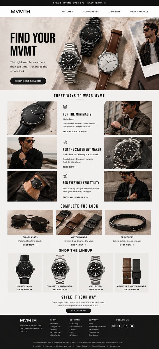
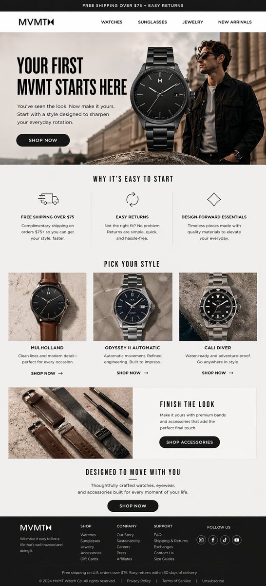
9,256 caractèresEMAIL 1: Create a full-length, tall vertical ecommerce email mockup for MVMT, a modern watch, sunglasses, and accessories brand for millennials. This is Email 1 of a 3-email welcome series for non-buyers. The purpose of this first email is to welcome the subscriber, introduce the brand, communicate the brand's value, and encourage browsing. It should feel like a true welcome email, not a generic sales blast. The design should look like a real premium DTC ecommerce email screenshot. Keep it clean, polished, masculine-leaning, modern, editorial, and highly realistic. Use a neutral palette of black, white, charcoal, warm gray, stone, soft beige, and subtle metallic tones. Brand feel: Modern, stylish, youthful, premium, accessible, design-forward, California-cool. Required layout and content: 1. Thin top promo bar Text: "FREE SHIPPING OVER $75 + EASY RETURNS" 2. Clean white header Include the MVMT logo and nav links: WATCHES SUNGLASSES JEWELRY NEW ARRIVALS 3. Hero section Use one dominant premium black watch image and subtle lifestyle imagery with a stylish male model. Headline: "WELCOME TO MVMT" Supporting copy: "Modern watches, sunglasses, and accessories designed to elevate your everyday." Dark rounded CTA button: "EXPLORE MVMT" 4. Value proposition section Add a clean 3-column section titled: "WHY MVMT" Use icon-led blocks with these headlines and short supporting copy: - "MODERN DESIGN" — "Clean lines. Sharp details. Built for everyday style." - "EVERYDAY VERSATILITY" — "From daily wear to nights out, MVMT moves with you." - "MORE THAN WATCHES" — "Explore sunglasses, jewelry, and accessories too." 5. Category discovery section Add a section titled: "SHOP BY CATEGORY" Show 3 clean category tiles with premium imagery: - WATCHES - SUNGLASSES - ACCESSORIES Each should include a short one-line description and a small "SHOP" link. 6. Lifestyle banner Add a wide editorial lifestyle/product banner showing MVMT accessories and elevated everyday styling. 7. Closing brand section Add a centered message block with headline: "DESIGNED TO MOVE WITH YOU" Supporting copy: "Thoughtfully crafted pieces that make everyday style feel more intentional." 8. Footer Add a premium dark footer with: - MVMT logo - SHOP / COMPANY / SUPPORT columns - social icons - compact shipping and legal text Visual direction: - realistic ecommerce email proportions - crisp sans-serif body text - bold condensed sans-serif headlines - premium product photography - subtle masculine lifestyle imagery - strong visual hierarchy - clean spacing - mostly legible text - modern, polished, premium feel Avoid: - clutter - salesy discount energy - collage styling - generic template look - too many product rows - anything that makes the first email feel too aggressive Output: A full-length, vertically composed, highly realistic premium ecommerce welcome email for MVMT that introduces the brand and invites the subscriber to explore. --- EMAIL 2: Create a full-length, tall vertical ecommerce email mockup for MVMT, a modern watch, sunglasses, and accessories brand for millennials. This is Email 2 of a 3-email welcome series for non-buyers. The purpose of this email is product discovery and style education. Help the subscriber figure out which MVMT style fits them best. This email should be more product-focused than Email 1, while still feeling clean, premium, and editorial. The design should look like a real premium DTC ecommerce email screenshot. Keep it clean, polished, masculine-leaning, modern, editorial, and highly realistic. Use a neutral palette of black, white, charcoal, warm gray, stone, soft beige, and subtle metallic tones. Brand feel: Modern, confident, elevated, wearable, stylish, premium, design-forward. Required layout and content: 1. Thin top promo bar Text: "FREE SHIPPING OVER $75 + EASY RETURNS" 2. Clean white header Include the MVMT logo and nav links: WATCHES SUNGLASSES JEWELRY NEW ARRIVALS 3. Hero section Use a refined still life of multiple watches plus subtle male lifestyle imagery. Headline: "FIND YOUR MVMT" Supporting copy: "The right watch does more than tell time. It changes the whole look." Dark rounded CTA button: "SHOP BEST SELLERS" 4. Main discovery section Add a large editorial section titled: "THREE WAYS TO WEAR MVMT" Include 3 style blocks: - "FOR THE MINIMALIST" featuring Mulholland - "FOR THE STATEMENT MAKER" featuring Cali Diver or Odyssey II Automatic - "FOR EVERYDAY VERSATILITY" featuring a versatile daily-wear watch look Each style block should include: - product or lifestyle imagery - short style-focused supporting copy - small CTA link 5. Accessory section Add a clean section titled: "COMPLETE THE LOOK" Feature complementary categories like: - sunglasses - watch bands - bracelets Each should feel like a stylish add-on, not a random upsell. 6. Single lineup section Add one simple shoppable row titled: "SHOP THE LINEUP" Show 4 items: - Mulholland - Odyssey II Automatic - Cali Diver - Signature Watch Bands 7. Closing section Add a centered message block with headline: "STYLE IT YOUR WAY" Supporting copy about exploring, discovering, and finding pieces that fit your everyday style. Include a subtle CTA like: "EXPLORE MVMT" 8. Footer Add a premium dark footer with: - MVMT logo - SHOP / COMPANY / SUPPORT columns - social icons - compact legal text Visual direction: - clear section separation - premium photography - clean hierarchy - bold condensed headlines - crisp modern body typography - realistic email proportions - strong consistency with Email 1 - mostly legible text - modern editorial ecommerce feel Avoid: - making it feel like a sales email - too many duplicate product rows - repetitive best-seller messaging - generic catalog energy - cluttered layouts Output: A full-length, vertically composed, highly realistic premium ecommerce email for MVMT focused on style discovery, product education, and helping the subscriber find their fit. --- EMAIL 3: Create a full-length, tall vertical ecommerce email mockup for MVMT, a modern watch, sunglasses, and accessories brand for millennials. This is Email 3 of a 3-email welcome series for non-buyers. The purpose of this email is conversion. Encourage the first purchase, reduce hesitation, and close the welcome series. This email should follow best-practice welcome-series logic and should feel like the natural final step after brand introduction and style discovery. The design should look like a real premium DTC ecommerce email screenshot. Keep it clean, polished, masculine-leaning, modern, editorial, and highly realistic. Use a neutral palette of black, white, charcoal, warm gray, stone, soft beige, and subtle metallic tones. Brand feel: Premium, confident, streamlined, aspirational, design-forward, modern. Important rule: Do not include duplicate best-seller sections. Do not repeat the same product-showcase idea twice. Keep the email focused and intentional. Required layout and content: 1. Thin top promo bar Text: "FREE SHIPPING OVER $75 + EASY RETURNS" 2. Clean white header Include the MVMT logo and nav links: WATCHES SUNGLASSES JEWELRY NEW ARRIVALS 3. Hero section Use one dominant premium watch image with subtle male lifestyle imagery. Headline: "YOUR FIRST MVMT STARTS HERE" Supporting copy: "You've seen the look. Now make it yours. Start with a style designed to sharpen your everyday rotation." Dark rounded CTA button: "SHOP NOW" 4. Trust and ease section Add a 3-column icon-led section titled: "WHY IT'S EASY TO START" Include these blocks: - "FREE SHIPPING OVER $75" - "EASY RETURNS" - "DESIGN-FORWARD ESSENTIALS" Each block should include short, practical supporting copy that reduces hesitation and makes the purchase feel easy. 5. Curated product section Add exactly one curated product section only, titled: "PICK YOUR STYLE" Show 3 starter options: - Mulholland - Odyssey II Automatic - Cali Diver Each card should include: - product image - short style or use-case description - small CTA like "SHOP NOW" This is the only main product showcase section in the email. 6. Compact accessory banner Add one compact editorial section titled: "FINISH THE LOOK" Feature premium watch bands or accessories with short supporting copy and one CTA: "SHOP ACCESSORIES" 7. Final conversion block Add a centered signoff section with headline: "DESIGNED TO MOVE WITH YOU" Supporting copy: "Thoughtfully crafted watches, eyewear, and accessories for everyday life." Include one final CTA button: "SHOP NOW" 8. Footer Add a premium dark footer with: - MVMT logo - SHOP / COMPANY / SUPPORT columns - social icons - compact shipping and legal text Visual direction: - realistic ecommerce email proportions - premium product photography - subtle lifestyle imagery - bold condensed headlines - clean modern body text - strong hierarchy - premium spacing - mostly legible text - cohesive with Emails 1 and 2 Avoid: - duplicate best-seller sections - repetitive product rows - overly crowded layouts - discount-heavy design - generic sale-banner energy - clutter or visual noise Output: A full-length, vertically composed, highly realistic premium ecommerce conversion email for MVMT that closes the welcome series and drives a first purchase.
Comment l'utiliser
Si vous voulez l'adapter à votre propre marque, remplacez le nom de la marque, les libellés de navigation et les noms de produits dans le texte, et conservez la palette neutre ainsi que la hiérarchie typographique sans-serif, car ce sont elles qui portent l'effet calme et premium. L'ordre des sections (bannière principale, trois arguments, vignettes de catégories, bandeau, message de conclusion, pied de page) est ce qui fait ressembler le tout à un e-mail de bienvenue, gardez-le donc tel quel. Il a été partagé comme prompt pour GPT Image 2, et le résultat convient bien comme maquette pour une présentation ou une revue de design.
Partagé publiquement sur X le 22 avr. 2026. Tout le mérite de ce prompt et de son résultat revient à son créateur. Ce prompt est le vôtre ? Demandez une mise à jour ou un retrait.