

Prompt d'image Affiches et typographie Ajoutez votre photo
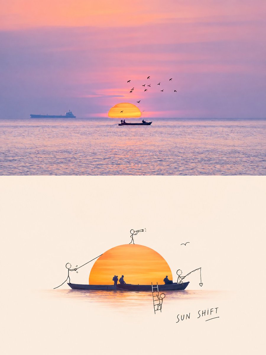
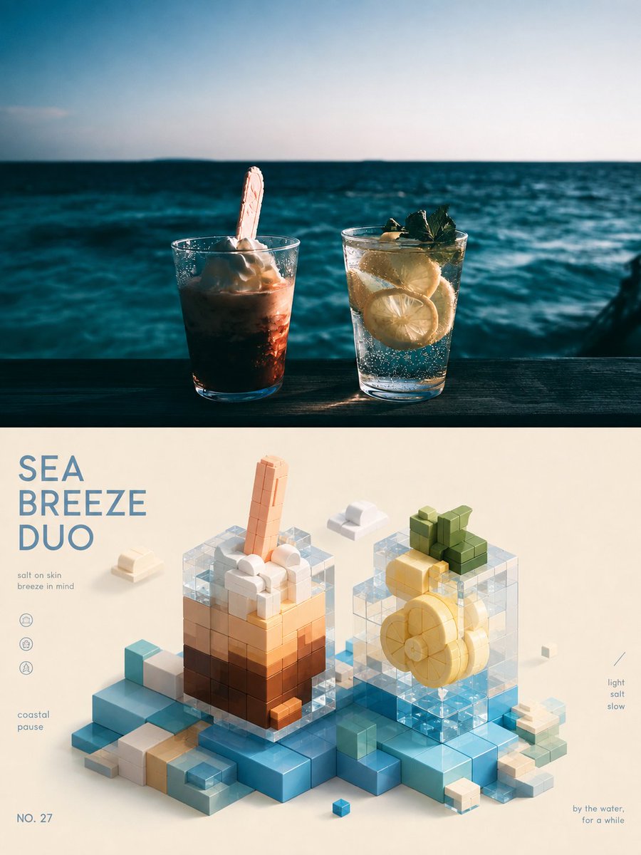
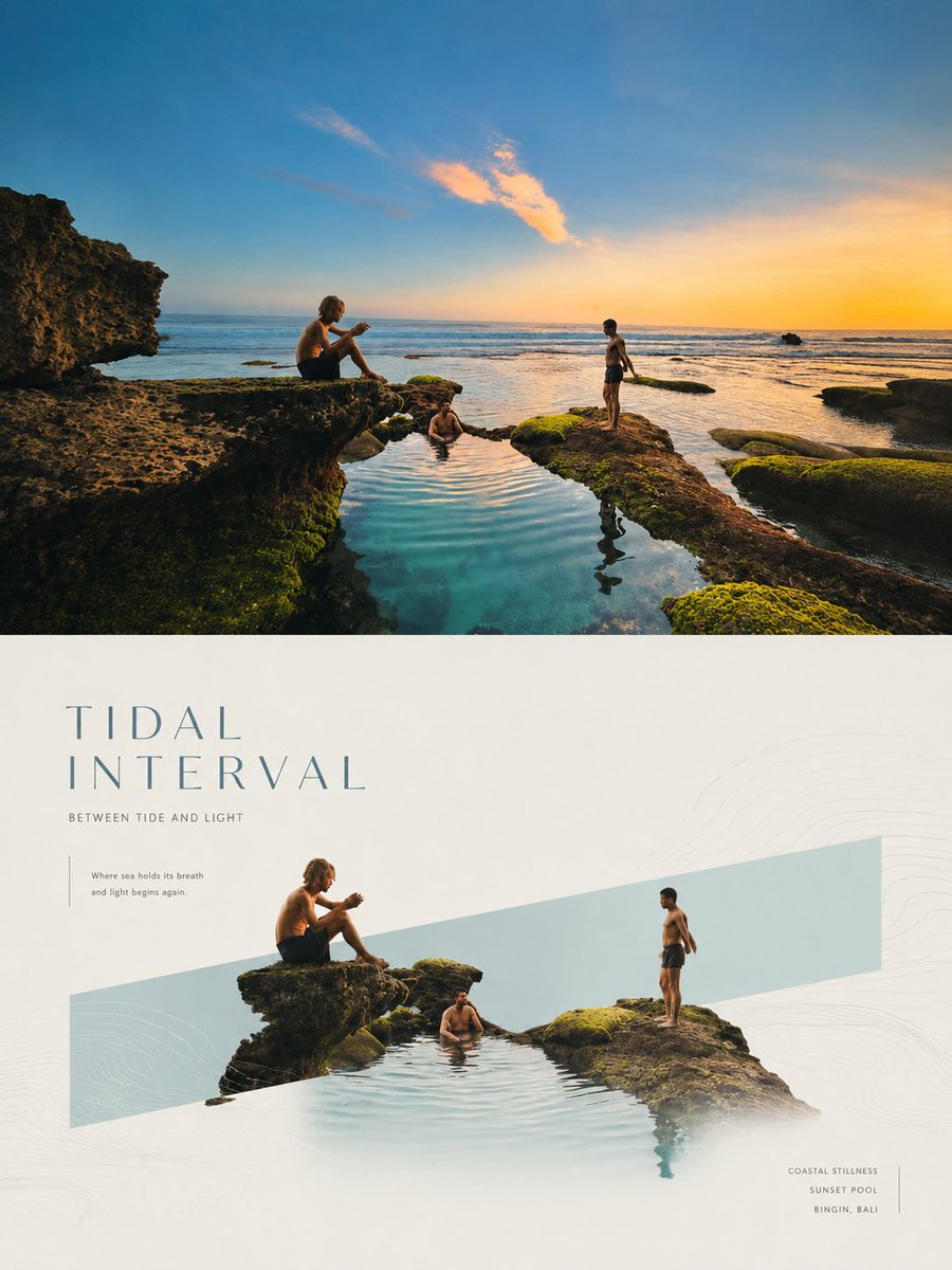
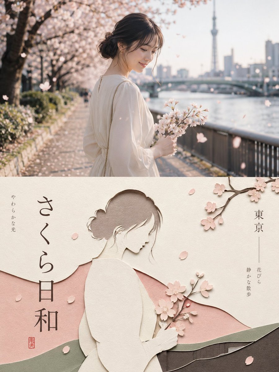
Affiche en papier découpé superposé avec typographie éditoriale
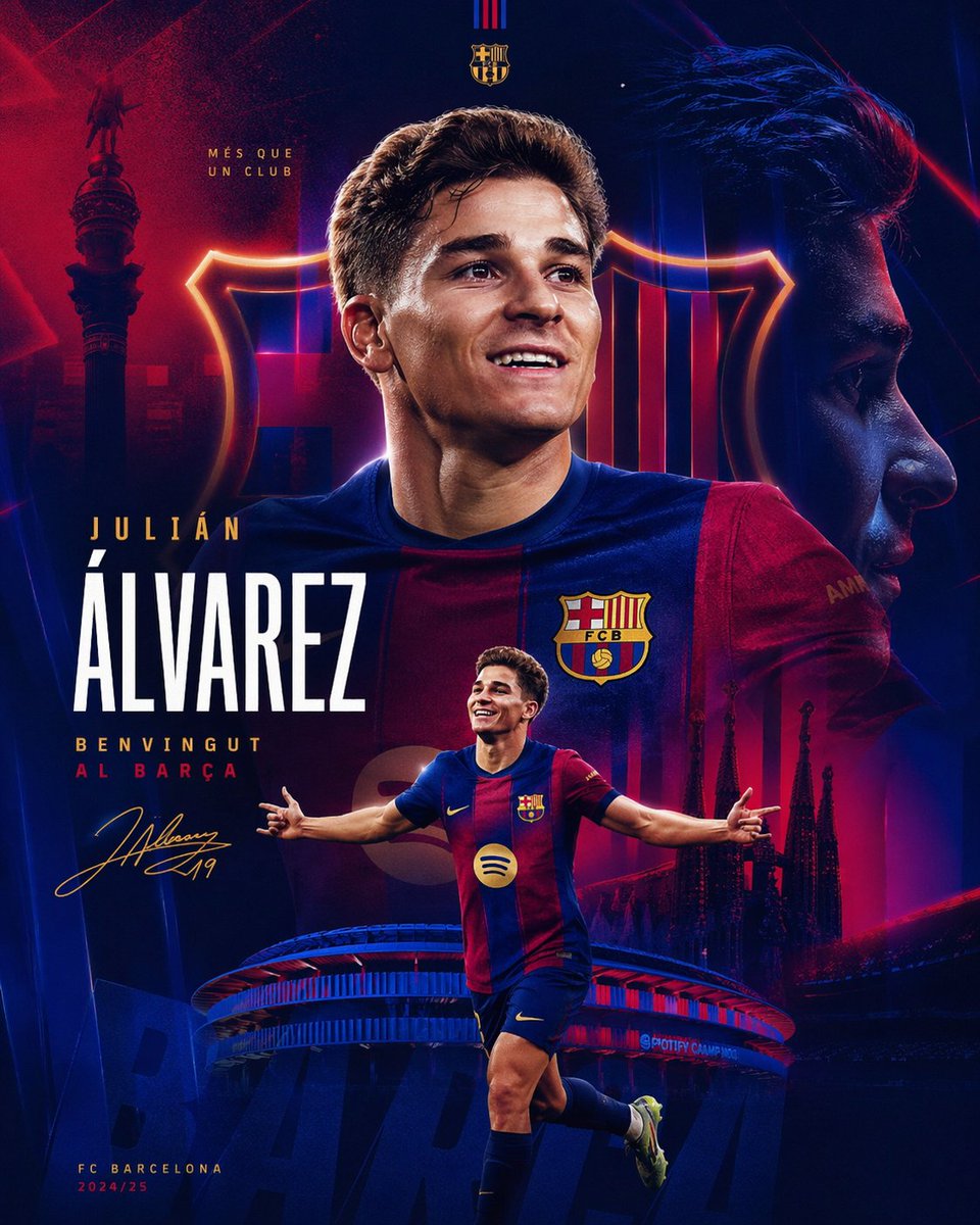
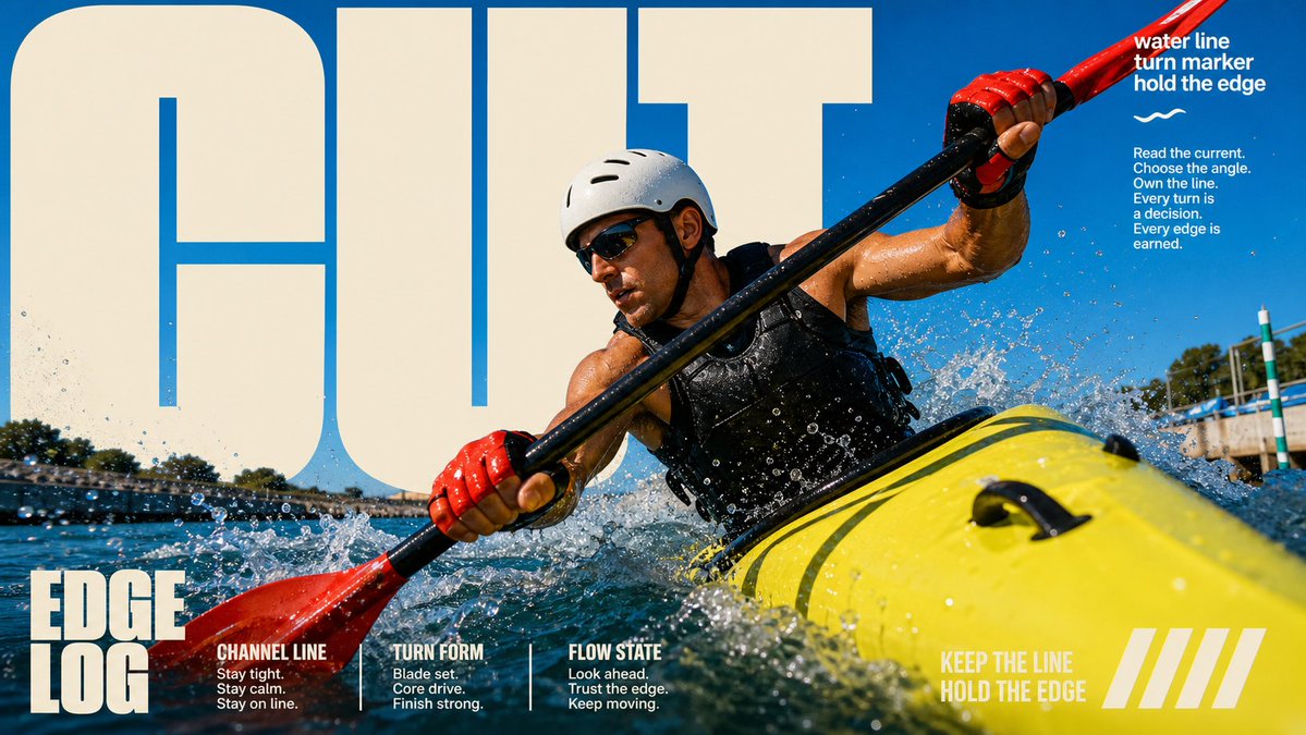
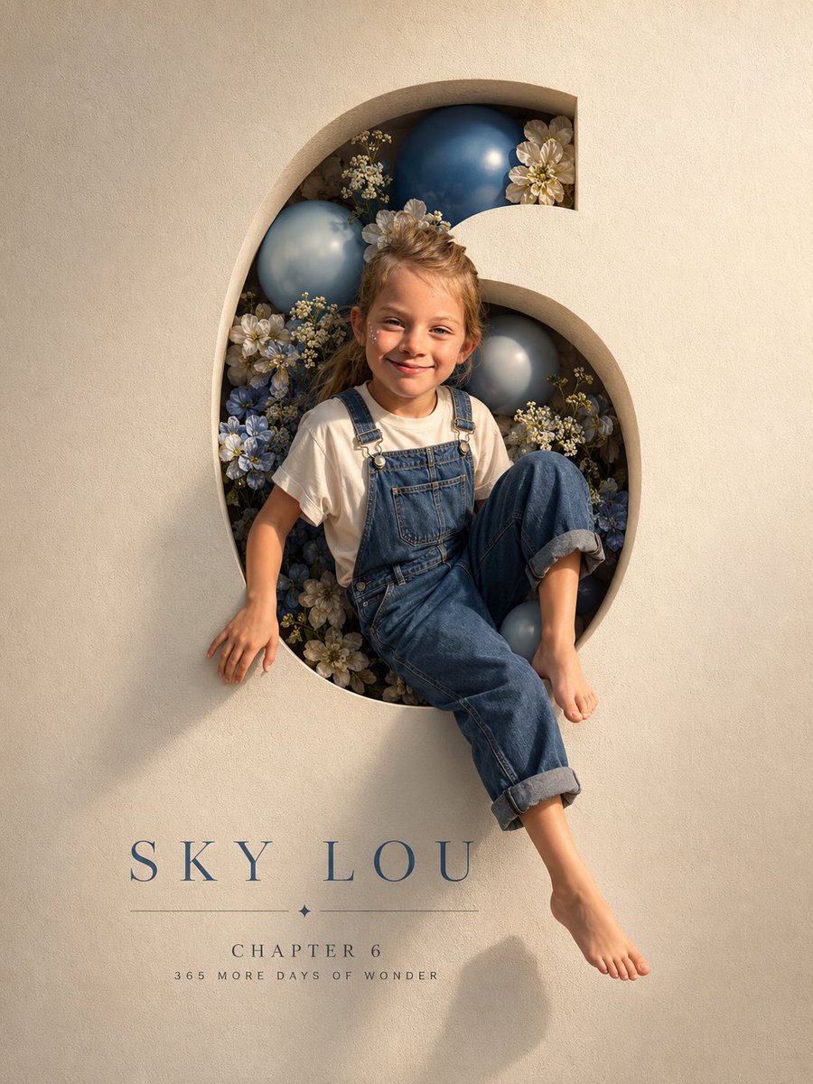
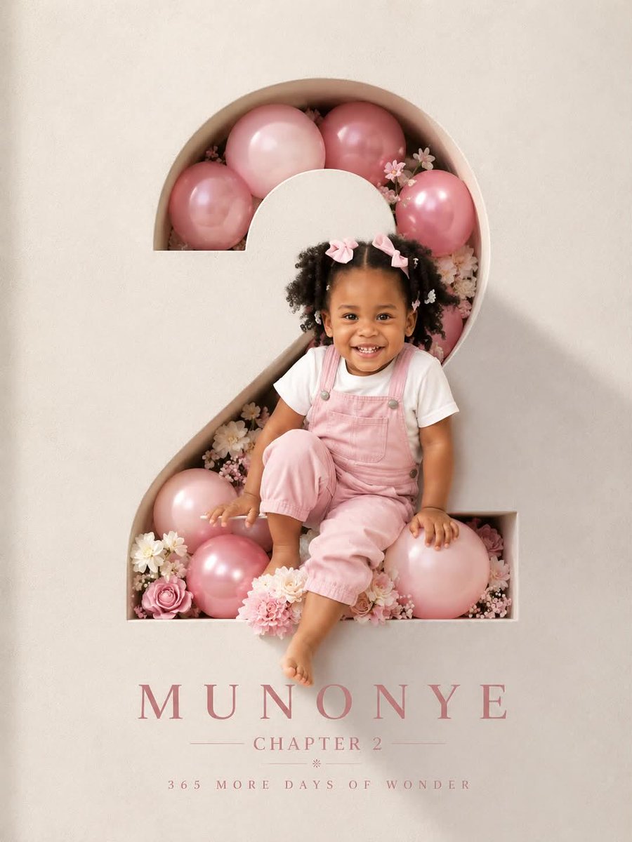
Une vraie photographie occupe la moitié haute d'une grande affiche, tandis que la moitié basse transforme son sujet en papier plié et superposé, avec une petite typographie précise courant le long des bords. Le contraste entre photo et travail manuel lui donne un air d'objet de collection, façon couverture de magazine.

- Modèle
- GPT Image 2
- Type
- 4 images
- Format d'image
- 3:4
- Partagé
- 22 août 2026
- J'aime sur X
- 285
Prompt d'image
4,492 caractèresPlease turn each photo I upload into a separate, standalone premium design poster. Do not create multi-image collages; each photo must be output individually. Use an overall 3:4 vertical composition, with the upper and lower sections divided in a strict 1:1 height ratio, each occupying exactly 50% of the canvas. The upper half should preserve the original photograph, maintaining the subject’s structure, realistic texture, natural lighting, and original color atmosphere. Apply only subtle, high-end photographic color grading so that the image feels like an art magazine, independent publication, or exhibition photograph. To adapt the image to the required aspect ratio, you may naturally extend the sky, ground, or surrounding environment, but do not stretch, distort, or alter the subject itself. The lower half should extract the most recognizable subject, silhouette, pose, and narrative relationship from the photograph and reinterpret them as a minimalist, handcrafted layered paper-cut and paper-sculpture collage. Use one core subject as the visual anchor, simplifying its essential silhouette, proportions, and structure through folding, cutting, layering, and overlapping rather than mechanically reproducing every detail. Then select only a small number of environmental relationships from the original image and transform them into foreground, midground, and background paper layers. Establish clear hierarchy through differences in scale, compositional axes, positive and negative space, front-to-back overlap, and generous areas of empty space. The subject should remain immediately recognizable while maintaining the restraint, precision, and order of contemporary editorial design. Extract the most distinctive and energetic colors from the upper photograph and translate them into a limited, harmonious paper color palette. Use warm ivory or a light-toned paper surface as the base, then create spatial depth with a dominant color, a darker structural tone, lighter layering tones, and only a very small amount of accent color. Use refined matte cardstock with visible paper fibers, crisp cut edges, and soft contact shadows. Lighting should be naturally diffused to emphasize the thickness of folded layers and the authentic tactile quality of handmade paper. Avoid plastic-looking 3D rendering, cheap craft-paper aesthetics, neon colors, and complex gradients. Create a complete high-end editorial micro-typography system. Based on the subject’s identity, location, action, material, mood, or symbolic meaning, derive one short main title, accompanied by 2–4 groups of very small supporting text. These may flexibly combine the object or subject name, location information, numbering, chapter markers, serial numbers, coordinate-style numerals, directional words, status words, material descriptors, category labels, or one extremely short poetic annotation. Do not use years or dates. The main title should provide recognition and emotional tone, while the small text should create structure, rhythm, sophistication, and editorial precision. Typography must be composed together with the paper-cut graphics rather than placed separately. Text may follow the edges of paper layers, the contour of the subject, geometric axes, or negative space. It may also appear horizontally, vertically, rotated, widely tracked, aligned tightly to edges, anchored into corners, crossing color blocks, embedded between paper layers, or partially obscured and interwoven with the main subject. The main title may be moderately transformed into paper-cut or folded-paper letterforms, while the supporting typography should remain thin, restrained, and contemporary. Use strong contrasts in type size, direction, and orientation to create a deliberate reading path, so that the paper artwork creates the visual memory while the micro-typography creates the premium editorial order. The overall visual language should combine real photography × handcrafted paper cutting × high-end editorial design. The result should feel clean, elegant, tactile, contemporary, refined, and collectible. Regardless of whether the subject is a person, animal, plant, architecture, object, vehicle, or natural landscape, always maintain one primary subject, a limited number of paper layers, generous negative space, and precise micro-typography. Avoid childish craft aesthetics, excessive visual stacking, duplicated subjects, e-commerce presentation styles, and obvious template-like compositions.
Comment l'utiliser
Importez d'abord une seule photo, car la moitié haute en est tirée et la moitié basse en reprend la silhouette et la pose principales. Limitez la palette de papier et laissez beaucoup d'espace vide, et ne réécrivez que le titre et les micro-textes pour les adapter à votre sujet. Il a été partagé comme prompt GPT Image 2, et la mise en page convient aux affiches, aux tirages d'exposition ou à la couverture d'un zine indépendant.
Partagé publiquement sur X le 22 août 2026. Tout le mérite de ce prompt et de son résultat revient à son créateur. Ce prompt est le vôtre ? Demandez une mise à jour ou un retrait.