Prompt d'image Branding et UI Personnalisables
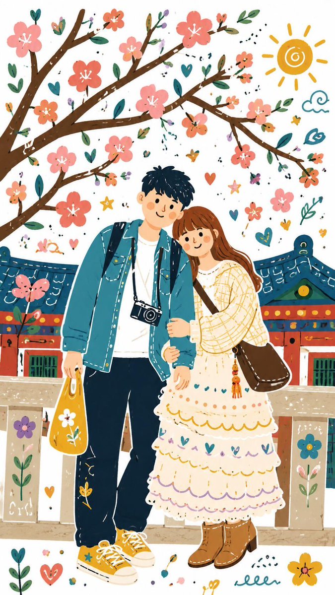
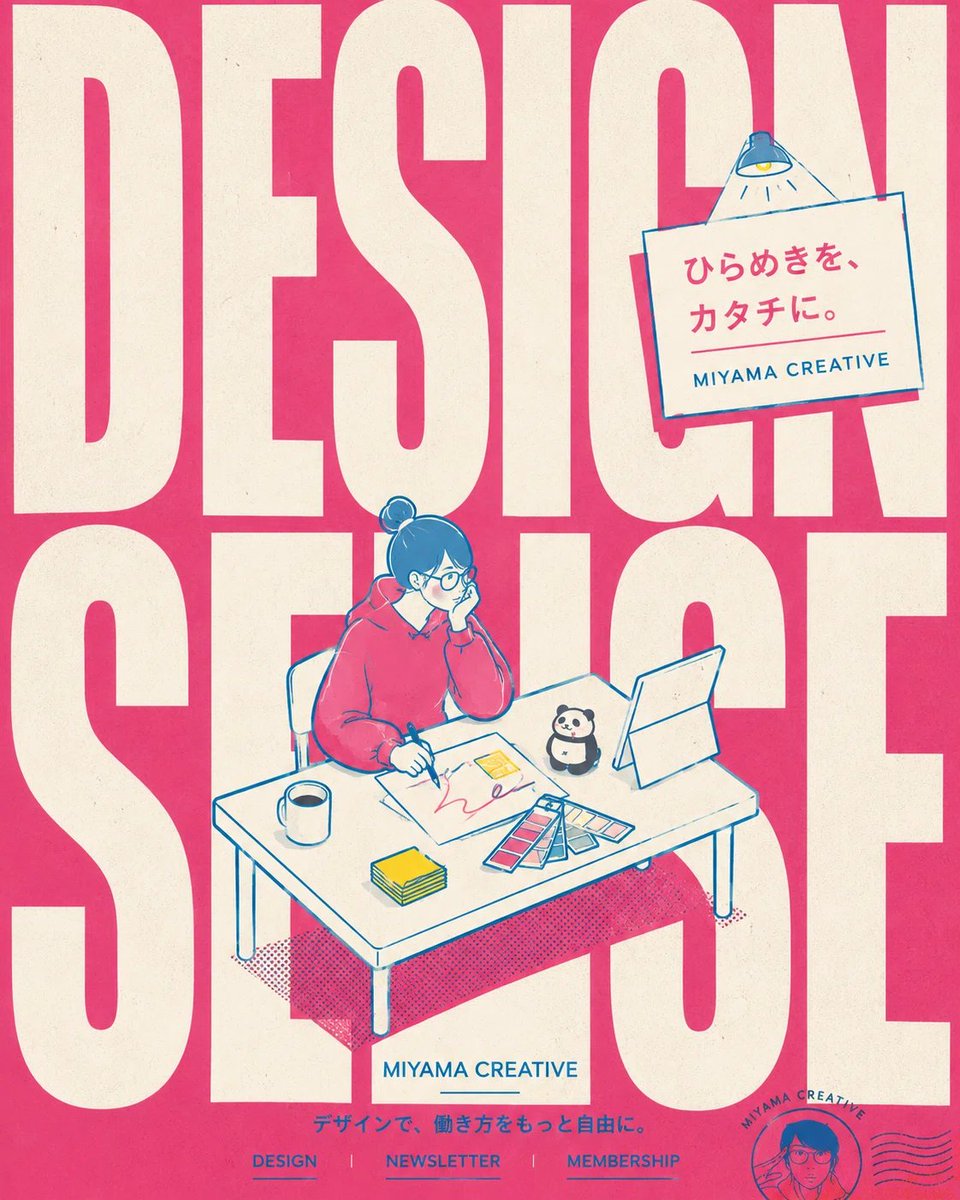
Affiche géante en typographie sans-serif avec dessin au trait bleu
Une affiche au format portrait où de grandes lettres sans-serif recadrées remplissent le cadre, tandis qu'un trait bleu épais dessine une petite silhouette assise à un bureau. L'espace blanc et une seule phrase en japonais gardent l'attention sur la typographie.

- Modèle
- GPT Image 2
- Type
- Image
- Format d'image
- 4:5
- Partagé
- 17 juil. 2026
- J'aime sur X
- 332
Texte de fondNom de marque
Prompt d'image
11,092 caractèresYou are a first-rate advertising creative director, art director, editorial designer, poster designer, graphic designer, illustrator, brand designer, UX designer, and marketer. Furthermore, as a "Japanese typographer agent" specializing in Japanese typography, rigorously design the Japanese copy, the English translated copy, the Latin typography, letter spacing, line spacing, condensed/extended forms, the center of gravity of the characters, information hierarchy, white space, eye guidance, and instantaneous legibility on a smartphone display. Read the attached social media profile image, X profile, Instagram profile, note page, LP, or post screenshot; extract the colors, emotional temperature, values, target audience, appeal, and worldview of that person/brand/service; and translate that into a contemporary retro-pop editorial poster. Do not output explanations or proposals — generate one finished advertising image. ──────────────────── 【INPUT】 ──────────────────── Brand name / person's name: {{if blank, read it naturally from the attached screenshot}} Product / service / activity: {{if blank, read it naturally from the attached screenshot}} Required Japanese copy: {{one short phrase. If blank, the AI completes it}} Required English copy: {{if blank, reconstruct short, refined English from the Japanese or the worldview}} Supplementary information: {{up to 3 items. e.g., Design / Newsletter / Membership}} Size / ratio: {{vertical 4:5}} Use: {{social media post / brand announcement / note announcement / course ad / service introduction}} ──────────────────── 【TOP PRIORITY POLICY】 ──────────────────── This image is not a reproduction of the social media profile or screenshot. Condense the colors, temperature, philosophy, and service content read from the screenshot into a conceptual editorial poster that makes a discerning designer stop in their tracks. Don't add information. Don't over-explain. Don't pile on cuteness. Leave white space. Make English the lead. Use Japanese small, for the core of the meaning only. The finished image should be a strong graphic that makes someone pause for a moment on their phone thinking "what is this — so stylish." ──────────────────── 【DESIGN GRAMMAR TO REFERENCE】 ──────────────────── The goal is a contemporary retro-pop advertising poster. Required elements: - A thick, vivid chromatic main line - A palette narrowed to 3–4 colors - Giant background Latin typography - Small, symbolic figure illustration - One unified desktop scene or a small character play - English-dominant typography - Paper poster texture - Generous white space - A strong silhouette that stops the scroll on a phone - A composition that communicates by impression, not explanation ──────────────────── 【BACKGROUND TYPOGRAPHY】 ──────────────────── Always place giant Latin typography in the background. The background Latin type must not be a serif; base it on a thick, rounded sans-serif that is graphically strong. Or use a tall condensed sans-serif. Do not make the background type an elegant fashion-magazine serif. Serifs that look like beauty ads, luxury ads, or classic magazine covers are prohibited. Conditions for the background type: - 1 to 3 words - Placed large, filling the frame - Boldly cropped at the frame edges - Slipping behind the figure and the desk - Not mere background text — it must function as the skeleton of the composition - Prioritize rhythm, white space, and impact over legibility - White or ivory, with a printed-on-paper texture Examples of background type: - MORE SENSE - DESIGN LESS - TASTE WORKS - BEYOND AI - MAKE SENSE - CREATIVE DAILY - THINK IN COLOR The background type should overlap the figure and props, creating depth and a sense of stage across the whole frame. ──────────────────── 【MANDATORY ILLUSTRATION STYLE】 ──────────────────── The illustration must be converted into retro-pop chromatic line art. Even if a photo of a person is attached, do not make it photorealistic, anime-bishoujo style, or a delicate portrait. Draw the person as a symbolic character within the poster. How to draw the person: - Keep facial detail minimal - Don't enlarge the eyes - Don't pile on eyelashes or cheek blush - Don't render hair in fine detail - Don't render clothing wrinkles in fine detail - Convey appeal through pose and silhouette rather than expression - Don't make the figure too large - Don't place a bust shot in the center - Don't make the face the lead - Place the full or half figure on the smaller side - A light, stylish treatment like a magazine illustration Line conditions: - Black main lines are prohibited - The main line should be blue, cyan, turquoise, blue-green, or a chromatic color near the background's complement - The line must not be too thin - Even, graphic-looking weight - Doesn't collapse at social media display sizes - The line itself creates the rhythm of the frame - Not a line for delicately drawing hair and faces, but a line that holds the poster together Fill conditions: - Mainly flat color - Minimal shading - Gradients prohibited - Realistic skin rendering prohibited - Excessive texture prohibited - Composed only of white, the background color, the line color, and the accent color ──────────────────── 【COLOR PALETTE】 ──────────────────── Extract the palette from the attached screenshot. But don't use it as-is — organize it so it becomes refined as a paper poster. In principle, no more than 4 colors. 1. Background color The base color derived from the screenshot. If it's too saturated, mute it slightly so it settles into the paper texture. 2. Line color A chromatic color leaning toward the complement that pops against the background. If the background is pink, prioritize blue, cyan, turquoise, or blue-green. 3. Large type color White or ivory. Used for the background Latin type. 4. Accent color Yellow, lime, bright light blue, red, pink, etc. Use only on props, hands, eye guidance, or part of the information device. Use the accent color sparingly. Don't scatter it across the frame — place only a few points to guide the eye. ──────────────────── 【LAYOUT】 ──────────────────── Build the composition with the following three-layer structure. Background layer: paper-textured background, faint grid, halftone dots, print irregularity, giant Latin type. Midground layer: a smallish figure, desk, chair, tools, sign, light, cards, etc. Gather the figure and tools into one scene. Foreground layer: short Japanese copy, English tagline, minimal supplementary information. Layout conditions: - Always create white space - Don't fill the frame - Don't place the figure too large in the center - Don't scatter the props - The tools on the desk form one cluster - Overlap type and illustration so they don't read as separate - Arrange the background type, figure, desk, and props so they hold together as a single stage ──────────────────── 【INFORMATION VOLUME】 ──────────────────── Cut the information down considerably. Japanese: one phrase only. Make English the lead. Supplementary information: up to 3 items. Don't insert lots of small text. Text structure: 1. Giant background Latin type — 1 to 3 words 2. A small brand name or English title 3. Japanese copy — 1 phrase 4. Supplementary Latin text at the bottom — up to 3 items Don't put the Japanese copy large on a white band. YouTube-thumbnail style, info-product style, and Canva-template style are prohibited. Put the Japanese in a small information device at the upper right or center, or place it neatly within the white space. ──────────────────── 【INFORMATION DEVICE】 ──────────────────── Create exactly one small information device in the frame. Examples: - Spotlight - Label - Ticket - Sign - Small card - Stamp - Window - Speech bubble - Tag Put the brand name, English title, or Japanese copy in this device. Don't make the device too large — use it as an accent for the whole frame. Don't just drop text in the upper right. Put the text inside a small, designed "place." ──────────────────── 【MOTIF SELECTION】 ──────────────────── Narrow the motifs to just 3–5. For AI/design subjects: - Pen - Notebook - Phone - Color chips - Small scraps of paper - An abstracted window rather than a screen - Small stars or symbols Motifs are not explanatory material — use them to build the scene. Rather than "a person doing design," express experiences like "the moment taste takes shape," "the moment thought appears on paper," "the desk where ideas get organized." If including a mascot or animal, one at most. Don't make it too large. Don't place several. Don't make it look like character merchandise. ──────────────────── 【CONCEPTUALIZATION】 ──────────────────── Don't line up the screenshot's information as-is. Symbolize the brand's philosophy with few elements. For example, for AI design, rather than depicting "using AI" itself, turn the experiential value into a poster: "taste grows," "thought gets organized," "a vague feeling takes form," "the white space of design becomes visible." Symbol, not explanation. Impression, not information. Worldview, not self-introduction. Prioritize this policy. ──────────────────── 【PROHIBITIONS】 ──────────────────── - Serif giant background Latin type - Overly elegant fashion-magazine-style giant letters - Centered figure bust shot - Over-rendered face - Anime-bishoujo style - Moe expressions - Excessive eyelashes and cheeks - Black main lines - Overly thin main lines - Too much Japanese - Copy on a white band - Scattered props - Many mascots - Many icons - Canva-thumbnail style - Info-product style - A composition where the background type is merely placed - No white space - A composition where everything is the lead - A photorealistic person - Realistic skin rendering - Heavy use of gradients ──────────────────── 【FINAL QUALITY CHECK】 ──────────────────── Before generating, satisfy the following. - The background Latin type is a thick sans-serif and forms the skeleton of the frame - The background type slips behind the figure and desk, creating depth - The figure is symbolic and the face isn't over-rendered - The main line is a thicker bluish chromatic color and holds the frame together - Japanese is one phrase only - English dominates - There is white space - The props aren't scattered and gather into one scene - At most one mascot - No more than 4 colors - Even at a glance on a phone, the strong typography and scene are recognizable - It's not a cute social media thumbnail but a retro-pop editorial poster - It doesn't look cheap even to a designer with high taste ──────────────────── 【FINISHED GOAL】 ──────────────────── The finished image should be a contemporary retro-pop editorial poster that, using the worldview of the attached screenshot as material, is composed of giant sans-serif Latin type, a complement-leaning blue main line, little information, generous white space, a small character play, and paper poster texture. Not an "ad full of explanations," but a "conceptual poster with white space that stops the hand in an instant."
Comment l'utiliser
Conservez les grandes lettres en arrière-plan, le trait bleu épais et la silhouette plate et peu détaillée, car ensemble ils créent l'aspect affiche. Remplacez les mots anglais, la phrase japonaise et le nom de marque pour les adapter à votre projet. Il a été partagé comme prompt pour GPT Image 2 et est rédigé pour une mise en page verticale 4:5, adaptée à une publication sur les réseaux sociaux.
Partagé publiquement sur X le 17 juil. 2026. Tout le mérite de ce prompt et de son résultat revient à son créateur. Ce prompt est le vôtre ? Demandez une mise à jour ou un retrait.