Studio de prompts
Personnalisez « Des aliments qui se séparent autour d'une typographie percutante »
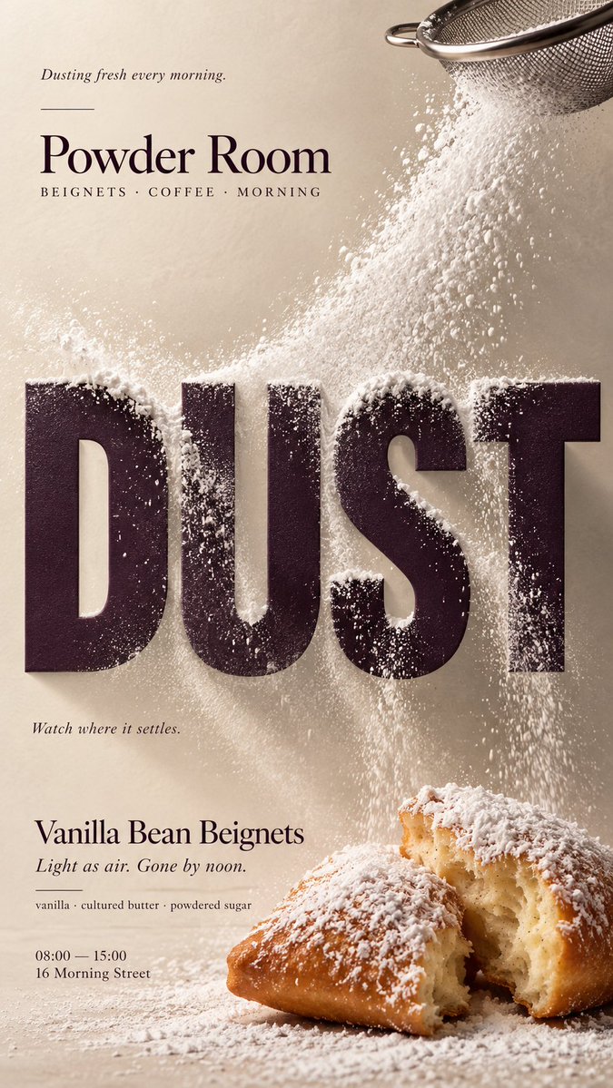
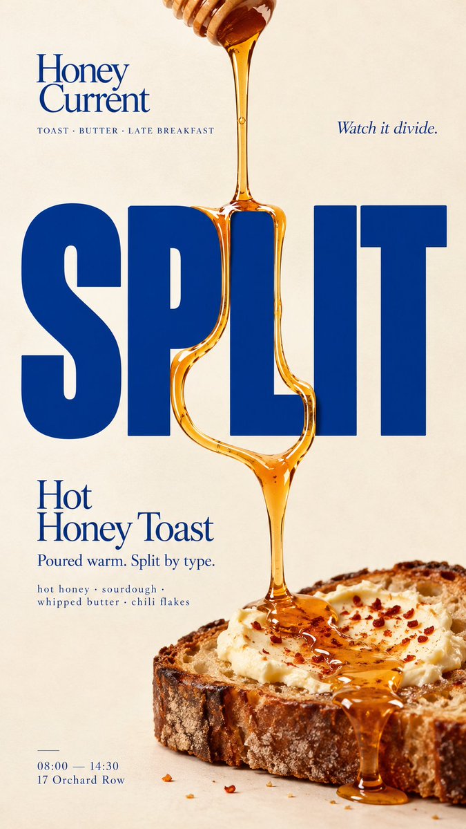
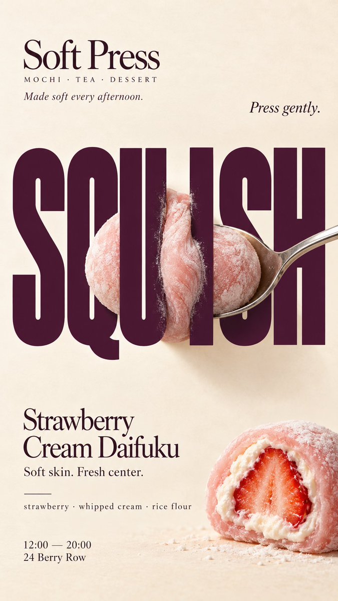
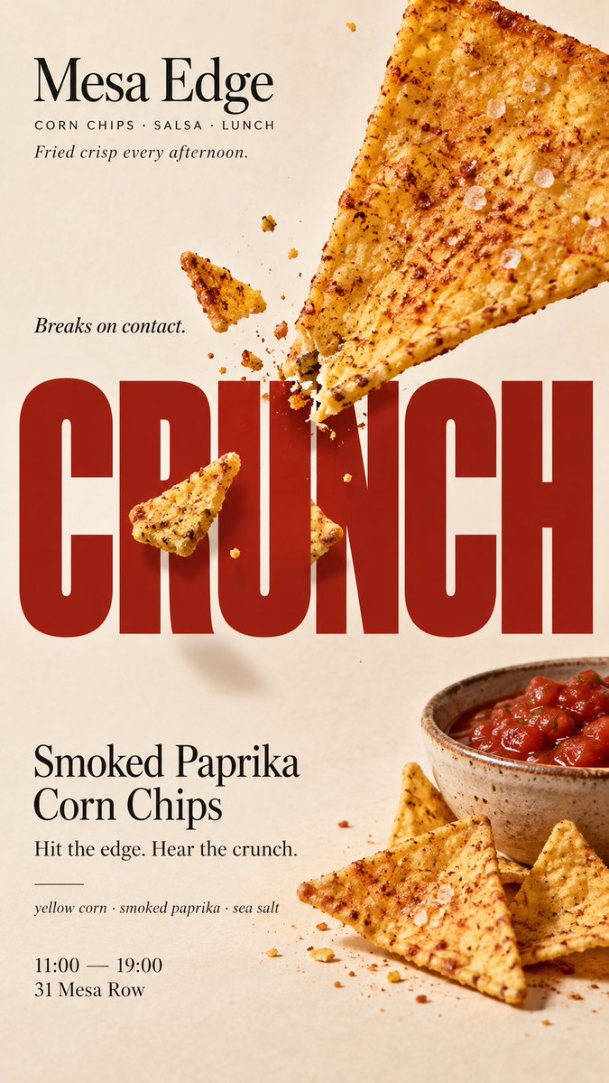
Une affiche éditoriale verticale où de vrais aliments réagissent physiquement à des lettres de titre rigides. Un flux liquide se divise autour d'une lettre, la poudre s'accumule sur ses bords, et la typographie reste nette et inchangée.
 Prompt de @MrLarus
- Remplissez les champs ci-dessous.
- Regardez le prompt se mettre à jour à droite.
- Copiez-le, ou ouvrez-le dans un outil d'image.
Prompt d'image
[BRAND]: {brand name} [PRODUCT]: {food / drink} [HEADLINE]: {short bold word} [INTERACTION]: {split / impact / powder flow / compression} [ACCENT COLOR]: {headline color} [DETAILS]: {ingredients / short copy / hours / address} Create a 9:16 vertical food editorial poster combining highly realistic food photography with bold, professionally designed typography. Use a warm cream or ivory background, subtle paper texture, clean editorial composition and minimal props. Keep [HEADLINE] large, flat, rigid and fully readable. The typography stays unchanged while the real food physically reacts to it according to [INTERACTION]. For “split,” let one continuous liquid stream hit a letter and clearly divide into two believable flows before rejoining. For “impact,” let a brittle food collide with a hard letter edge and break only at the contact point, with a few realistic fragments following the impact direction. For “powder flow,” let real food powder hit the typography, accumulate on exposed edges, flow around its geometry and create cleaner shadow zones behind the letters. For “compression,” push a soft food through a narrow gap between rigid letters, showing realistic flattening, stretching and bulging while keeping the food continuous. Use believable gravity, contact shadows, material texture and clear cause-and-effect. The viewer should immediately understand what the typography is physically doing to the food. Do not turn food into letters, do not distort the typography, and avoid fake digital effects, CGI materials, excessive debris, numbered labels, 01/02, Vol. or sparkles. Use [ACCENT COLOR] with natural food colors and dark neutrals. Add only a few useful details such as [BRAND], product name, ingredients, one short line of copy, opening hours and address. The final poster should work as a stop-scroll image: one bold headline, one recognizable food element and one clear physical reaction. Keep the type rigid. Let the food react.
Prompt partagé sur X par @MrLarus. Tout le mérite revient à son créateur.
Plus de prompts à personnaliser
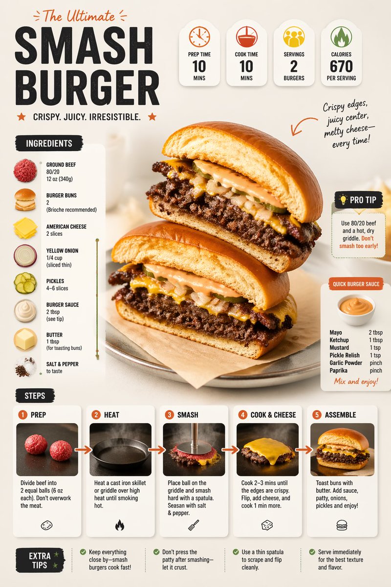 Prompt moderne d'infographie de recette avec mise en page culinaire
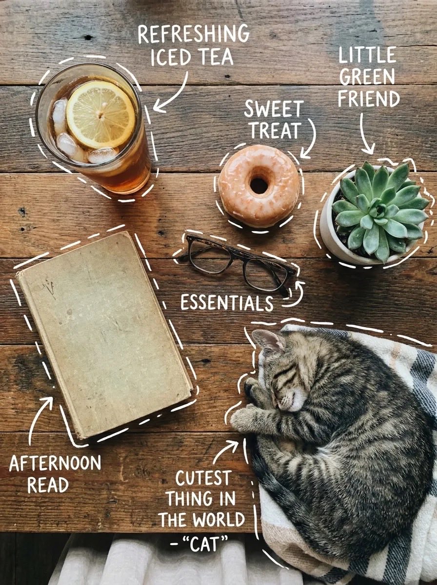 Vue du dessus d'une table avec étiquettes manuscrites
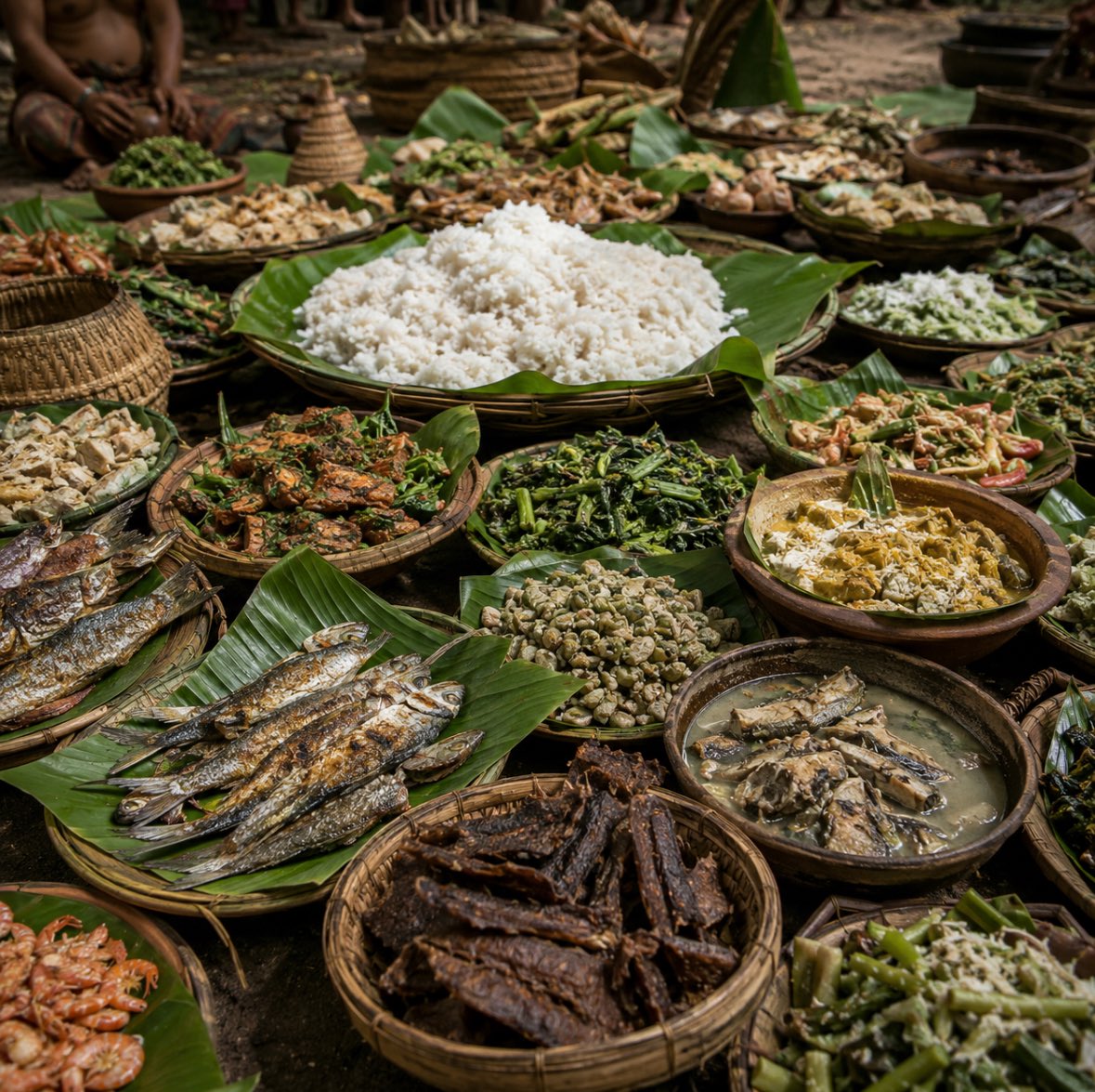 Festin javanais ancien sur feuilles de bananier
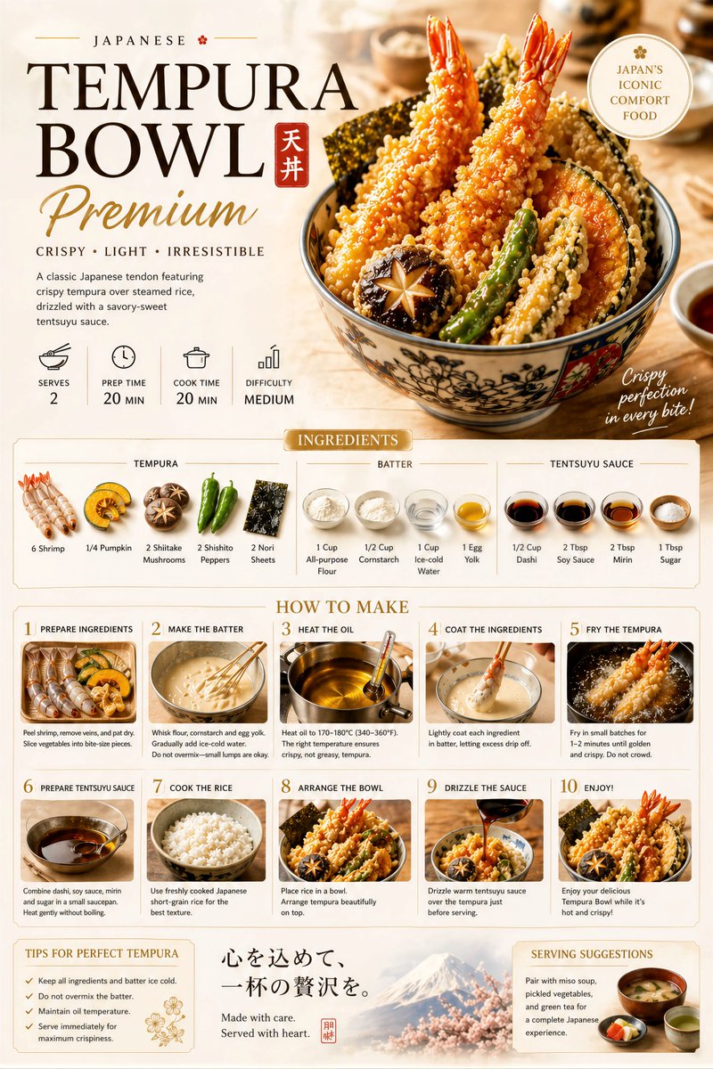 Affiche de recette premium avec mise en page étape par étape
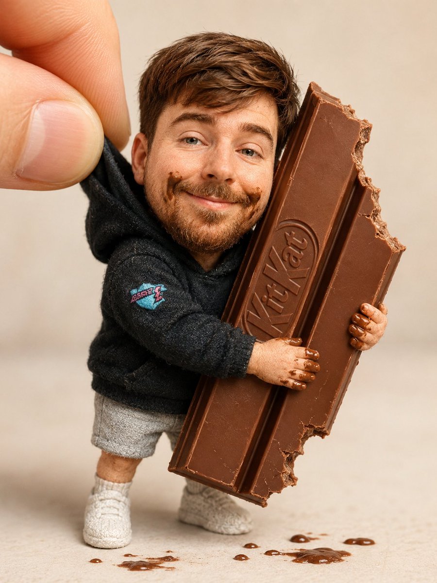 Ajoutez votre photoPoupée de collection serrant une barre de chocolat en macro
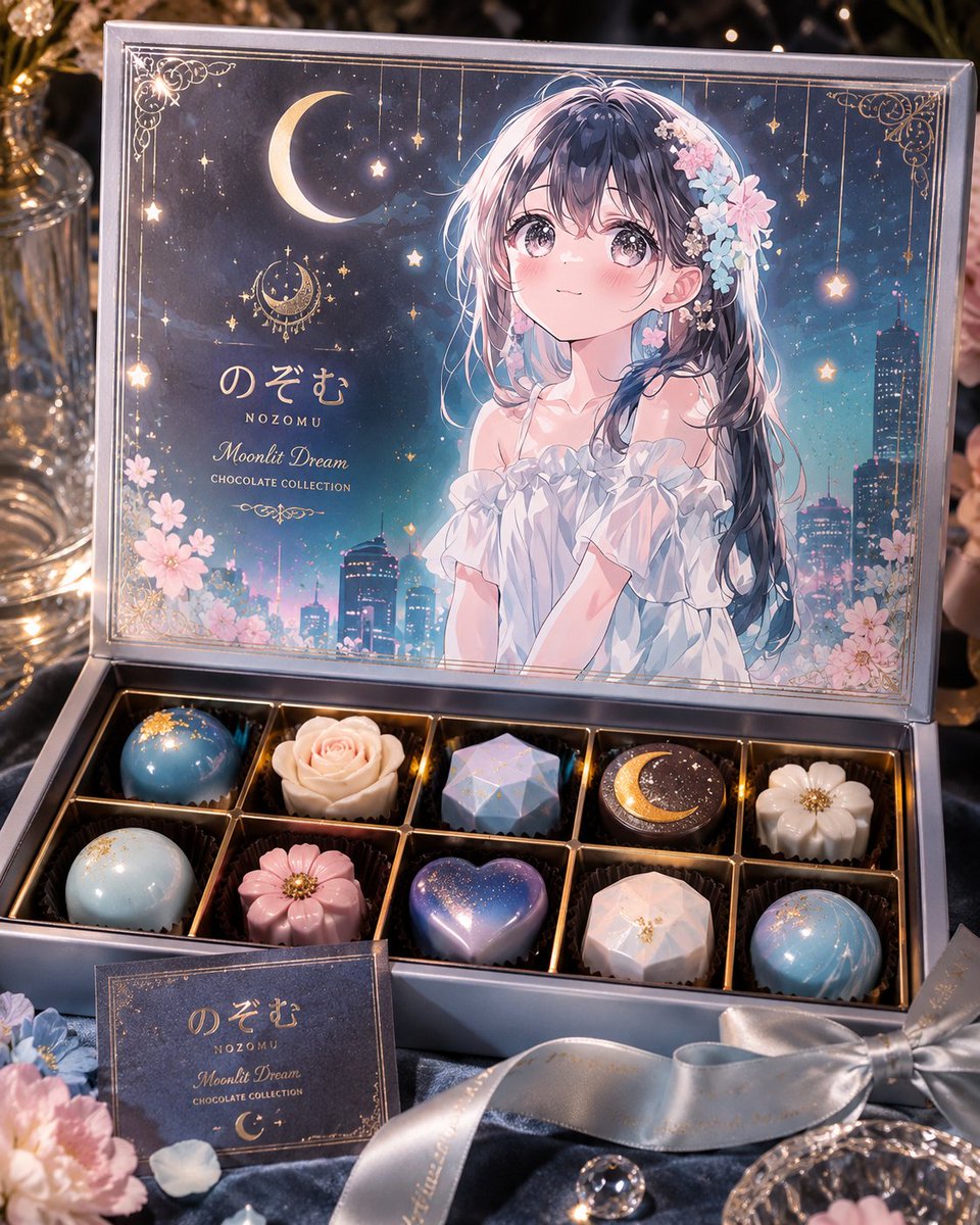 Ajoutez votre photoPrompt de boîte de chocolats de luxe en édition limitée avec personnage
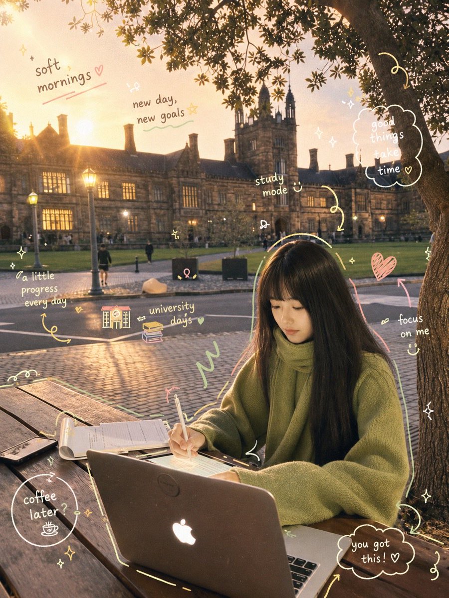 Scène d'étude cosy et prompt de scrapbook petit-déjeuner
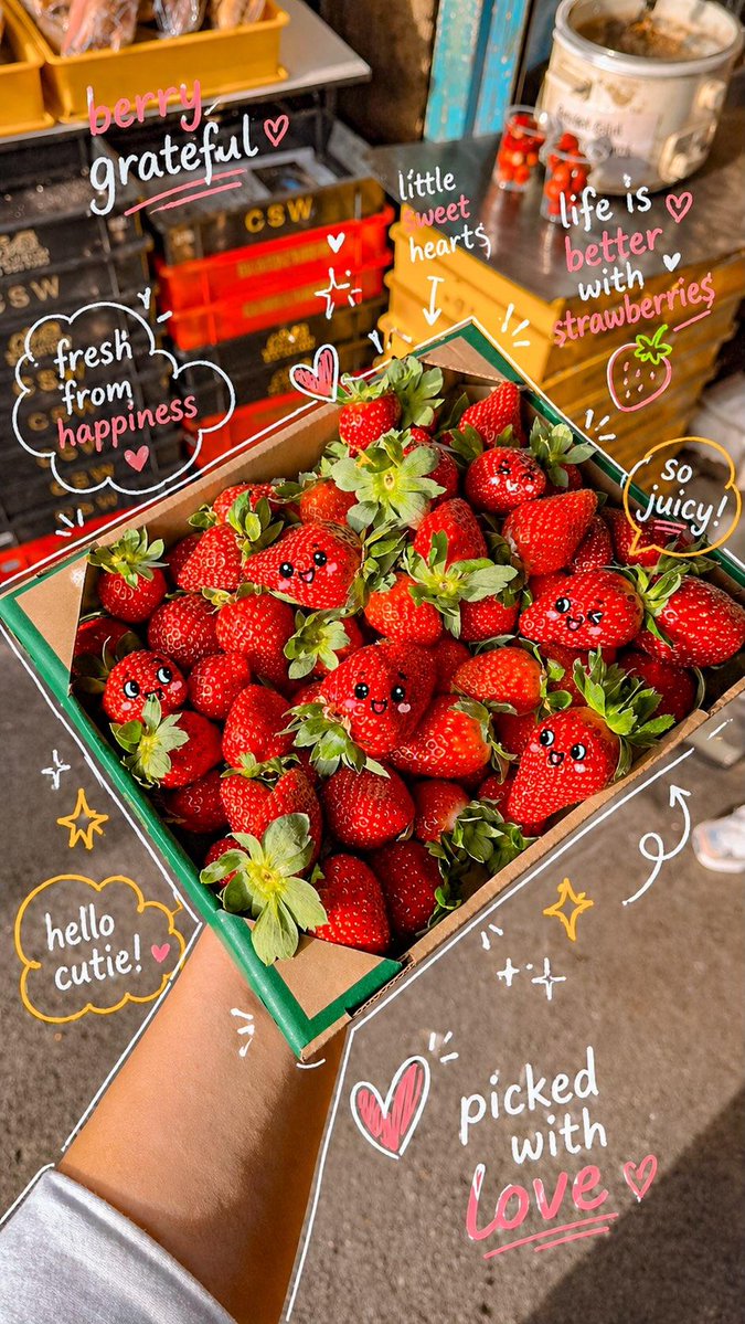 Photo kawaii de marché aux fraises et visages dessinés