Studio de prompts
Personnalisez « Affiche culinaire à typographie interactive »
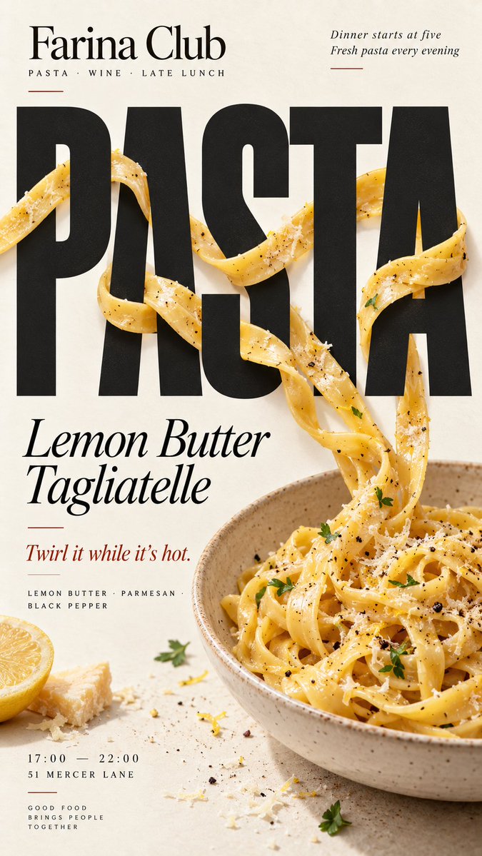
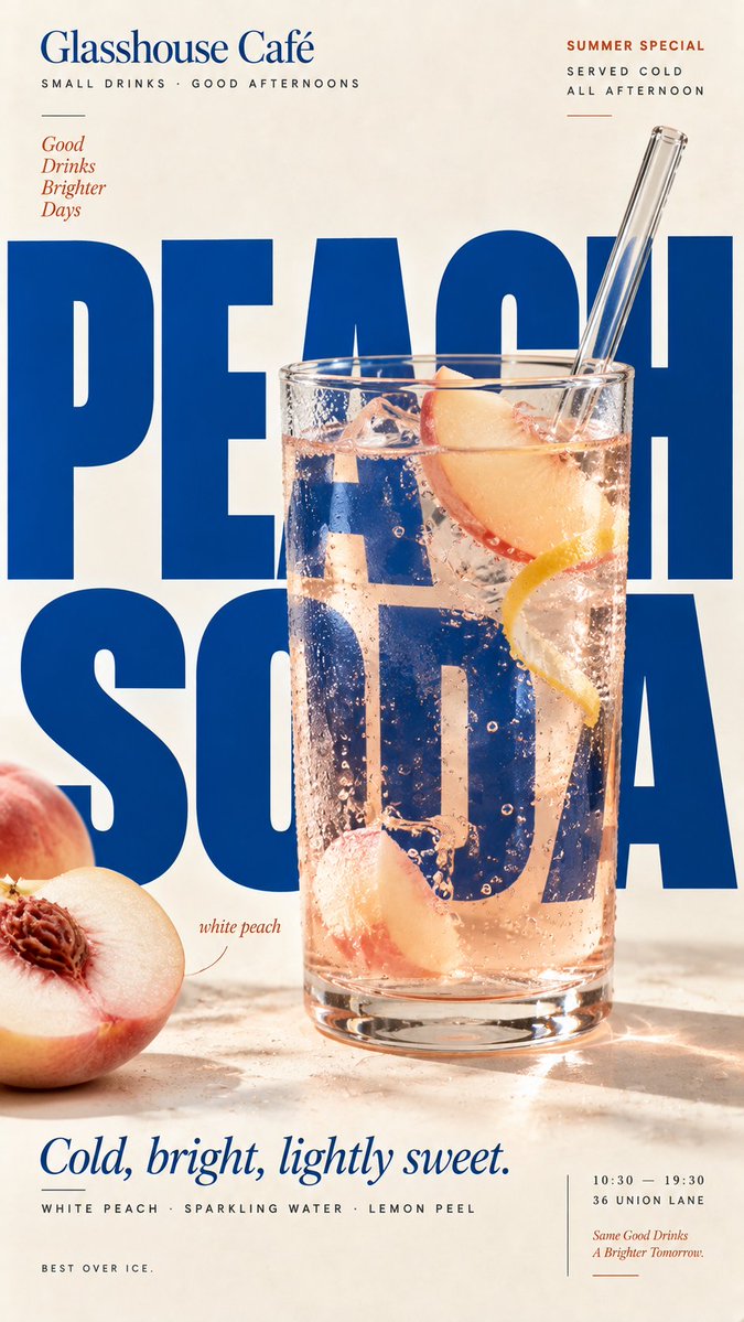
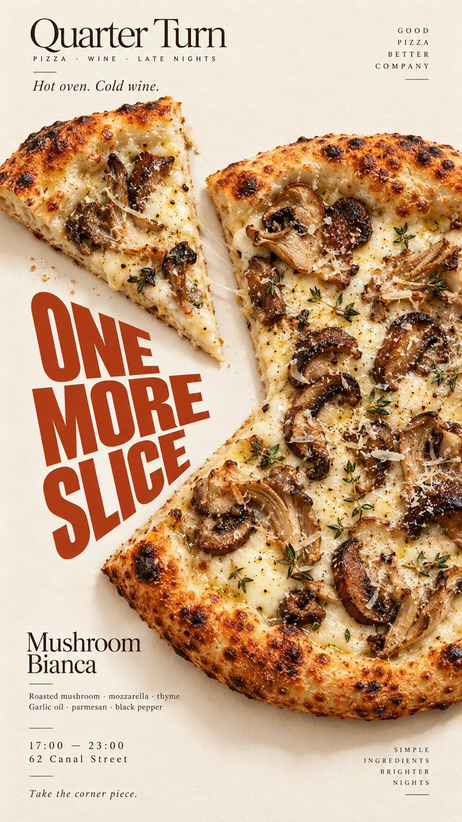
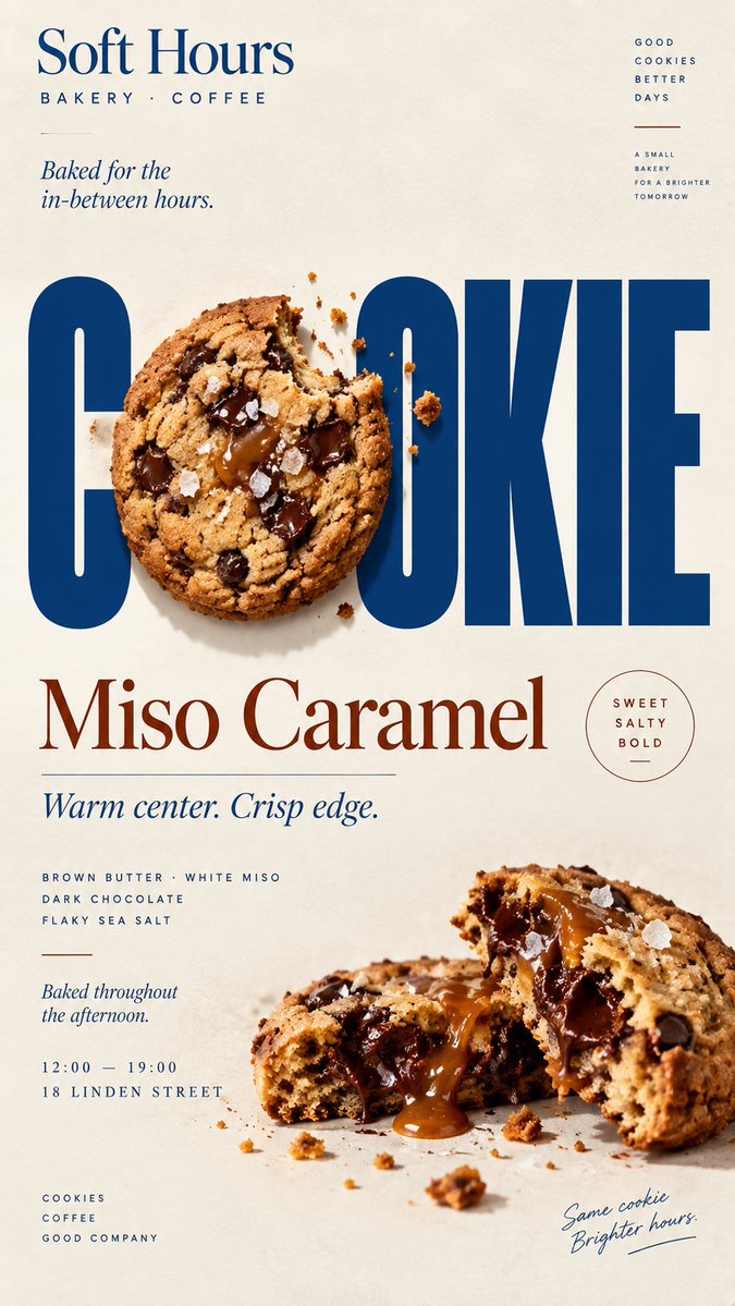
Une affiche éditoriale verticale où des plats réalistes s'insèrent dans les lettres elles-mêmes, avec des éléments qui passent devant et derrière les grandes lettres. Le résultat ressemble à une campagne de café ou de restaurant où le plat et le titre dépendent l'un de l'autre.
 Prompt de @MrLarus
- Remplissez les champs ci-dessous.
- Regardez le prompt se mettre à jour à droite.
- Copiez-le, ou ouvrez-le dans un outil d'image.
Prompt d'image
[BRAND]: {brand name} [FOOD / DRINK]: {main product} [HEADLINE]: {main word or short title} [INTERACTION]: {weave through type / refract type / create negative space / replace a letter} [ACCENT COLOR]: {main typography color} [DETAILS]: {ingredients / short copy / hours / address} Create a 9:16 vertical food editorial poster combining highly realistic food photography with bold, expressive typography. Use a warm cream or ivory paper background with subtle natural texture. Keep the food or drink realistic, appetizing and materially believable, with natural highlights, shadows, texture and proportions. Avoid CGI, plastic surfaces, floating cutouts or overly polished commercial rendering. The key concept is that the food must physically interact with the typography according to [INTERACTION], rather than simply sitting beside the text. For “weave through type,” let a few continuous food elements move naturally in front of and behind large letters with clear, believable depth. For “refract type,” place transparent glass or liquid in front of the headline so only the letters seen through it are naturally shifted, enlarged or distorted by real optical refraction. For “create negative space,” let the shape or missing portion of the food create a clean empty area where the headline naturally fits. For “replace a letter,” use the food itself as one recognizable letter inside the headline while keeping the full word immediately readable. Make [HEADLINE] one of the strongest visual elements using bold editorial typography. Integrate type and food into the same composition with clear hierarchy, strong negative space and intentional cropping. Add only a few useful brand details such as [BRAND], ingredients, flavor notes, opening hours or address. Keep all copy short and meaningful. Use [ACCENT COLOR] as the main typographic accent alongside cream, natural food colors and dark neutrals. Keep the palette controlled. Avoid numbered labels, 01/02, Vol., sparkles, generic filler copy, unnecessary decoration, UI-style cards or template-like layouts. The final poster should feel like a real café, bakery or restaurant campaign: visually striking at thumbnail size, detailed up close, and built around one clear idea where food and typography genuinely affect each other.
Prompt partagé sur X par @MrLarus. Tout le mérite revient à son créateur.
Plus de prompts à personnaliser
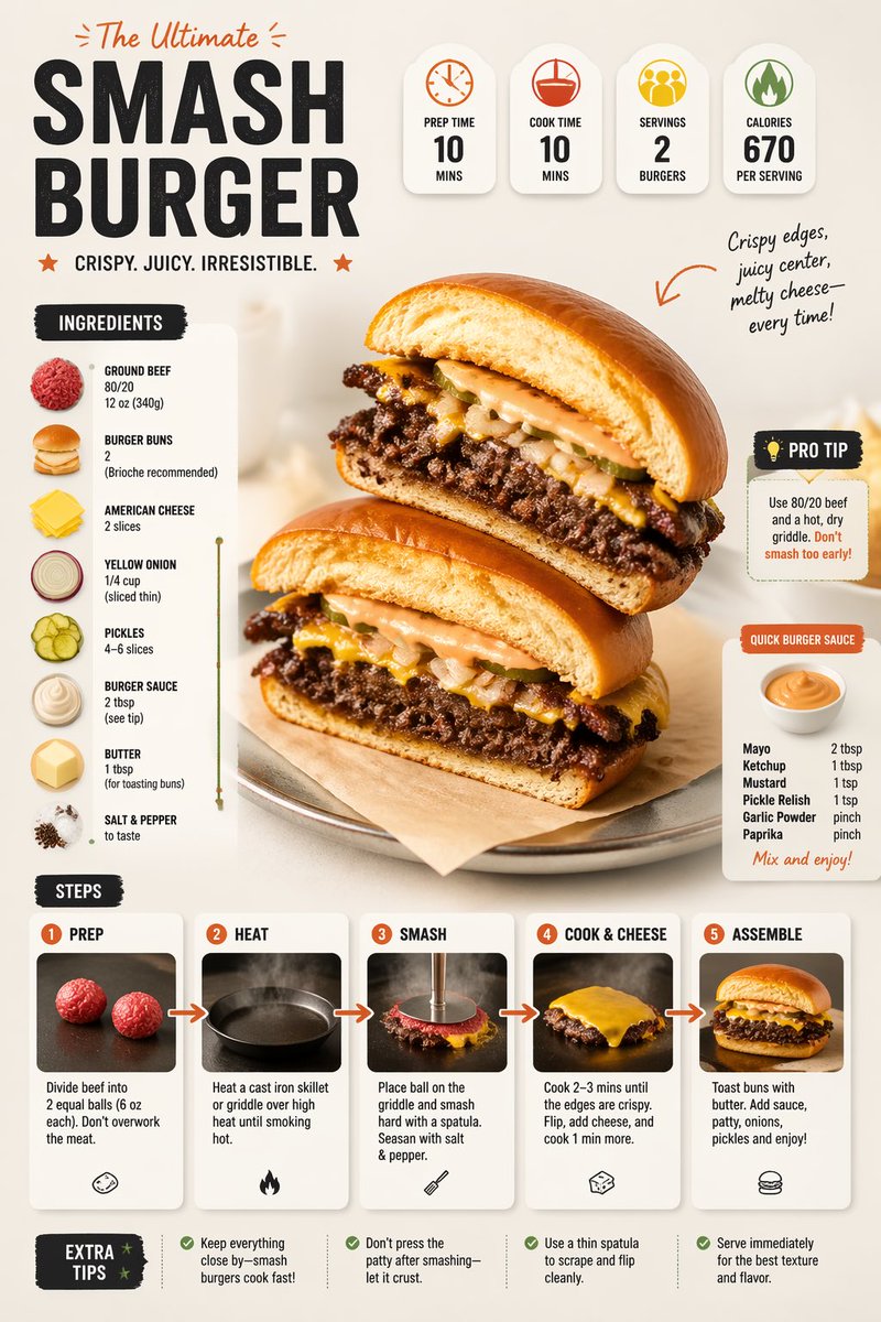 Prompt moderne d'infographie de recette avec mise en page culinaire
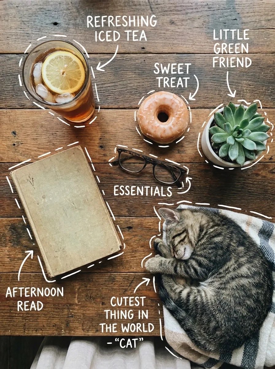 Vue du dessus d'une table avec étiquettes manuscrites
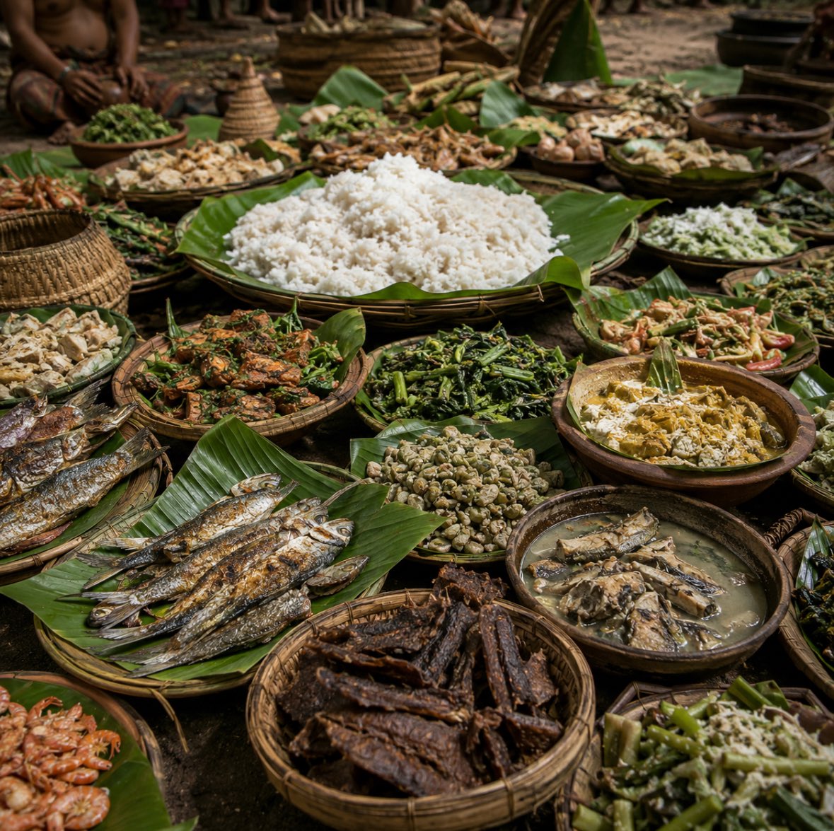 Festin javanais ancien sur feuilles de bananier
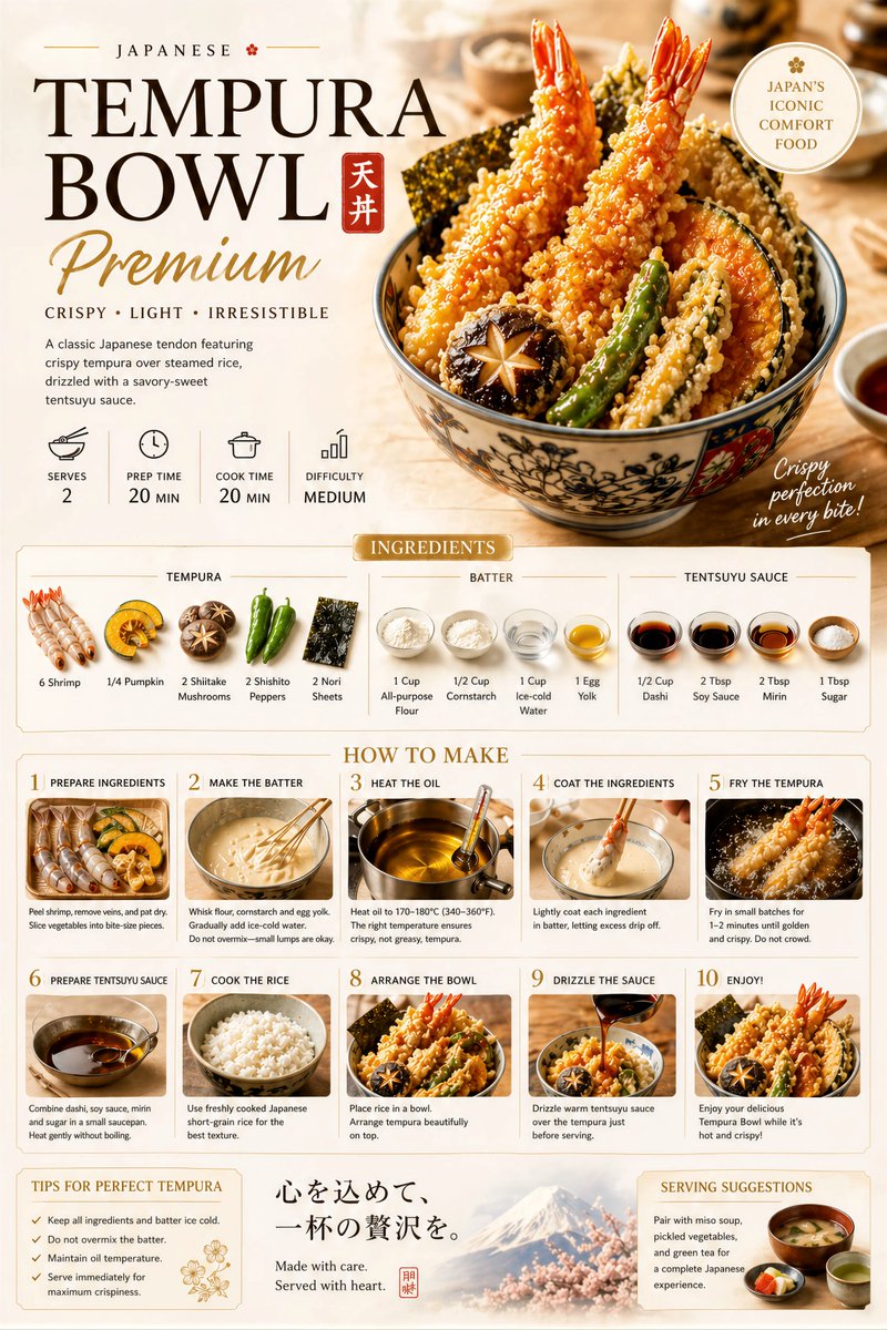 Affiche de recette premium avec mise en page étape par étape
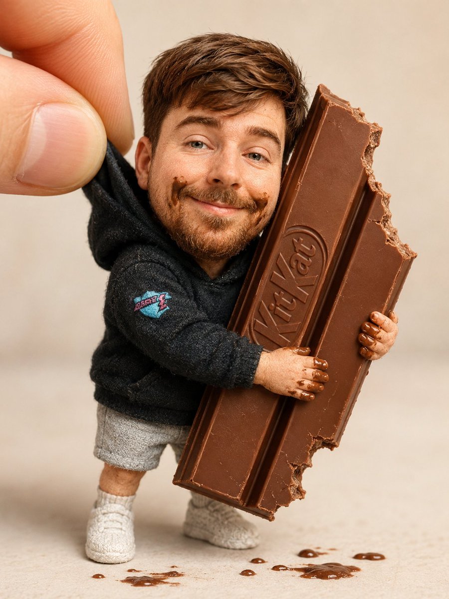 Ajoutez votre photoPoupée de collection serrant une barre de chocolat en macro
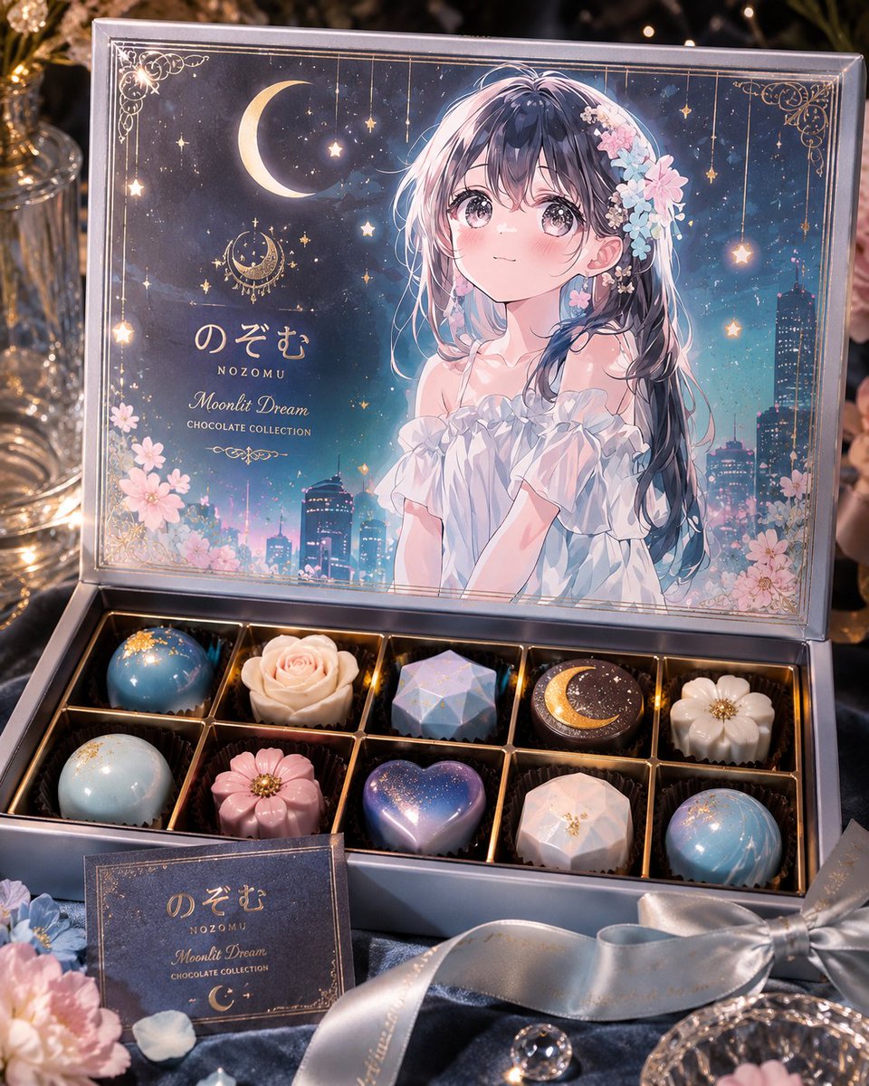 Ajoutez votre photoPrompt de boîte de chocolats de luxe en édition limitée avec personnage
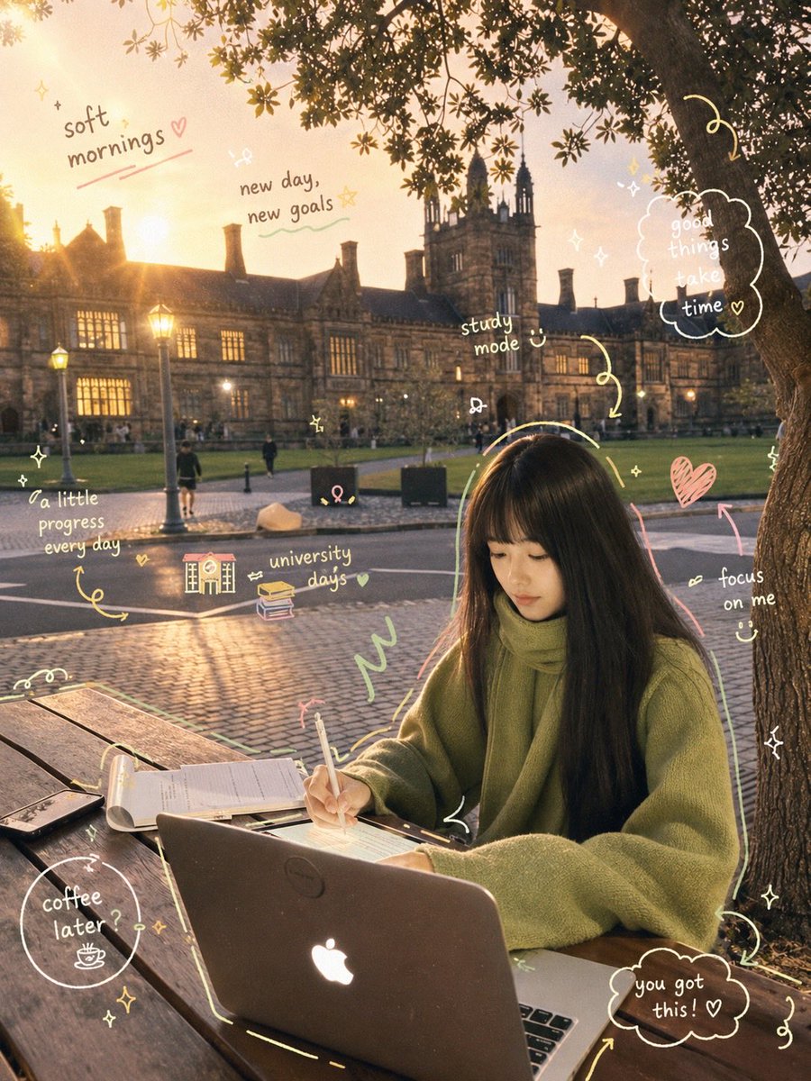 Scène d'étude cosy et prompt de scrapbook petit-déjeuner
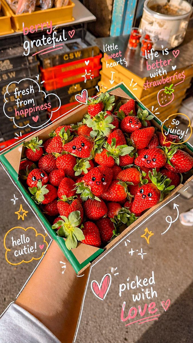 Photo kawaii de marché aux fraises et visages dessinés