Studio de prompts
Personnalisez « Cartes de comptoir découpées avec recommandations de plats »
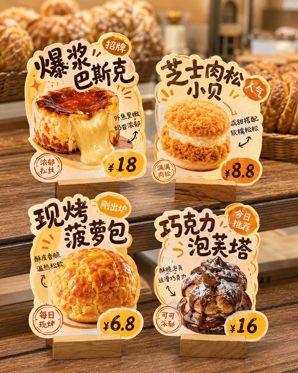
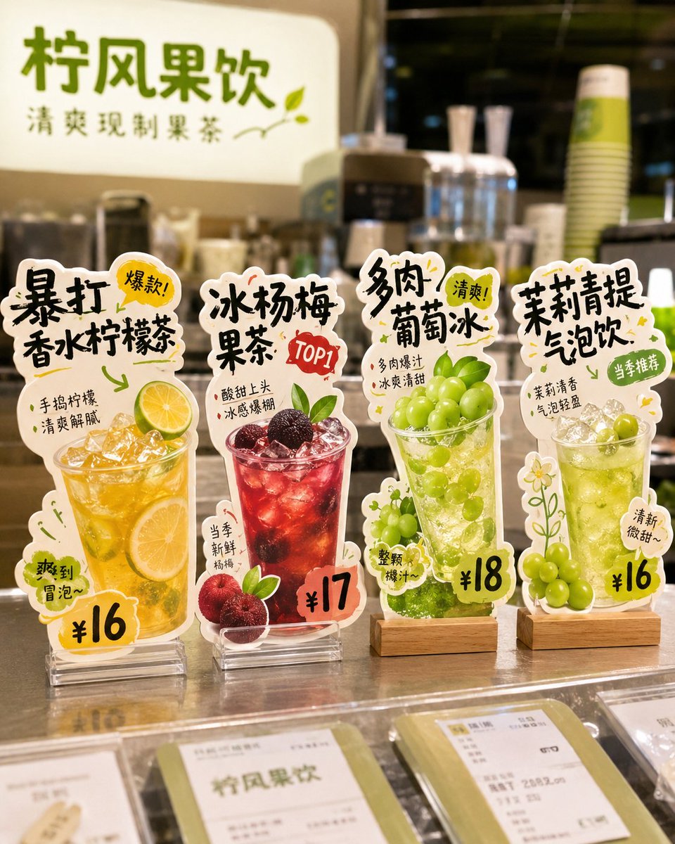
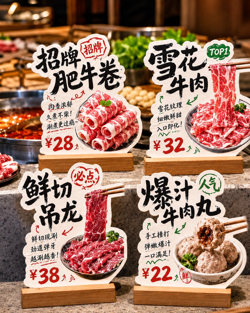
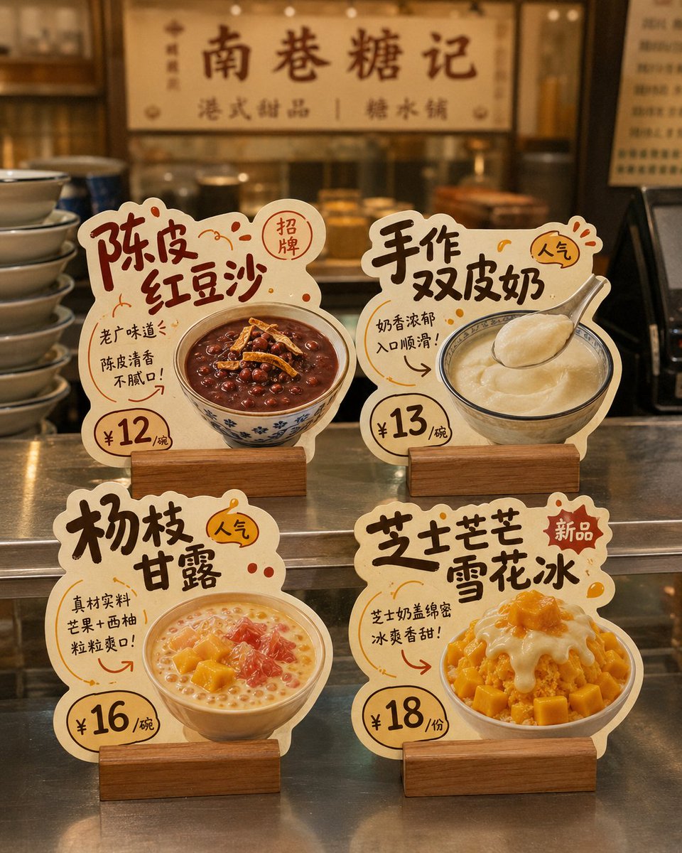
Quatre chevalets en carton séparés sur fond blanc uni, chacun consacré à un plat avec son nom, son prix et un bref argument de vente. Chaque contour épouse la forme de l'aliment, si bien que l'ensemble ressemble à un kit de présentoir de boutique prêt à l'emploi.
 Prompt de @MrLarus
- Remplissez les champs ci-dessous.
- Regardez le prompt se mettre à jour à droite.
- Copiez-le, ou ouvrez-le dans un outil d'image.
Prompt d'image
Generate a design showcase image of "store die-cut tabletop cards." The background must be pure white, and the whole thing is intended for later cutout and individual splitting. Core requirement: This is not a real-scene store poster or a scene display image, but a white-background layout image. The image shows 4 independent "store die-cut tabletop cards / dish recommendation standees / hit-product recommendation cards," so each card can be cut out and used separately later. Design around the following: Brand name: [brand name] Store type: [type, e.g., hotpot restaurant / dessert shop / tea drink shop / bakery / snack shop / café] Overall style: [style, e.g., handwritten POP feel / down-to-earth liveliness / fresh fruit-drink feel / Hong Kong-style dessert feel / warm bakery feel / cute and healing] Main color: [color direction] Product list: 1. [product 1] / [price 1] / [selling point 1] 2. [product 2] / [price 2] / [selling point 2] 3. [product 3] / [price 3] / [selling point 3] 4. [product 4] / [price 4] / [selling point 4] Image requirements: 1. The entire image has a pure white background, clean, simple, unobstructed; no store environment, no tabletop scene, no holding hands, no people, no prop backgrounds. 2. Show 4 independent tabletop cards in a 2×2 arrangement, with a tidy and clear layout, enough spacing between them, no overlap, for easy individual cutout. 3. Each card must be fully presented, with clear edges, a defined outline, and a strong die-cut feel, not an ordinary rectangular card. 4. Each card centers on a single product, highlighting the food's main visual, product name, price, short selling point, and tags such as featured/new/TOP1/popular. 5. The card style should look like a small recommendation standee a real store would use, commercial and practical, not an illustrated poster or coursework layout. 6. The material should look like thick cardstock die-cut shapes, optionally with a base, but the base should also be simple, complete, and easy to recognize. 7. The typography leans toward handwritten POP feel, bold-title feel, friendly and down-to-earth; you may add a few arrows, stamps, annotations, small tags, and decorative symbols, but not too cluttered. 8. Each card should have strong product recognizability and different die-cut outline variations, designed according to product shape, text flow, and ingredient elements. 9. The food should be appetizing, realistic, and appetite-inducing, suitable for food-service stores. 10. The overall visual must be refined, unified, and complete, like a small set of store die-cut tabletop cards ready to deliver to a client as reference. Special emphasis: - The background must be pure white - Show only 4 cards - No real store scene - No tabletop set design - No complex shadows - Do not assemble into a poster - The focus is that each die-cut card can be cut out individually The final effect should look like: A pure-white-background design showcase image with 4 independent store die-cut tabletop cards neatly arranged, each complete, clear, easy to cut out, and ready to be split and used directly.
Prompt partagé sur X par @MrLarus. Tout le mérite revient à son créateur.
Plus de prompts à personnaliser
 Photo de pub en contre-plongée avec mannequin tenant un produit
 Ajoutez votre photoStoryboard de marque produit en grille 3x3
 Photo produit d'un autocollant vinyle holographique au logo de marque
 Ajoutez votre photoAffiche de campagne streetwear avec maillot de football au style éditorial de luxe
 Maquette de matrice de points de contact de marque pour restaurant
 Infographie publicitaire de boîtier d'écouteurs avec texte en gras
 Photo produit en plongée sur surface texturée
 Ajoutez votre photoPortrait produit à l'heure dorée avec reflet arc-en-ciel