Prompt d'image Branding et UI Personnalisables
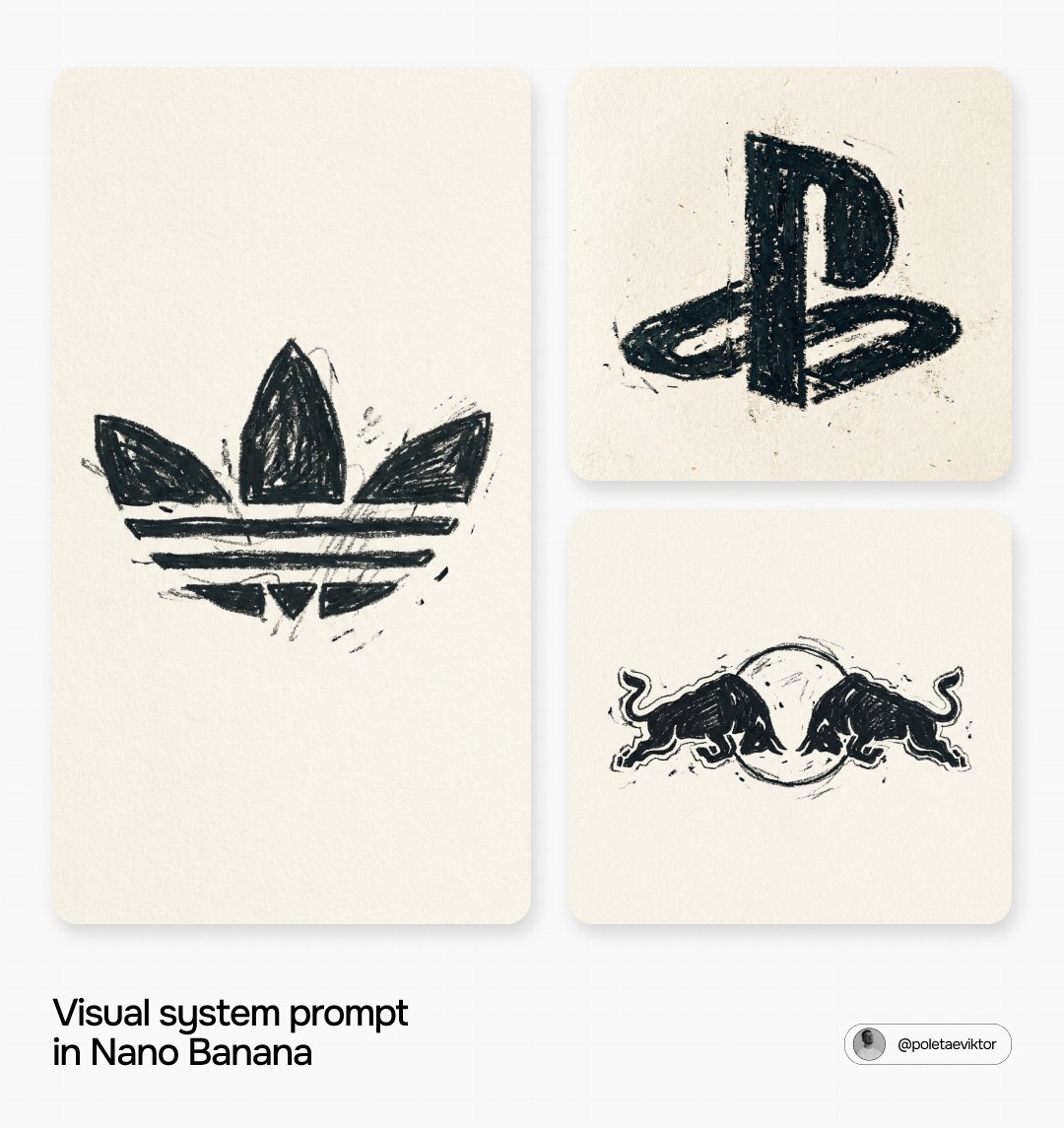
Dessin enfantin d'un logo de marque au pastel gras
Un logo connu redessiné comme le ferait un jeune enfant de mémoire : contours tremblants, pigment noir cireux et épais, remplissage irrégulier. Le grain du papier transparaît dans les zones fines, si bien que le motif se lit comme un vrai dessin et non comme un effet numérique.

- Modèle
- GPT Image 2
- Type
- Image
- Format d'image
- 1:1
- Partagé
- 29 juin 2026
- J'aime sur X
- 113
Nom de marque
Prompt d'image
3,180 caractères[BRAND NAME]. Act as a Senior Printmaking Artist, specializing in childlike oil pastel logo reproductions on raw paper (style: expressive child-drawn oil pastel, loose and imperfect waxy pigment on textured paper). PHASE 1: BACKGROUND — PAPER SURFACE A flat, warm off-white paper surface (#F5F2EC range) — NOT pure digital white, but the texture of a real uncoated cold-press paper with clearly visible paper grain and fiber texture across the entire surface. The paper grain is visible both in the negative space AND through the pigment. No gradient, no vignette. PHASE 2: LOGO RECONSTRUCTED IN CHILDLIKE OIL PASTEL TECHNIQUE (TRUE SHAPE) [BRAND NAME]'s real, official primary icon/logomark is reproduced with its overall silhouette and general shape recognizable — but drawn as a child would draw it: with imprecise, wobbly lines, uneven pressure, slightly lopsided proportions, and the natural imperfections of a young hand gripping an oil pastel too hard. The logo's core identity remains recognizable, but the execution is deliberately clumsy, energetic, and unrefined — as if a child who knows what the logo looks like tried to draw it from memory. Centered, occupying roughly 50–60% of frame height. CRITICAL ACCURACY INSTRUCTION: The logo must remain recognizable as [BRAND NAME]'s real mark — do not invent a completely different shape. The core silhouette is preserved, only the execution quality is deliberately childlike and imprecise. PHASE 3: CHILDLIKE OIL PASTEL TEXTURE LOGIC (HERO EFFECT) The oil pastel application follows the physical behavior of a child drawing with heavy wax sticks: - Pressure is wildly uneven — some zones are heavily over-applied with thick, waxy, almost sculptural pigment build-up; other zones are barely touched, showing mostly bare paper with just a hint of color. - The outer edges are very irregular — wobbly, wandering lines that go slightly outside and inside the intended shape, with visible over-runs where the pastel slipped beyond the form. - The fill strokes are visible and directionally inconsistent — going in multiple directions within the same area, overlapping, crossing, as a child would naturally scribble to fill a shape. - Paper grain shows heavily through the thinner pigment areas — especially in the center of larger filled zones where pressure was lighter. - Small accidental marks, extra strokes, and pigment smudges appear just outside the logo's silhouette — the natural result of an unsteady hand. - Some areas are left partially unfilled — gaps and holes in the coverage where the child missed a section or ran out of patience. - The overall form feels energetic, immediate, and joyfully imperfect — maximum analog rawness. PHASE 4: COMPOSITION Logo centered with generous paper-colored negative space surrounding it. No additional text, no background pattern, no color accents — strictly the childlike oil pastel logo mark on warm off-white textured paper. TECH SPECS: Flat 2D illustration, no 3D, no lighting simulation, no gradients. Pigment color: deep charcoal-black (#1A1A1A) oil pastel. Paper background: warm off-white (#F5F2EC) with visible cold-press paper grain throughout. Resolution: 8K.
Comment l'utiliser
Remplacez le nom de marque entre crochets par la marque que vous souhaitez dessiner, puis conservez telles quelles les consignes sur le papier, la pression et les imperfections afin de préserver l'aspect fait main. Ce prompt est rédigé comme une demande uniquement textuelle, aucune photo n'est donc nécessaire. Il a été partagé comme prompt pour GPT Image 2, et le résultat convient très bien pour une publication ludique sur les réseaux, une idée d'autocollant ou une pièce de moodboard pour un projet autour d'une marque.
Partagé publiquement sur X le 29 juin 2026. Tout le mérite de ce prompt et de son résultat revient à son créateur. Ce prompt est le vôtre ? Demandez une mise à jour ou un retrait.