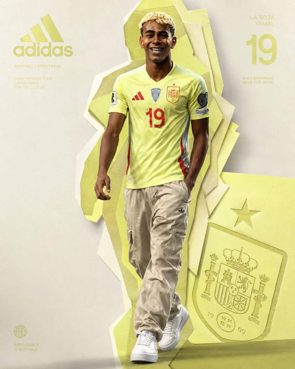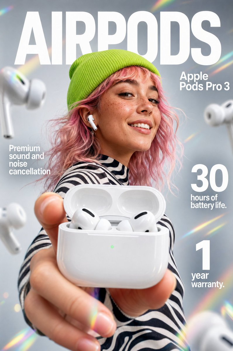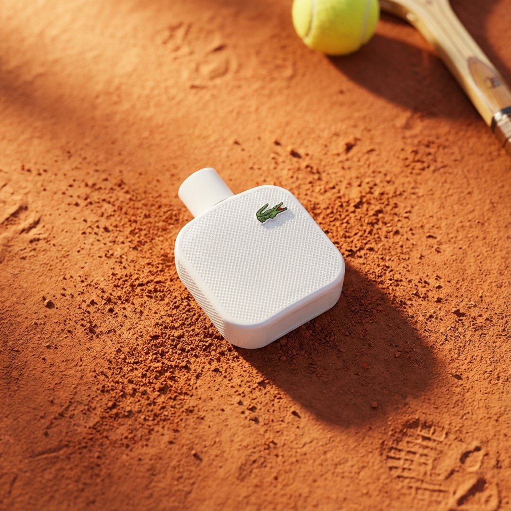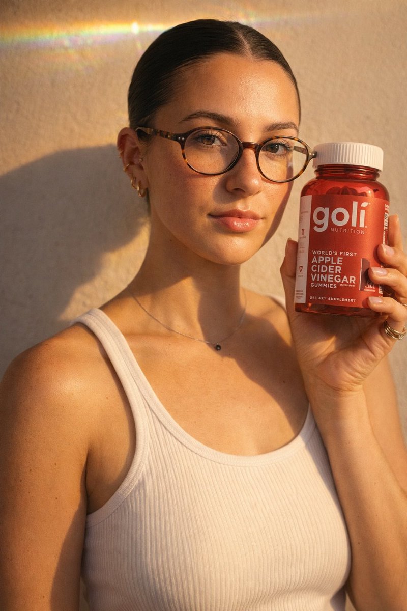
Prompt d'image Produit et publicité Personnalisables
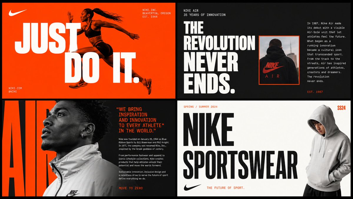
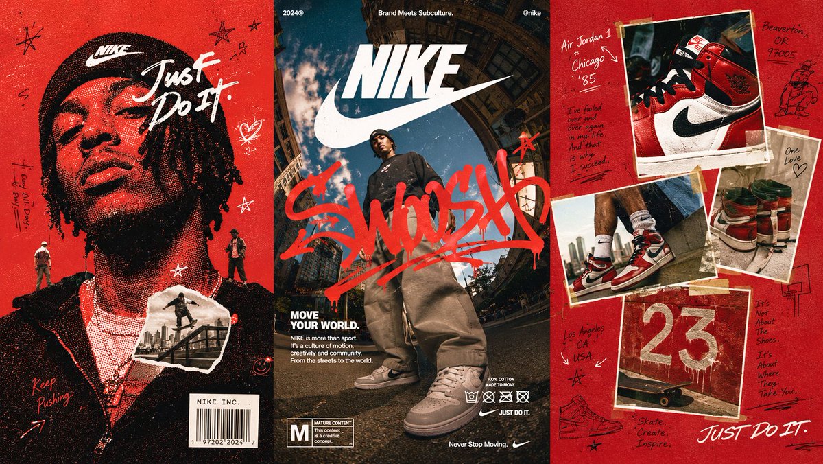
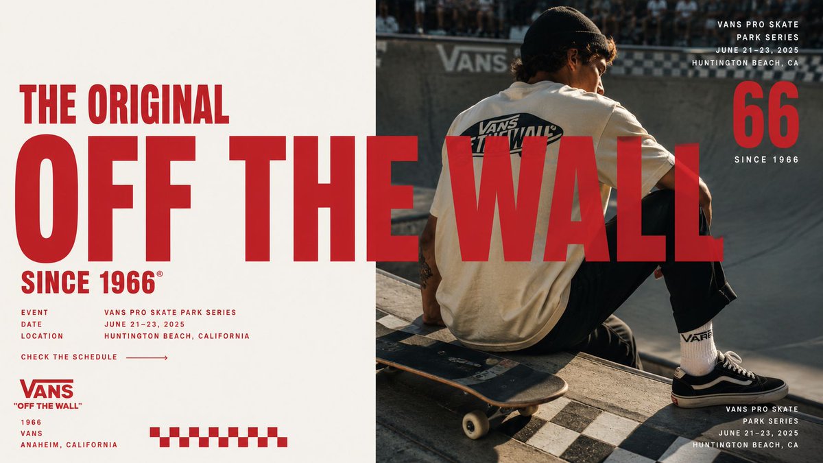
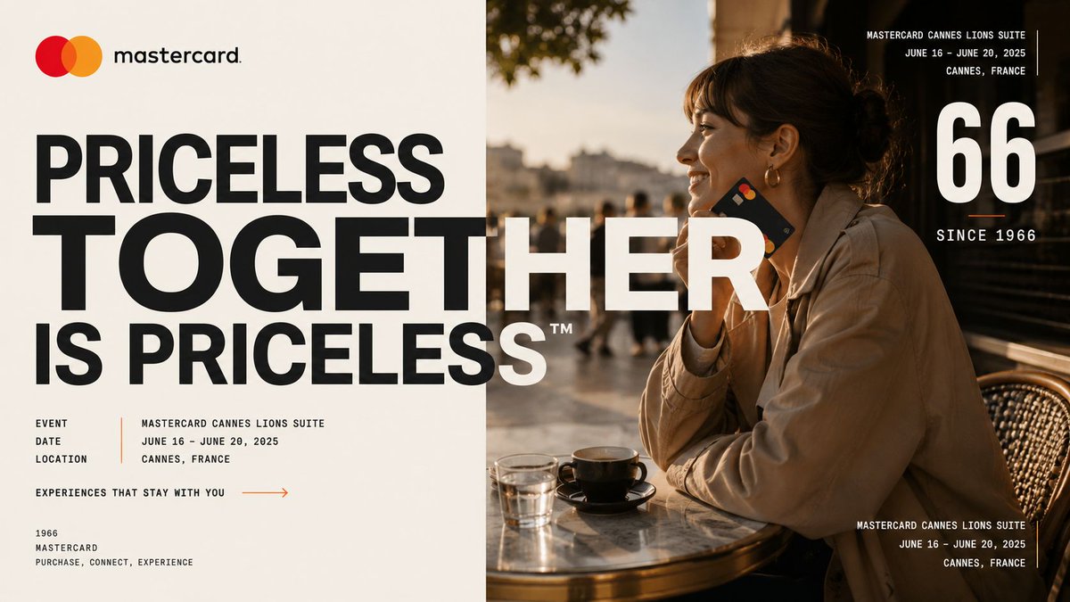
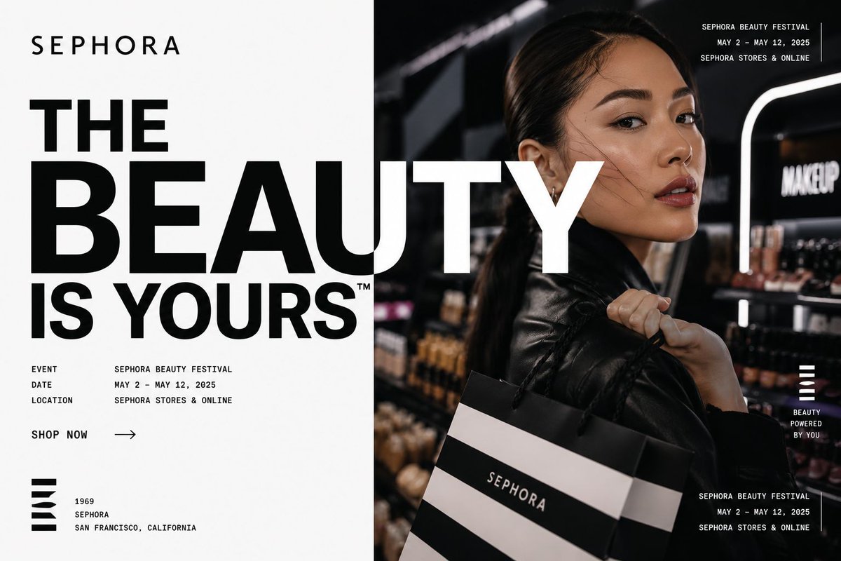
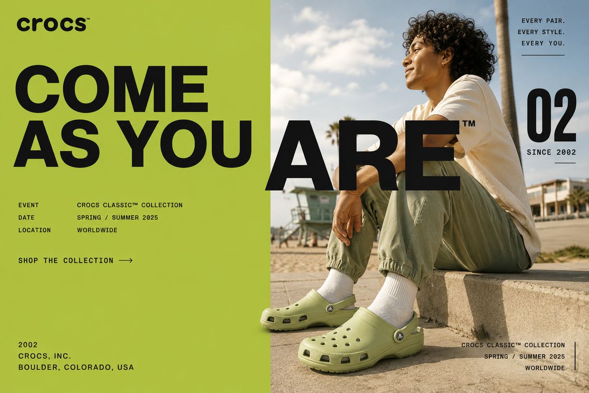
Affiche horizontale de campagne de marque en mise en page scindée
Une affiche de campagne 16:9 où une typographie de titre surdimensionnée traverse un aplat aux couleurs de la marque et une photographie éditoriale, reliant les deux moitiés en une seule composition. La ligne la plus grande s'étend sur toute la largeur, si bien que la mise en page évoque un panneau publicitaire ou une double page de magazine.

- Modèle
- GPT Image 2
- Type
- 4 images
- Format d'image
- 16:9
- Partagé
- 7 mai 2026
- J'aime sur X
- 548
Nom de la marque
Prompt d'image
9,485 caractères[BRAND NAME] Act as a Senior Brand Art Director and Editorial Poster Designer creating a horizontal editorial campaign poster where bold typography and photography are unified across a split-layout composition. The poster is deeply rooted in [BRAND NAME]'s real brand identity — colors, typography character, campaign language, and visual codes drawn from actual brand materials and campaigns. IMPORTANT LIMITATION: Do not attempt to generate real identifiable people by name. Instead use a realistic figure whose appearance, clothing, and context are entirely consistent with [BRAND NAME]'s campaign aesthetic — wearing [BRAND NAME] products visibly, in an environment associated with the brand. --- PHASE 0: BRAND INTELLIGENCE — STRICT BRANDBOOK ACCURACY Perform a complete brand decode of [BRAND NAME] from training data. Apply all of the following with maximum fidelity: COLOR SYSTEM — ZERO APPROXIMATION: retrieve the exact official brand colors of [BRAND NAME] as documented in their public brand guidelines and campaign materials. Identify: primary background color — the color [BRAND NAME] most commonly uses as the dominant background in campaign posters and editorial materials. Primary headline color — the color used for large display type. Secondary information color — the color used for small body text, labels, and informational copy. Apply these exactly. Do not substitute or approximate. Examples: Gucci uses cream/off-white background (#F5F0E8) with deep red (#8B0000 to #CC0000) for headlines. Nike uses white background with black headlines and red accents. Adidas uses black background with white headlines. Supreme uses white or red background with the opposing color for type. A brand designer must confirm these colors are correct for [BRAND NAME]. TYPOGRAPHY CHARACTER — PRECISE VISUAL DESCRIPTION: identify whether [BRAND NAME] uses serif or sans-serif type and describe its precise visual character — do not name a font, describe how it looks and feels. Gucci: classic high-contrast serif with strong thin-thick stroke variation, elegant and editorial, similar in character to Bodoni or Didot. Nike: geometric sans-serif, bold, uniform stroke weight, condensed, no contrast between strokes. Adidas: clean grotesque sans-serif, slightly condensed, utilitarian and athletic. Supreme: perfectly geometric sans-serif, circular O, uniform stroke weight, Futura-like. Balenciaga: ultra-extended grotesque, extremely wide letterforms, uniform stroke weight. Louis Vuitton: refined serif with moderate contrast, luxury editorial character. Apply this visual character description to generate type that feels authentically correct for [BRAND NAME]'s brand category — luxury serif for heritage fashion houses, athletic grotesque for sportswear brands, geometric for streetwear. CAMPAIGN LANGUAGE — REAL SLOGANS ONLY: extract the single most famous, most documented real campaign slogan of [BRAND NAME]. Not an invented phrase. Not a generic motivational line. The actual trademarked or documented slogan used in real campaigns. Examples: Gucci — "We Will Always Be Yours". Nike — "Just Do It". Adidas — "Impossible Is Nothing". Puma — "Forever Faster". Use this real slogan as the headline text broken across 2 to 3 lines. BRAND FACTS: extract real founding year, key event names, real campaign names, product line names, geographic origin city, and documented campaign dates. Use this real data as all informational micro-copy. No invented data. --- PHASE 1: LAYOUT ARCHITECTURE Single horizontal rectangle — aspect ratio 16:9. Two zones split at approximately 55 to 60% from the left edge. Left zone: pure flat background in [BRAND NAME]'s exact primary campaign background color from PHASE 0. NOT automatically white — the color is whatever [BRAND NAME] actually uses in their campaign materials. No photography, no texture, pure graphic design. Right zone: full-bleed editorial photograph bleeding to right, top, and bottom edges. TYPOGRAPHIC BRIDGE — CRITICAL: the headline type starts in the left zone and physically crosses the split line continuing over the photograph. Type appears simultaneously on the brand background AND over the photo. The largest headline line crosses the split most dramatically — it spans the full width of the poster. This bridge unifies the two zones into one composition. --- PHASE 2: HEADLINE TYPOGRAPHY Real [BRAND NAME] campaign slogan from PHASE 0 broken into 2 to 3 lines. Typography character matches the visual description from PHASE 0 — serif for luxury heritage brands, grotesque for sportswear, geometric for streetwear. Line 1: medium-large, starts in left zone, crosses into right zone over the photo. Uppercase. Primary headline color. Line 2: maximum size — 35 to 45% of total poster height. The single most dominant visual element of the entire poster. May bleed slightly off the left edge — leftmost letter partially cropped. Crosses the split line fully, spanning both zones. Primary headline color. Line 3: large, ends with asterisk or registered trademark symbol as graphic accent. Primary headline color. All lines left-aligned. Flat color, full opacity. No shadows, no outlines, no gradients, no effects. Type sits directly over the photograph at full opacity where it crosses into the right zone. --- PHASE 3: INFORMATIONAL MICRO-TYPOGRAPHY Small-scale type set in the same typographic character as the headline but regular weight. Small size, generous tracking. Secondary information color from PHASE 0. Cluster 1 — brand event details: three label-value pairs stacked with real [BRAND NAME] data. Format: "EVENT" left-aligned, real event name right-aligned. "DATE" left-aligned, real campaign date right-aligned. "LOCATION" left-aligned, real city and country right-aligned. Cluster 2 — CTA: a short directional phrase in small caps with tracking — "DISCOVER THE EXHIBITION →" or "SHOP THE COLLECTION →" or similar. Positioned below Cluster 1 with clear spacing. Both clusters positioned in the breathing space between headline lines in the left zone — they occupy the open area between Line 1 and Line 3. --- PHASE 4: CORNER ELEMENTS Bottom left corner: three-line brand attribution block — founding year, brand name in the brand's logotype style, geographic origin city (e.g. "1921 / GUCCI / FIRENZE, ITALIA"). Small type, left-aligned. If [BRAND NAME] has a recognizable wordmark — render the wordmark in its correct typographic style at this position. Top right corner over photo: small cluster of event name, date range, and location. Small type, right-aligned, secondary information color. Bottom right corner over photo: same event/date/location information repeated. Right-aligned, slightly larger than top right cluster. Large numeral accent: a typographically significant number positioned upper right in the photo zone — founding year last two digits, collection edition number, or campaign year. Size: 15 to 20% of poster height. Primary headline color at 85% opacity. Below the numeral: the word "SINCE" followed by the full founding year — small caps, tracked out, secondary information color. --- PHASE 5: PHOTOGRAPHY A realistic figure — not a named real person — whose appearance and context are entirely consistent with [BRAND NAME]'s visual world. The figure is wearing [BRAND NAME] products visibly and recognizably. The environment is authentic to the brand's cultural positioning: Gucci — Italian Renaissance architecture, Florence rooftops, luxury interiors. Nike — athletic venues, courts, tracks, urban environments. Adidas — urban streets, sports arenas, creative studios. Supreme — New York streets, skate spots, urban environments. Photographic style: editorial, naturalistic. Slight warm or cool grade depending on brand aesthetic — Gucci uses warm film-like grades, Nike uses clean neutral grades, Adidas uses high contrast neutral grades. Not stock photography. The figure is positioned slightly left of center within the photo zone, facing slightly away from camera or in profile — creating the characteristic editorial non-confrontational pose. The headline type from PHASE 2 overlaps the figure's body where it crosses into the right zone. --- PHASE 6: COMPOSITION PRINCIPLES Hard vertical split line — precise, no feathering, no blend, no gradient transition. Left zone is pure graphic. Right zone is photography. They meet at an exact vertical cut. Typography hierarchy: Line 2 maximum > Line 3 > Line 1 > Large numeral > Corner elements > Micro clusters. Visual flow: large type enters from left → crosses into photo → numeral accent upper right → corner information → figure. Left zone negative space: generous — micro-typography clusters are small relative to the zone. The white or colored space breathes around the type. --- PHASE 7: TECH SPECS Aspect ratio: 16:9, single flat image. Typography: crisp, anti-aliased, flat color — zero shadows, zero outlines, zero gradients on type. Typography character strictly matches the visual description from PHASE 0 — serif for luxury brands, grotesque for sport, geometric for street. Color palette: exactly the three colors identified in PHASE 0 — zero additions, zero gradients, zero textures. Photography: editorial quality, color grade consistent with [BRAND NAME]'s visual world. Output feel: this poster is published as a campaign hero visual on [BRAND NAME]'s official website, as an outdoor billboard, or as a full-page spread in Vogue, GQ, Hypebeast, or Highsnobiety.
Comment l'utiliser
Remplacez [BRAND NAME] par la marque de votre choix et vérifiez que la palette et la description typographique correspondent aux véritables supports de campagne de cette marque. Conservez les consignes de mise en page scindée, la typographie qui relie les deux zones et le traitement en aplat, car ce sont eux qui créent le rendu. Il a été partagé comme prompt GPT Image 2, et le résultat fonctionne bien comme visuel d'accroche pour un site web ou une double page imprimée.
Partagé publiquement sur X le 7 mai 2026. Tout le mérite de ce prompt et de son résultat revient à son créateur. Ce prompt est le vôtre ? Demandez une mise à jour ou un retrait.