Prompt d'image Branding et UI Personnalisables
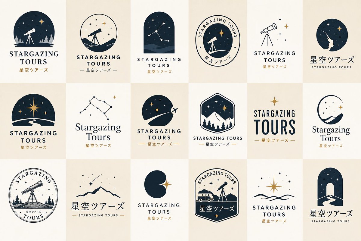
18 concepts de logo avec touches vintage
Une grille de 6 par 3 de concepts de logo de marque, qui passe de silhouettes audacieuses et de marques monolines épurées à des symboles en espace négatif et quelques emblèmes vintage. La planche se lit comme une seule marque explorée dans de nombreuses directions, avec des palettes sobres sur des tuiles ivoire unies.

- Modèle
- GPT Image 2
- Type
- Image
- Format d'image
- 3:2
- Partagé
- 22 juin 2026
- J'aime sur X
- 71
Nom de la marqueSecteur
Prompt d'image
5,990 caractèresCreate a logo concept sheet for <BRAND_INFO name="{{brand name. e.g.: Stargazing Tours}}" industry="{{industry/genre. if blank, AI decides from the brand name}}" mood="{{mood/world. e.g.: mysterious, exciting, nature. if blank, AI decides from industry and brand name}}" motif="{{main motif. e.g.: stars, telescope. if blank, AI decides from industry and mood}}" japanese_name="{{e.g.: Japanese name. 星空ツアーズ}}" > Purpose Generate 18 polished logo concepts for human review. This is a reusable template prompt. Adapt the design intelligently to the BRAND_INFO. Overall Direction Create a curated logo moodboard with contemporary minimalist taste. The logos should feel designed, memorable, and brand-ready. Aim for: - modern but not sterile - minimal but not empty - premium but not overly elegant - slightly artistic but still usable - diverse but visually cohesive - some vintage influence, but not a full vintage badge collection Important Taste Direction Do not make the sheet too clean, too delicate, or too corporate. Avoid the “luxury template logo” look. The best logos should have clear visual weight, simple charm, and a strong readable symbol. Visual Style Mix Use a balanced mix of design approaches: - bold silhouette icon logos - clean monoline logos - simple geometric symbol logos - negative-space logos - compact emblem logos - typography-led logos - Japanese wordmark logos if japanese_name is provided - bilingual lockups if japanese_name is provided - a few vintage-inspired logos - a few very modern minimal logos Keep the whole sheet cohesive, but do not repeat the same formula. Vintage Control Vintage influence is allowed. Use vintage-inspired treatment in about 4 to 6 logos only. The rest should feel more contemporary, simple, and fresh. Avoid making every logo: - a circular badge - an old stamp - an engraved illustration - a heritage serif layout - a scenic emblem Motif Interpretation The MAIN_MOTIF should strongly influence the sheet. Use it in multiple ways: - direct symbol - bold silhouette - simplified line art - geometric abstraction - negative space - small accent detail - typographic inspiration Do not draw the same motif 18 times. Do not make the motif too tiny or decorative. At least half of the concepts should clearly communicate the motif at a glance. Logo Composition Rules Create 18 complete logo lockups in a clean 6 × 3 grid. Do not include tile numbers. Do not leave empty tiles. No captions outside the logos. Each tile should include: - a distinctive icon, symbol, emblem, or typographic idea - the brand name - optional tiny microtype only if it makes the logo feel more realistic Most logos should be icon + wordmark. A few can be typography-led, but avoid lazy plain text-only logos. Typography Direction Use typography as a design anchor. Show both serif and sans-serif possibilities when appropriate. Use a mix of: - refined serif - clean sans-serif - slightly condensed sans-serif - spaced uppercase lettering - Japanese title treatment if japanese_name is provided Avoid default Helvetica-like text. Avoid overly elegant fashion-logo typography. Avoid huge plain wordmarks with tiny decoration. Avoid script, brush, or calligraphy unless the BRAND_INFO clearly requires it. Japanese Text Rules If japanese_name is provided, include 3 to 5 logo concepts using that exact Japanese name. Treat Japanese text as a real logo title, not just a subtitle. If japanese_name is blank, do not invent Japanese text. Density & Weight Use selective density, but keep each tile visually satisfying. Each logo should have one strong idea. Good density: - bold readable icon - simple but intentional wordmark - small accent detail - enough negative space Bad density: - tiny symbol floating in empty space - thin unfinished line drawing - decorative dots with no idea - overly clean luxury spacing - overfilled vintage illustration Icon Weight Icons should feel substantial. Avoid fragile hairline icons. Use strong black or deep neutral shapes where useful. Fine lines are allowed, but they must feel intentional and balanced. Color Palette Use a restrained brand palette inferred from BRAND_INFO. Prefer: - near black or deep neutral - warm ivory or soft neutral - one muted accent color - one optional stronger accent color when useful Use 1 to 3 colors per logo. No gradients. No metallic effects. No neon unless the brand clearly requires it. No drop shadows. No bevels. Canvas & Layout Use a wide presentation sheet. Arrange logos evenly in a 6 × 3 grid. Use alternating warm ivory, off-white, and muted beige tile backgrounds. Keep tile backgrounds flat and clean. Avoid harsh grid lines. Keep consistent visual scale. Icons should be large enough to read. Wordmarks should be carefully spaced and aligned. Quality Bar Every tile must feel like a real logo proposal from a skilled designer. Minimal does not mean lazy. Premium does not mean sterile. Vintage does not mean old-fashioned. Diversity does not mean random. The sheet should feel like one brand explored through multiple intelligent directions. Positive Style Keywords curated logo concept sheet, contemporary minimalist logo design, strong readable symbols, bold silhouette icon, refined vector mark, tasteful vintage influence, modern brand identity, Japanese-modern restraint, editorial typography, balanced logo moodboard, cohesive diversity, premium but approachable, clean geometry, negative space, simple emblem, designed wordmark Negative Style Keywords sterile luxury logo template, overly clean corporate logo, fragile thin line art, tiny floating icon, lazy text-only logo, repeated same layout, full vintage badge collection, old stamp collection, excessive circular emblems, default Helvetica, generic sans-serif logo, fashion brand cliché, random dots, childish icon, clipart, stock vector, clutter, over-detailed illustration, neon, gradient, drop shadow, bevel, metallic, brush stroke, calligraphy unless requested, numbered tiles
Comment l'utiliser
Commencez par remplacer le nom de la marque et le secteur dans le bloc BRAND_INFO, en laissant l'ambiance et le motif vides si vous voulez que le modèle les choisisse. Ce prompt a été partagé comme prompt GPT Image 2, qui gère bien les wordmarks et la mise en page en grille. Conservez les consignes sur le poids visuel, la grille 6 par 3 et les règles de palette, car elles évitent que la planche paraisse générique.
Dans les collectionsPrompts IA pour la création de logos
Partagé publiquement sur X le 22 juin 2026. Tout le mérite de ce prompt et de son résultat revient à son créateur. Ce prompt est le vôtre ? Demandez une mise à jour ou un retrait.