Prompt de imagen Branding y UI Personalizables
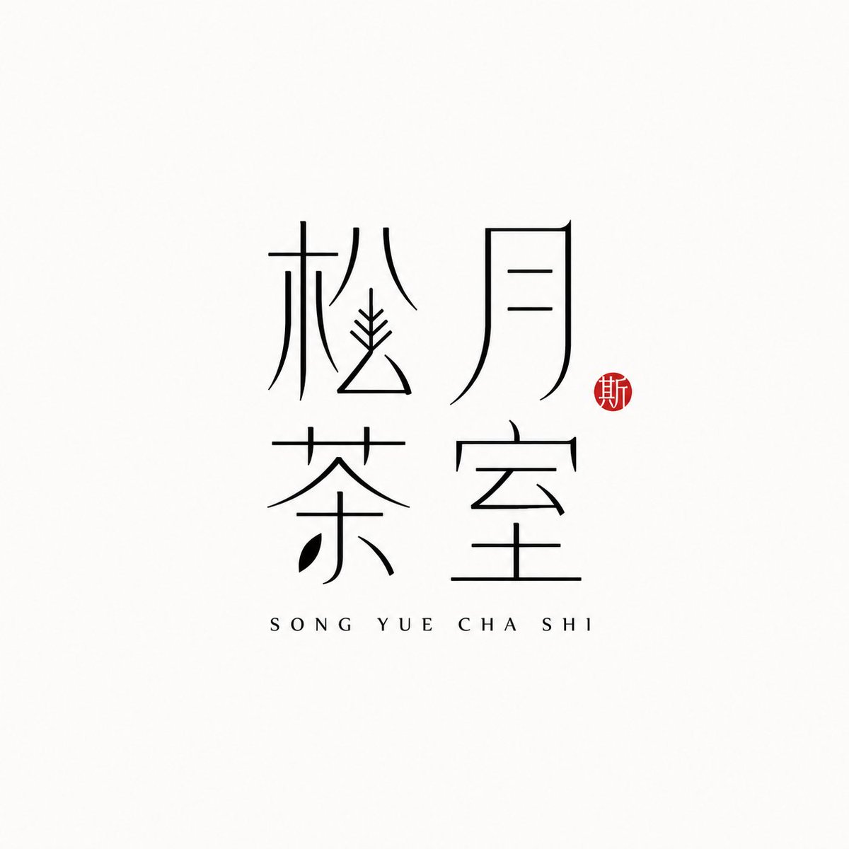
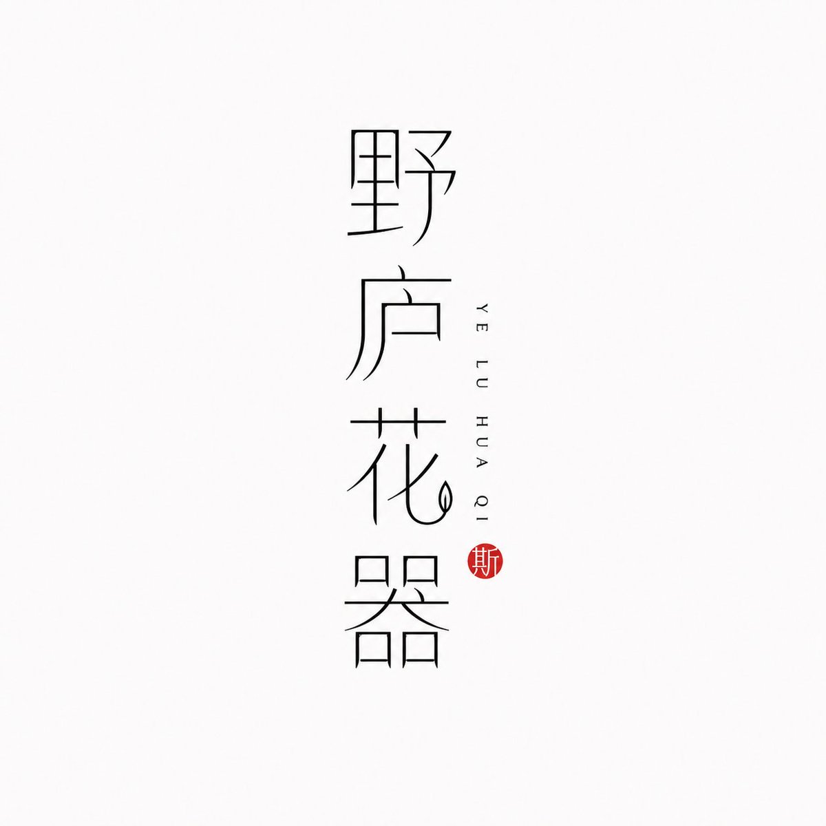
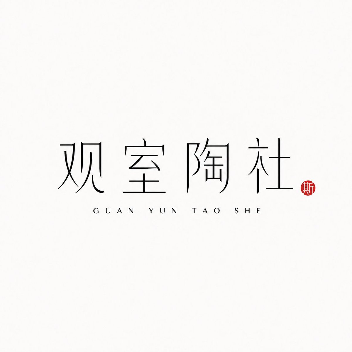
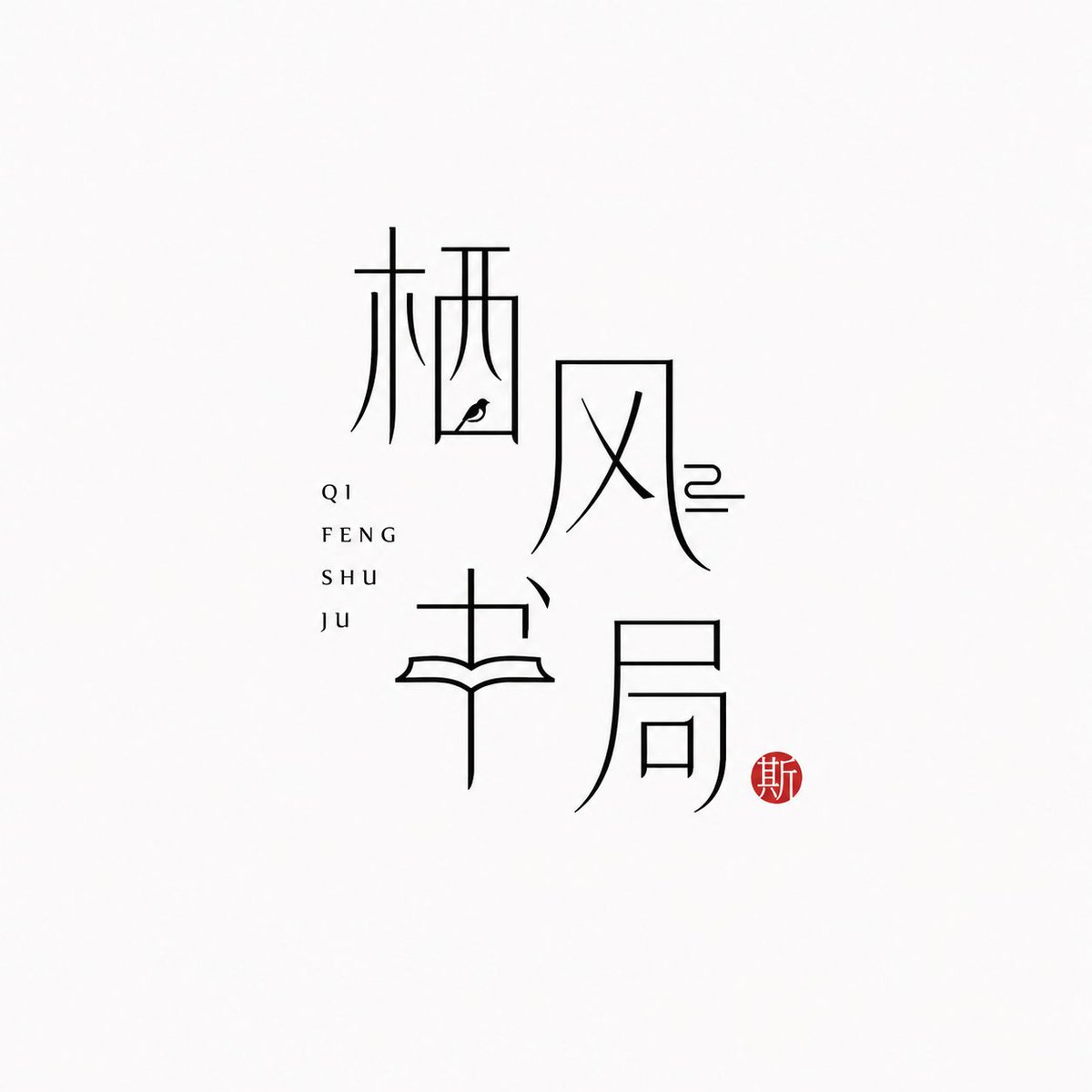
Logotipo de marca con caracteres chinos de trazo fino
El propio nombre de la marca en chino se convierte en el logotipo, dibujado con trazos negros y finos sobre un fondo casi blanco. Junto a él, el pinyin aparece discreto y un pequeño sello bermellón aporta un único acento cálido, con un aire oriental sereno y moderno.

- Modelo
- GPT Image 2
- Tipo
- 4 imágenes
- Relación de aspecto
- 1:1
- Compartido
- 25 jun 2026
- Me gusta en X
- 97
Nombre de la marcaPinyinDiseño
Prompt de imagen
1,778 caracteres[Brand name]: [Auxiliary pinyin]: [Brand direction]: tea house / flower vessel / ceramics / bookstore / fragrance / objects / guesthouse / Oriental lifestyle brand [Layout structure]: 2×2 grid / vertical / horizontal / staggered interweaving [Mood keywords]: cool-serene / restrained / refined / whitespace / modern Oriental / thin-line typography Generate a "Thin-Line Oriental Typographic Logo." The whole is a minimalist Chinese typographic logo on a white or very light gray-white background with abundant whitespace. The main subject is neither an illustration nor a graphic, but the Chinese brand name itself designed as a visual mark. The main Chinese characters use black thin-line strokes — slender, light, restrained, and cool, with a modern Oriental feel. Some strokes may receive slight geometric reconstruction, elongation, broken strokes, displacement, or whitespace treatment, but the whole must keep readability and consistency and must not become illegible scrambled characters. The core is "typography as logo": the Chinese brand name itself is the main visual, while pinyin or English serve only as auxiliary layout. The pinyin can be placed below, to the side, vertically, or interwoven beside the main characters, with wide letter spacing, staying refined, quiet, and restrained. Add a small vermilion seal-carving-style stamp; its content can be a single character in an antique style or an abstract ancient seal symbol. The seal is only a finishing touch — it must not be too large nor steal the main visual. The overall effect should look like a real brand's modern Chinese typographic logo: clean, flat, design-driven, with a sense of series, suitable for brand proposals, storefronts, packaging, social media avatars, and visual system extension.
Cómo usarlo
Se compartió como prompt para GPT Image 2. Sustituye los campos entre corchetes del nombre de la marca y el pinyin por los tuyos, y conserva la tipografía de trazo fino, los amplios espacios en blanco y el pequeño sello, ya que esos detalles definen el look. Elige una dirección de marca, como casa de té o perfumería, para orientar el ambiente, y un diseño como pila vertical o cuadrícula 2x2. El logotipo terminado funciona bien como rótulo de tienda, frontal de envase o avatar de redes sociales.
Compartido públicamente en X el 25 jun 2026. Todo el mérito de este prompt y de su resultado es de su creador. ¿Es tuyo? Pide que se actualice o se elimine.