Estudio de prompts
Haz tuyo «Póster de portada editorial con cuadrícula suiza para imprimir»
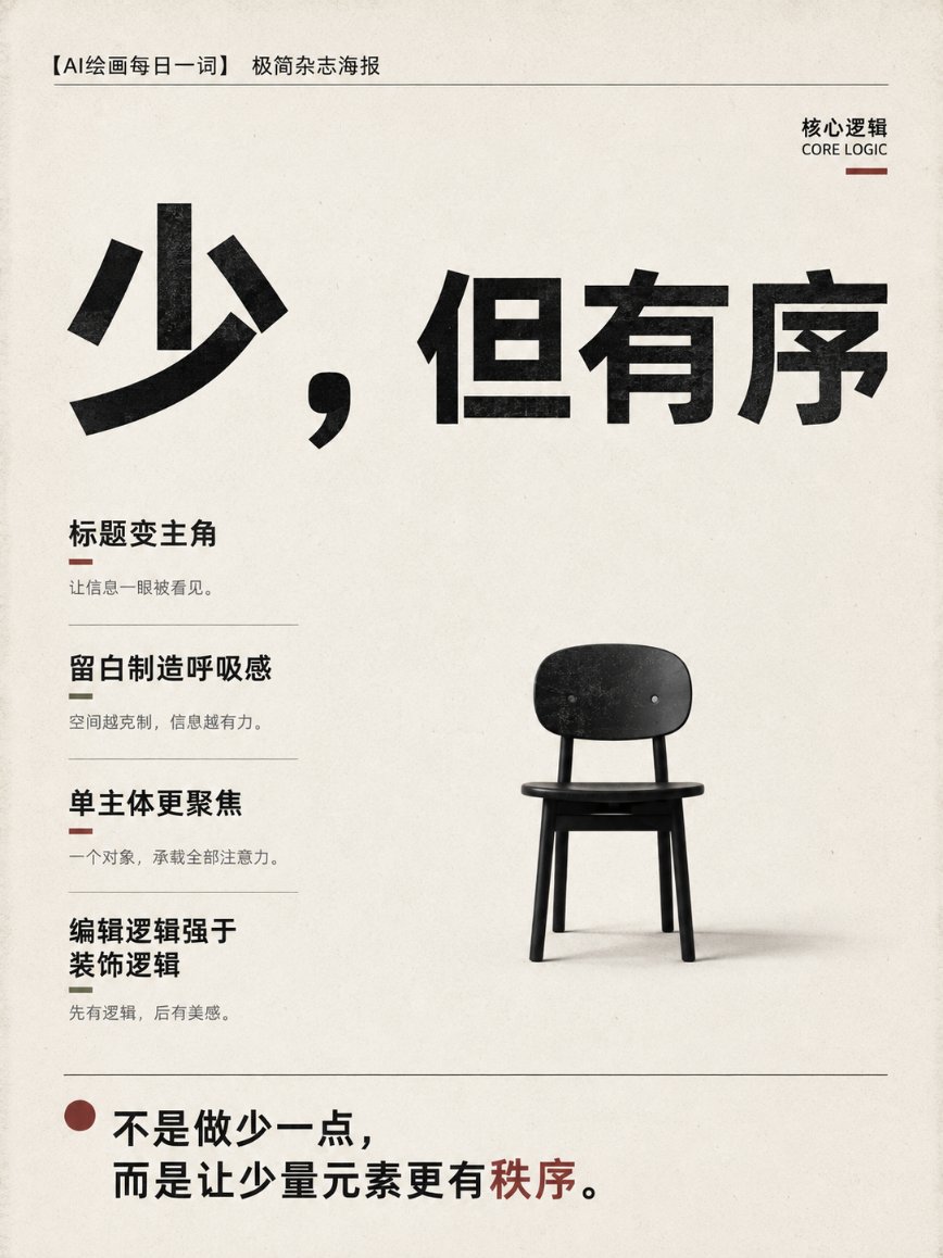
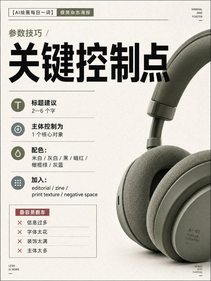
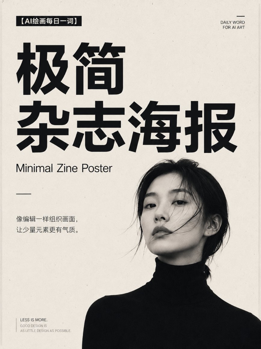
Un único sujeto descansa sobre papel blanco cálido junto a un título enorme de palo seco que se convierte en el ancla visual. Pies de foto pequeños y neutros recogen los detalles del número, y un único color de acento apagado mantiene la portada serena y deliberada.
 Prompt de @derek_wall90176
- Rellena los huecos de abajo.
- Mira cómo se actualiza el prompt a la derecha.
- Cópialo o ábrelo en una herramienta de imágenes.
Prompt de imagen
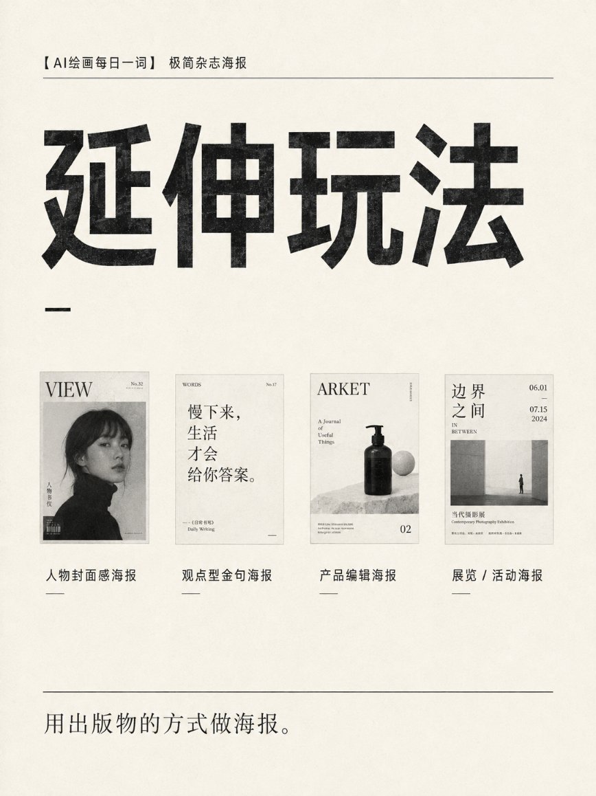
Design a 3:4 vertical "minimalist magazine poster" for [person / product / concept / exhibition theme]. Use an independent design publication cover-style layout, overall restrained, quiet, avant-garde, with a contemporary editorial design feel. The background uses warm white, grayish white, or a low-saturation solid color, preserving large areas of clean white space. Place only one core subject: [person / product / architecture / object / abstract shape]. The subject may be shown in full, or use bold partial cropping, bleeding off the edge, or asymmetric placement, but must keep a clear visual focus. The title uses an oversized bold sans-serif font, becoming the main visual anchor. The title should be 2–6 characters; part of the text may be covered by the subject, extend to the edge, or be arranged asymmetrically, but must remain clearly legible. Auxiliary information uses a small neutral sans-serif font, like a magazine cover's issue number, date, section name, and short description. The information hierarchy is limited to: level 1: giant main title; level 2: the single core subject; level 3: a small amount of auxiliary information. Use a strict Swiss grid system and asymmetric editorial layout. The main color is limited to black, white, gray, and one low-saturation accent color, for example: dark red, olive green, gray-blue, or earthy brown. Add slight paper fiber, ink grain, and print registration offset, but do not over-age it. The image should look like the cover of a limited-edition publication made by an independent design studio, not an ordinary promotional poster. Avoid: stacked elements, complex backgrounds, multiple figures, fancy fonts, gradient glow, metallic effects, cheap tech feel, dense text, decorative stickers, and meaningless graphics. Core formula: one subject + one strong title + large white space + strict information hierarchy.
Prompt compartido en X por @derek_wall90176. Todo el mérito es de su creador.
Más prompts que puedes personalizar
 Tablero de diseño de estudio web japonés estilo nórdico
 Cartel de viaje de calle urbana en línea monocromática estilo line art
 Póster de viaje de línea con la vida callejera de Tokio
 Diseño en blanco y negro de informe de belleza facial
 Guía de lectura de palma en contorno, blanco y negro
 Añade tu fotoPóster del sistema de identidad de marca sobre fondo oscuro
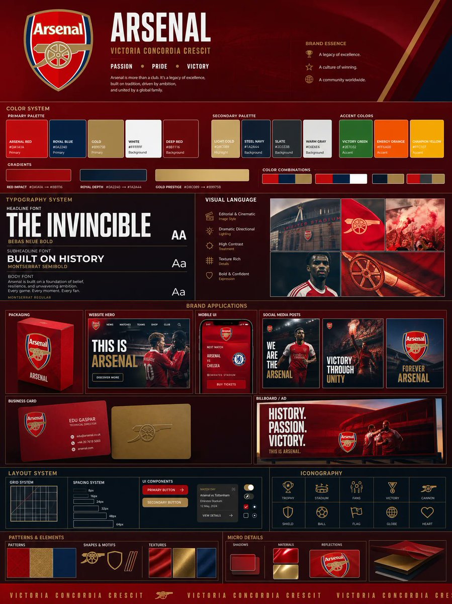 Añade tu fotoTablero de identidad de marca a partir de un logotipo, con paleta y mockups
 Ilustración minimalista de líneas con acentos de color