Prompt de imagen Branding y UI Personalizables
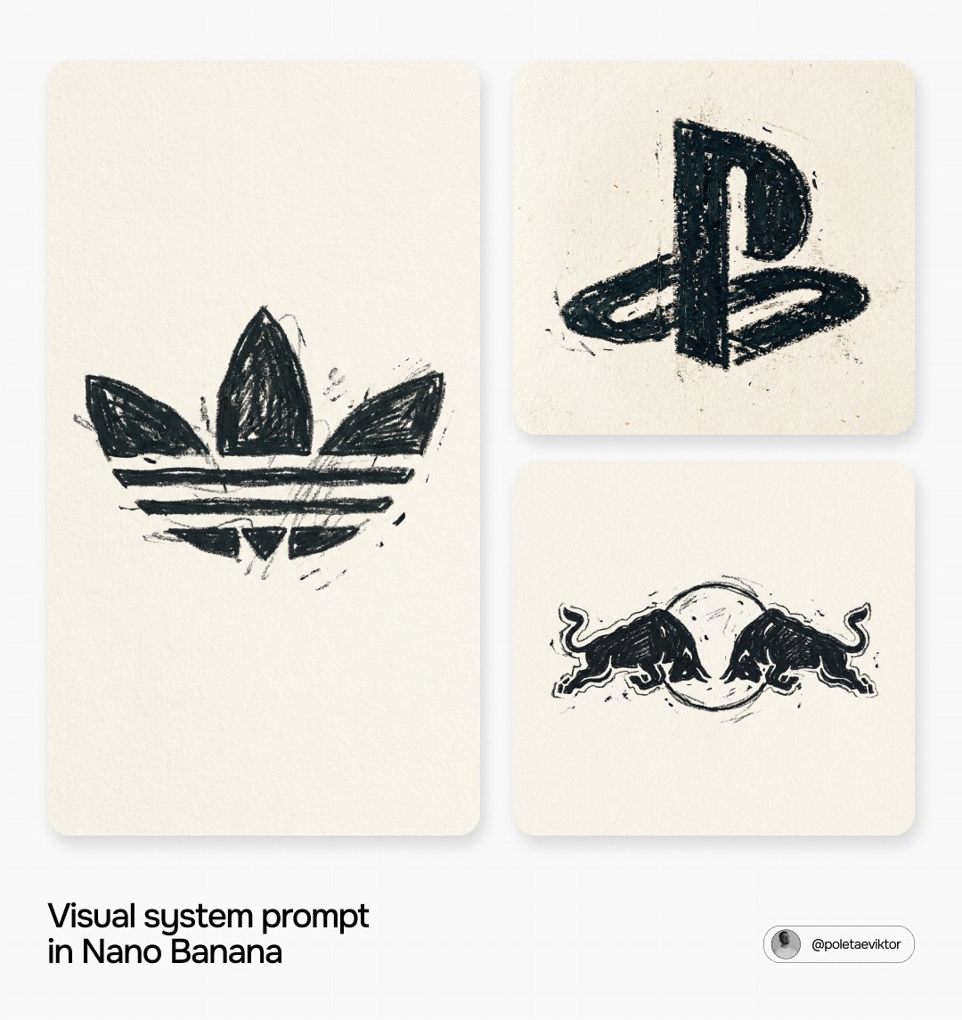
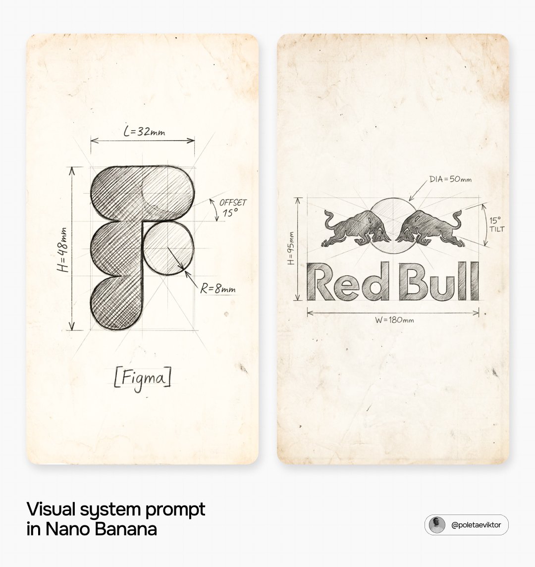
Boceto técnico a lápiz de logotipo de marca sobre papel envejecido
Un logotipo de marca redibujado como un boceto técnico a lápiz hecho a mano sobre papel cálido y desgastado. Unas líneas de construcción ligeras enmarcan la marca, un sombreado cruzado más intenso le da profundidad y unas notas de cotas escritas a mano la rodean como en el dibujo de trabajo de un diseñador.

- Modelo
- GPT Image 2
- Tipo
- Imagen
- Relación de aspecto
- 1:1
- Compartido
- 14 jul 2026
- Me gusta en X
- 21
Nombre de la marca
Prompt de imagen
3,332 caracteres[BRAND NAME]. Act as a Senior Industrial Designer and Technical Illustrator, specializing in pencil engineering sketch reproductions of brand logos (style: hand-drawn technical blueprint/concept sketch on aged paper). PHASE 1: AGED PAPER SURFACE A warm, aged beige-cream paper surface (#E8D5B0 range) filling the entire frame — with visible aging spots, worn patches, scattered pencil smudges, and fine paper grain consistent with a real old technical sketchbook or archival drawing sheet. Subtle vignette darkening at all frame edges. No clean digital white — the paper must read as genuinely old and physical. PHASE 2: LOGO RECONSTRUCTED AS PENCIL TECHNICAL SKETCH (TRUE SHAPE) [BRAND NAME]'s real, official primary icon/logomark is reproduced with full shape and proportional accuracy exactly as it appears in the brand's real guidelines, then rendered entirely as a hand-drawn pencil engineering sketch — as if a designer sketched the logo concept by hand in a technical drawing session. The logo is positioned in the center of the frame, occupying roughly 40–50% of frame height. CRITICAL ACCURACY INSTRUCTION — NON-NEGOTIABLE: Do not invent, approximate, restructure, or substitute the logo with any other imagery. The logo's real geometry and proportions stay exactly as in the brand's real guidelines — only the pencil sketch rendering treatment is applied on top of the unchanged shape. PHASE 3: PENCIL SKETCH TECHNIQUE (HERO EFFECT) Two distinct pencil layers build the complete illustration: - CONSTRUCTION LAYER (light pressure): thin, precise straight lines forming a rectangular bounding box around the logo's outer dimensions, plus internal diagonal construction/guide lines radiating from key structural points of the logo — all drawn with light pencil pressure, slightly imprecise, with the natural slight waviness of a hand-drawn straight line. - LOGO LAYER (heavier pressure): the logo's actual forms drawn with firmer pencil pressure — clean but hand-drawn contour lines tracing the real logo shape, with dense diagonal crosshatch pencil shading filling the solid/dark areas of the logo to imply volume and depth. Shading direction is consistent (45-degree diagonal strokes), varying in density from light to dark across the form. PHASE 4: TECHNICAL ANNOTATIONS Around the logo, hand-drawn engineering dimension annotations in classic technical drawing style — rendered in thin pencil handwriting: - Horizontal and vertical double-arrow dimension lines with end caps, indicating key measurements (written as plausible dimensions: "L=Xmm", "R=Xmm") - Angle annotations for key diagonal elements (e.g. "10°", "OFFSET X°") - All annotation text in a clean, slightly imperfect hand-lettered technical style — not a printed font, but the careful handwriting of a technical draftsman - 4–6 annotation labels total, positioned logically around the bounding box and key logo elements PHASE 5: COMPOSITION Logo and annotations centered in the frame with generous aged-paper negative space surrounding them, especially above and below. No color, no additional graphic elements — strictly monochrome pencil on aged paper. TECH SPECS: Flat 2D pencil illustration, no 3D, no digital gradients — all tone from pencil pressure and crosshatch density. Monochrome: dark graphite pencil on warm aged paper. Resolution: 8K.
Cómo usarlo
Empieza sustituyendo el nombre de marca entre corchetes por la empresa que quieras dibujar, y comprueba que el modelo trabaja con el logotipo real de la marca y no con una suposición. Se compartió como prompt de GPT Image 2. Mantén el papel, las capas de lápiz y las instrucciones de anotaciones tal como están escritas, ya que son las que aportan el aire de dibujo técnico vintage. Usa el resultado como pieza de ambiente para una presentación de marca, un póster para la pared de un estudio de diseño o una publicación en redes sobre temática patrimonial.
En coleccionesPrompts de IA para diseño de logotipos
Compartido públicamente en X el 14 jul 2026. Todo el mérito de este prompt y de su resultado es de su creador. ¿Es tuyo? Pide que se actualice o se elimine.