Prompt de imagen Branding y UI Personalizables
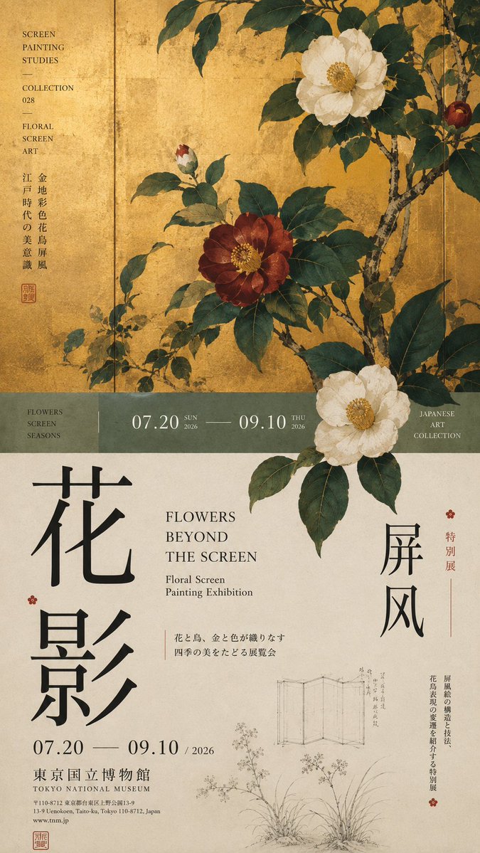
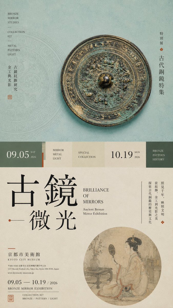
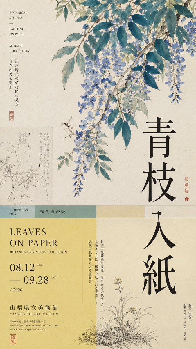
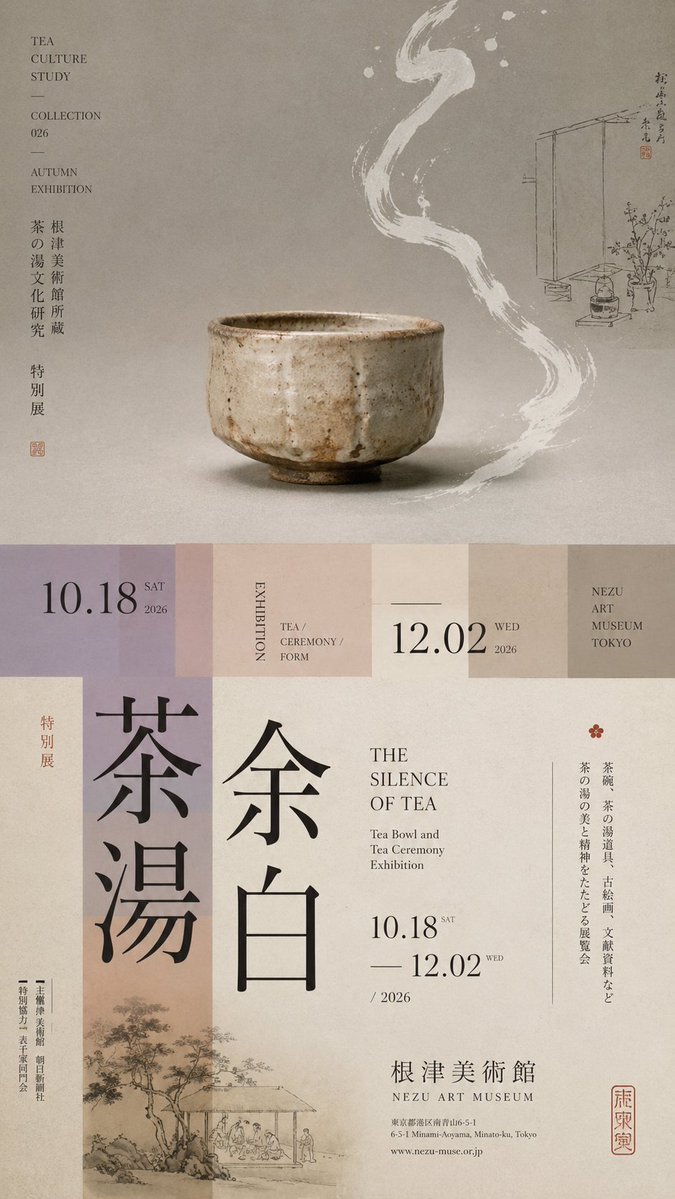
Cartel de exposición con división horizontal y tipografía en capas
Un cartel de exposición vertical 9:16 dividido en zonas desiguales, con una única imagen principal, una franja de transición estrecha y tipografía vertical de gran tamaño. El sujeto cruza la línea de corte para que las mitades superior e inferior se lean como una sola página editorial.

- Modelo
- GPT Image 2
- Tipo
- 4 imágenes
- Relación de aspecto
- 9:16
- Compartido
- 18 ago 2026
- Me gusta en X
- 80
Tema de la exposiciónTítulo en chinoTítulo en inglésFecha y lugar
Prompt de imagen
1,789 caracteresPrompt: 【Theme】: ____ 【Main visual】: ____ 【Chinese title】: ____ 【English title】: ____ 【Auxiliary visual】: ____ 【Main color】: ____ 【Secondary color】: ____ 【Date / Institution】: ____ 【Ratio】: 9:16 Generate a "horizontal-split" poster with a sophisticated Editorial Design and cultural-exhibition character. Don't simply make it "image on top, text on bottom." Divide the layout into 2–3 vertical zones of unequal proportions: main visual zone about 50%–65%, central transition cut about 8%–15%, lower information zone about 25%–40%. Keep only one primary visual core 【main visual】, then add a few low-weight details, such as line art, partial painting, patterns, study diagrams, small collection info, or vertical text, so the whitespace has design density without stealing focus from the subject. In the middle, use low-saturation color blocks, narrow color bands, or information modules to connect the upper and lower zones. The main title participates in the composition through enlargement, vertical setting, offset, or crossing zones; allow the subject to partially cross the cut boundary, creating front-back layers between the zones. Establish a clear text hierarchy: large Chinese title → English title / date → small subtitle → tiny institutional info. Group the small text together, don't scatter it. Keep colors to 3–5 tones, building hierarchy through zone proportions, visual weight, cross-zone relationships, and typography. Key point: the horizontal split is not about cutting the image into two blocks, but about giving the different zones clear roles while reconnecting them through the subject and the text. Museum Exhibition Poster × Editorial Graphic Design—rich but not chaotic, spacious but not empty, with the finish of a real museum poster and art catalogue.
Cómo usarlo
Empieza rellenando los campos entre corchetes de la plantilla, sobre todo el tema, la imagen principal y ambos títulos. Como es una plantilla, conserva las proporciones de las zonas y la estructura de corchetes, porque son las que sostienen la composición; mantén también la frase que permite que el sujeto cruce el límite de corte. Se compartió como prompt para GPT Image 2. El resultado funciona bien como maqueta de cartel para galería o museo, o como portada de un catálogo de exposición.
Compartido públicamente en X el 18 ago 2026. Todo el mérito de este prompt y de su resultado es de su creador. ¿Es tuyo? Pide que se actualice o se elimine.