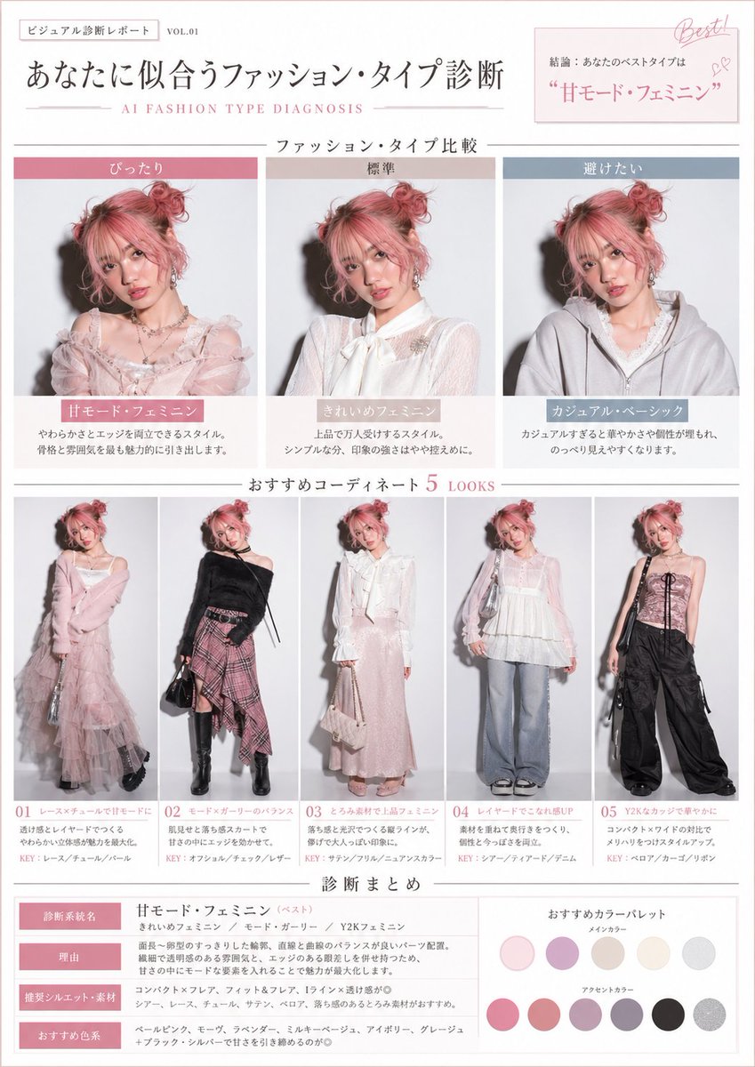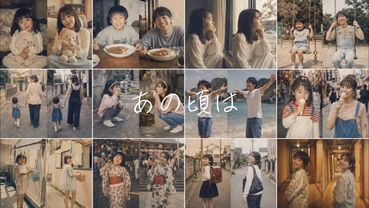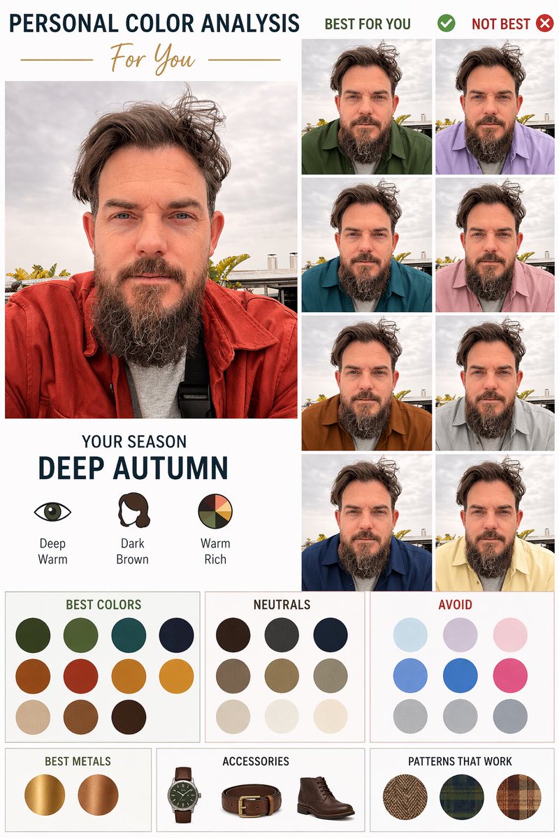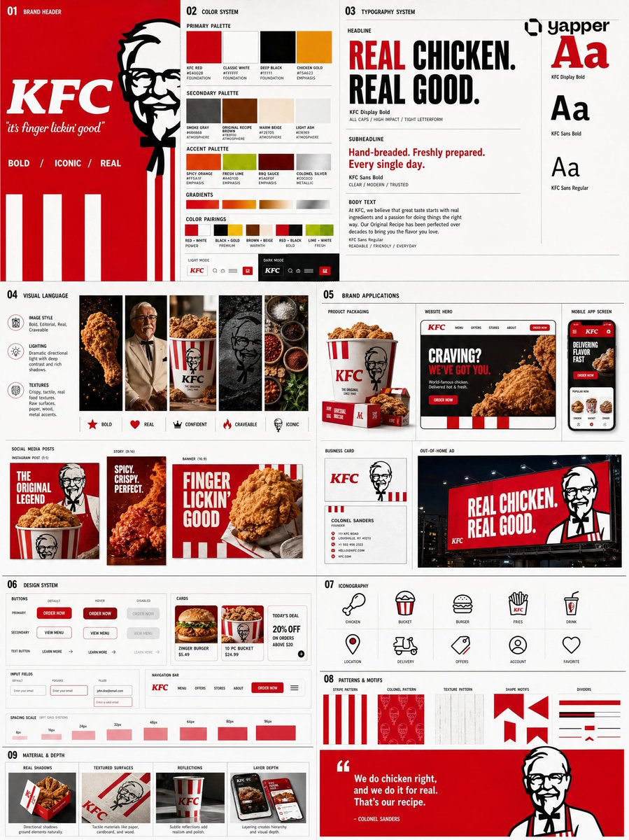
Prompt de imagen Branding y UI Personalizables Añade tu foto
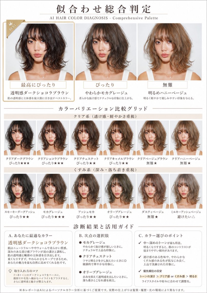
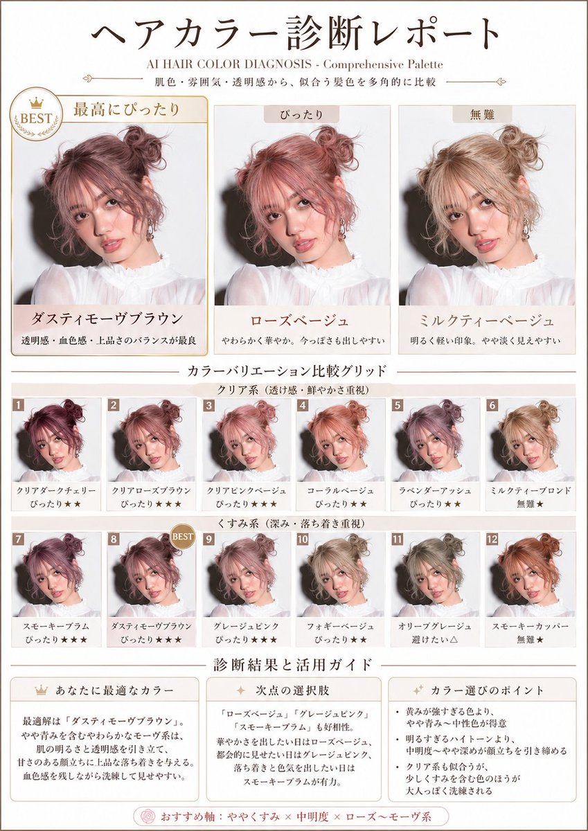
Tabla de paleta de color de pelo a partir de tu foto
Una composición de estilo revista que prueba una gama de tonos de pelo sobre el mismo rostro, de oscuros a claros y de vivos a apagados, y clasifica cada uno de un vistazo. La cuadrícula facilita ver qué tonos favorecen más a la piel.

- Modelo
- GPT Image 2
- Tipo
- 2 imágenes
- Relación de aspecto
- 3:4
- Compartido
- 28 abr 2026
- Me gusta en X
- 730
Texto del titularTamaño del papel
Prompt de imagen
1,962 caracteresBased on the uploaded photo of the person, diagnose the flattering hair colors from multiple angles using skin tone and overall impression, and create a visual report that lets you compare at a glance a rich variety of tones — from dark to light, from clear types to muted types. A4 portrait, beauty-magazine style. White × pale beige base. With the subtitle "AI HAIR COLOR DIAGNOSIS - Comprehensive Palette". Absolutely maintain the identity of the person's face and makeup. Change only the hair color, naturally. Layout: 1. Top: a large comparison of 3 hair colors "Best match / Good match / Safe" Apply different colors to the same person and highlight the single most flattering one. 2. Middle: 【Color variation comparison grid】 (important) In a 2×6 or 3×6 grid, visualize all of the following variations: 【Top row: clear type (emphasis on transparency and vividness)】 - 3 to 4 tones: dark / medium / light 【Bottom row: muted type (emphasis on depth and calmness)】 - 3 to 4 tones: dark / medium / light Add a small rank label to each pattern, such as "Match★★★", "Match★★", "Safe★", "Avoid△" (visualizing relative evaluation with stars). 3. Bottom: 【Diagnosis result and usage guide】 【Your ideal color】 - Objectively explain the characteristics of the highest-rated color in the grid. - Derive why that color suits the person from skin tone, bone structure, and impression. - How to use and make the most of this color. 【Runner-up options】 - Characteristics and use scenes of the colors recommended in 2nd place and beyond. 【Points for choosing colors】 - The person's color aptitude tendency read from the entire grid. - Priority in tone selection (which axis to emphasize). - Flexible options to match lifestyle and preferences. Maintain identity absolutely. Change only the hair color and tone. Give top priority to a grid-format composition that lets you compare multiple patterns at the same time.
Cómo usarlo
Necesita una foto subida de la persona, así que empieza con un retrato nítido y con iluminación uniforme. Se compartió como prompt de GPT Image 2. Mantén la estructura de la cuadrícula y las etiquetas de clasificación, porque sostienen la comparación, y cambia el texto del subtítulo para que coincida con tu marca o título. La hoja final funciona bien como guía de estilo para una visita a la peluquería o como publicación de belleza para compartir.
Compartido públicamente en X el 28 abr 2026. Todo el mérito de este prompt y de su resultado es de su creador. ¿Es tuyo? Pide que se actualice o se elimine.