Prompt de imagen Producto y publicidad Personalizables
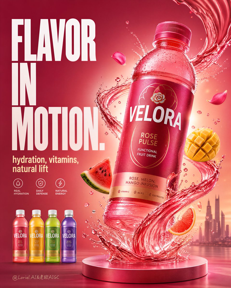
Cartel publicitario del envase de bebida funcional de fruta
Una gran botella de bebida rosa-roja se eleva en diagonal sobre un remolino brillante de líquido, con un titular llamativo apilado a la izquierda y algunos toques de fruta alrededor. La botella sigue siendo el foco principal, iluminada para brillar sobre un fondo cálido que va del magenta al coral.

- Modelo
- GPT Image 2
- Tipo
- Imagen
- Relación de aspecto
- 4:5
- Compartido
- 25 ago 2026
- Me gusta en X
- 7
Nombre de la marcaTexto del titular
Prompt de imagen
5,659 caracteresCreate a flagship advertising poster for an original functional fruit drink brand named "VELORA", merging Transit restraint with Orbit energy. Use ultra-realistic commercial product photography, not illustration, not 3D render. Keep the same structural logic: one oversized hero bottle floating diagonally in the right-center as the absolute visual focus, a giant stacked English headline block on the left, one controlled liquid vortex rising from a pedestal at the bottom and wrapping around the bottle, a restrained number of fruit pieces and splash fragments orbiting around the product, a small four-SKU lineup in the lower-left area, and a minimal atmospheric city silhouette in the far lower-right background. The final image must feel like a Cannes-level FMCG beverage campaign: radiant, premium, high-energy, but highly controlled. Style lock: high-end beverage advertising, ultra-clean product-first hierarchy, bold editorial typography, luminous liquid dynamics, vivid tropical-luxury palette, premium studio realism, globally launch-ready hero visual. Core composition: one large translucent pink-red beverage bottle dominates the right half of the frame, slightly tilted for impact, rising above a single sculpted liquid column that starts from a circular pedestal base. The bottle must be dramatically larger than every supporting element. On the left side, place an oversized stacked headline in bold condensed English type, taking most of the upper-left vertical zone. In the lower-left, align four smaller SKU bottles in a clean restrained row. Maintain strong breathing room between the bottle, the text block, and the SKU lineup so the poster feels premium rather than crowded. Transit logic: reduce all unnecessary visual noise. Limit the number of fruit pieces, splash fragments, and icon details. Keep the SKU lineup compact. Shorten supporting copy. Let scale, light, and negative space drive the impact. Avoid a busy retail-flyer look. Orbit logic: build one elegant upward motion path using the liquid vortex and a few precisely placed fruit accents. The eye should move from the pedestal, up through the liquid spiral, around the bottle body, and out toward the upper-right glow. The motion must feel smooth, forceful, and concentrated, not chaotic. Product concept: redesign the hero drink as an original botanical-functional fruit beverage called "VELORA Rose Pulse", with subtle subtext such as "functional fruit drink" and "rose, melon, mango infusion". The bottle should feel shelf-ready, modern, elegant, and energetic, with a matte-gloss label system, white primary wordmark, refined gold line-art detailing, and crisp cap/rim surfaces. The liquid inside should look lightly translucent, vibrant, and fresh. Lighting: use bright commercial key light from upper front-left with a radiant back glow behind the bottle to create halo separation and premium translucency. Add crisp rim highlights on the bottle shoulders, cap, condensation droplets, and liquid edges. Shadows remain soft, clean, and minimal. The background glows warmly while preserving clear bottle readability. Liquid and motion: create one glossy pink-red liquid vortex that spirals upward from the pedestal and wraps around the bottle in a clean S-curve. Add realistic splash crowns, a few suspended droplets, refracted highlights, and only minimal crystal-like liquid fragments. The motion must feel physically coherent, elegant, and premium. Fruit and ingredient cues: include only a restrained set of sharply lit premium fruit accents such as one watermelon wedge, one mango cube, one citrus slice, and a few rose petals. These should support the flavor story without competing with the bottle. Keep each fruit juicy, photoreal, and precisely placed. Typography and layout: use original English text only, never copy any existing wording. Place a bold left-side headline such as "FLAVOR IN MOTION." with a short supporting line like "hydration, vitamins, natural lift". If needed, add a very small row of concise benefit markers below. Keep all type clean, large, architectural, and secondary to the hero bottle. SKU lineup: place four smaller bottles in the lower-left corner, evenly spaced, front-facing, and aligned in the same size family. Each variant should have distinct color coding but remain clearly subordinate to the hero bottle. Keep the lineup compact and clean. Background and atmosphere: use a radiant magenta-to-coral gradient with subtle glow transitions and a faint premium city silhouette in the far lower-right distance. Keep the background luminous and uncluttered. No heavy scenery, no distracting props. Color strategy: dominant rose pink, magenta, coral, warm orange, watermelon red, mango gold, and crisp white typography with subtle gold detailing. Keep saturation bold but disciplined, with premium contrast and strong shelf impact. Quality and physical rules: extremely sharp hero bottle, readable label, correct bottle symmetry, realistic condensation, believable liquid physics, clean typography edges, coherent fruit scale, no muddy shadows, no dead black patches, no clutter, no warped bottle, no excessive elements. The hero bottle must remain the absolute visual center and strongest sales trigger. Negative prompt: copied branding, copied slogan, weak product hierarchy, blurry bottle, unreadable label, fake plastic reflections, warped bottle shape, muddy gradient background, dead black areas, cluttered layout, excessive fruit, oversized SKU lineup, chaotic splash physics, cheap retail flyer aesthetic, cartoon rendering, CGI look, illustration style, low-resolution packaging, product losing dominance.
Cómo usarlo
Mantén la botella como elemento dominante, el remolino que asciende desde la base y la cantidad contenida de trozos de fruta, ya que esas decisiones transmiten la sensación premium de la campaña. Cambia las palabras del titular, el nombre de la marca y los colores de la línea de cuatro botellas para hacerlo tuyo. Se compartió como prompt de GPT Image 2, así que el resultado funciona mejor como imagen de campaña de producto, cartel estilo estantería o anuncio para redes sociales.
Compartido públicamente en X el 25 ago 2026. Todo el mérito de este prompt y de su resultado es de su creador. ¿Es tuyo? Pide que se actualice o se elimine.