Estudio de prompts
Haz tuyo «Diseño de cartel editorial para marcas y eventos»
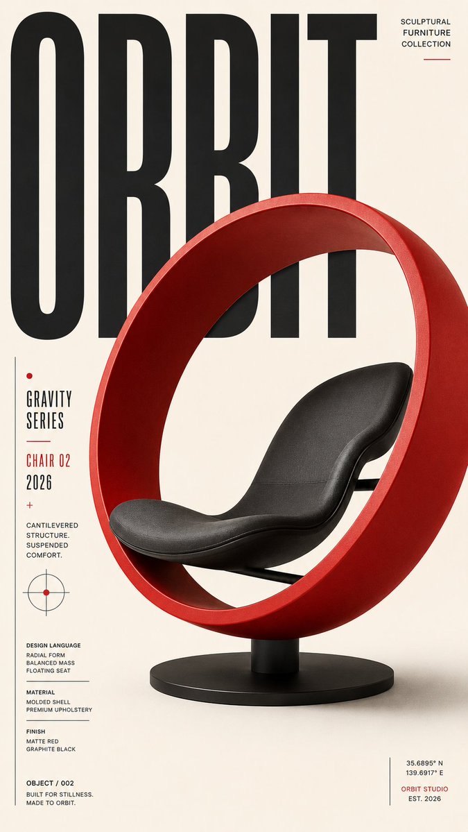
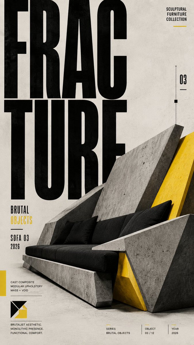
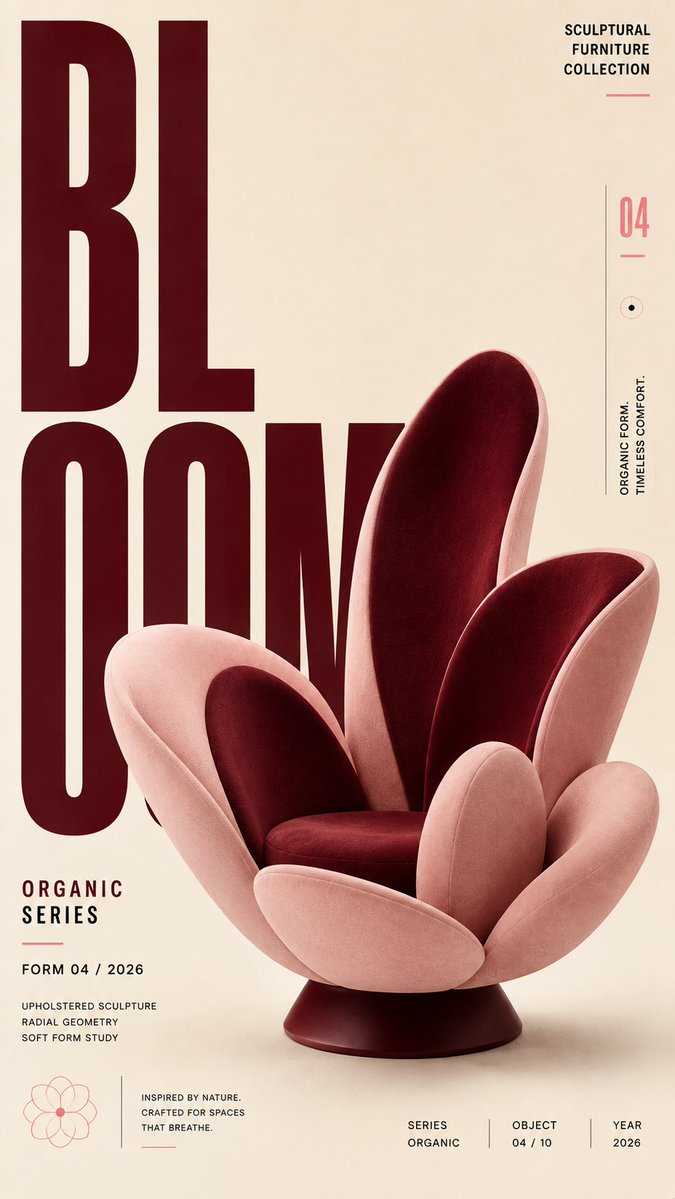
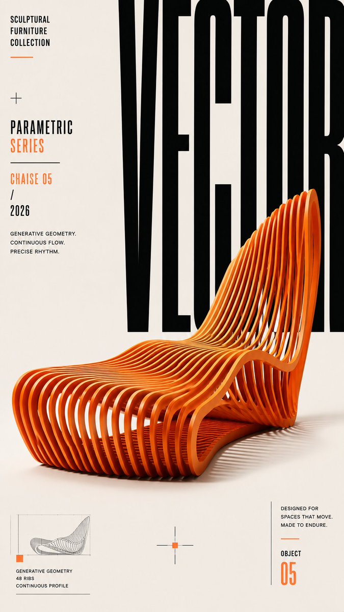
Un cartel editorial alto construido sobre una cuadrícula disciplinada, con tipografía de gran tamaño y un único punto focal dominante. El contraste de escala y el espacio negativo deliberado hacen que el titular se lea de un vistazo, incluso en una miniatura pequeña.
 Prompt de @ShamsAmin56
- Rellena los huecos de abajo.
- Mira cómo se actualiza el prompt a la derecha.
- Cópialo o ábrelo en una herramienta de imágenes.
Prompt de imagen
Create a premium, highly engaging editorial poster for [SUBJECT / BRAND / EVENT / PRODUCT], designed around strong visual hierarchy, intentional composition, and immediate 2–3 second readability. **ART DIRECTION** Style: [Swiss / Brutalist / Bauhaus / Minimal / Editorial / Futuristic / Architectural / Luxury] Create a sophisticated contemporary graphic-design aesthetic rather than a generic advertising layout. Every element must have a clear compositional purpose. **01 — VISUAL HIERARCHY** Establish a clear viewing sequence: 1. Primary: "[MAIN HEADLINE]" 2. Secondary: "[HERO SUBJECT / IMAGE / OBJECT]" 3. Tertiary: "[SUBHEAD / DATE / DETAILS / CTA]" The main message must remain recognizable even when viewed as a small thumbnail. **02 — TYPOGRAPHY** Use typography as an active visual element rather than simple text placement. Use: - Oversized display typography - Strong differences in scale - Tight, intentional kerning - Controlled line spacing - Strategic cropping - Stacking and vertical alignment - Selective text/subject overlaps - Typographic masking where appropriate Use maximum 1–2 complementary typefaces. Primary typography: [BOLD CONDENSED / GROTESK / SERIF / CUSTOM] Secondary typography: clean neutral sans-serif. Keep all important text accurately spelled, readable, and professionally typeset. **03 — COMPOSITION** Build the poster using a disciplined editorial grid. Create: - One dominant focal point - Strong alignment - Clear margins - Asymmetrical balance where appropriate - Controlled tension - Intentional negative space - One or two elements subtly breaking the grid Avoid placing every element in the center. Balance visual weight across the entire canvas. **04 — HERO VISUAL** Feature [SUBJECT] as the primary visual. Presentation: "[FULL-BLEED / CUTOUT / 3D / PHOTOGRAPHIC / ILLUSTRATED / PAPER-CUT / ABSTRACT]" Integrate the subject with the typography using layering, masking, foreground/background relationships, or controlled overlap. The subject and headline should feel like one unified composition, not an image with text placed on top. **05 — SCALE** Use dramatic scale contrast: Huge: main headline or hero element Medium: secondary information Small: supporting copy Micro: technical/editorial details Avoid using similar sizes for every element. **06 — COLOR** Palette: Background: "[COLOR]" Primary: "[COLOR]" Accent: "[COLOR]" Use a restrained 2–4 color system with one dominant accent. Prioritize strong tonal contrast and readability. **07 — DEPTH & LAYERING** Hierarchy > Typography > Subject > Contrast > Negative Space > Details **AVOID** Generic centered layouts, excessive text, random decorative shapes, weak hierarchy, equal-sized elements, excessive fonts, unnecessary gradients, clutter, illegible typography, arbitrary placement, excessive effects, oversaturation, cheap advertising aesthetics, fake logos, watermarks, duplicated objects, malformed typography, and meaningless micro-text. **OUTPUT** Aspect ratio: "[4:5 / 2:3 / 3:4 / 9:16 / 16:9]" Quality: ultra-high-resolution, print-quality finish Layout: balanced from all edges with deliberate margins and professional spacing.
Prompt compartido en X por @ShamsAmin56. Todo el mérito es de su creador.
Más prompts que puedes personalizar
 Tablero de diseño de estudio web japonés estilo nórdico
 Cartel de viaje de calle urbana en línea monocromática estilo line art
 Póster de viaje de línea con la vida callejera de Tokio
 Diseño en blanco y negro de informe de belleza facial
 Guía de lectura de palma en contorno, blanco y negro
 Añade tu fotoPóster del sistema de identidad de marca sobre fondo oscuro
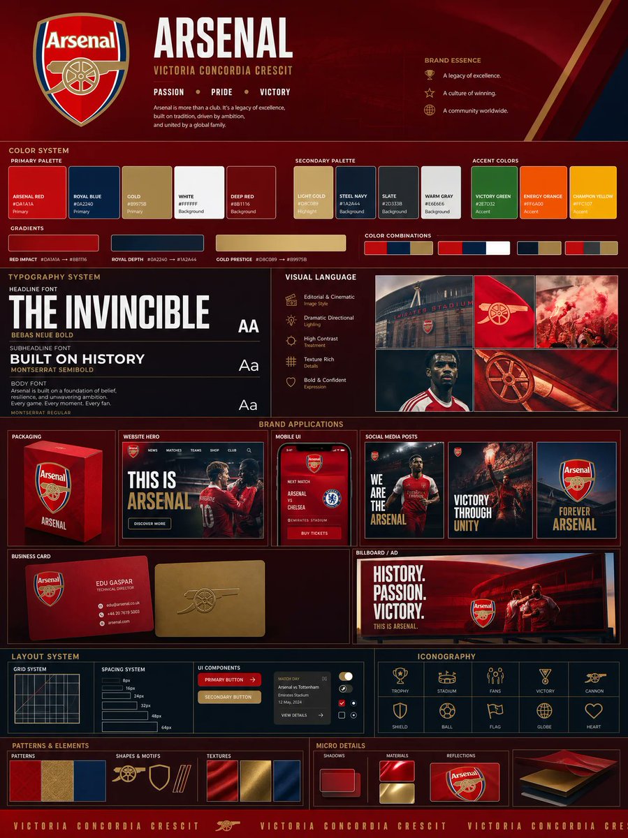 Añade tu fotoTablero de identidad de marca a partir de un logotipo, con paleta y mockups
 Ilustración minimalista de líneas con acentos de color