Estudio de prompts
Haz tuyo «Cartel cultural de tipografía con matriz de puntos»
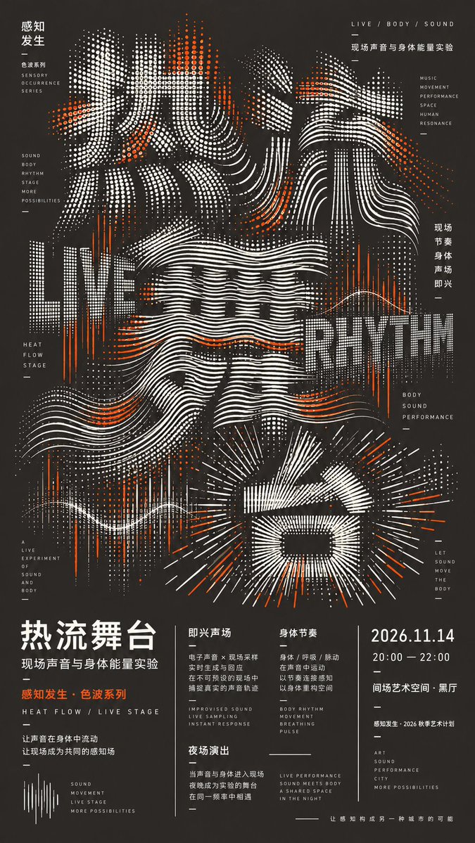
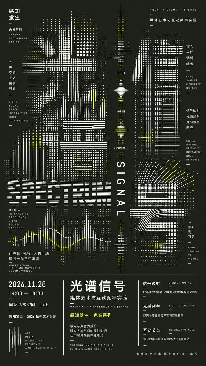
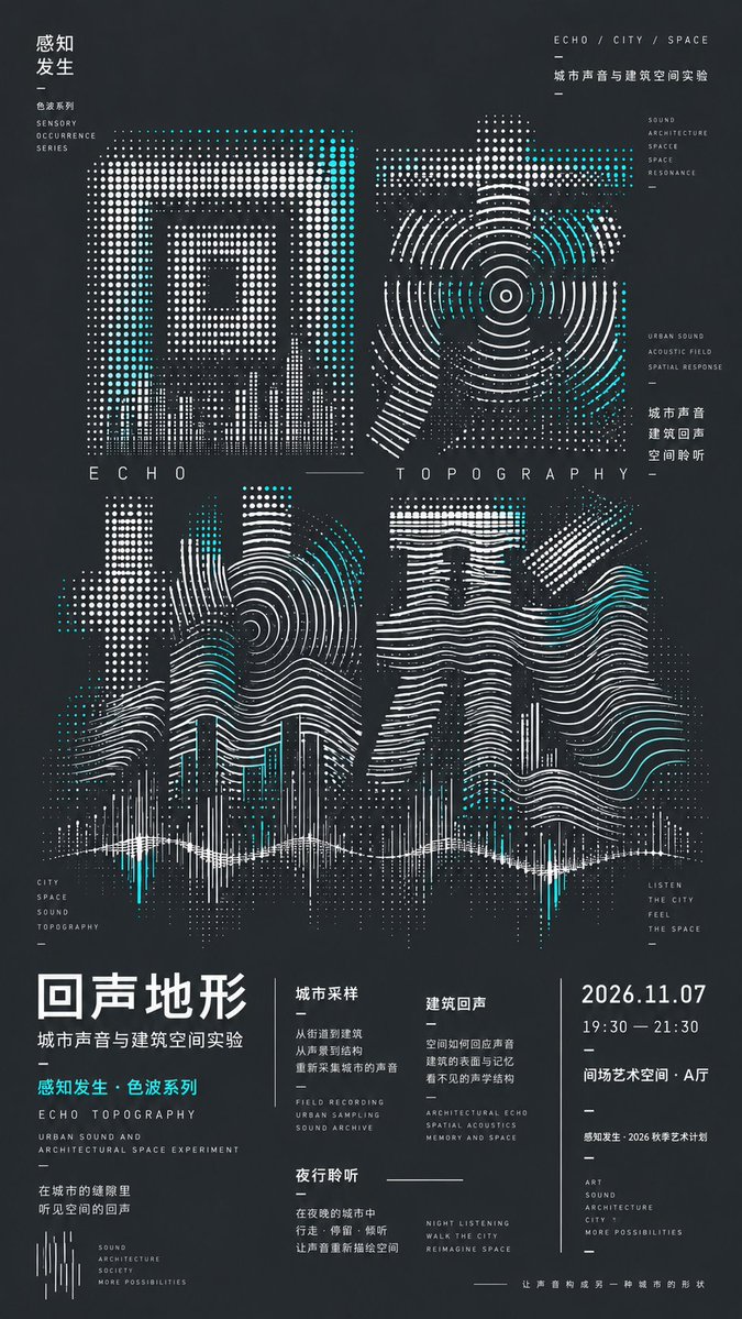
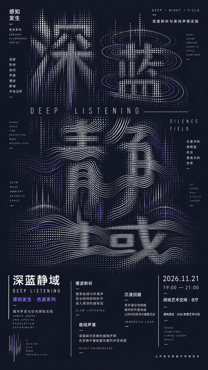
Un cartel cultural oscuro en el que el título principal se reconstruye con matrices de puntos, arcos, ondas y cuadrículas radiales en lugar de tipografía convencional. Las letras se suavizan y se disuelven en los bordes, de modo que la rotulación se percibe como textura desde lejos y como detalle de cerca.
 Prompt de @MrLarus
- Rellena los huecos de abajo.
- Mira cómo se actualiza el prompt a la derecha.
- Cópialo o ábrelo en una herramienta de imágenes.
Prompt de imagen
Prompt: 【Main title】: 【Theme】: 【Series name】: 【Background color】: 【Accent color】: 【Dot/line mechanism】: 【Secondary text】: 【Event information】: 【Aspect ratio】: default 9:16 Design a high-density experimental typography culture poster. Do not simply add effects to ordinary fonts; instead, use dot matrices, arcs, ripples, radial lines, grids, or scan lines to directly reconstruct the【Main title】. Different characters use different but related dot/line mechanisms, forming a continuous variation, e.g. dot matrix → arcs → ripples → radial / grid. The main title occupies about 65%–70% of the frame. Letterforms are created through density, line spacing, curvature, compression, stretching, and partial disappearance, allowing a slight sacrifice of legibility in exchange for stronger design impact. Add distinctly multi-layered typography: a huge Chinese main title + larger Chinese and English keywords + tiny editorial text + complete event information. Text at different scales must genuinely participate in the composition, not just serve as explanation. Use a dark background, light main graphics, and a single【Accent color】. The accent color is used only on local nodes and keywords, kept restrained. At the bottom, keep a complete editorial information area with varied column widths, slight misalignment, partial vertical typesetting, and dividers of differing lengths, avoiding even four columns or a PPT / UI-card feel. Overall it should be dense yet orderly, with continuous dots and lines and rich text hierarchy — striking from afar, detailed up close. Do not add photography, people, 3D, neon, random gibberish, QR codes, watermarks, four-point star sparkles, or page numbers. Output only one complete 9:16 poster.
Prompt compartido en X por @MrLarus. Todo el mérito es de su creador.
Más prompts que puedes personalizar
 Añade tu fotoPóster dividido con foto y miniatura isométrica de papel
 Póster de fútbol del Mundial 26 por capas
 Ilustración de revista de moda anime en amarillo y negro
 Ilustración minimalista de portada de revista de moda japonesa
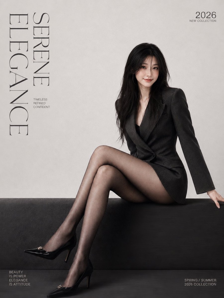 Añade tu fotoPóster minimalista de portada de revista de moda con tipografía serif
 Añade tu fotoPóster de serigrafía gestalt dividido con figura Morandi
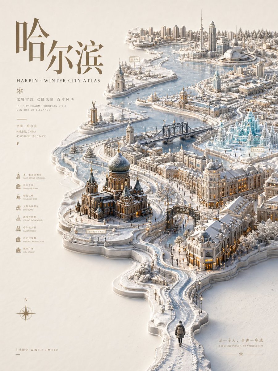 Póster atlas de ciudad en relieve con mapa en miniatura de temporada
 Estilo de póster impreso pastel tipo risograf