Estudio de prompts
Haz tuyo «Tarjetas troqueladas de mostrador con recomendaciones de platos»
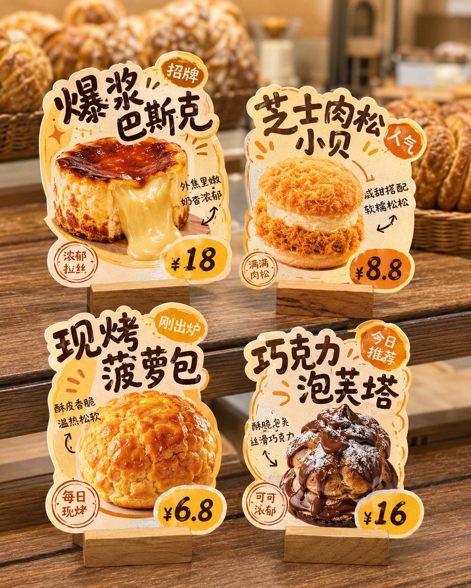
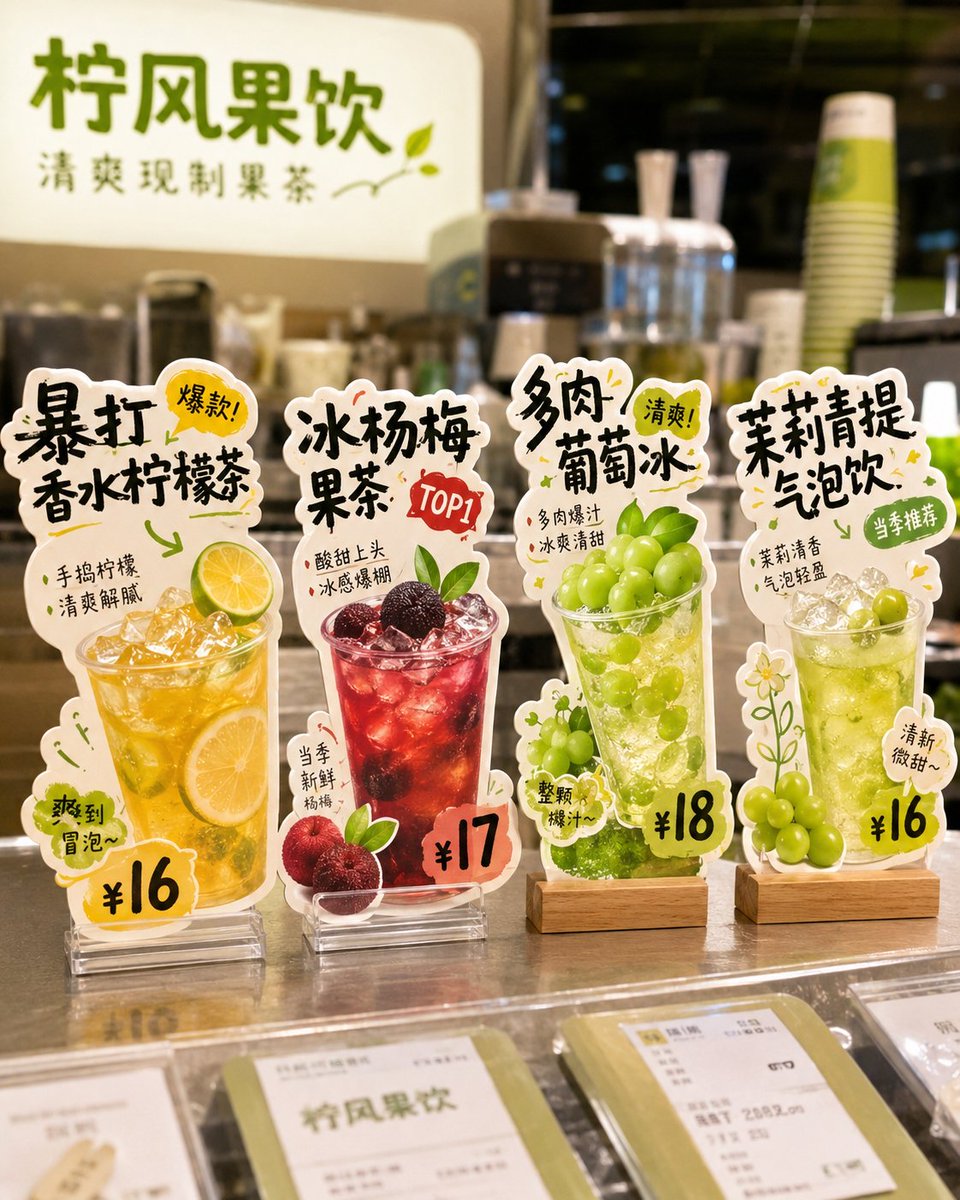
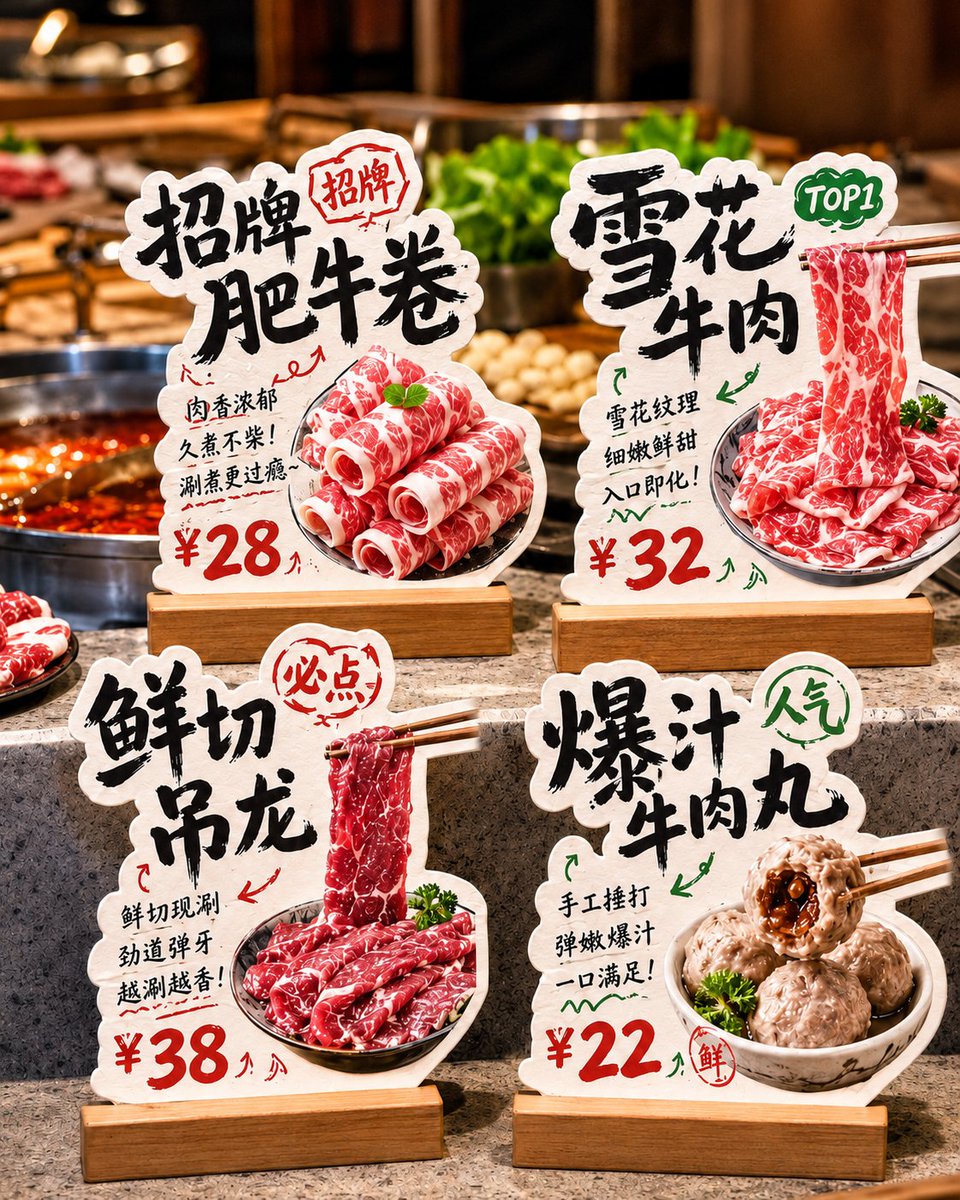
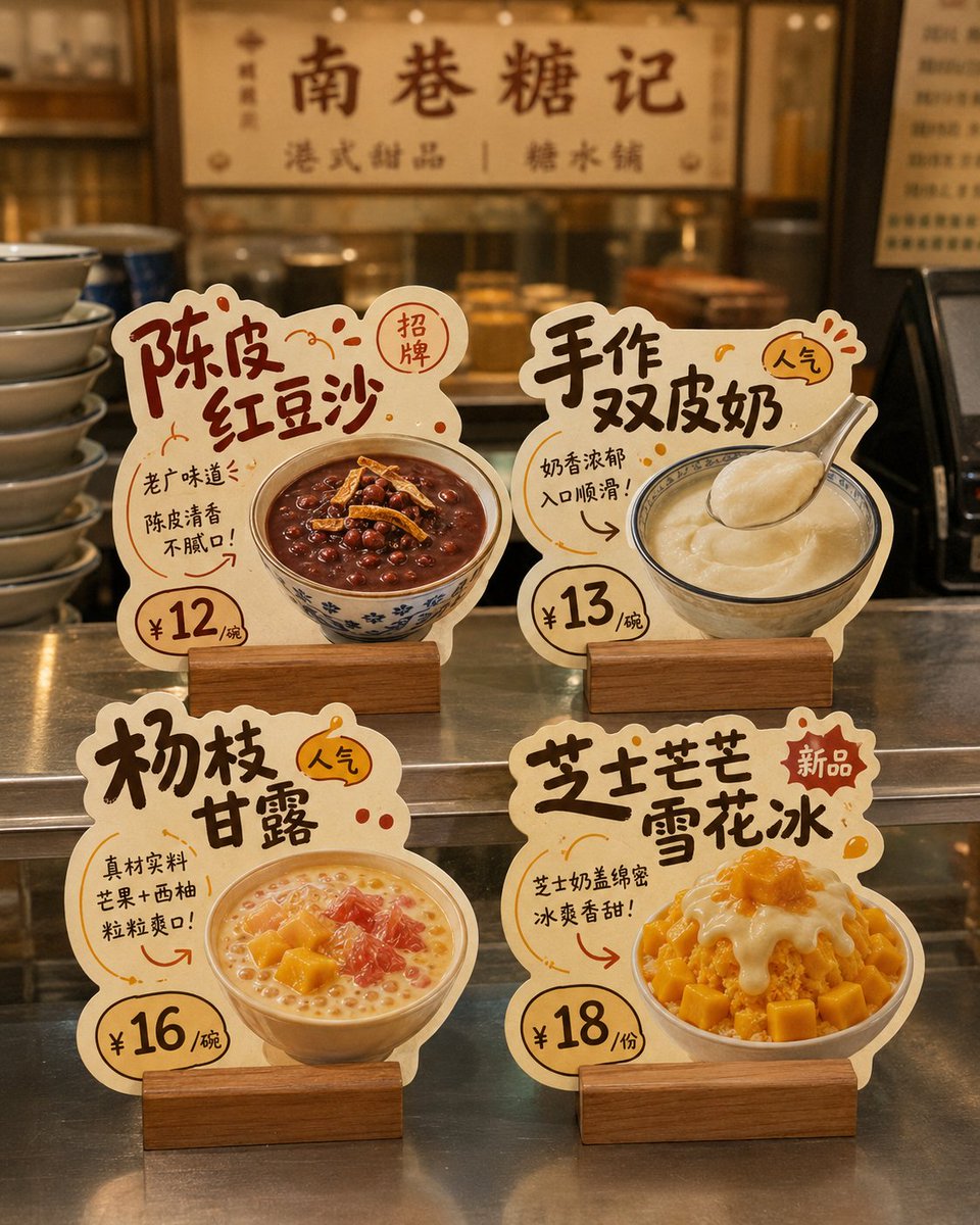
Cuatro displays de cartulina independientes sobre un fondo blanco liso, cada uno con un plato, su nombre, su precio y un breve argumento de venta. Cada contorno está recortado con la forma de su comida, así que el conjunto parece un kit de exhibición de tienda terminado.
 Prompt de @MrLarus
- Rellena los huecos de abajo.
- Mira cómo se actualiza el prompt a la derecha.
- Cópialo o ábrelo en una herramienta de imágenes.
Prompt de imagen
Generate a design showcase image of "store die-cut tabletop cards." The background must be pure white, and the whole thing is intended for later cutout and individual splitting. Core requirement: This is not a real-scene store poster or a scene display image, but a white-background layout image. The image shows 4 independent "store die-cut tabletop cards / dish recommendation standees / hit-product recommendation cards," so each card can be cut out and used separately later. Design around the following: Brand name: [brand name] Store type: [type, e.g., hotpot restaurant / dessert shop / tea drink shop / bakery / snack shop / café] Overall style: [style, e.g., handwritten POP feel / down-to-earth liveliness / fresh fruit-drink feel / Hong Kong-style dessert feel / warm bakery feel / cute and healing] Main color: [color direction] Product list: 1. [product 1] / [price 1] / [selling point 1] 2. [product 2] / [price 2] / [selling point 2] 3. [product 3] / [price 3] / [selling point 3] 4. [product 4] / [price 4] / [selling point 4] Image requirements: 1. The entire image has a pure white background, clean, simple, unobstructed; no store environment, no tabletop scene, no holding hands, no people, no prop backgrounds. 2. Show 4 independent tabletop cards in a 2×2 arrangement, with a tidy and clear layout, enough spacing between them, no overlap, for easy individual cutout. 3. Each card must be fully presented, with clear edges, a defined outline, and a strong die-cut feel, not an ordinary rectangular card. 4. Each card centers on a single product, highlighting the food's main visual, product name, price, short selling point, and tags such as featured/new/TOP1/popular. 5. The card style should look like a small recommendation standee a real store would use, commercial and practical, not an illustrated poster or coursework layout. 6. The material should look like thick cardstock die-cut shapes, optionally with a base, but the base should also be simple, complete, and easy to recognize. 7. The typography leans toward handwritten POP feel, bold-title feel, friendly and down-to-earth; you may add a few arrows, stamps, annotations, small tags, and decorative symbols, but not too cluttered. 8. Each card should have strong product recognizability and different die-cut outline variations, designed according to product shape, text flow, and ingredient elements. 9. The food should be appetizing, realistic, and appetite-inducing, suitable for food-service stores. 10. The overall visual must be refined, unified, and complete, like a small set of store die-cut tabletop cards ready to deliver to a client as reference. Special emphasis: - The background must be pure white - Show only 4 cards - No real store scene - No tabletop set design - No complex shadows - Do not assemble into a poster - The focus is that each die-cut card can be cut out individually The final effect should look like: A pure-white-background design showcase image with 4 independent store die-cut tabletop cards neatly arranged, each complete, clear, easy to cut out, and ready to be split and used directly.
Prompt compartido en X por @MrLarus. Todo el mérito es de su creador.
Más prompts que puedes personalizar
 Modelo en contrapicado sosteniendo un producto para anuncio
 Añade tu fotoStoryboard de marca de producto en cuadrícula 3x3
 Foto de producto de pegatina de vinilo holográfica con logotipo de marca
 Añade tu fotoCartel de campaña de streetwear con camiseta de fútbol en estilo editorial de lujo
 Maqueta de matriz de puntos de contacto de marca para restaurante
 Anuncio infográfico de estuche de auriculares con texto llamativo
 Foto de producto cenital sobre superficie con textura
 Añade tu fotoRetrato de producto a la hora dorada con destello arcoíris