Estudio de prompts
Haz tuyo «Set de carteles de mano troquelados para promociones de tienda»
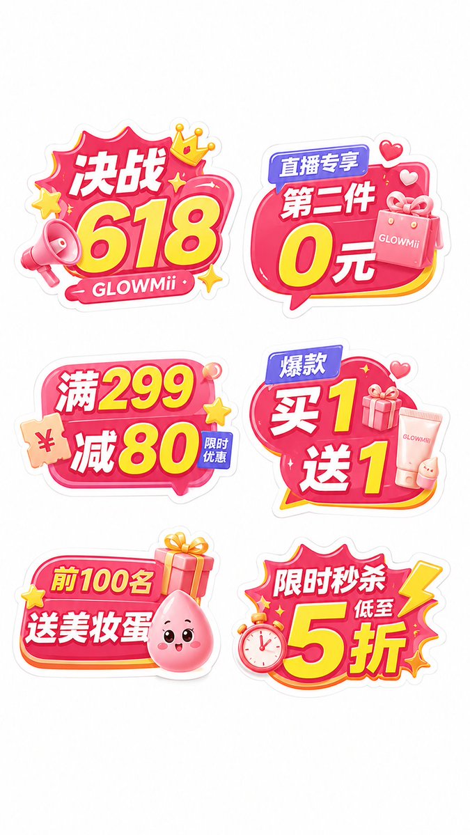
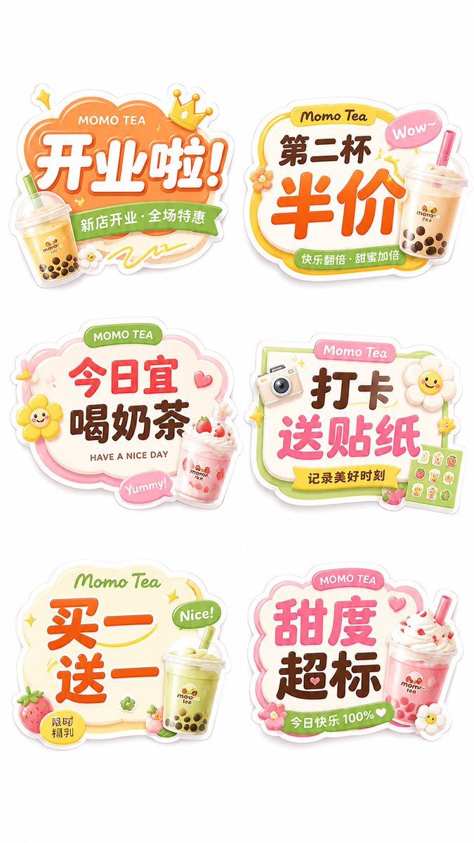
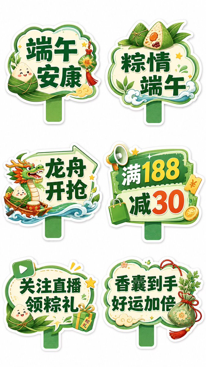
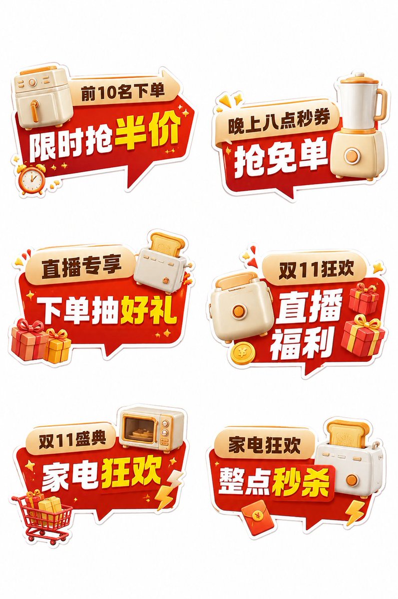
Seis carteles de mano troquelados e independientes sobre un fondo blanco limpio, cada uno con su propio contorno, desde globos de diálogo hasta marcos en forma de rayo. La tipografía promocional en negrita se sitúa sobre iconos 3D en capas, de modo que el set parece utilería física de cartón pluma lista para fotografiar.
 Prompt de @MrLarus
- Rellena los huecos de abajo.
- Mira cómo se actualiza el prompt a la derecha.
- Cópialo o ábrelo en una herramienta de imágenes.
Prompt de imagen
Show 6 standalone hand-held signs in a single image, each fully visible, separated from one another, not overlapping, not merged into one big board; use a clear 2-column × 3-row layout, comfortable white space, and a clean white background that highlights each sign. Each case is its own single image; do not combine multiple cases together. Overall style: reference high-completion commercial promotional hand-sign materials, with a mature commercial feel, originality and strong detail; not crude, not too flat, not like kindergarten stickers. Each sign must have a clear multi-layer structure: thick white outer outline, colorful die-cut main baseplate, inner highlight outline, slight 3D dimensionality, moderate shadow, local gradients, rich but uncluttered small 3D icons, large main message, and auxiliary small labels. The whole should look like real, producible KT-board / PVC die-cut hand signs, with complete edges, sturdy structure, suitable for die-cutting and for being held by hand for photos. The palette revolves around the [main color], paired with [secondary color] and [accent color], eye-catching, unified, with event atmosphere. Don't use a single color and don't be too plain. Icon elements revolve around the [industry/scene keyword], and may include [icon1], [icon2], [icon3], [icon4], [icon5], etc., to enhance the event feel and finished-product feel. Generate the following 6 standalone sign texts, each with a more fitting die-cut contour and icon configuration: 1.[text1] 2.[text2] 3.[text3] 4.[text4] 5.[text5] 6.[text6] The 6 signs must vary in shape, not all look the same. Flexibly use: speech bubbles, dialog boxes, burst frames, arrow frames, rounded-label frames, coupon frames, product-shape frames, lightning frames and other die-cut contours, while keeping a unified series feel. The font must be a bold Chinese promotional logotype style, with the main message clear and legible from a distance; if the text contains numbers, discounts, prices, quantities, gifts or other benefit points, those numbers and keywords must be clearly enlarged as the visual center. Key emphasis: the whole set should look like a hand-sign material kit really used in [application scenario], with both photo check-in appeal and promotional-spread and commercial-landing feel. Avoid: too flat, too crude, children's-sticker feel, six identical cloud frames, too few icons, no layering, no commercial event feel, weak text, looking like an ordinary electronic decal rather than a physical hand sign. Final output requirements: high definition, white background, vertical 9:16, 6 standalone hand signs shown within a single image, rich in detail, strongly original, good-looking and suitable for later reference production.
Prompt compartido en X por @MrLarus. Todo el mérito es de su creador.
Más prompts que puedes personalizar
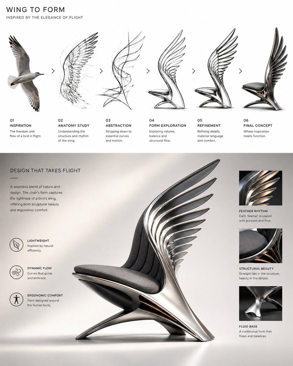 Evolución del diseño de una silla escultórica con ala de pájaro
 Prompt de póster publicitario surrealista de taza de café
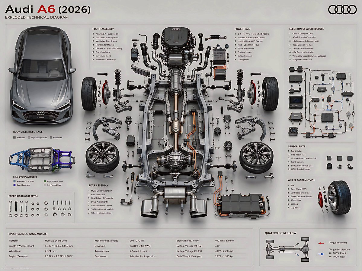 Póster de diagrama técnico del Audi A6 desmontado
 Añade tu fotoCartel publicitario de lujo flotante del director creativo
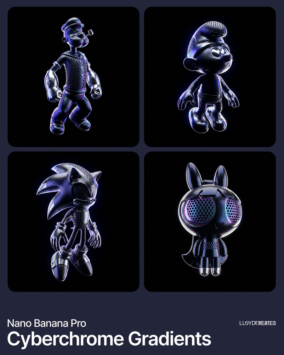 Render de producto flotante en cromo y obsidiana sobre negro
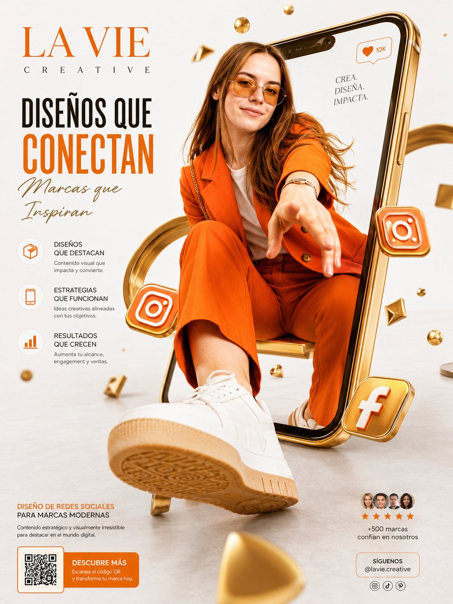
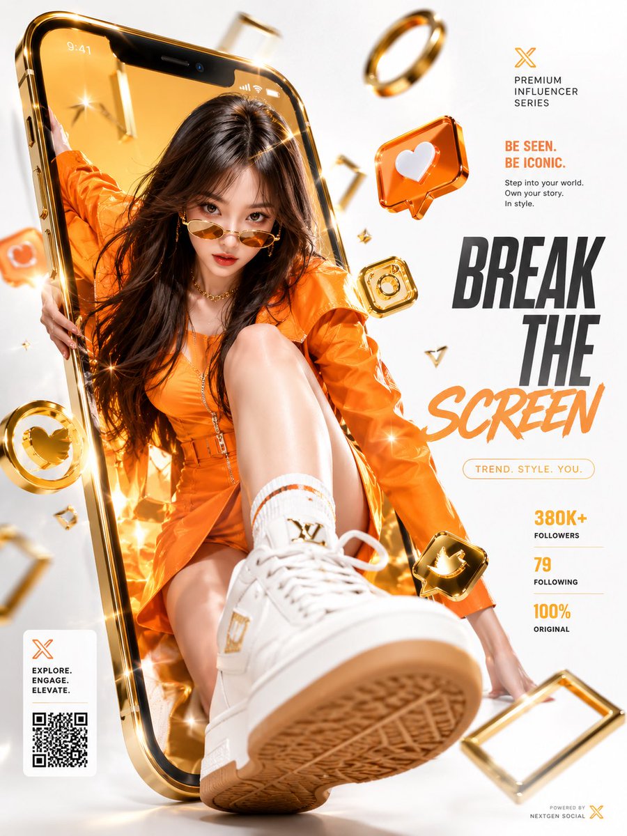 Añade tu fotoMujer saliendo de un móvil dorado en un cartel publicitario
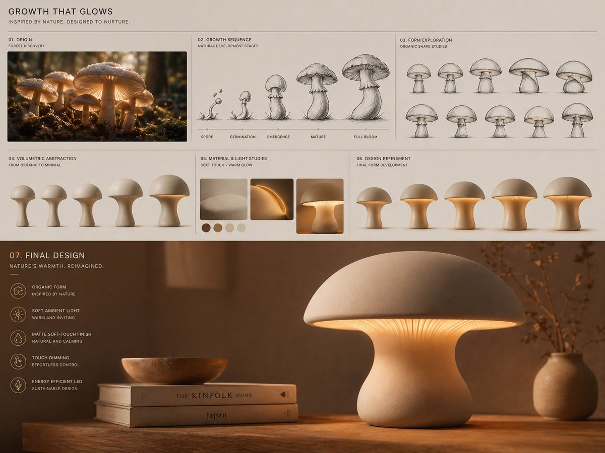 Del crecimiento de un hongo a una lámpara de mesa ambiental: tablero de diseño
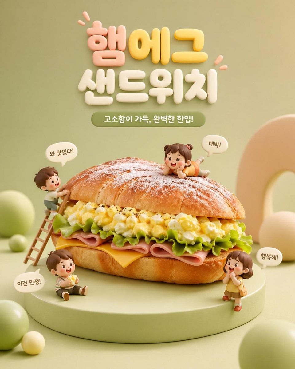 Escena de sándwich gigante con diminutos personajes chibi