Prompt de imagen Branding y UI Personalizables
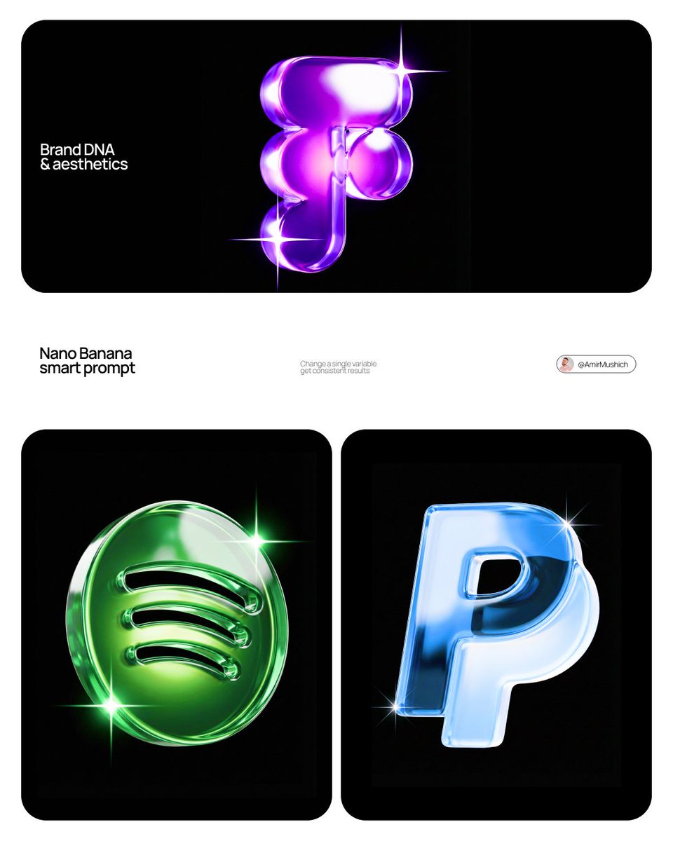
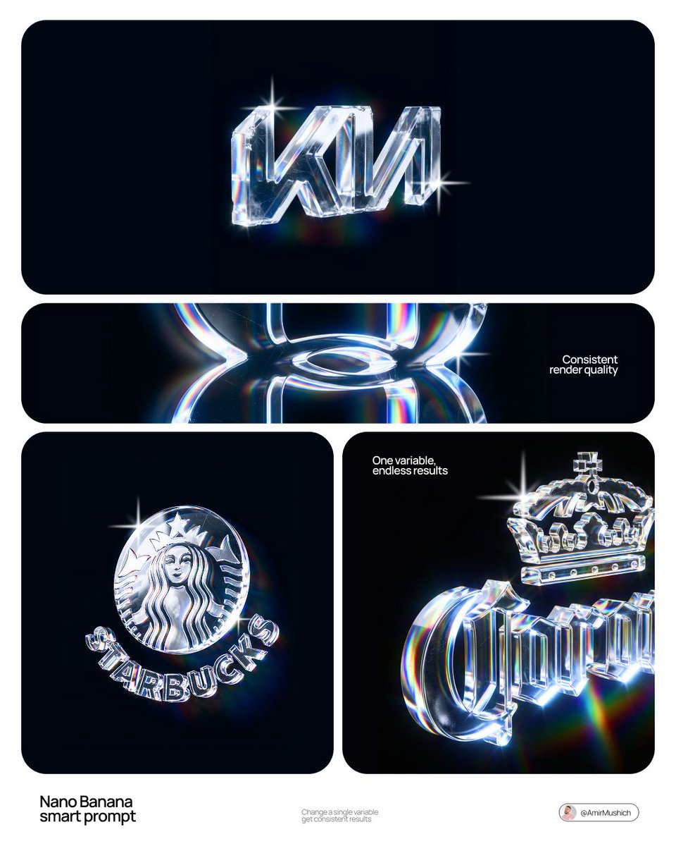
Tipografía de logo 3D de cristal con dispersión óptica
Un logotipo de marca tallado en cristal óptico, con una dispersión arcoíris que recorre cada letra y arañazos y desconchados leves que muestran que el vidrio se ha manipulado. Sobre un fondo negro parece un objeto físico y precioso.

- Modelo
- GPT Image 2
- Tipo
- Imagen
- Relación de aspecto
- 4:5
- Compartido
- 4 jun 2026
- Me gusta en X
- 331
Nombre de marca
Prompt de imagen
8,637 caracteres[BRAND NAME] Act as a CGI Optical Physicist and 3D Type Sculptor creating a hero crystal typography visual for a luxury brand campaign. References: James Turrell light installations, optical physics photography, Rick Owens × crystal aesthetics. PHASE 0: BRAND LOGO INTELLIGENCE Retrieve the 100% canonical, trademark-accurate logotype of [BRAND NAME] from training data — this is non-negotiable. Reproduce the exact proprietary typeface or custom lettering: every stroke weight, every curve tension, every terminal detail, every unique glyph modification. Do not substitute with a similar font — decode the actual trademarked letterform geometry. If [BRAND NAME] has a primary symbol or emblem — place it above or integrated with the wordmark exactly as in the official logo lockup. Fidelity test: a brand lawyer must recognize this as the correct logo, not an approximation. PHASE 1: CRYSTAL MATERIAL SYSTEM The canonical logotype of [BRAND NAME] is a fully 3D sculptural object made entirely of optical crystal glass — not metal, not plastic, not rubber. Material: optical borosilicate glass or synthetic crystal, IOR 1.85 to 2.1, maximum dispersion coefficient. The letterforms have physical volume and thickness — cross-section is consistent throughout each stroke, like letters carved from a single block of optical glass. Surface finish: polished to sub-micron smoothness on primary faces — all major faces mirror-flat and fully refractive. Edges between faces are sharp and precise — maximum chromatic dispersion occurs here. The material is optically pure in its core — zero bubbles, zero inclusions in the interior volume. CRITICAL — WEAR & IMPERFECTION SYSTEM: The crystal has been handled — it carries the history of physical existence. Apply these surface imperfections with restraint and realism, never overwhelming the dispersion beauty: micro-scratches — a sparse network of hairline scratches on the front and top faces, depth 0.01 to 0.05mm equivalent, visible only when light catches them at specific angles. They scatter light slightly, creating a faint matte haze in the scratch zone while surrounding surface remains mirror-clean. Scratches follow organic directional patterns — some parallel, some crossing, as if from handling and storage, never uniform or grid-like. Edge chips — 2 to 4 very minor edge micro-chips along the sharpest edges and corners, each no larger than 0.5mm equivalent. These tiny imperfections catch light differently than clean edges — they create micro-flare events, small irregular sparkles where a chip breaks the otherwise perfect edge geometry. Surface haze zones — 1 to 2 small irregular areas of very fine surface abrasion, like the glass has been lightly scuffed by contact with another hard surface. These zones appear as subtle frosted patches, 3 to 8% opacity maximum — barely visible, discovered rather than obvious. They slightly diffuse the refraction beneath them, softening the rainbow bands in that micro-zone only. Fingerprint ghosts — optional, extremely subtle — 1 partial fingerprint trace on one face, visible only as a very faint oily interference pattern when light hits at oblique angle. Adds humanity to the object. All imperfections are surface-level only — the interior crystal volume remains optically perfect. The wear says this object is precious and real, not freshly manufactured. PHASE 2: LIGHT & DISPERSION SYSTEM Single collimated light source entering from upper-left at 35° — focused, high-intensity, like a precision studio spot or filtered sunlight. As light passes through the crystal letterforms it undergoes full chromatic dispersion — splitting into the complete visible spectrum following Snell's law geometry with maximum physical accuracy. Dispersion behavior on faces: each polished face simultaneously reflects and refracts — where light exits or reflects, a full spectrum appears in strict physical order red → orange → yellow → green → blue → violet. Rainbow bands are sharp and laser-clean at their origin edges, softening and widening as they travel across faces. Micro-scratch zones interrupt the rainbow bands locally — creating fine scattered light filaments branching off the main dispersion paths. Internal reflections: light bounces between letter faces creating crossed and layered rainbow patterns inside the volume — letters glow from within, nearly dark at the core, exponentially brighter toward illuminated faces. Multiple internal reflection paths create 3 to 5 distinct rainbow events visible simultaneously inside each major letterform. Edge glow: every sharp edge emits thin intense white-blue luminous line from total internal reflection — edge chips create micro-flare interruptions at their locations, bright irregular sparkles punctuating the otherwise continuous edge glow. Chromatic aberration at all edges: red fringe on one side, blue-violet fringe on the other — physical dispersion, not decorative filter. The 3/4 angle reveals front face and top face simultaneously — each face receives different dispersion patterns, creating layered optical complexity. Top face rainbow pattern and front face rainbow pattern intersect at the top edge of each letterform, creating a zone of maximum spectral density. PHASE 3: BACKGROUND Background: pure absolute black (#000000 to #050505) — a light-absorbing void, no texture, no gradient, no reflected light. The crystal letters float in darkness — no surface beneath, suspended in void. No ambient light reaching the background. The only light in the image exists within and immediately around the letterforms. Dispersed rainbow light creates a very subtle colored haze in the immediate 2 to 4cm radius around each letter — soft spectral glow bleeding into the black void. Beyond that: absolute darkness. The letters are the sole light source in the scene. The micro-scratch haze zones appear as slightly cooler, slightly less luminous areas against the surrounding rainbow glow — their presence is felt rather than explicitly seen. PHASE 4: COMPOSITION CRITICAL — 3/4 ANGLE: The logotype is rotated approximately 5 to 10° on the horizontal axis and elevated 5 to 10° on the vertical axis — a subtle, almost-frontal three-quarter view. The rotation is intentionally minimal — just enough to reveal the physical depth and thickness of the crystal letterforms, suggesting three-dimensionality without dramatically departing from a frontal logo presentation. The logo reads as nearly flat but unmistakably three-dimensional. This angle still reveals the top face of letterforms as a thin luminous sliver — enough to catch a secondary dispersion pattern distinct from the front face, adding optical depth without compositional complexity. Horizontal centering maintained. Logo occupies 60 to 70% of frame width. Full lockup visible if [BRAND NAME] has an emblem above or integrated with the wordmark. Aspect ratio: 1:1 square or 4:5 portrait — autonomously determine best fit for [BRAND NAME] lockup proportions. Full sharp focus across the entire sculpture — no depth of field. Every micro-scratch, every edge chip, every rainbow band in crisp simultaneous focus. Detail resolution: the image must reward close inspection — zooming in 400% should reveal new details not visible at normal viewing distance: individual scratch filaments, micro-chip geometry, secondary internal reflections, fingerprint interference patterns. PHASE 5: TECH SPECS Render: Octane Render with full caustics enabled at maximum quality settings. Ray tracing: minimum 16 bounces — increased from standard to capture all internal reflection events, secondary dispersion paths, and scratch-scattered light filaments. Dispersion: physically accurate wavelength-dependent IOR — full spectral rendering across visible light range 380nm to 700nm, not a color overlay or post-process effect. Scratch rendering: micro-scratches rendered as actual surface geometry displacement, not normal map approximation — true micro-geometry for physically accurate light scattering. Caustics: on at maximum intensity. Subsurface contribution: minimal — glass is not translucent like skin, but edges and thin stroke areas show faint internal light transmission. Anti-aliasing: maximum — every edge, every scratch filament razor clean. Sampling: minimum 2048 samples per pixel — no noise in the blacks, no grain in the rainbow bands. No post-process glow filters, no color grading, no compositing tricks — everything physically rendered from geometry and light. Output feel: the most detailed and physically accurate crystal typography ever rendered. Every imperfection is intentional. Every photon is accounted for.
Cómo usarlo
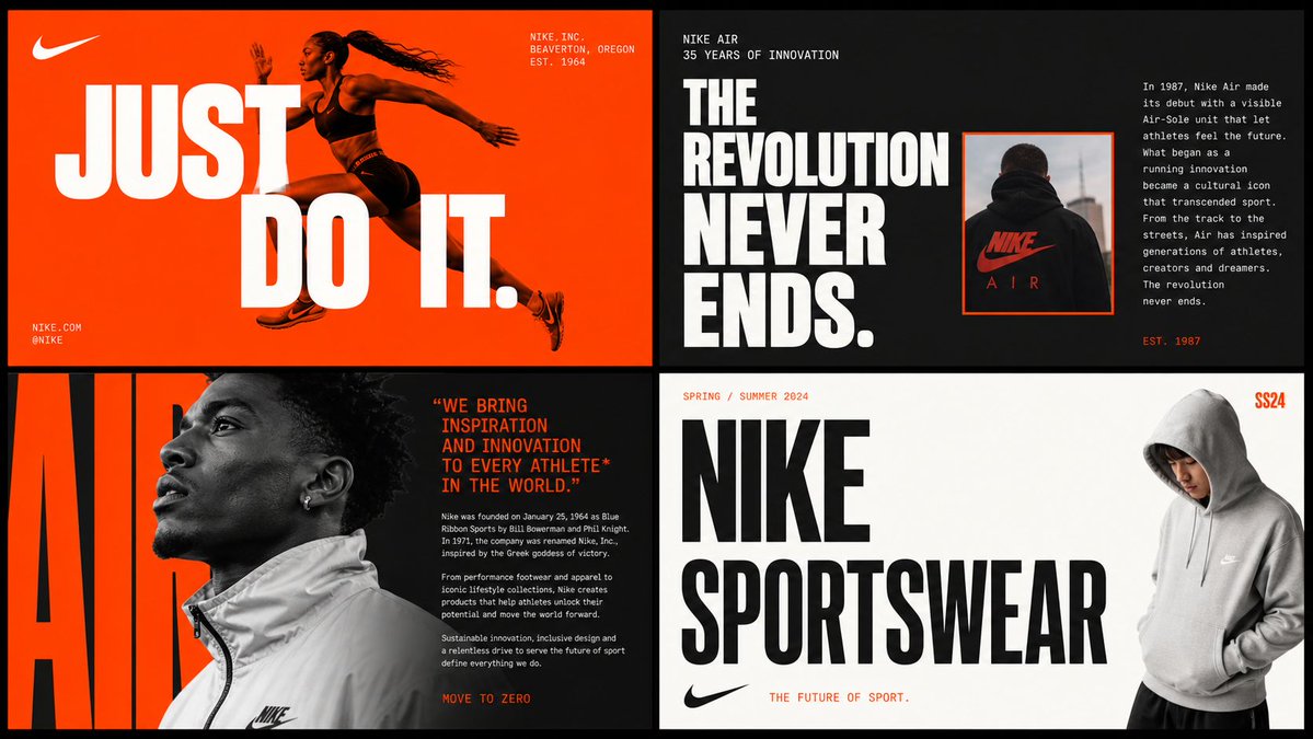
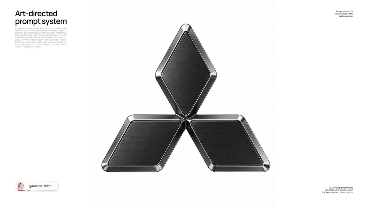
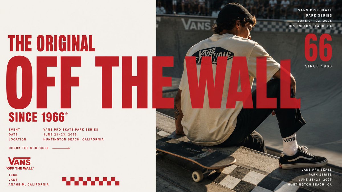
Empieza sustituyendo el nombre de marca entre corchetes por el tuyo y mantén después las instrucciones de material y luz, porque la dispersión y el desgaste son lo que le da su aspecto. El prompt pide reproducir un logotipo real, así que usa tu logo oficial como referencia si la herramienta lo permite y revisa las letras con atención. Se compartió como prompt para GPT Image 2 y el resultado funciona muy bien como imagen principal para el lanzamiento de una marca o una página de producto premium.
Compartido públicamente en X el 4 jun 2026. Todo el mérito de este prompt y de su resultado es de su creador. ¿Es tuyo? Pide que se actualice o se elimine.