Prompt de imagen Producto y publicidad Personalizables
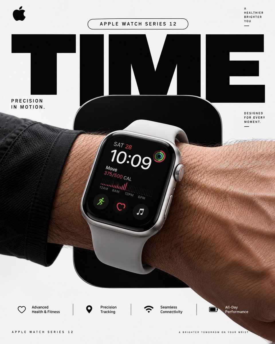
Póster de Apple Watch con tipografía gigante recortada
Un póster vertical de estudio en el que un Apple Watch se sitúa sobre un gran rectángulo redondeado en grafito y un titular TIME sobredimensionado y recortado. La composición recuerda al diseño gráfico suizo, con una paleta contenida de plata y negro.

- Modelo
- GPT Image 2
- Tipo
- 4 imágenes
- Relación de aspecto
- 4:5
- Compartido
- 18 sept 2026
- Me gusta en X
- 149
Nombre del productoEsloganLínea de apoyo
Prompt de imagen
3,368 caracteresAPPLE WATCH SERIES 12 — “TIME MOVES WITH YOU” 4:5 vertical premium poster, 8K, bold commercial layout × Swiss minimalism × photorealistic Apple product advertising 🧠 CORE IDEA: “PRECISION, IN MOTION.” 🎬 LAYOUT: BACKGROUND BLOCK: Solid, uninterrupted Apple-inspired pure white / cool silver field with no environment, no scenery, no objects, no texture. Ultra-clean studio backdrop with subtle tonal depth, controlled architectural shadows and precise geometric contrast. GIANT TYPOGRAPHY: “TIME” in bold oversized black typography, dramatically cropped behind the product. Typography acts as a structural graphic element rather than decoration. 👤 SUBJECT: Athletic human wrist and forearm entering dynamically from the edge of frame. Apple Watch Series 12 worn naturally and realistically. Watch positioned large in the foreground with the display clearly visible. Realistic skin pores, fine arm hair, subtle veins, natural wrist anatomy, physically accurate proportions and believable contact between strap and skin. ⌚ PRODUCT + CONCEPTUAL TWIST: Apple Watch Series 12 becomes the entire visual hero. A single oversized rounded-rectangle cut-out sits directly behind the watch, precisely echoing the Apple Watch’s iconic case geometry. Inside the rounded rectangle: deep graphite black. The watch partially overlaps the shape, creating a strong graphic silhouette and layered depth while keeping the composition completely abstract and environment-free. The rounded rectangle should feel like a giant architectural version of the watch itself. ✨ GRAPHIC ELEMENTS: Oversized rounded-rectangle geometry Giant cropped TIME typography Thin precision measurement lines Minimal technical annotation Small Apple-style microtype Controlled hard-edged shadow Precise alignment grid Generous negative space Subtle silver/graphite accents No decorative clutter ✍️ TEXT SYSTEM: Top pill: “Apple Watch Series 12” Primary supporting line: “Precision in Motion” Small technical microtype: “DESIGNED FOR EVERY MOMENT” BOTTOM FEATURE STRIP: Advanced Health & Fitness Precision Tracking Seamless Connectivity All-Day Performance 🎨 COLOR SYSTEM: Apple White × Graphite Black × Cool Silver Extremely restrained palette. High contrast. No gradients that look artificial. No excessive blue, neon, or colorful effects. 📸 PHOTOGRAPHY: Premium global product advertising photography. Large-format commercial camera aesthetic. 50mm–85mm lens, controlled perspective, extremely sharp product detail. Soft directional key light + controlled studio fill + crisp contact shadows. Physically accurate reflections on glass and metal. Natural skin rendering. High dynamic range. True-to-life materials. 🧠 ANTI-SLOP DIRECTION: No landscape, no architecture, no room, no desk, no clouds, no scenery, no floating objects, no holograms, no particles, no neon, no futuristic interface, no excessive reflections, no fake lens flare, no random props, no unnecessary environmental elements, no distorted wrist, no malformed fingers, no warped watch case, no incorrect strap geometry, no duplicated watch, no unrealistic screen perspective, no CGI appearance. The final image must look like a real Apple global advertising campaign photographed in a controlled studio, combined with sophisticated Swiss graphic design. Clean. Precise. Bold. Product-first. Zero visual clutter.
Cómo usarlo
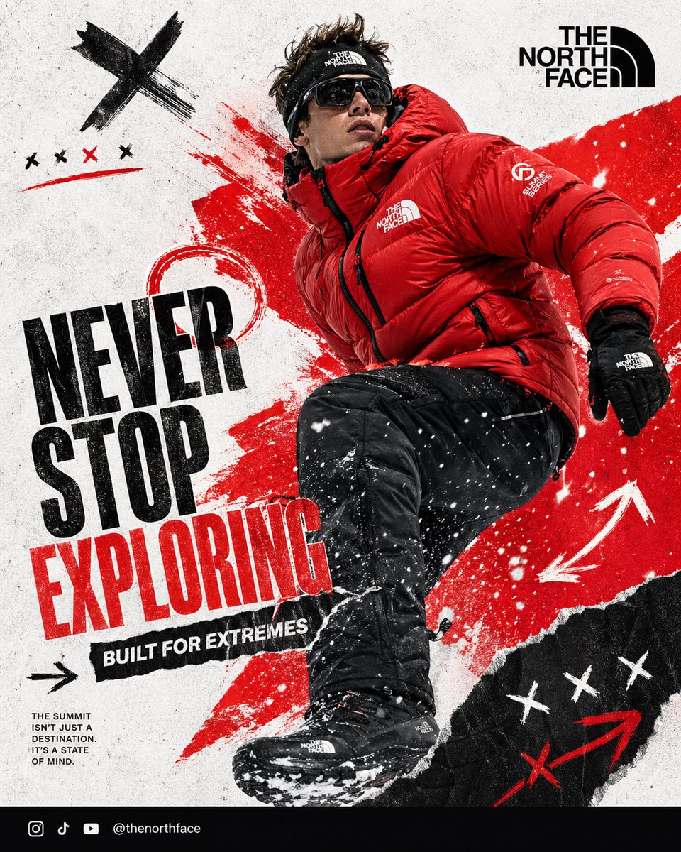
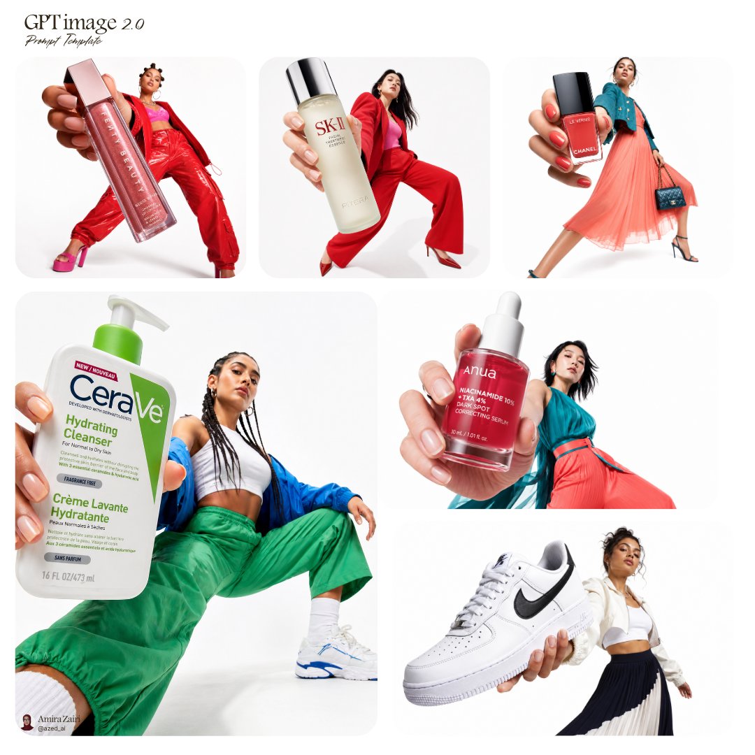
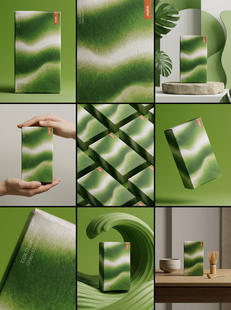
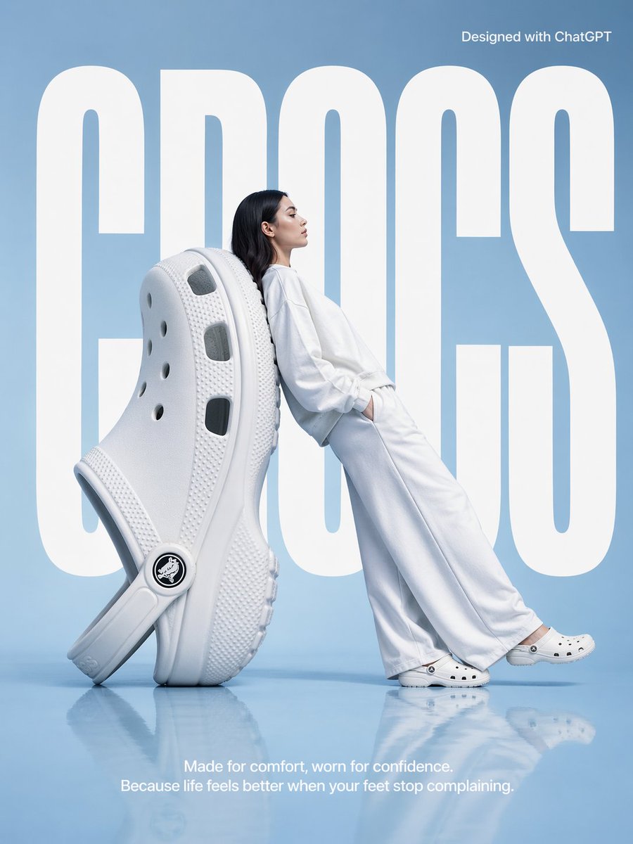
Empieza con una foto de tu muñeca si tienes una, porque el resultado depende de que el brazo parezca entrar creíblemente desde el borde. Puedes cambiar el nombre del producto y la palabra del titular para adaptarlos a tu marca, pero conserva el recorte del rectángulo redondeado y la paleta contenida, ya que sostienen la composición. Se compartió como prompt para GPT Image 2 y encaja en una campaña de producto o en un expositor de tienda.
Compartido públicamente en X el 18 sept 2026. Todo el mérito de este prompt y de su resultado es de su creador. ¿Es tuyo? Pide que se actualice o se elimine.