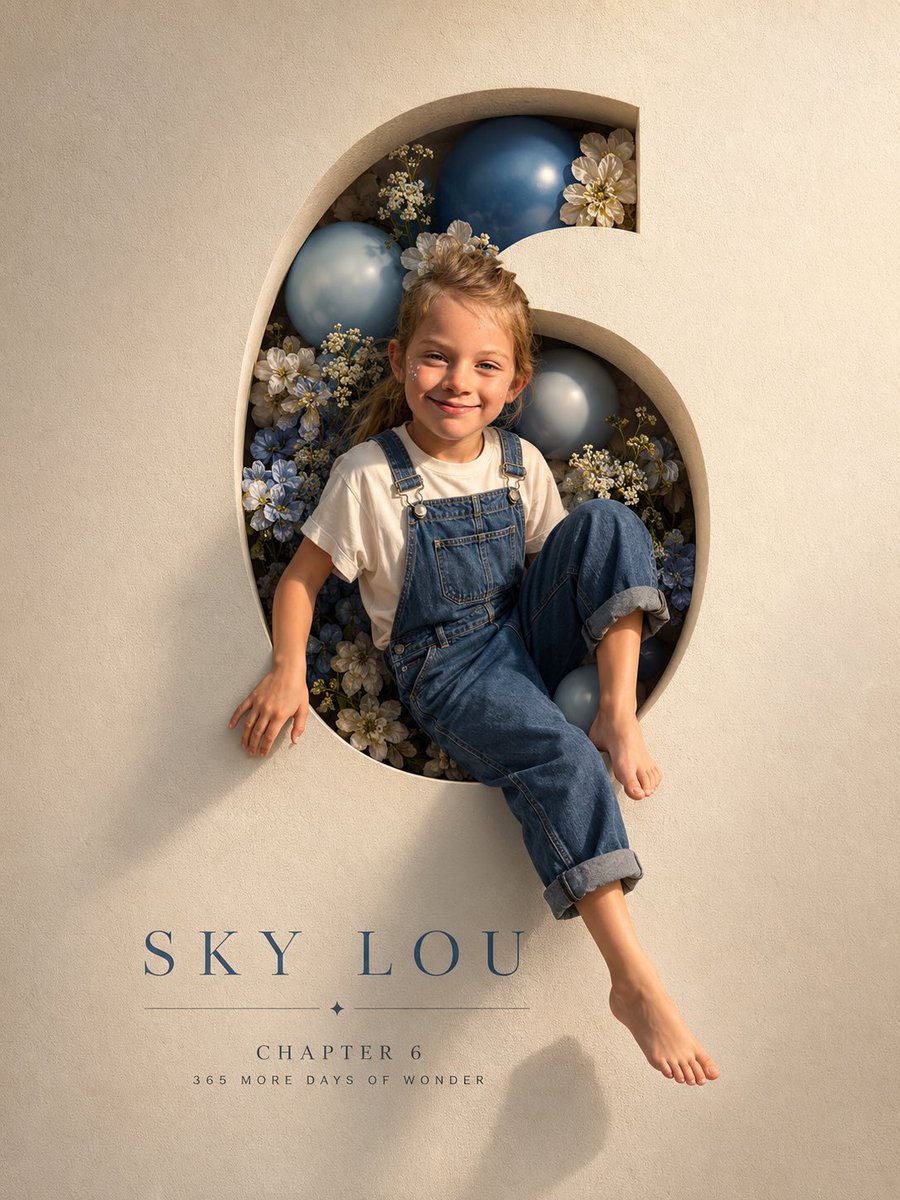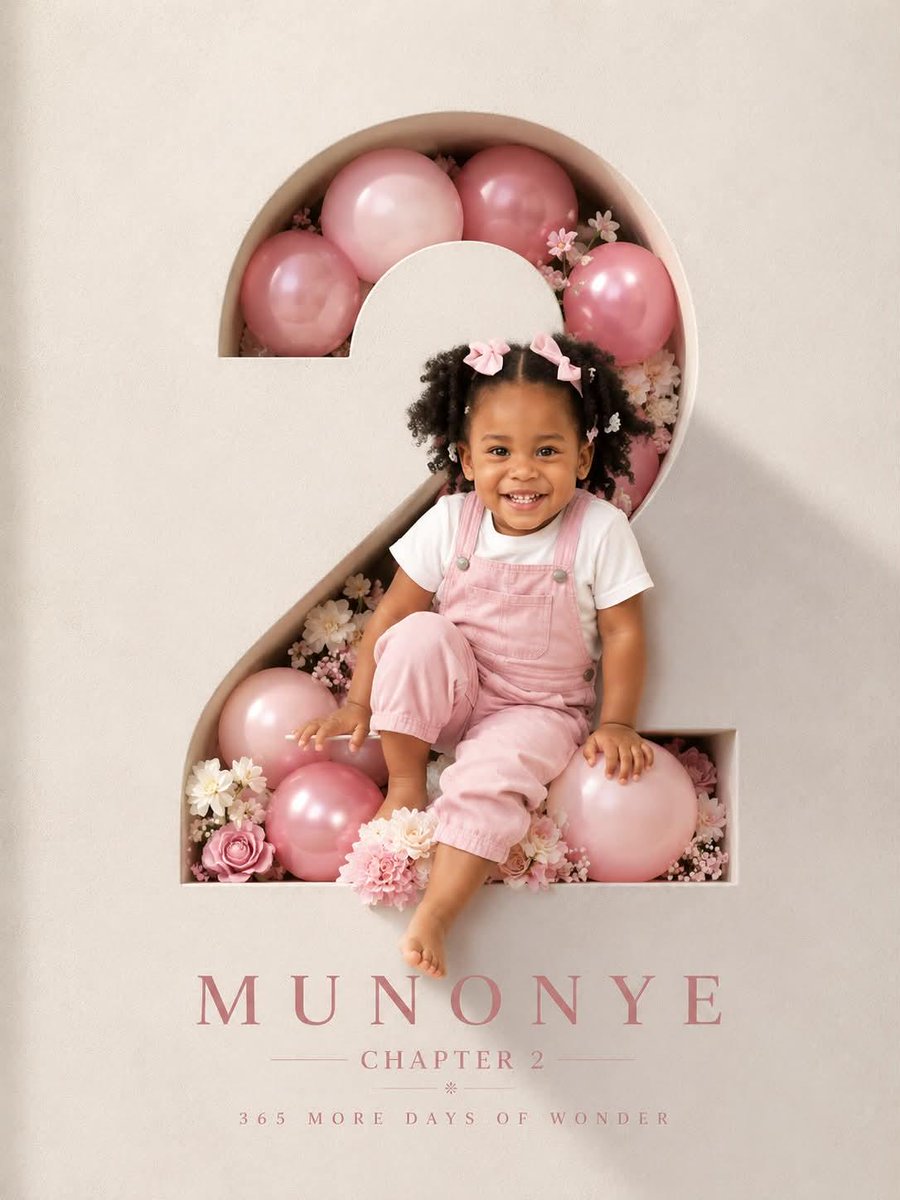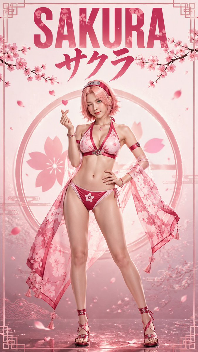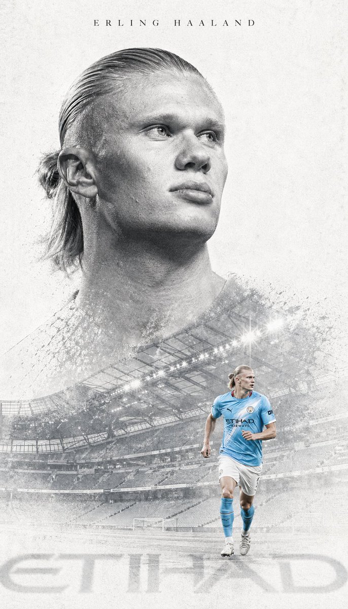
Prompt de imagen Pósters y tipografía Personalizables
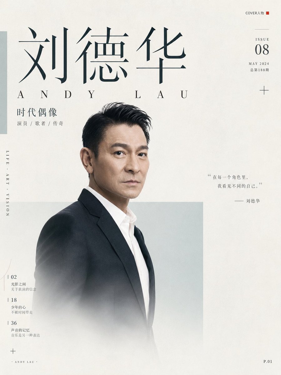
Póster de portada editorial de revista de Andy Lau
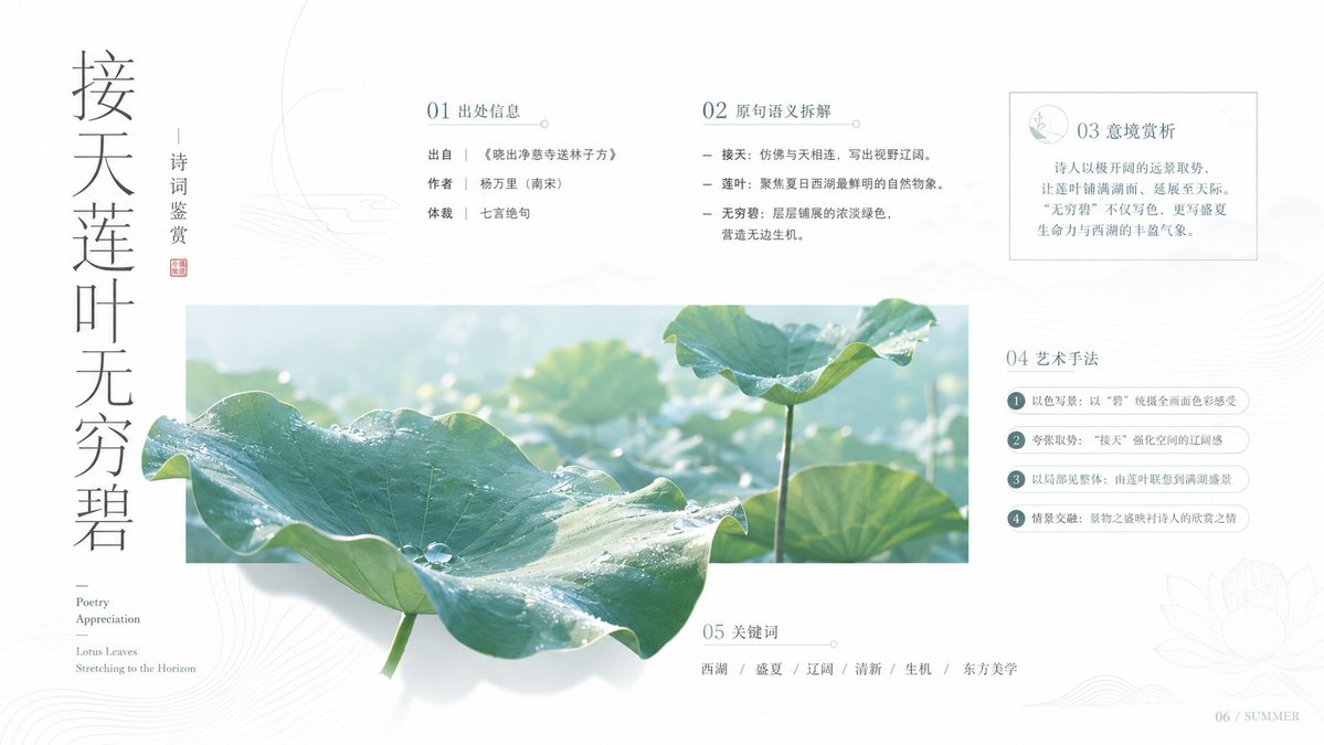
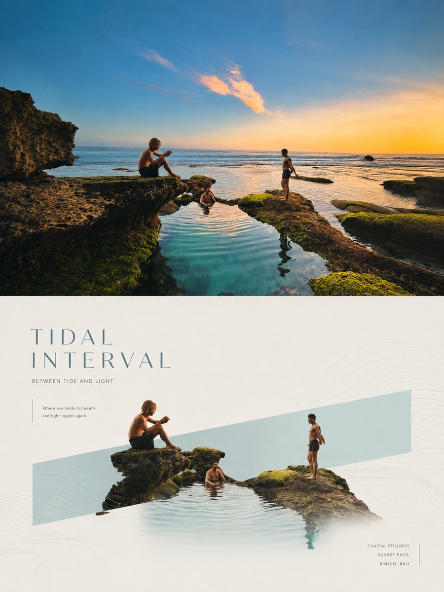
Un póster limpio al estilo de revista, construido alrededor de un gran campo blanco, un titular con serifa y un retrato suavemente difuminado que se superpone a franjas de color translúcidas. Pequeños grupos de anotaciones le dan la calma precisa de una portada impresa.

- Modelo
- GPT Image 2
- Tipo
- 2 imágenes
- Relación de aspecto
- 3:4
- Compartido
- 4 jun 2026
- Me gusta en X
- 218
Nombre de persona
Prompt de imagen
1,749 caracteresAround a specific theme, generate a clean, quiet visual with the editorial feel of a publication. A large area of high-brightness white space serves as the main breathing zone; the subject (a person or thematic object) appears with near-photoshoot quality, keeping clean edges and a slightly translucent, misted lower edge so the form emerges from the negative space. The subject should not fill the frame but form an offset overlap with the background color field; use one or several low-saturation, semi-transparent rectangles or narrow bars in the theme color as structural support, with restrained color areas and clear borders that hold the subject without stealing the gaze. The visual hierarchy is built by a huge, elegant serif title, a brief subtitle, tiny annotation text, and a few symbolic information markers; text may partially occlude or interweave with the subject, creating a magazine-cover reading path: first the subject's outline, then drawn by the large type, finally landing on the small information clusters. Colors are extracted from the theme's own material, mood, and narrative, preserving the role ratio among a bright base color, crisp dark text, soft supporting color fields, and a few high-purity accents, keeping the whole clean, quiet, calm, precise, and not gray or dirty; accent colors are used only in small squares, icons, sidebars, or local text, lighting up the image like visual coordinates. The texture should have slight paper grain, soft light, clean shadows, and a restrained print feel; the information density looks rich but must concentrate into small blocks, with ample white space all around, avoiding decorative stacking, heavy backgrounds, murky aging, and oversaturation. Theme: Andy Lau Ratio 3:4
Cómo usarlo
Empieza cambiando el nombre del tema, ya que todo el diseño está construido en torno a ese único sujeto. Mantén el solapamiento desplazado entre la figura y las franjas translúcidas, así como el borde inferior difuminado, porque esos detalles crean la profundidad editorial. Se compartió como prompt de GPT Image 2, por lo que encaja mejor en un póster o maqueta de portada donde el titular grande y los pies de foto pequeños transmitan el mensaje.
Compartido públicamente en X el 4 jun 2026. Todo el mérito de este prompt y de su resultado es de su creador. ¿Es tuyo? Pide que se actualice o se elimine.