Prompt εικόνας Branding & UI Προσαρμόσιμα
Prompt για ζεστές υφές σε παρουσιάσεις διαφανειών για μαθήματα κινεζικού πολιτισμού
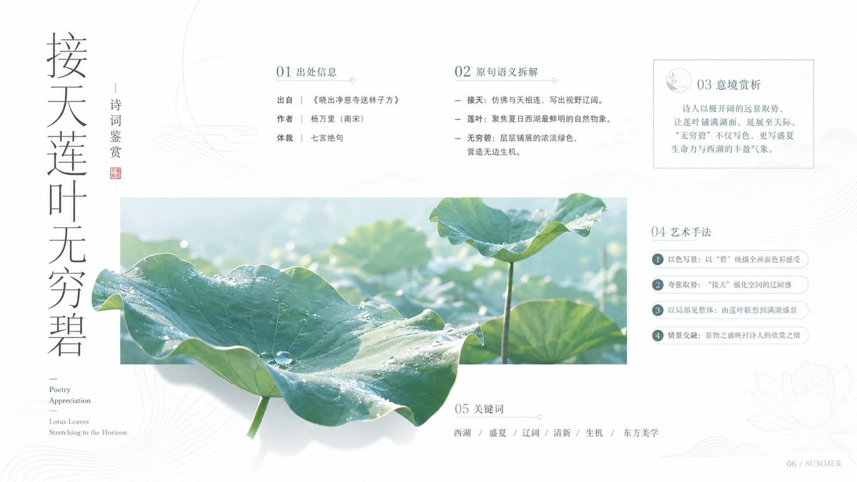
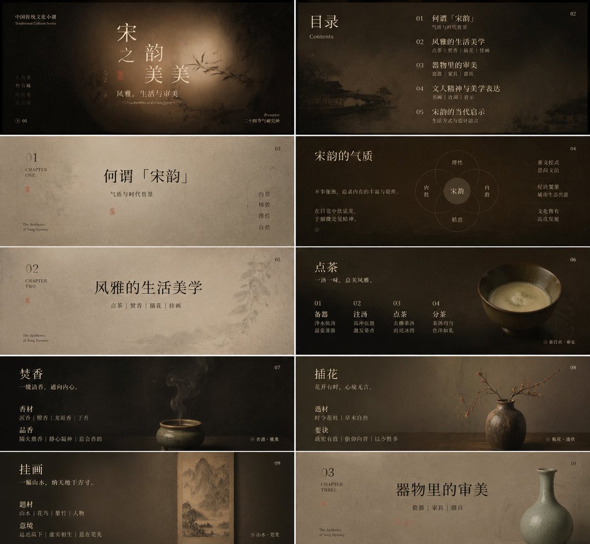
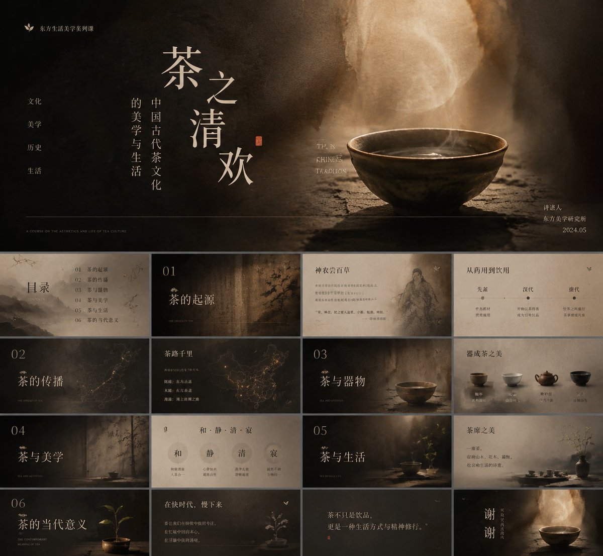
Ένα σύνολο διαφανειών μαθήματος με χαμηλό κορεσμό, όπου ένας λεπτός κινεζικός τίτλος με serif πλέει πάνω σε ένα ζεστό, φθαρμένο υλικό όπως χαρτί, ξύλο ή καπνός. Μικρές αγγλικές ετικέτες και υποσημειώσεις βρίσκονται στις άκρες, έτσι ώστε κάθε διαφάνεια να διαβάζεται ταυτόχρονα ως εξώφυλλο και ως σελίδα αναφοράς.

- Μοντέλο
- GPT Image 2
- Τύπος
- 2 εικόνες
- Κοινοποιήθηκε
- 19 Μαΐ 2026
- Likes στο X
- 303
Θέμα μαθήματοςΠαλέτα χρωμάτωνΓραμματοσειρά τίτλου
Prompt εικόνας
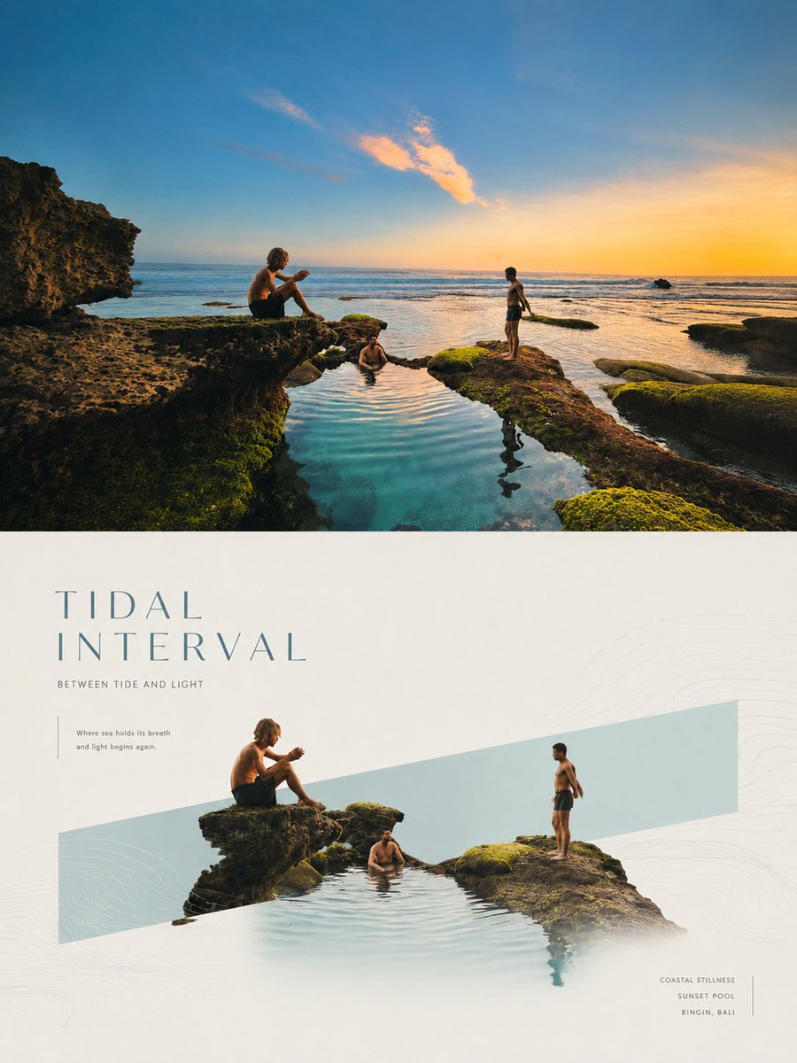
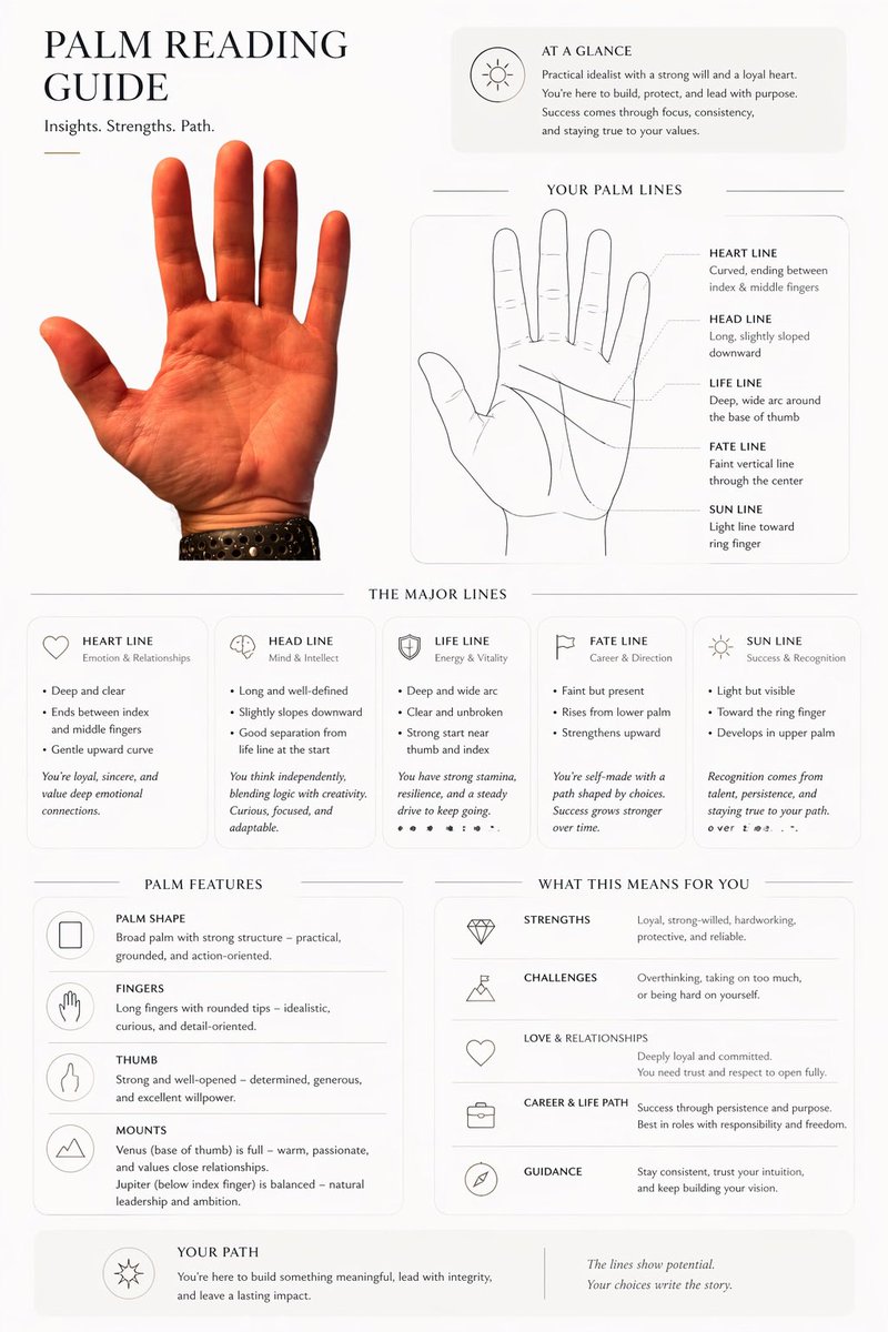
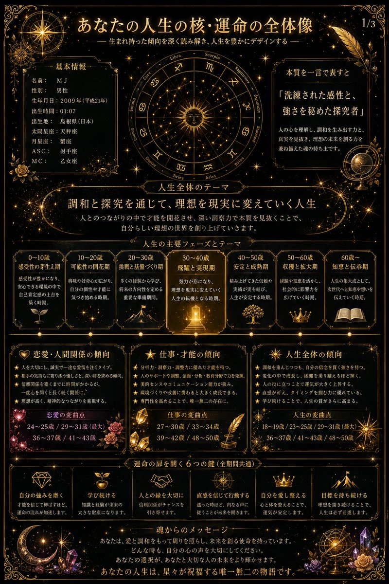
4,190 χαρακτήρεςTurn this aesthetic into a transferable way of generating visuals: the image shouldn't grab attention with sharp objects, but let the subject, information, or product slowly emerge from a warm material steeped in time. Keep low-saturation, low-noise, soft-focus tonal layers throughout; the background can be wood grain, paper fiber, leather, clay, smoke, fabric, rock face, food texture, a data underlay, or abstract space, but all should show tactile thickness, a faint sense of rotation, and dark edges, so the center is gently lifted by a restrained diffuse light. Don't make a template poster, and don't let decoration speak louder than content; every element should look naturally deposited — quiet, mature, understated, and memorable. Type is the main shaping force of the image. Chinese titles should use a slender, lean, breathing serif (Song) with a scholarly air, slightly loosened tracking, airy leading, allowing words to be split, offset, and layered, so the text blocks float like a set of specimens or fallen leaves — not fully aligned, yet with inner order. English, numbers, notes, and small labels use lighter serif or condensed faces as rhythmic pauses and side-notes, tiny in area but precise in position. Between main title and subtitle, build a contrast of size, language, and light-dark: the large Chinese carries emotion and poetry, the small English or numbers carry explanation, time, category, ranking, metrics, source, or a faint rational echo. You may add a minimal symbolic graphic, line, leaf, dot, emblem, or data marker as a visual pivot — no cute icons, and don't steal weight from the text. The color system is organized as "dark air + warm subject + low-brightness text + small-area semantic accent." Keep the light-dark relationships and soft edges among the reference's amber-brown, caramel, smoke-black, and cream, but the colored part changes role by actual content: knowledge, report, finance, and tech themes let the accent be cooler, cleaner, more like a glimmering annotation; food, lifestyle, solar-term, and culture themes let it be warmer, oilier, or papery; medical, environmental, and public-good themes let it be cleaner, paler, more breathing; commercial launches or covers let it be sharper, more concentrated, on a minimal area. The large color fields of the background stay restrained; the accent color doesn't spread into full-screen decoration but takes on the emotional pivot near title junctions, key numbers, legends, labels, buttons, or visual focus. Text colors are mainly ivory, old-paper white, pale gray-gold, or matte light tones, with detail kept in the shadows, avoiding hard cuts of pure black or white. The layout follows an order of central concentration with quiet complement around the edges. The center can hold the title, core data, product outline, figure's pose, a chart conclusion, or the main visual object, with slow, shadow-wrapped space left around it; at the top, a little brand, series name, chapter name, or short phrase; on the sides, bracketed annotations; at the bottom, a hair-thin divider, short English, footnote, source, metric note, or a line of dense small text weighting the image, so the work reads as both a cover and a page of a premium report. The reading path enters through the large central text, pauses briefly at the graphic or accent color, then settles to the bottom information layer; density decreases from center to edges, and edge information should be small, stable, and precise. For charts and rankings, let the data be tucked into this serene material, with key numbers becoming part of the poetic title; for PPT or reports, let chapter titles, key conclusions, and supporting notes form a soft but clear hierarchy; for products, figures, food, architecture, or natural objects, capture contour, material, shadow, and negative space rather than copying the original subject matter. Now apply this aesthetic to my actual content and let the image grow into the form it needs. This time's theme: plan a knowledge topic suited to this prompt style, then build PPT courseware around it, ideally on a small sub-direction of some traditional Chinese culture. At least 10 images.
Πώς να το χρησιμοποιήσετε
Αυτό το prompt κοινοποιήθηκε ως prompt για το GPT Image 2 και είναι γραμμένο για τη δημιουργία μιας σειράς διαφανειών και όχι μιας μεμονωμένης αφίσας. Διατηρήστε τις οδηγίες για την τυπογραφία, το υλικό με σκούρα άκρα και το συγκρατημένο χρώμα έμφασης, καθώς αυτά δίνουν την ήρεμη εικόνα. Αντικαταστήστε το παραδοσιακό θέμα του κινεζικού πολιτισμού με τη δική σας υποκατηγορία, όπως το τσάι, την καλλιγραφία ή έναν ηλιακό όρο, και αλλάξτε το δείγμα τίτλου και τις ετικέτες με το όνομα του μαθήματός σας. Χρησιμοποιήστε το αποτέλεσμα ως ενιαίο σετ εξωφύλλου και σελίδων ενοτήτων για ένα σύντομο μάθημα.
Κοινοποιήθηκε δημόσια στο X στις 19 Μαΐ 2026. Όλα τα credits για αυτό το prompt και το αποτέλεσμά του ανήκουν στον δημιουργό του. Είναι δικό σας; Ζητήστε ενημέρωση ή αφαίρεση.