

Prompt εικόνας Προϊόντα & διαφήμιση Προσαρμόσιμα
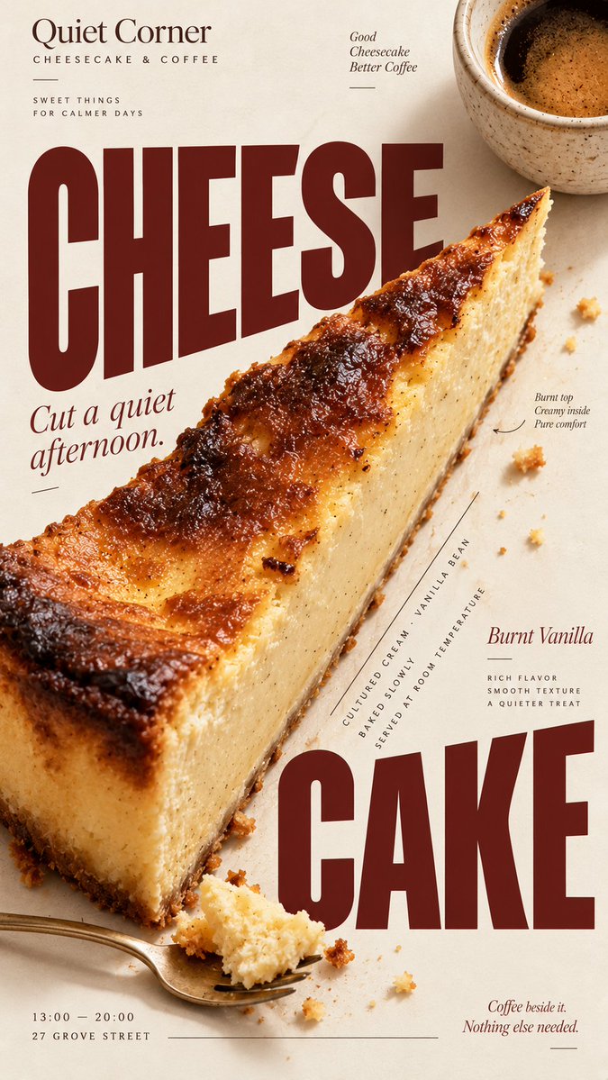
Πρότυπο αφίσας editorial για φαγητό για καφετέριες και αρτοποιεία
Μια κάθετη αφίσα που συνδυάζει ρεαλιστική φωτογραφία φαγητού με τολμηρή τυπογραφία σε στιλ περιοδικού. Το ίδιο το φαγητό διαμορφώνει τη διάταξη, έτσι ώστε ο τίτλος, η φωτογραφία και οι λεπτομέρειες να φαίνονται σχεδιασμένα μαζί και όχι τοποθετημένα σε ένα πρότυπο.

- Μοντέλο
- GPT Image 2
- Τύπος
- 4 εικόνες
- Αναλογία διαστάσεων
- 9:16
- Κοινοποιήθηκε
- 5 Σεπ 2026
- Likes στο X
- 2
ΜάρκαΌνομα μάρκαςΦαγητό / ποτόΚύριο προϊόνΤίτλος+6 περισσότερα
Prompt εικόνας
2,417 χαρακτήρες[BRAND]: {brand name} [FOOD / DRINK]: {main product} [HEADLINE]: {main headline} [SUBHEAD]: {short supporting line} [DETAILS]: {ingredients / flavor / hours / address / short brand copy} [ACCENT COLOR]: {burgundy / forest green / cobalt blue / etc.} [LAYOUT]: {diagonal split / annotated flat lay / circular typography / oversized type / other editorial composition} Create a 9:16 vertical food editorial poster that combines highly realistic food photography with expressive magazine-style typography. Use a warm ivory or cream paper background with subtle natural paper texture. The food or drink should be the main visual anchor, photographed with realistic texture, natural highlights, contact shadows, appetizing materials and believable proportions. Avoid CGI, plastic-looking surfaces, overly polished commercial rendering or floating cutout objects. Build the composition around the actual shape, direction or arrangement of the food rather than placing the product in a fixed template. Let the selected [LAYOUT] determine how photography and typography interact. The subject may crop beyond the frame, overlap with type, divide the page, create a circular structure, form a diagonal axis, or leave intentional negative space for editorial information. Typography should be a major part of the composition. Use one expressive display typeface for the main [HEADLINE] and one restrained supporting typeface for secondary information. Allow changes in scale, orientation, cropping and placement so the text feels integrated with the food rather than simply placed above or below it. Keep a clear visual hierarchy: large headline and food first, short supporting copy second, then a few useful details such as ingredients, flavor notes, opening hours or address. Use [ACCENT COLOR] sparingly alongside cream, food-derived natural colors and dark neutral typography. Keep the palette controlled and cohesive. Small editorial elements such as thin rules, dots, curved lines or subtle annotations may be added when useful, but avoid decorative clutter, numbered labels, 01/02, Vol., four-point sparkles, generic filler copy or meaningless microtext. The final image should feel like a real café, bakery or food brand campaign: visually bold at thumbnail size, detailed when viewed closely, practical enough for branding or menu use, and designed as a complete poster rather than a reusable-looking template.
Πώς να το χρησιμοποιήσετε
Ξεκινήστε αλλάζοντας τα σημεία που αντικαθιστούν τη μάρκα, το φαγητό, τον τίτλο και το χρώμα έμφασης, και επιλέξτε μια διάταξη που ταιριάζει στο προϊόν σας, όπως μια διαγώνια διαίρεση ή μια επεξηγηματική επίπεδη σύνθεση από πάνω. Διατηρήστε το κρεμ χαρτί φόντο και την οδηγία να σχεδιάζετε γύρω από το πραγματικό σχήμα του φαγητού, γιατί αυτό κάνει την αφίσα να μοιάζει editorial. Κοινοποιήθηκε ως prompt για το GPT Image 2 και το αποτέλεσμα λειτουργεί καλά ως εξώφυλλο μενού, αφίσα βιτρίνας ή ανάρτηση στα social media.
Κοινοποιήθηκε δημόσια στο X στις 5 Σεπ 2026. Όλα τα credits για αυτό το prompt και το αποτέλεσμά του ανήκουν στον δημιουργό του. Είναι δικό σας; Ζητήστε ενημέρωση ή αφαίρεση.













