Prompt-Studio
Machen Sie „Overdimensionierte Buchstaben-Architektur Kampagnenposter“ zu Ihrem
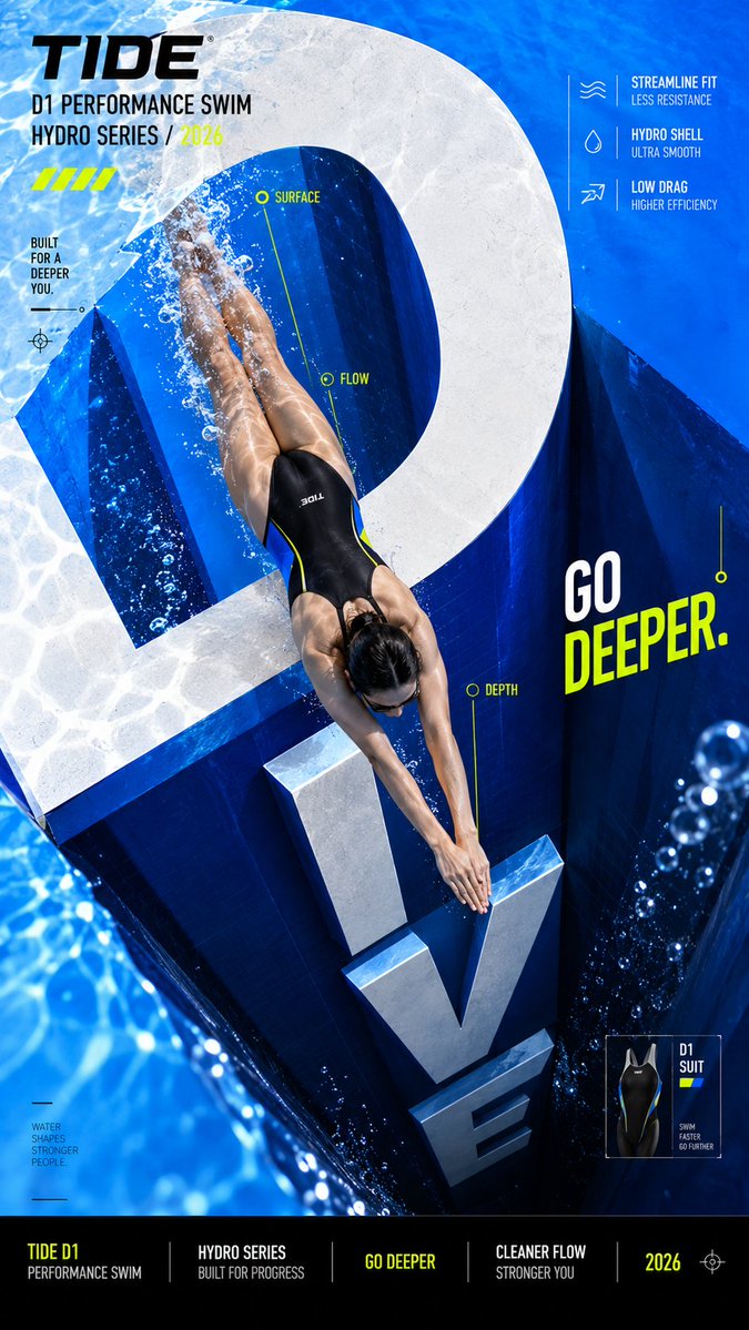
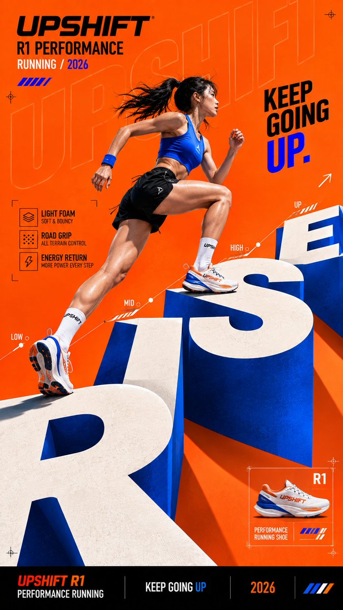
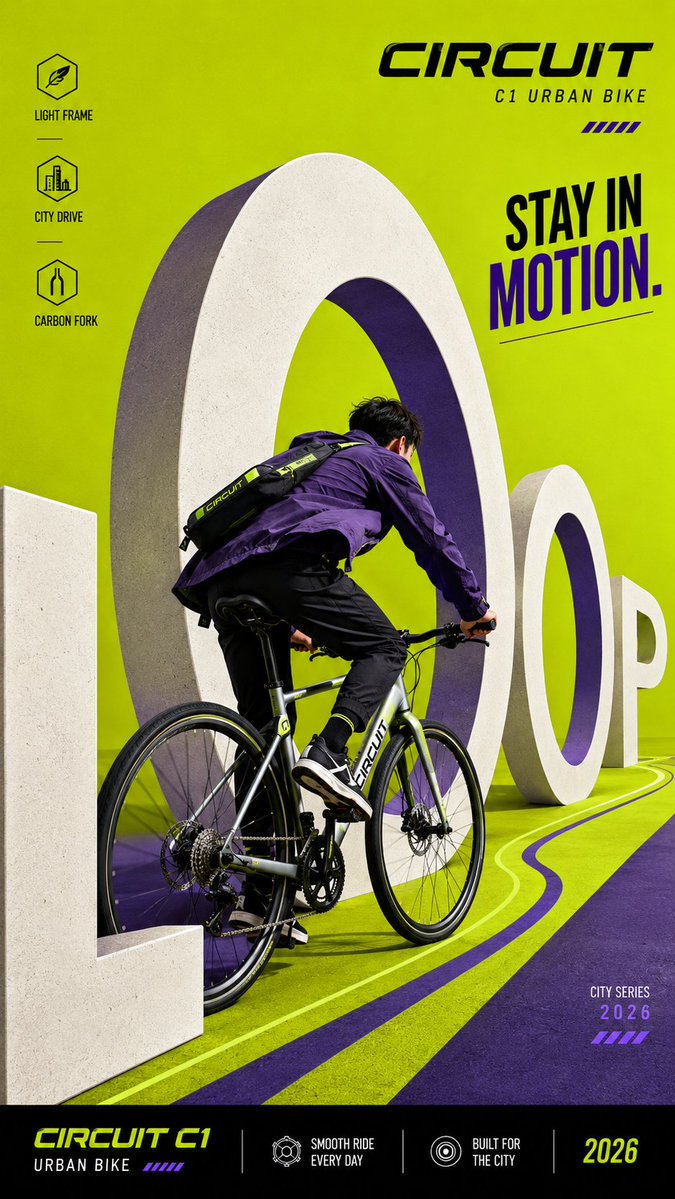
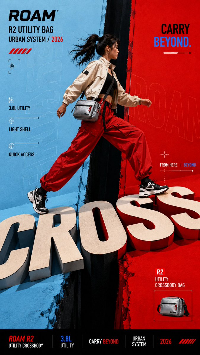
Ein kühnes redaktionelles Kampagnenmotiv, in dem ein riesiges Wort als Treppe, Brücke oder Tunnel gebaut ist und sich das Motiv durch seine Buchstabenformen bewegt. Tiefe entsteht dadurch, dass manche Buchstaben vor der Figur stehen, während andere zurückweichen.
 Prompt von @MrLarus
- Füllen Sie unten die Lücken aus.
- Rechts sehen Sie, wie sich der Prompt aktualisiert.
- Kopieren Sie ihn oder öffnen Sie ihn in einem Bild-Tool.
Bild-Prompt
Create a bold editorial campaign poster where oversized typography becomes the physical space the subject moves through. Brand: [BRAND NAME] Product / Campaign: [PRODUCT OR CAMPAIGN] Main Word: [SHORT WORD] Subject: [PERSON / PRODUCT / BOTH] Architecture Type: [STAIRS / BRIDGE / TUNNEL / SHAFT / OTHER] Movement: [CLIMB / CROSS / MOVE THROUGH / DIVE / OTHER] Main Color: [COLOR] Accent Color: [COLOR] Aspect Ratio: [9:16] Use realistic commercial photography, strong perspective, high-contrast colors, oversized typography, and contemporary editorial design. Make the main word extremely large and transform its letterforms into a believable spatial structure. The subject should physically interact with it — climbing on the letters, crossing between them, moving through their negative space, or traveling deeper into the typography. Use clear foreground, midground, and background relationships. Let some letterforms sit in front of the subject while others recede behind them, creating real depth and strong perspective. Keep the typography recognizable and graphic. Add only enough thickness, shadows, or perspective to make the architecture believable without turning it into a heavy 3D environment. Use one dominant color with black, white, and one contrasting accent color. Add a few meaningful campaign details such as the brand name, product name, slogan, specifications, or editorial labels. Keep people, products, materials, lighting, and contact shadows realistic so the subject feels genuinely present inside the typographic space. The final image should feel like a finished campaign key visual — bold, colorful, spatial, and conceptually clear. Avoid generic subject + big text layouts, random 3D letters, overly complex environments, excessive UI graphics, meaningless filler text, cluttered information, and disconnected perspective.
Prompt, geteilt auf X von @MrLarus. Alle Rechte liegen beim Creator.
Weitere Prompts zum Anpassen
 Untersicht-Werbefoto eines Models mit Produkt
 Dein Foto hinzufügenProdukt-Markenstoryboard im 3x3-Raster
 Holografische Vinyl-Sticker-Produktaufnahme mit Markenlogo
 Dein Foto hinzufügenFootball-Trikot Streetwear-Kampagnenposter im luxuriösen Editorial-Stil
 Restaurant-Markenkontaktpunkt-Matrix-Mockup
 Ohrhörer-Etui-Werbeinfografik mit fettem Textlayout
 Draufsicht-Produktfoto auf strukturierter Oberfläche
 Dein Foto hinzufügenGoldene-Stunde-Produktporträt mit Regenbogen-Lichtreflex