

Bild-Prompt Branding & UI Anpassbar
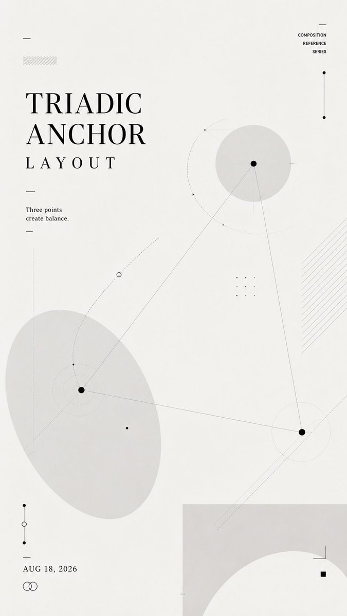
Layout-Studienplakat mit geometrischen Formen und Negativraum
Eine weiche, cremeweiße vertikale Studie aus hellgrauen Formen, dünnen Linien, gepunkteten Bahnen und kleinen Knotenpunkten. Der Titel verschiebt sich je nach gewählter Layout-Logik, sodass die Struktur selbst die Komposition trägt.

- Modell
- GPT Image 2
- Typ
- 4 Bilder
- Seitenverhältnis
- 9:16
- Geteilt
- 21. Jul 2026
- Likes auf X
- 18
TitelEin kurzer SatzDatum
Bild-Prompt
1,342 ZeichenCreate a 9:16 vertical composition reference poster. Layout name: [TRIADIC ANCHOR / NEGATIVE SPACE CHANNEL / LAYERED INTERLOCK / ORBITAL TYPOGRAPHY / CUSTOM] Core relationship: [balance / negative space / overlap / orbit / tension / flow] Main title: [TITLE] Short line: [ONE SHORT SENTENCE] Date: [DATE] Use a soft off-white background, charcoal typography, pale gray geometric forms, thin lines, dotted paths, small nodes, and subtle transparent layers. This is not a tutorial, infographic, or finished commercial poster. It should feel like a designer's layout study: light, restrained, experimental, and reusable as an upstream visual reference for AI image generation. Let the title, shapes, lines, and negative space build the composition together. The title position must follow the selected layout logic rather than always sitting at the top. Keep the text minimal and readable. Use only the main title, one short supporting line, and the date. Do not add numbered steps, design explanations, labels, or long paragraphs. Make the layout visually rich without becoming crowded. Add enough secondary lines, nodes, transparent shapes, cropping, and overlapping elements to create depth and structure. The final image should clearly demonstrate the chosen composition through the layout itself, without needing written explanation.
So geht's
Ersetzen Sie die Felder in eckigen Klammern durch Ihren eigenen Titel, eine kurze Zeile, das Datum und einen Layout-Namen wie Triadic Anchor oder Orbital Typography, und wählen Sie die zentrale Beziehung, die zu Ihrem gewünschten Gleichgewicht passt. Behalten Sie den cremeweißen Hintergrund, die anthrazitfarbene Schrift und die zurückhaltenden grauen Formen bei, denn genau sie lassen das Blatt wie eine Layoutstudie eines Designers wirken und nicht wie ein fertiges Poster. Geteilt wurde es als GPT-Image-2-Prompt, und das Ergebnis funktioniert am besten als Referenzbild, das Sie in eine spätere Generierung einspeisen.
Am 21. Jul 2026 öffentlich auf X geteilt. Alle Rechte an diesem Prompt und seinem Ergebnis liegen beim Creator. Ist das Ihr Werk? Bitten Sie um Aktualisierung oder Entfernung.













