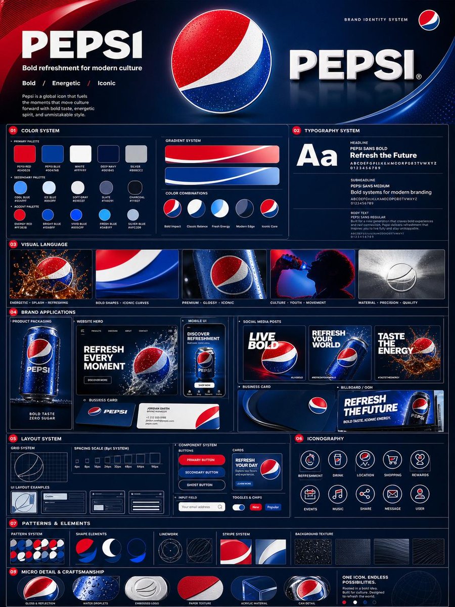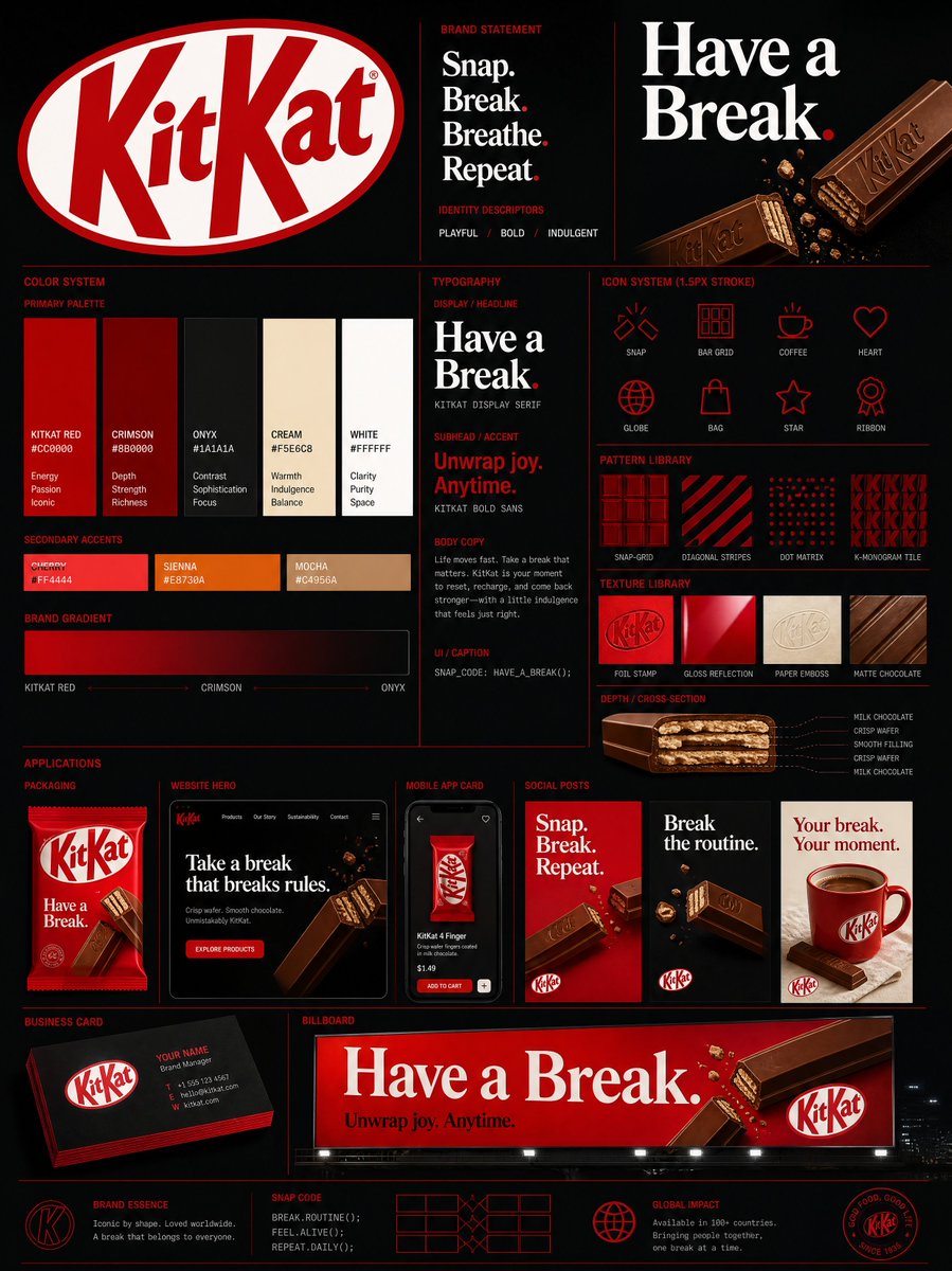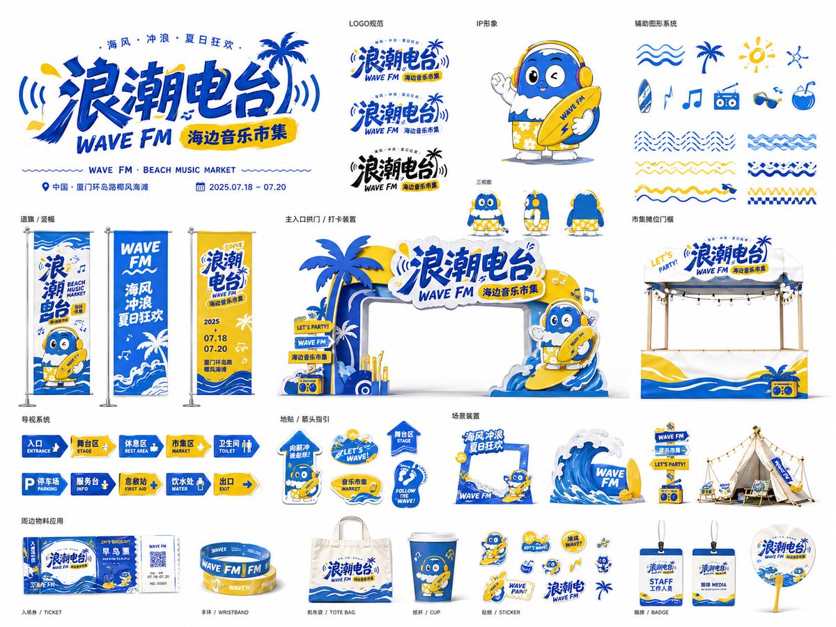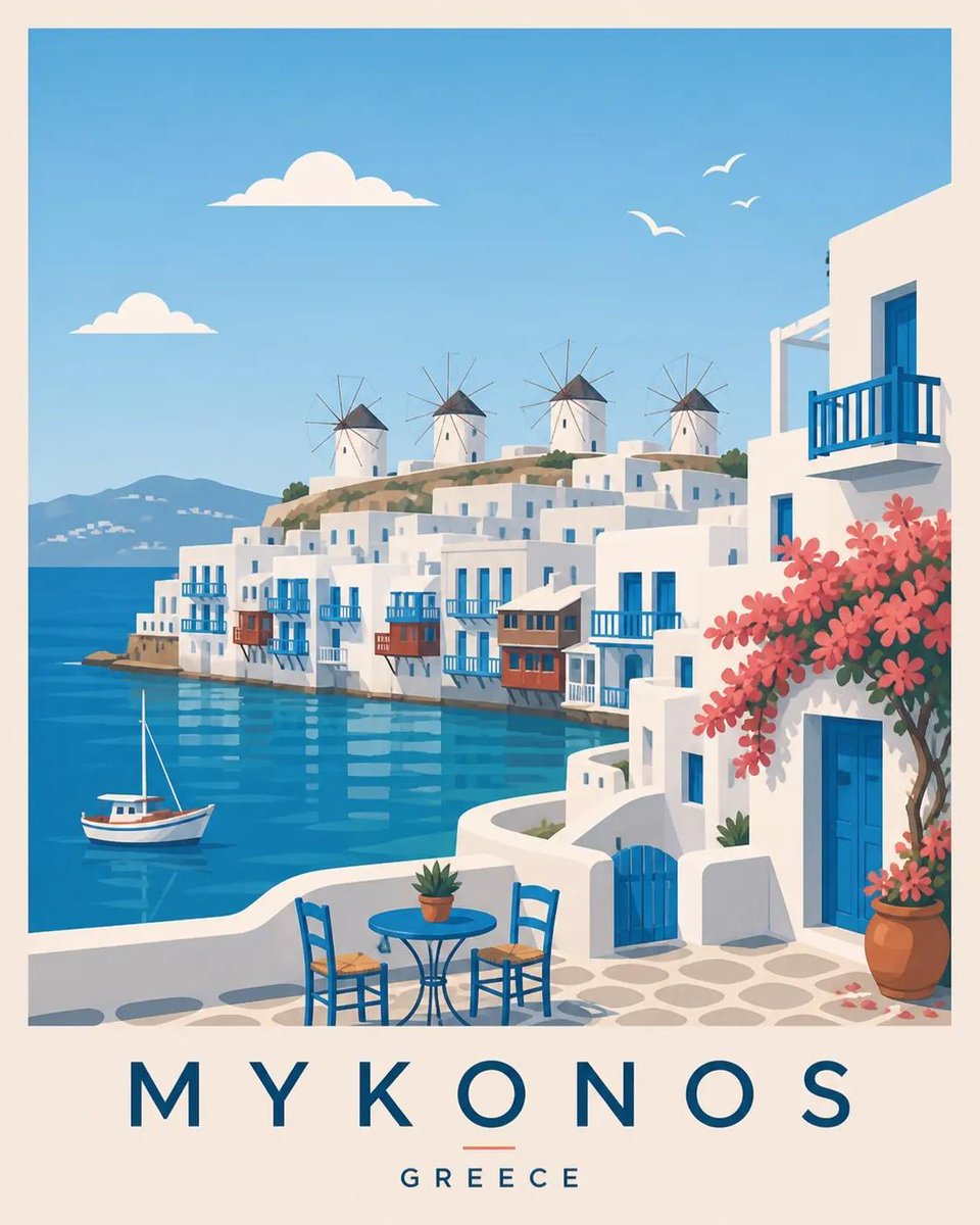
Bild-Prompt Branding & UI Anpassbar
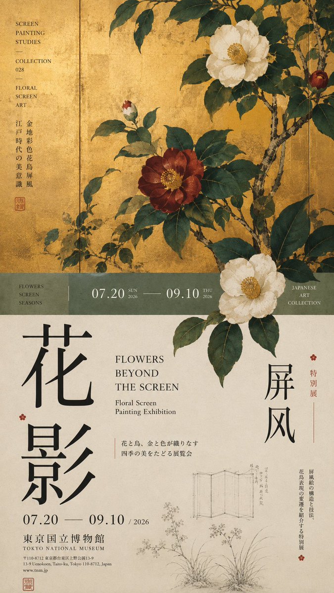
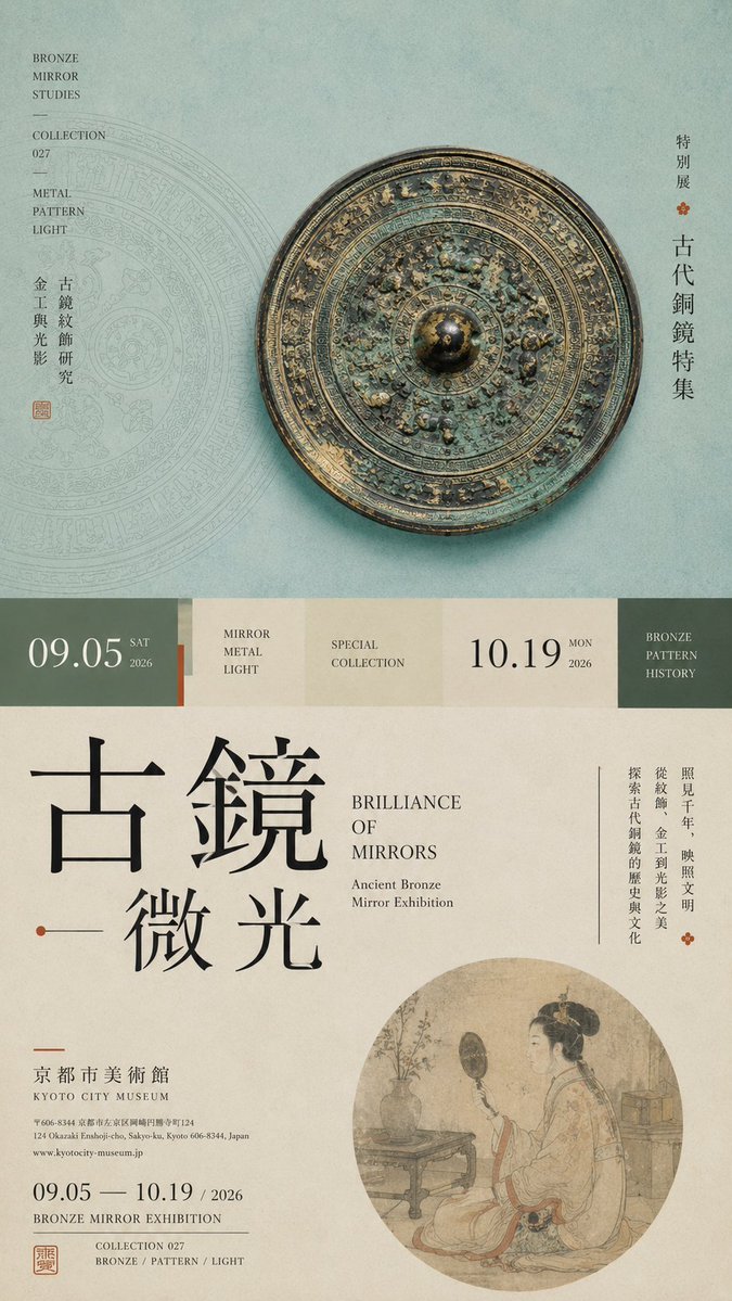
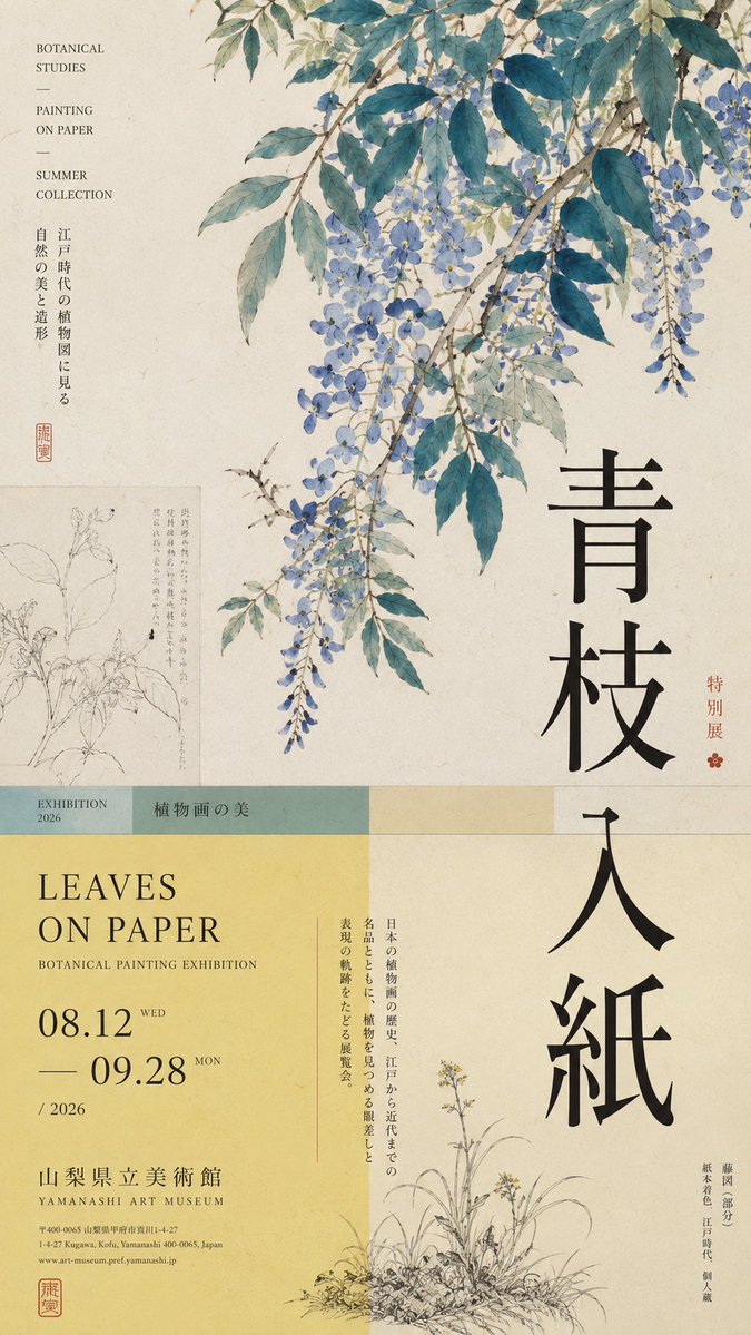
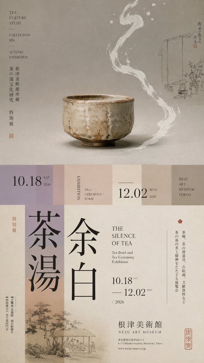
Ausstellungsposter mit horizontaler Teilung und geschichteter Schrift
Ein hohes 9:16-Ausstellungsposter, in ungleiche Zonen geteilt, mit einem einzigen Hauptmotiv, einem schmalen Übergangsband und überdimensionaler vertikaler Schrift. Das Motiv überschreitet die Schnittlinie, sodass die obere und die untere Hälfte als eine redaktionelle Seite wirken.

- Modell
- GPT Image 2
- Typ
- 4 Bilder
- Seitenverhältnis
- 9:16
- Geteilt
- 18. Aug 2026
- Likes auf X
- 80
AusstellungsthemaChinesischer TitelEnglischer TitelDatum und Ort
Bild-Prompt
1,789 ZeichenPrompt: 【Theme】: ____ 【Main visual】: ____ 【Chinese title】: ____ 【English title】: ____ 【Auxiliary visual】: ____ 【Main color】: ____ 【Secondary color】: ____ 【Date / Institution】: ____ 【Ratio】: 9:16 Generate a "horizontal-split" poster with a sophisticated Editorial Design and cultural-exhibition character. Don't simply make it "image on top, text on bottom." Divide the layout into 2–3 vertical zones of unequal proportions: main visual zone about 50%–65%, central transition cut about 8%–15%, lower information zone about 25%–40%. Keep only one primary visual core 【main visual】, then add a few low-weight details, such as line art, partial painting, patterns, study diagrams, small collection info, or vertical text, so the whitespace has design density without stealing focus from the subject. In the middle, use low-saturation color blocks, narrow color bands, or information modules to connect the upper and lower zones. The main title participates in the composition through enlargement, vertical setting, offset, or crossing zones; allow the subject to partially cross the cut boundary, creating front-back layers between the zones. Establish a clear text hierarchy: large Chinese title → English title / date → small subtitle → tiny institutional info. Group the small text together, don't scatter it. Keep colors to 3–5 tones, building hierarchy through zone proportions, visual weight, cross-zone relationships, and typography. Key point: the horizontal split is not about cutting the image into two blocks, but about giving the different zones clear roles while reconnecting them through the subject and the text. Museum Exhibition Poster × Editorial Graphic Design—rich but not chaotic, spacious but not empty, with the finish of a real museum poster and art catalogue.
So geht's
Füllen Sie zuerst die Felder in Klammern in der Vorlage aus, besonders Thema, Hauptmotiv und beide Titel. Dies ist eine Vorlage, behalten Sie also die Zonenproportionen und die Klammerstruktur bei, denn sie tragen das Layout; lassen Sie auch die Formulierung stehen, die dem Motiv erlaubt, die Schnittgrenze zu überschreiten. Er wurde als Prompt für GPT Image 2 geteilt. Das Ergebnis eignet sich gut als Mockup für ein Galerie- oder Museumsposter oder als Cover für einen Ausstellungskatalog.
Am 18. Aug 2026 öffentlich auf X geteilt. Alle Rechte an diesem Prompt und seinem Ergebnis liegen beim Creator. Ist das Ihr Werk? Bitten Sie um Aktualisierung oder Entfernung.