Prompt-Studio
Machen Sie „Animierter Landingpage-Hero mit Vollbild-Video“ zu Ihrem
Eine React-Landingpage, bei der ein vollflächiges Hintergrundvideo hinter einer fixierten oberen Leiste und einer am unteren Rand verankerten Überschrift mit zwei Buttons liegt. Der Text erscheint nacheinander, während das Video sanft einblendet, und ergibt einen ruhigen, redaktionellen ersten Bildschirm.
 Prompt von @viktoroddy
- Füllen Sie unten die Lücken aus.
- Rechts sehen Sie, wie sich der Prompt aktualisiert.
- Kopieren Sie ihn oder öffnen Sie ihn in einem Bild-Tool.
Bild-Prompt
Create a full-screen hero section landing page using React, Vite, and Framer Motion (`motion` package). Use plain CSS (no Tailwind). The font is Inter (weights 300, 400, 500, 600) from Google Fonts. The design is minimal black-and-white with a full-viewport background video. **Stack:** React 19, Vite, `motion` (framer-motion), `lucide-react` (for the Plus icon). **Layout:** - Full viewport height (`min-height: 100vh`), white background, flex column with `justify-content: space-between` - Fixed navbar at top (z-index 50, pointer-events none on the nav itself, auto on children) - Absolutely positioned full-screen video behind everything (z-index 0) - Footer content pinned to bottom (z-index 30) with a white gradient fade-up background **Navbar (fixed, top):** - Left side contains: 1. Logo: custom SVG icon (two rotated rounded rectangles at -35deg, black fill) + brand text "NeuralKinetics" (hidden on mobile, shown on desktop 768px+) 2. Menu button: black pill with white circle containing a Plus icon (lucide, size 12, strokeWidth 3) + "Menu" text (11px, white) 3. Tags pill: light gray (#F4F4F6) rounded-full container with two text labels "Advanced Bionics" and "Cognitive AI" (hidden on mobile, shown on desktop) - Right side contains: - A light gray pill with a black circle button (containing a 4-dot grid SVG icon) + label "Adaptive Systems" (hidden on mobile) **Background Video:** - autoPlay, muted, playsInline, object-fit: cover - On mobile: video wrapper is 80% width and 80% height (centered) - On desktop (768px+): video wrapper is 100% width and 100% height **Footer content (bottom, over gradient):** - Background: `linear-gradient(to top, #ffffff 0%, rgba(255,255,255,0.8) 50%, transparent 100%)` - On mobile: stacks vertically. On desktop: row layout, items aligned to bottom. - Left block: 1. Subtitle line: small black dot (8px circle) + "Best digital banking card 2026" (13px, 55% opacity black) 2. Heading: "One Card, Zero / Limits. Worldwide." on two lines. Font-weight 300, clamp(2rem, 8vw, 4.5rem) on mobile, clamp(2.5rem, 5.5vw, 4.5rem) on desktop, letter-spacing -0.03em, line-height 1 3. Two buttons: "See Features" (black pill, white text, 13px) and "How It Works" (transparent with dark border rgba(0,0,0,0.35), 13px) - Right block: Three tag pills "Neuromorphic", "AGI", "Cybernetics" (white bg, light border rgba(0,0,0,0.12), 11px, rounded-full) **Animations (using `motion` from 'motion/react'):** - Navbar: slides down from y:-16, opacity 0 to visible. Duration 0.8s, ease [0.16, 1, 0.3, 1] - Video: fades in from opacity 0 + scale 1.05 to opacity 1 + scale 1. Duration 1.8s - Footer wrapper: slides up from y:20, delay 0.5s, duration 1s - Subtitle: slides up from y:16, delay 0.6s, duration 0.8s - Heading: slides up from y:20, delay 0.8s, duration 0.8s - Buttons: slides up from y:16, delay 1.0s, duration 0.8s - All use ease: [0.16, 1, 0.3, 1] **Responsive (mobile-first, breakpoint at 768px):** - Mobile: navbar padding 16px, smaller buttons (28px circles), brand text hidden, tags hidden, right label hidden, footer stacks vertically, video at 80% size - Desktop (768px+): navbar padding 24px 32px, larger buttons (32px circles), all text/tags visible, footer is row layout, video fills 100%
Prompt, geteilt auf X von @viktoroddy. Alle Rechte liegen beim Creator.
Weitere Prompts zum Anpassen
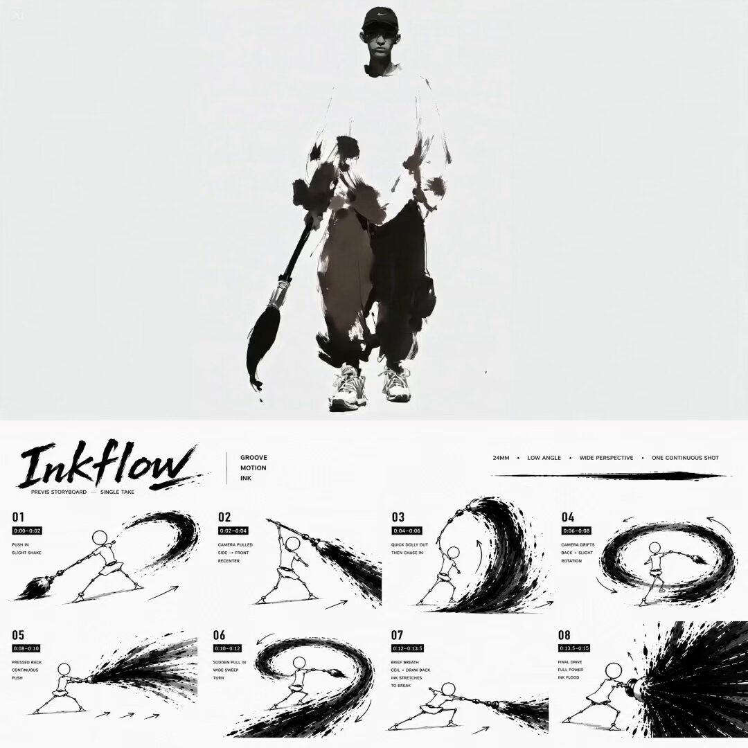 Tuschepinsel-Hip-Hop-Tanzvideo in Schwarz-Weiß
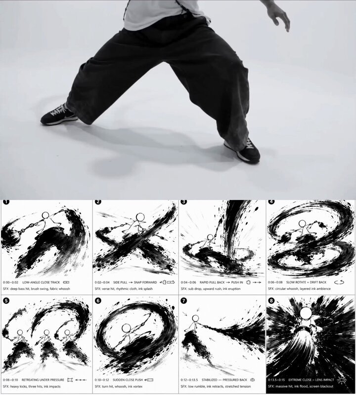 Tusche-Pinsel-Hip-Hop-Tänzer-Storyboard in Schwarz-Weiß
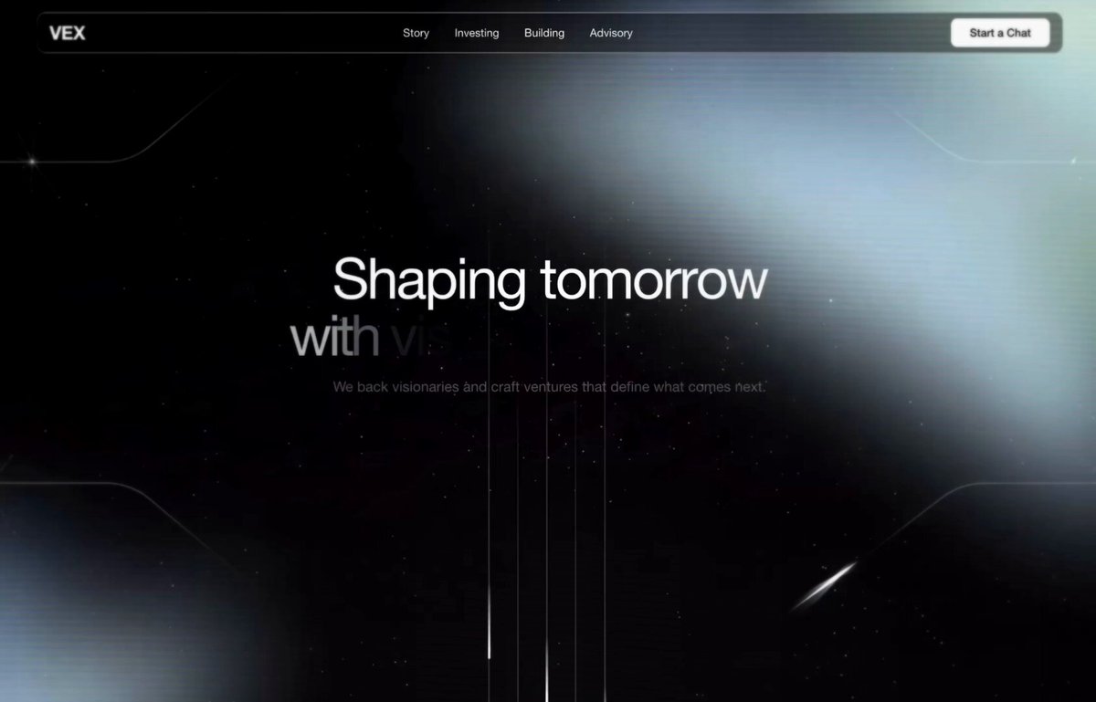 Glas-Navbar-Hero-Bereich mit Video-Hintergrund als Code
 Minimalistisches Schwarz-Weiß-Motion-Identity-Video
 Dein Foto hinzufügenLogo-Morph-Video-Prompt für eine 15-sekündige Marken-Enthüllung
 Filmische Landingpage zum Thema Weltraumreisen erstellen
 Morphing-UI-Bewegungsschleife in Schwarz-Weiß
 Schwarzes Dreieck gleitet durch ein Büro