Afbeeldingsprompt Posters & typografie Aanpasbaar
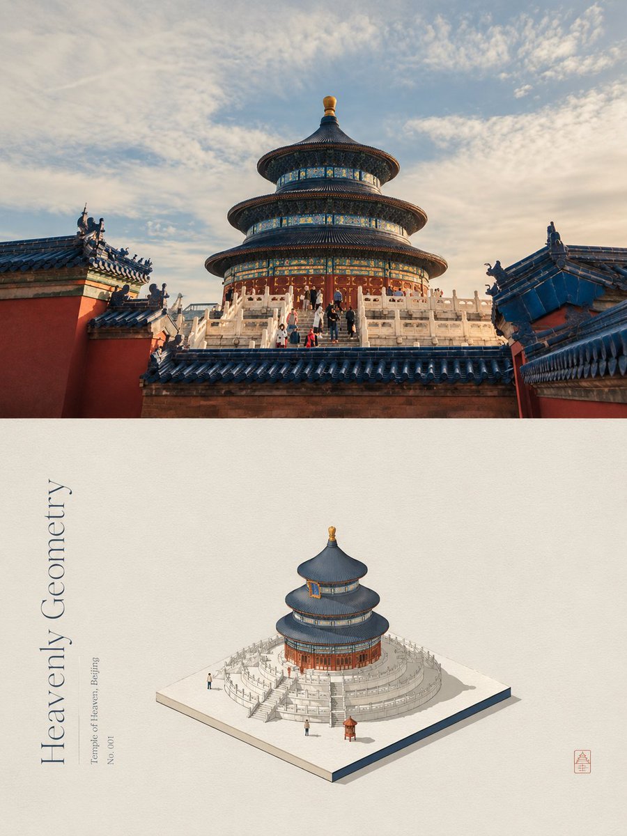
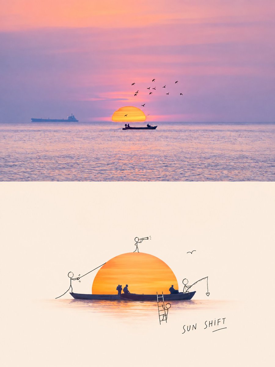
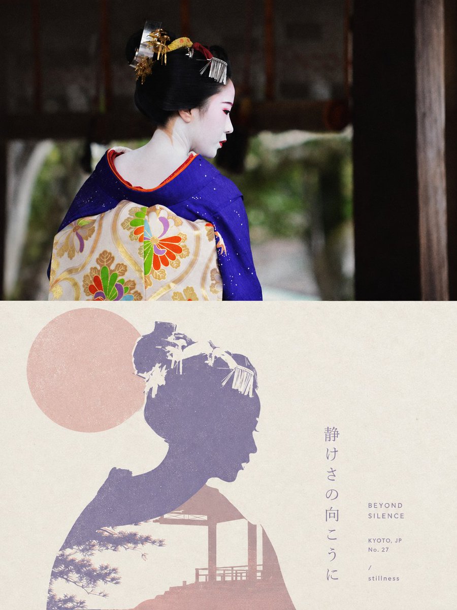
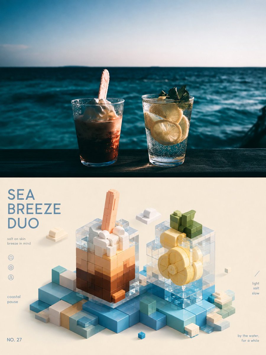
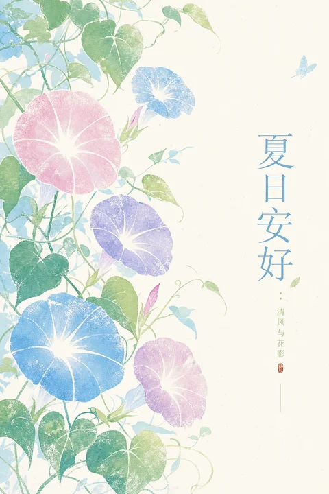
Zomerse ochtend-groetposter met winde in zachte printstijl
Winden en klimranken verspreiden zich over een bleek, doorschijnend vlak in een heldere bloemenprintstijl. Zachte witte sterren openen zich binnen de bloemblaadvormen, waardoor de gloeiende middens als eerste de aandacht trekken.

- Model
- GPT Image 2
- Type
- 4 afbeeldingen
- Beeldverhouding
- 2:3
- Gedeeld
- 23 jun 2026
- Likes op X
- 87
Kopregel tekstKleine tekstHoofdbloem
Afbeeldingsprompt
1,989 tekensAround any subject, generate a bright, translucent Eastern print-style image: translate the subject's core form into several soft, petal-like main bodies of varied sizes, resembling translucent rubbings lightly pressed onto paper, with faintly grainy edges and white print gaps, opened inside by radial white negative shapes so the eye reads the glowing center first and the colored outline second. Use a clean, pale base as a large structural field; the subject spreads from one side toward the center, leaving ample breathing space; thin twigs, leaves, linear connectors, or attached symbols derived from the subject weave between the main bodies, carrying rhythm and direction without crowding the glowing negatives. Draw colors from the subject's own material, season, cultural mood, or narrative meaning, mapped to a high-brightness base, a lightly translucent subject color, a few crisp support colors, fine information colors, and a minimal accent color, keeping bright, airy, cleanly graded relationships; colors may vary by subject but always keep a large pale background, moderately saturated subject, translucent warm-cool contrast, local crisp accents, and no muddy coverage. If text appears, use a slender, orderly Eastern layout as a quiet information layer near the negative space, kept at a distance from the subject, its color drawn from the accent role, with restrained rhythm and open letter spacing. Overall it carries the texture of handmade silkscreen and paper rubbing—light grain, soft light, non-rigid edges—focusing on the white starburst negatives within the translucent color blocks and the light growth rhythm unfolding around them. —————— Change the scene to: a summer greeting poster of morning glories and vines, keeping the bright floral print aesthetic For social posting: suited to a fresh summer blessing image, no complex copy Keep text: write “夏日安好” (Peaceful summer), small text may read “清风与花影” (Fresh breeze and flower shadows) Size: vertical 9:10
Afbeeldingsprompt
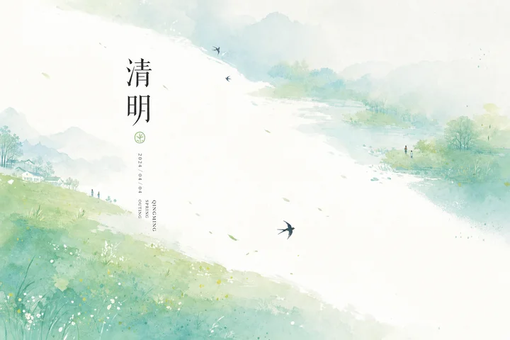
2,212 tekensAround any subject, generate a translucent, bright, generously spaced Eastern ink information image: the core graphic mechanism is a high-brightness negative light band cutting diagonally across the frame from the edge, like an empty riverbed naturally left open by water-color bleed, so the eye reads the large airy void first and the theme's color fields—spread like soft mist on both sides—second. Do not fill the scene with the subject as a realistic object; instead turn it into ink color fields bleeding on both sides, tiny directional symbols, and restrained information layers; the field edges have wet diffusion, grainy paper texture, and translucent layering, while the central void stays clean, glowing, and impurity-free. Draw colors from the subject's season, material, cultural meaning, and mood, mapped to a large high-brightness bright base, soft secondary color fields, a few crisp accent colors, and dark hairline text with linear information, keeping a bright, light, quiet mood: the base takes the largest area, saturation controlled but not muddy, accent only on the key small symbols, dark only for reading order. You may add very few small flying, floating, or moving symbols derived from the subject along the empty band, creating slight motion and scale—few, sparse, leaving room to breathe. If text appears, use one or two large characters as a silent focal center, paired with slender vertical information, an English subtitle, or a date-style short line, black, slender, loosely spaced, forming the ceremony of a traditional solar-term poster with a modern negative-space order. The finish resembles watercolor spray and ink bleed on clean paper—soft edges, translucent layers, restrained information—avoiding heavy illustration, crowded layout, dirty retro, and high-contrast commercial poster feel. —————— Solar-term direction: a spring-outing theme around Qingming, allowing green grassy slopes, shallow water banks, and a few very small pedestrian or swallow symbols Use case: a solar-term cover for WeChat or Xiaohongshu, reading like a fresh spring notice Text: main character “清明”, other info kept minimal, keeping only the date and an English subtitle Format: horizontal 16:9
Afbeeldingsprompt
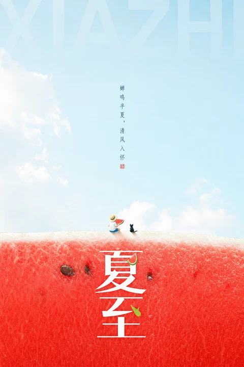
2,322 tekensAround any subject, generate a visual image with translucent negative space and a strong seasonal atmosphere: the upper part keeps a large bright, airy empty field, the background like open air washed by light, with only a few soft cloud shadows, misted layers, or light subject-derived textures carrying spatial depth; the lower part sets a full high-saturation textured color field translated from the subject's material and emotion, with naturally undulating edges and a fine, faint, tactile fiber or grain surface, forming a crisp yet soft horizontal divide with the void above. The visual focus sits near the dividing line, using a tiny narrative silhouette or symbolic action of the subject to create scale contrast, making the vast void and color field feel quieter and more memorable. The titling has three layers: at top, a very large, low-opacity, cropped Latin or pinyin letterform as background structure in the air; at center, small, narrow, sparse type in vertical or axial layout forming a quiet rhythm; at bottom, the main title in large geometricized Chinese or subject characters pressed onto the color field, with crisp strokes, ample space, and clear contrast to the texture. Draw colors from the subject's season, material, culture, and emotion, mapped to a large high-brightness clean base, a bright lively lower mood color field, a little calm dark information, and very few crisp accent points, keeping translucent, bright, clean, light graded relationships; even if the subject color is darker, keep translucent light, clear edges, and no muddy dirt. The finish blends a modern solar-term poster with brand visuals: restrained image, bold negative space, sparse but clearly hierarchical information, real light texture, with text and graphics together forming a reading path from air to surface, from the huge letter shadow to the tiny action to the main title. —————— Make the image as: a refreshing Summer Solstice watermelon solar-term poster, keeping the large blue-sky void and the red flesh-textured color field below Publishing context: a daily solar-term card for social media or WeChat, expressing high summer, freshness, and lightness Keep text: main title “夏至” (Summer Solstice), small text may read “蝉鸣半夏,清风入怀” (Cicadas sing in midsummer, fresh breeze to the heart) Size: vertical 3:4
Afbeeldingsprompt
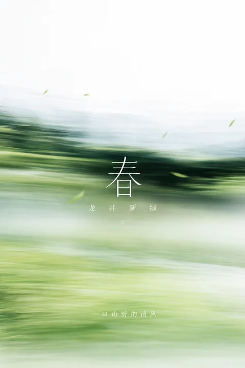
2,163 tekensAround any subject, generate an image of translucent Eastern poeticness: at first glance not a clear realistic scene, but a natural color field swept quickly across the horizontal, the subject translated into soft trailing shadows, layered sweeping light bands, and near-far focus shifts; the top keeps a bright, airy high-brightness void, the upper-center forms a denser, deeper, more concentrated subject structure band, and the lower part gradually transitions into an open, transparent, quiet pale zone, making the eye halt suddenly mid-motion. The subject need not be fully rendered; use a sense of speed, blurred edges, a faint water-mist horizontal texture, and a few subject-derived details to build the memory point; edges should soften but keep clear gradation, avoiding dirty gray, aged look, and heavy grain. Draw colors from the subject's season, material, emotion, and cultural signals, keeping the role relationship of a large bright clean base, a deeper structural color, small soft auxiliary colors, and white information color; overall bright, translucent, clean, and light, saturation controlled but not stuffy, dark only carrying the spatial center and speed trajectory, light handling breath and negative space. If text appears, it should sit like a still breathing point embedded in the moving color field: a single minimalist large character at center as visual anchor, short words below in loose spacing, a quiet short line at the bottom, all in fine clean white type, restrained, quiet, well-spaced. The final effect should feel like the afterimage of a subject motif after sweeping past in the wind—empty, bright, soft, fast—carrying both Eastern reticence and a modern photographic momentary motion. —————— Replace the theme: dominated by jasmine fragrance and a light-green wind feel, still like the afterimage of spring sweeping past a meadow Store use: for a tea shop's small spring poster or Xiaohongshu cover, keeping the image quiet and translucent Must appear: central large character “茉” (jasmine), below the short words “花 香 入 茶” (flower, fragrance, into tea), without adding complex product staging Output spec: vertical 9:10
Zo gebruik je hem
Het werd gedeeld als GPT Image 2-prompt, dus de opmaak is gebouwd voor de tekstweergave van dat model. Om het je eigen te maken, verwissel je het bloemtype of de groettekst, maar behoud je het bleke basisvlak, de doorschijnende bloemblaadjes en de witte radiale openingen die de look dragen. De ranken en kleine blaadjes sturen het oog, dus houd ze aan, ook als je de bloem verandert. De afgewerkte poster past bij een zomerse groetpost of een handgemaakte kaart.
Openbaar gedeeld op X op 23 jun 2026. Alle eer voor deze prompt en het resultaat gaat naar de maker. Is dit van jou? Vraag om een aanpassing of verwijdering.