Afbeeldingsprompt Branding & UI Aanpasbaar
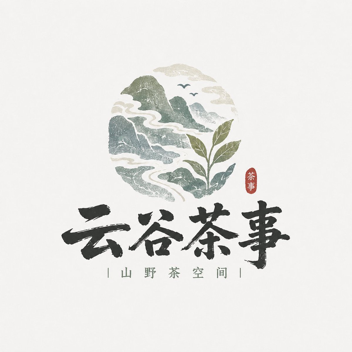
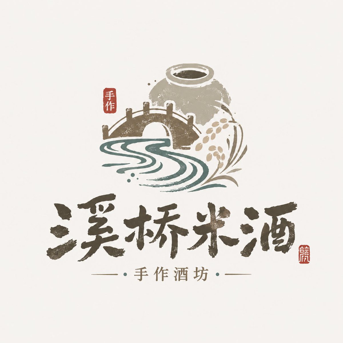
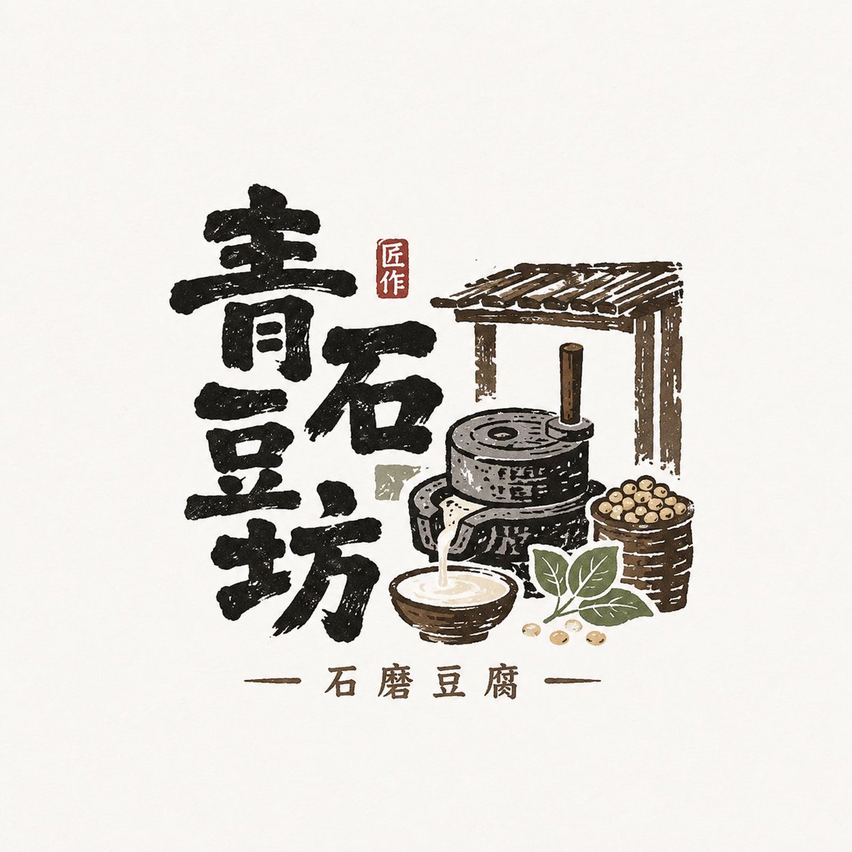
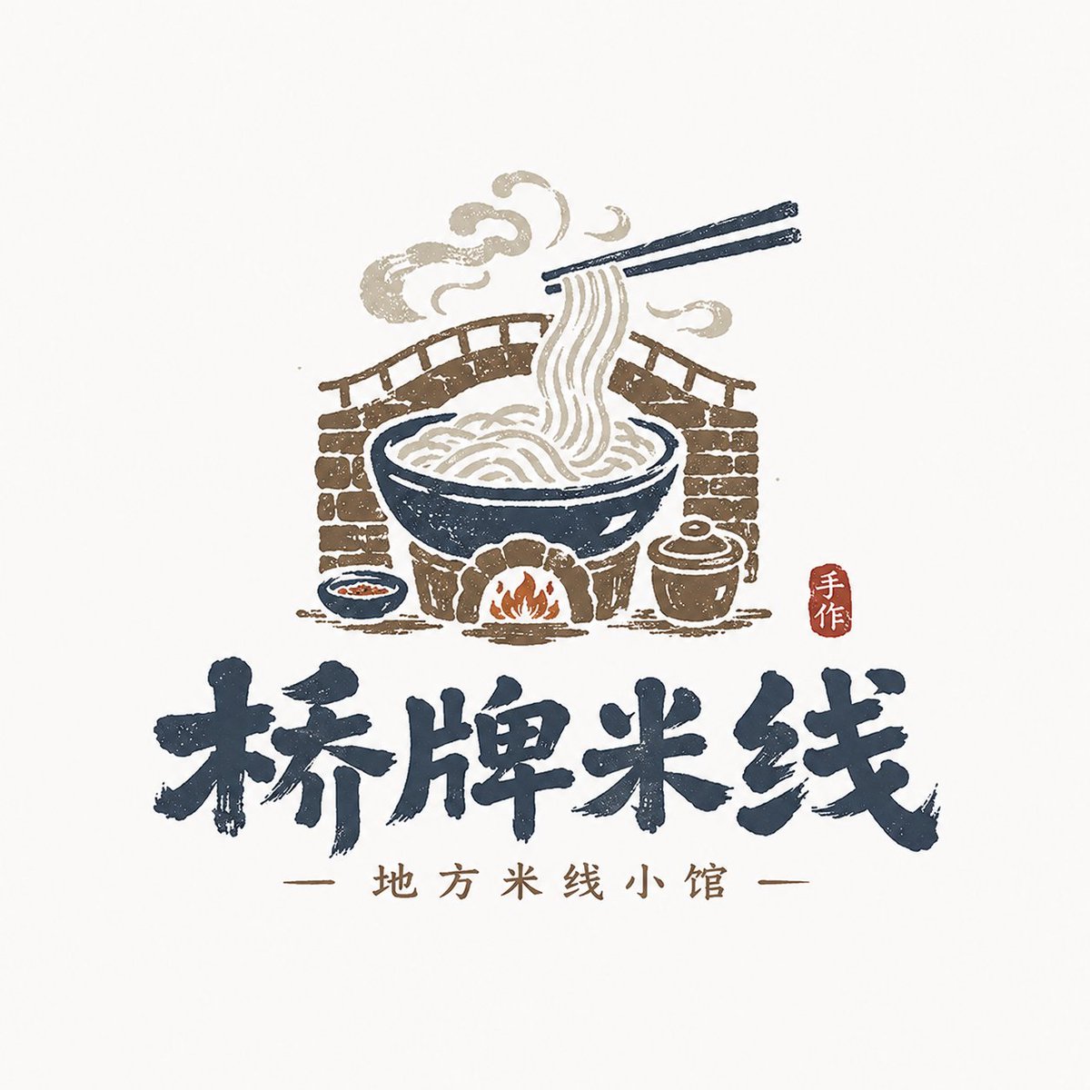
Handgemaakt Chinees woordmerk-logo met regionale motieven
Een Chinese merknaam vormt het middelpunt, geschreven met een penseelachtige, volkse winkelbordstijl en vergezeld van kleine regionale grafische elementen. Gedempte natuurlijke tinten en een subtiele houtsnedestructuur laten het aanvoelen als een winkelnaam die uit zijn eigen plek is gegroeid.

- Model
- GPT Image 2
- Type
- 4 afbeeldingen
- Beeldverhouding
- 1:1
- Gedeeld
- 20 mei 2026
- Likes op X
- 173
MerknaamKernmotiefRegio
Afbeeldingsprompt
6,470 tekensBased on the user-provided fields — 【Brand / project name】【Subtitle / product name】【Type / industry】【Brand positioning】【Core keywords】【Core motif】【Regional information】【Emotional temperament】【Primary color】【Accent colors】【Aspect ratio】 —, design a highly finished «Local Craft Illustrated Wordmark Logo / 风土手作图文 Logo». 【User input】 Brand / project name:【】 Subtitle / product name:【】 Type / industry:【】 Brand positioning:【】 Core keywords:【】 Core motif:【】 Regional information:【】 Emotional temperament:【】 Primary color:【】 Accent colors:【】 Aspect ratio:【】 【Core goal】 This time, design a «Local Craft Illustrated Wordmark Logo» that genuinely carries a regional flavor and a handcrafted texture. 【Design essence】 The point of this kind of logo is not to «look very flashy» but to «have flavor, a local feel, and a handmade quality». Complete the following integration: 1. Use the Chinese brand name as the primary identifier; 2. Use small graphics to supplement the regional information; 3. Use low-saturation natural colors to build a mountain/food/craft atmosphere; 4. Use light woodblock, light print, and light handcraft texture to enhance brand warmth; 5. Overall, form a word-and-image mark suitable for small shops, local brands, and cultural-creative brands. 【Most important principles】 1. The Chinese brand name must be the protagonist — clear, legible, with a written or shop-signboard feel; 2. The graphics should be small and precise, expressing local information, food attributes, or craft features; 3. Do not make a large commercial emblem, nor a heavy 'guochao' food-and-beverage trademark; 4. Do not make a high-saturation toy-style cartoon; 5. Do not use text only or image only — it must be a fusion of «text + image»; 6. It should feel handmade and rustic, but not crude or out of control; 7. Retain a natural, quiet, authentic brand temperament; 8. Avoid directly copying any existing brand's or reference image's specific mountain shape, composition, figures, frames, or symbol combinations; draw only on the style method, not on the concrete pattern. 【Typeface / wordmark requirements】 1. The Chinese brand name is the main body; 2. The wordmark should have a handwritten feel, brush feel, folk-signboard feel, small-shop writing feel, or light woodblock feel; 3. It may be slightly naive, rustic, and folk-art in spirit, but must be clearly readable; 4. Do not use a modern corporate sans-serif typeface, nor anything too geometric; 5. Do not use extremely wild cursive calligraphy; 6. It should look like «a name that grew out of the local brand itself», not a typeface stiffly applied. 【Graphic system requirements】 Design small word-and-image elements around the 【Core motif】 and 【Regional information】; the graphics may include but are not limited to: - mountains, water, clouds, bridges, fields, ancient paths, villages, doors and windows, arched scenery; - tea leaves, rice grains, wine jars, stone mills, tofu, bowls, chopsticks, steam, noodles; - small birds, branches, foliage, small beasts, rural animals; - artisans, handcraft scenes, woodblock-style small figures; - local patterns, seals, small labels. Graphic requirements: 1. The graphics should support brand recognition, not steal the show; 2. They should be concise, informative, and carry a local feel; 3. They may lean toward hand-drawing, woodblock, wood carving, or print feel; 4. Do not make complex realistic illustration; 5. The graphics must have a clear relation to the industry and brand temperament; 6. Do not be identical to the reference image's specific patterns, mountain shapes, figure poses, or door/window forms; perform a clear recomposition and innovation in element choice and compositional relationships. 【Composition requirements】 Choose the more suitable composition by brand type: 1. Mountain/regional type: Chinese wordmark + small landscape graphic + whitespace; 2. Handcraft eatery type: Chinese wordmark + food/utensil graphic + small subtitle; 3. Woodblock craft type: Chinese wordmark + artisan/carved-frame small image + small vertical text; 4. Regional object type: Chinese wordmark + wine jar/stone mill/tea ware/gateway scene as symbols. 【Color requirements】 The overall palette is mainly low-saturation, natural, and plain. Requirements: 1. Not too many colors; 2–5 main colors recommended; 2. The colors should resemble natural objects, old printing, ingredients, or handcraft materials; 3. Do not use overly fluorescent, gaudy, or toy-style high-saturation colors; 4. Red may only be a small accent and must not be overused. 【Texture requirements】 Express in moderation: 1. light wood-carving feel; 2. light woodblock feel; 3. light print grain; 4. light paper feel; 5. hand-drawn edge feel; 6. handmade warmth. 【Auxiliary element requirements】 A small amount of auxiliary information may be added: - small subtitle - small seal - small dots - small slogan - origin / handmade / craft note - pinyin or English as a very small auxiliary But it must be restrained; the focus remains the logo body. 【Presentation requirements】 1. This is a standalone logo display image, not a poster; 2. Clean background, recommended light grey-white, off-white, or paper-white; 3. The logo body is clear, complete, and centered; 4. Overall it looks like the mature primary mark of a small brand; 5. Suitable for packaging, shopfront, cup stickers, labels, social-media avatars, and brand key images. 【Style keywords】 Local Craft Illustrated Wordmark Logo, 风土手作图文 Logo, local feel, small-shop air, mountain-and-field, handcraft eatery, woodblock craft, natural palette, word-image fusion, Chinese handwritten wordmark, light print feel, folk-art temperament, cultural-creative small-shop brand. 【Acceptance criteria】 Ensure the final result meets: 1. The brand name is readable at a glance; 2. The local feel or food/craft attribute is felt at a glance; 3. It has a small-shop brand feel, not a big-corporation trademark feel; 4. Text and image combine naturally; 5. The palette is natural and pleasant to look at; 6. The style is unified but does not over-imitate the reference image; 7. It holds up as a real brand logo. 【Output requirements】 Finally output a highly finished «Local Craft Illustrated Wordmark Logo» that must center on the Chinese brand name, combining regional graphics, a natural palette, and light handcraft print texture to form a small-shop-style mark that has local flavor, brand recognizability, and real-world usability.
Zo gebruik je hem
Als je een lokale winkelnaam hebt, zet die dan in het merknaamveld en houd de ondertitel kort, zodat het woordmerk dominant blijft. Behoud de instructie over lichte textuur en lage verzadiging, want juist die details geven het een ambachtelijk, rustig karakter. Je kunt het resultaat gebruiken op verpakkingen, winkelgevels, bekerstickers of als social media-avatar. Het werd gedeeld als GPT Image 2-prompt.
Openbaar gedeeld op X op 20 mei 2026. Alle eer voor deze prompt en het resultaat gaat naar de maker. Is dit van jou? Vraag om een aanpassing of verwijdering.