Prompt per immagini Prodotto e pubblicità Personalizzabili
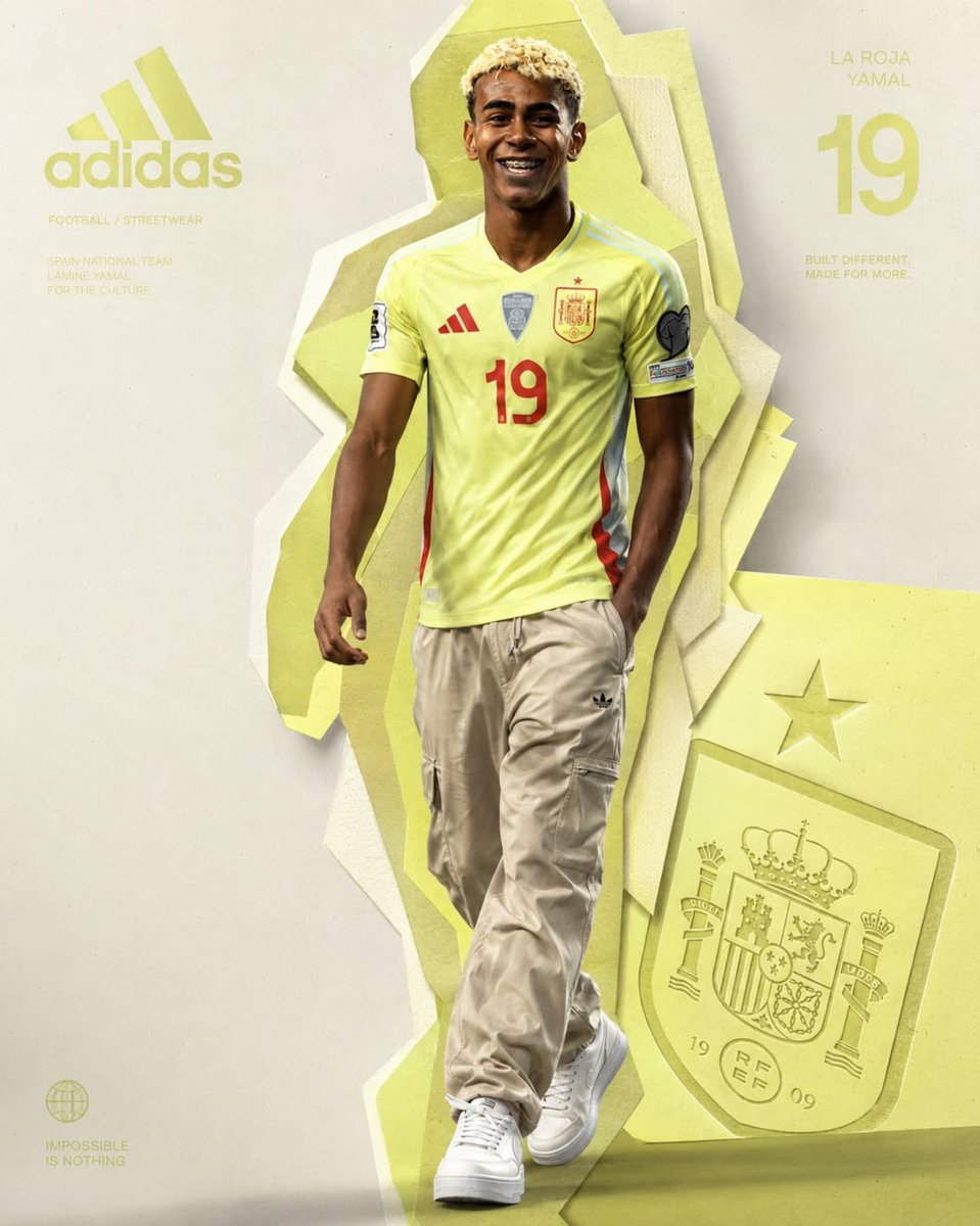
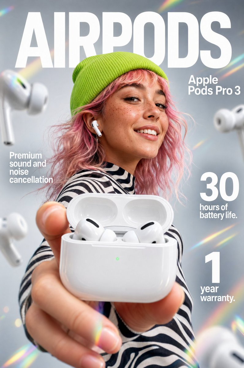
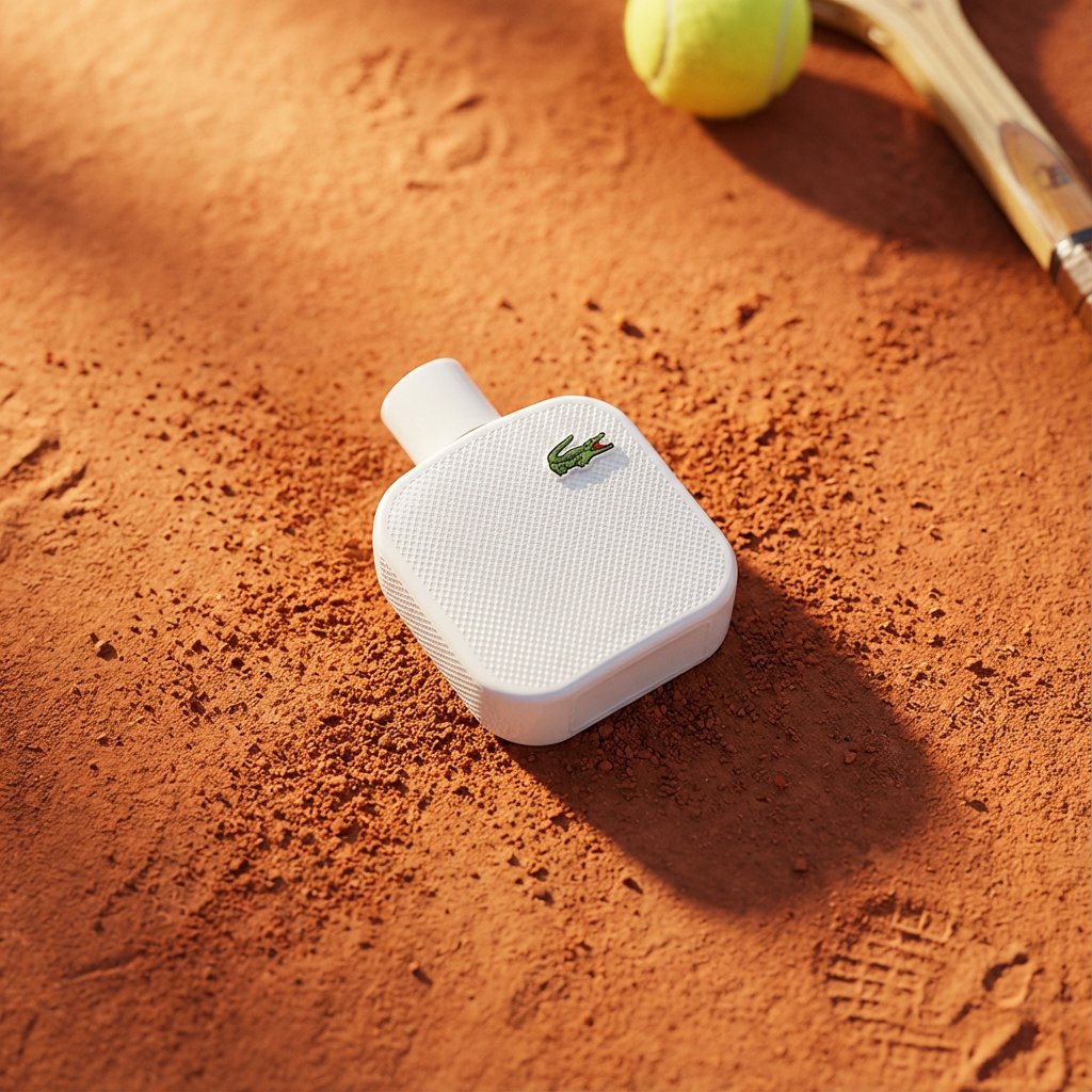
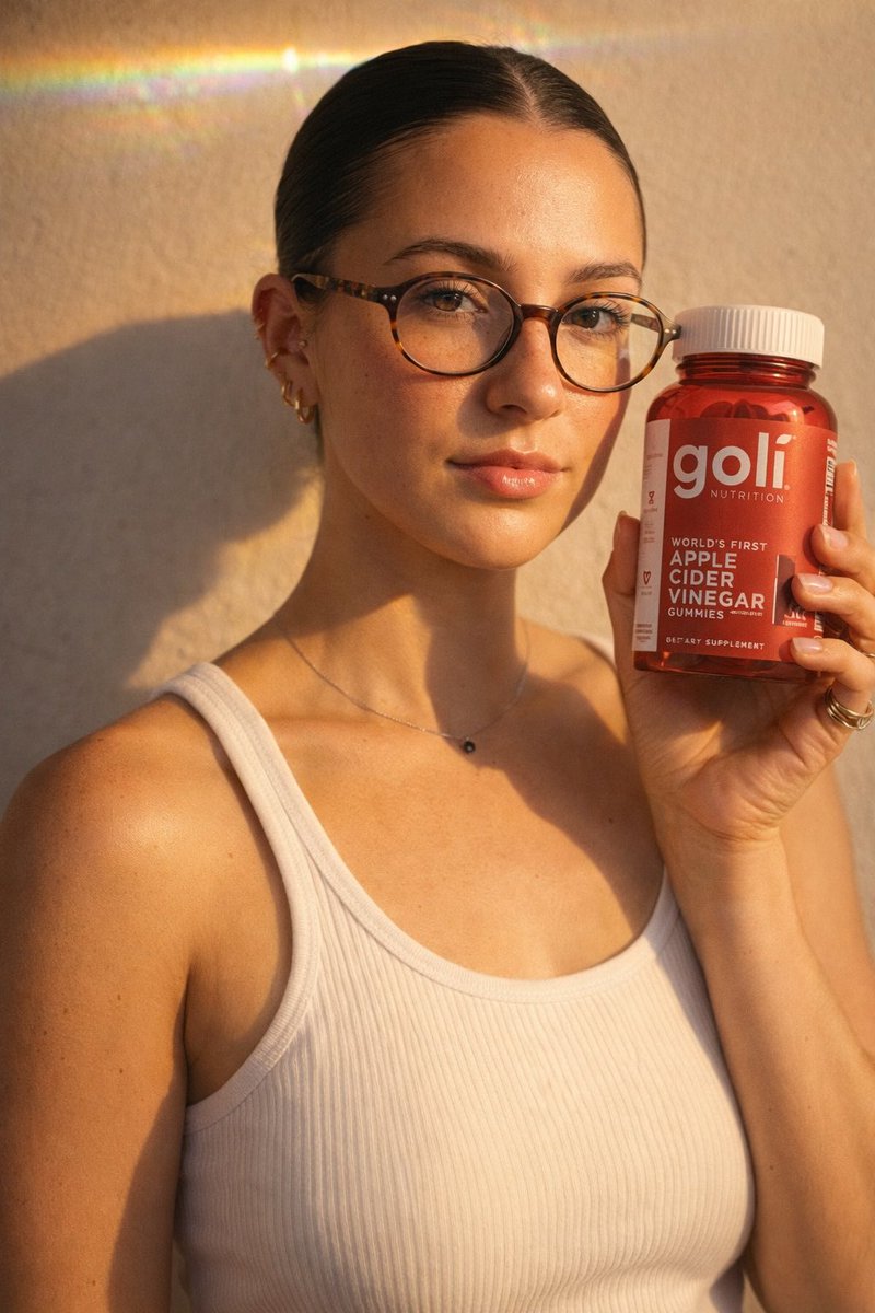
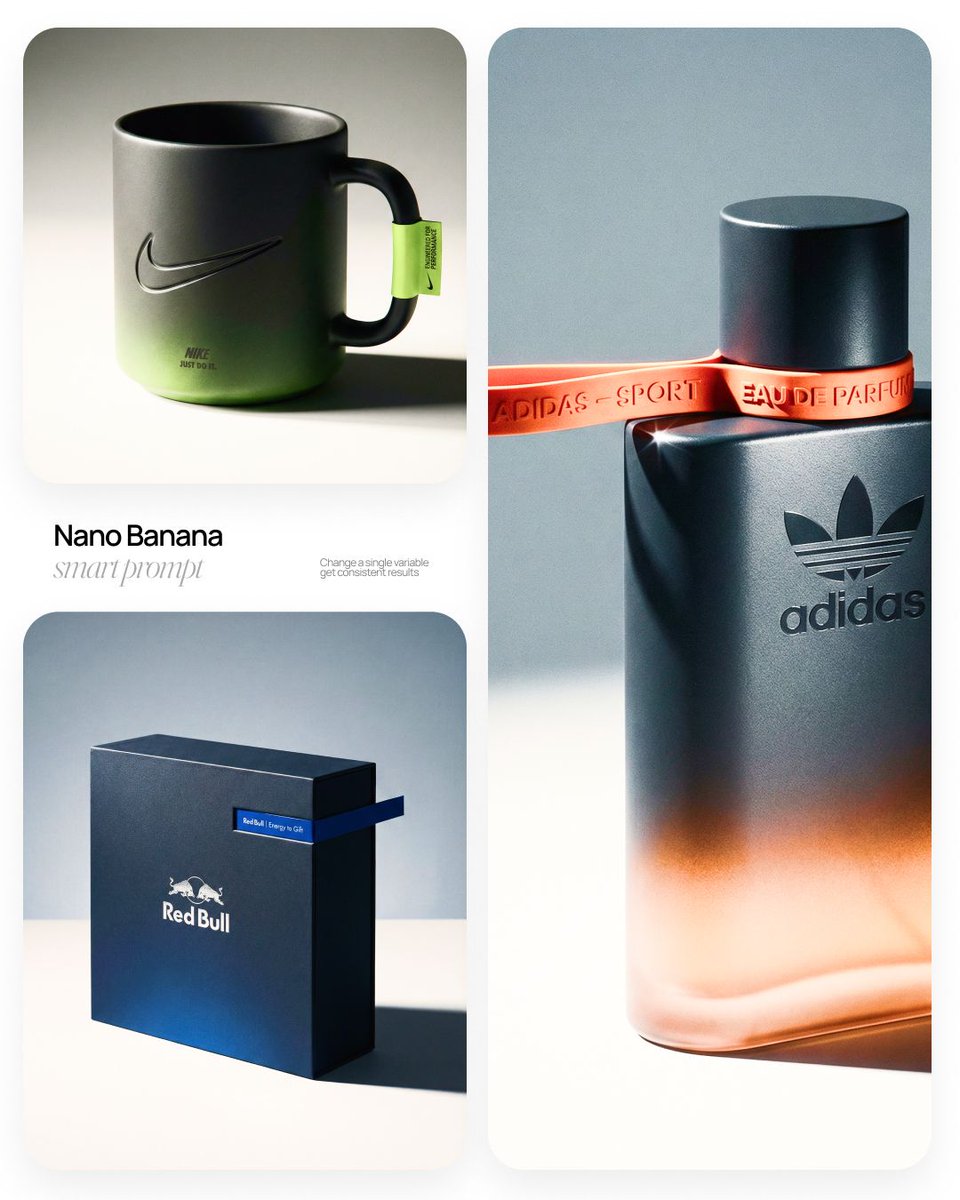
Scatto da studio di prodotto di lusso con accento sfondato
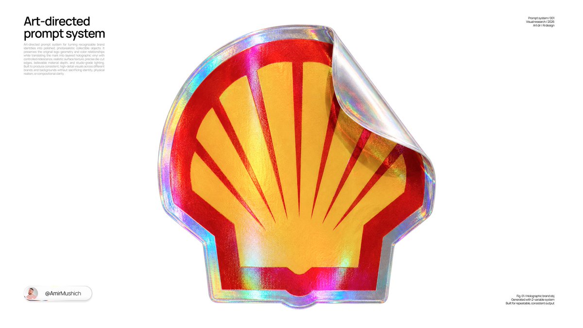
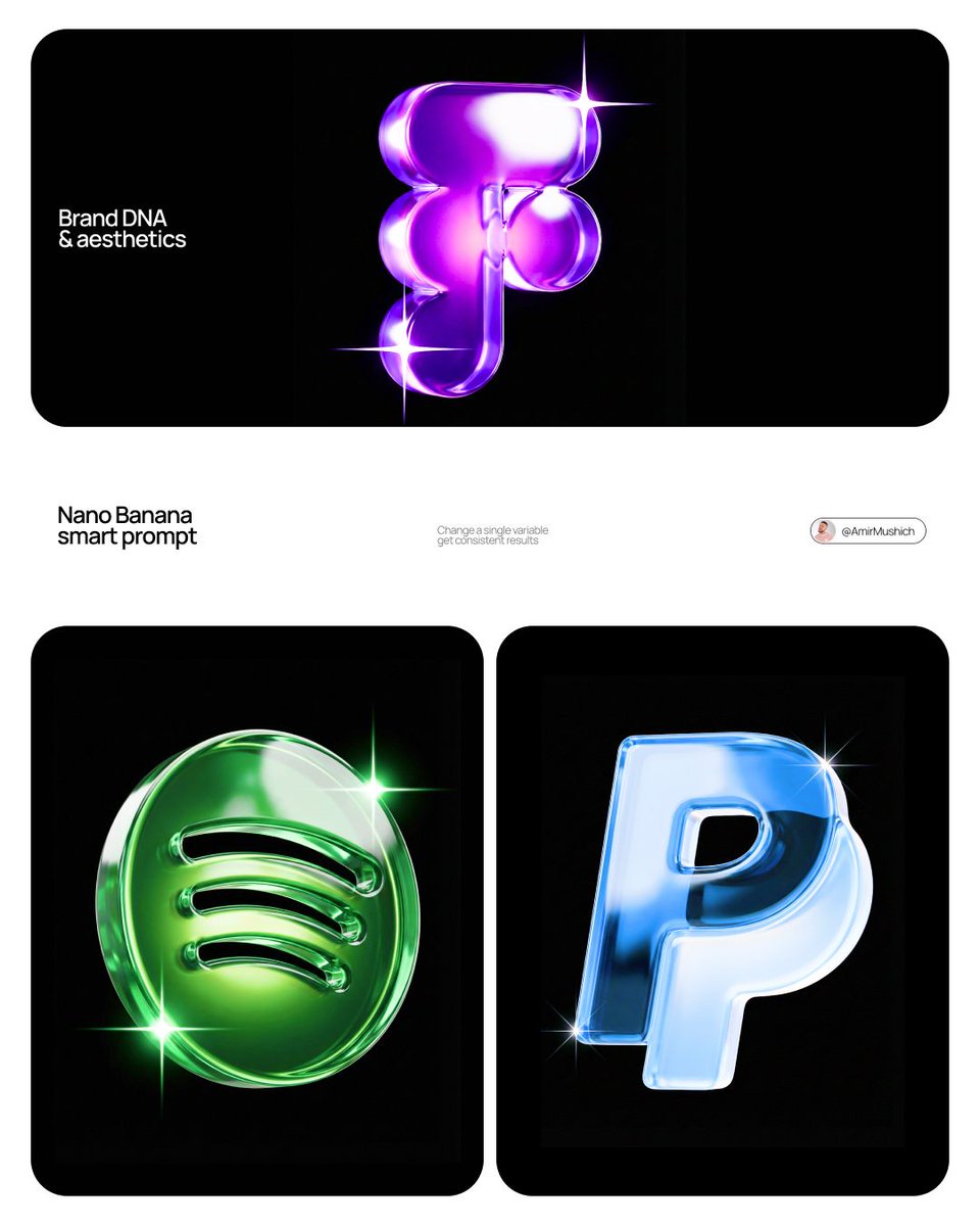
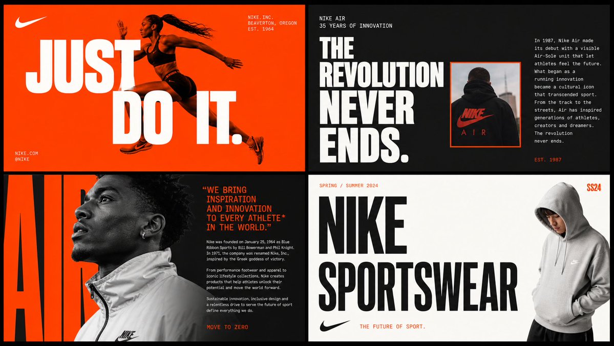
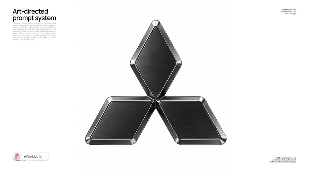
Un prodotto scuro e opaco mostrato a tre quarti sotto un'unica luce principale dura, con una striscia satura nel colore del brand che sembra superare il bordo dell'oggetto. Il risultato ricorda un annuncio di una rivista di moda di alta gamma: sobrio, preciso e illuminato con nettezza.

- Modello
- GPT Image 2
- Tipo
- Immagine
- Proporzioni
- 4:5
- Condiviso
- 20 apr 2026
- Mi piace su X
- 508
Nome del brandOggetto
Prompt per immagini
3,355 caratteri[BRAND NAME] | [OBJECT] Act as a High-End Commercial Product Photographer and Creative Director shooting a luxury editorial campaign (Hypebeast / Highsnobiety / Wallpaper* level). PHASE 1: BRAND INTELLIGENCE The hero subject is a [OBJECT] branded for [BRAND NAME]. Autonomously determine [BRAND NAME]'s full visual identity: signature color palette, typographic DNA, logo mark geometry, material language, and cultural positioning. Apply this identity to the [OBJECT] with precision — do not invent a generic brand, decode the real visual codes. PHASE 2: OBJECT SURFACE & MATERIAL DNA Regardless of the shape of [OBJECT], apply this material system: Base tone: deep neutral — matte dark graphite, warm charcoal, or matte black. Fine-grain surface micro-texture visible under raking light — powder-coat, matte paper, or brushed material feel. Subtle gradient bloom: the base color dissolves in the lower portion of the object's surface into the brand's most iconic accent color — a soft luminous haze from within the material, not a printed graphic. Logo application: embossed, debossed, or metallic foil relief — catching specular light at edges only. Precise. Restrained. Typography: brand-accurate typeface, small tracking, positioned with editorial intentionality. PHASE 3: THE ACCENT BREAKOUT ELEMENT This is the signature design move — adapt it to the natural geometry of [OBJECT]: Identify the most logical "interruption zone" on [OBJECT] — a seam, edge, band, collar, rim, strap, or wrap point. At this zone, apply a narrow saturated accent element in the brand's most iconic hue — vivid, slightly matte. This element must visually "break out" of the object's boundary — extending, protruding, or wrapping beyond the expected edge, creating a deliberate 3D tension between the object and the detail. The accent element carries a micro-typographic brand detail — tagline, model name, or descriptor — small, precise, tracked. PHASE 4: STAGING & COMPOSITION Studio cyclorama. Surface tone: off-white to warm light gray. Background field: cool neutral mid-gray, darker in upper zone. [OBJECT] positioned at 3/4 angle — front face and one secondary surface simultaneously visible. Rule of thirds: object occupies right 60% of frame. Left field: generous negative space — intentional, not empty. Single hard-edged directional shadow cast to the right and slightly downward — crisp penumbra, no diffusion. PHASE 5: LIGHTING Single dominant key light: large softbox, camera-left, elevated at 40°. Specular highlight traces the top-left edge of [OBJECT] — revealing material grain. Shadow side: no fill. Darkness earns depth. Subtle ambient bounce from cyclorama floor — lifts shadow by 15%, no more. Accent element receives micro-specular glint along its dominant edge. Mood: Rembrandt chiaroscuro logic applied to product photography. No lens flare. No atmospheric effects. PHASE 6: TECH SPECS Lens: 85mm equivalent, f/4.5. Depth of field: object fully sharp, background softened. Chromatic aberration: subtle, at extreme frame edges only — optical realism signal. Film grain overlay: 15% opacity — anti-CGI-plastic treatment. Render: Octane / Ray Tracing quality — subsurface scattering where material demands it, global illumination, physically accurate shadow falloff. Aspect ratio: autonomously determine optimal ratio for this [OBJECT] format.
Come usarlo
Sostituisci il nome del brand e l'oggetto con i tuoi, e il prompt ragionerà da solo sui colori e sulla tipografia del brand. Mantieni le sezioni dedicate a luce, ombra e materiali così come sono scritte, perché sono quelle che costruiscono lo stile editoriale. Il risultato funziona bene come immagine principale per una pagina prodotto o per un annuncio in stile rivista. È stato condiviso come prompt per GPT Image 2.
Condiviso pubblicamente su X il 20 apr 2026. Tutto il merito di questo prompt e del suo risultato va al creatore. È tuo? Chiedi un aggiornamento o la rimozione.