Prompt per immagini Prodotto e pubblicità Personalizzabili
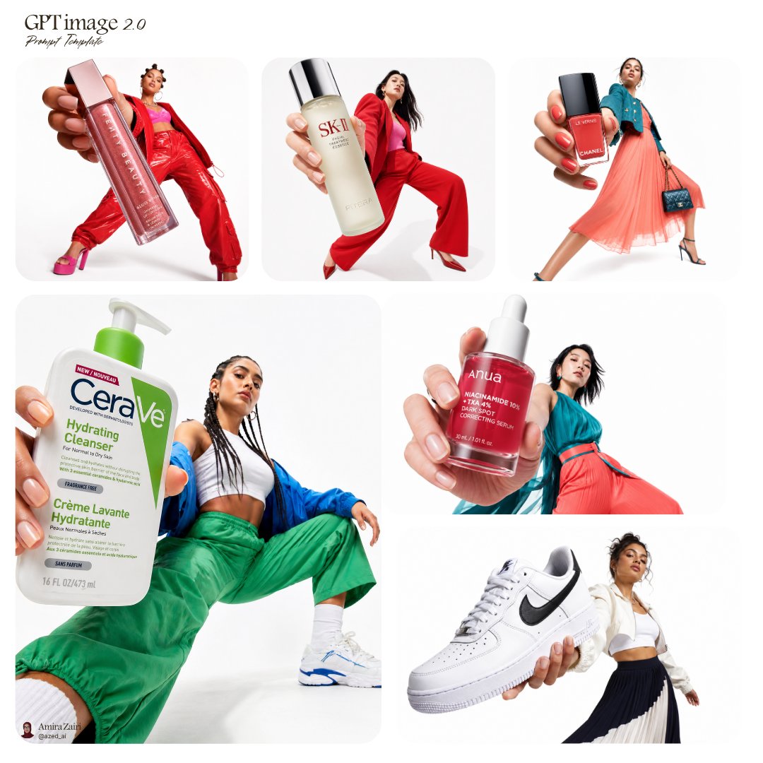
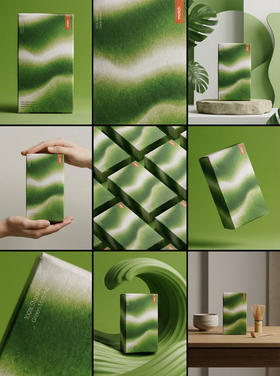
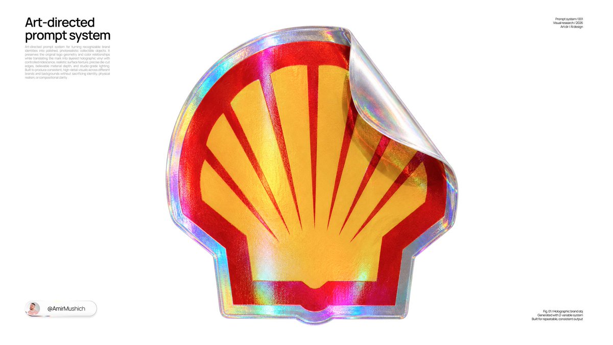
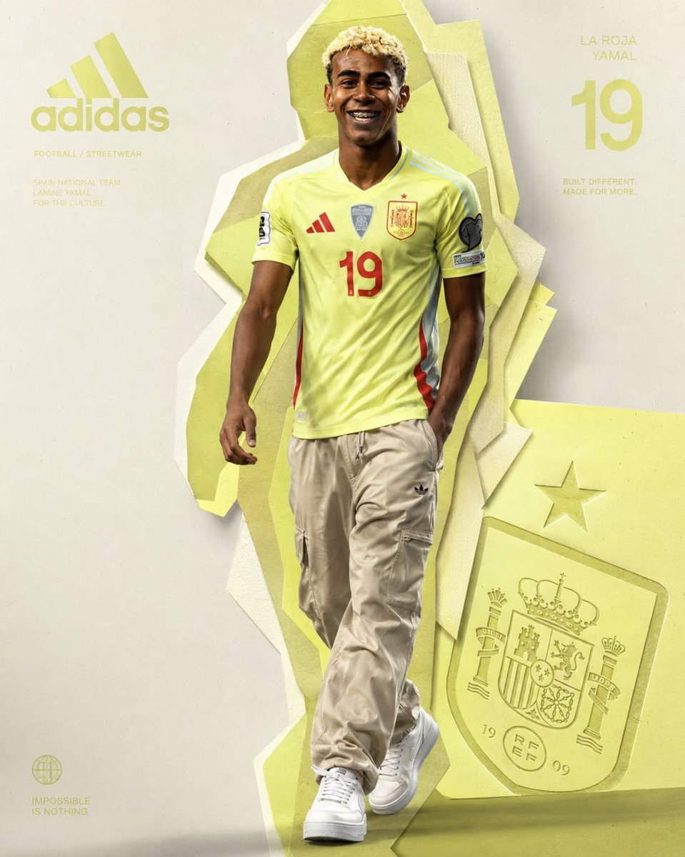
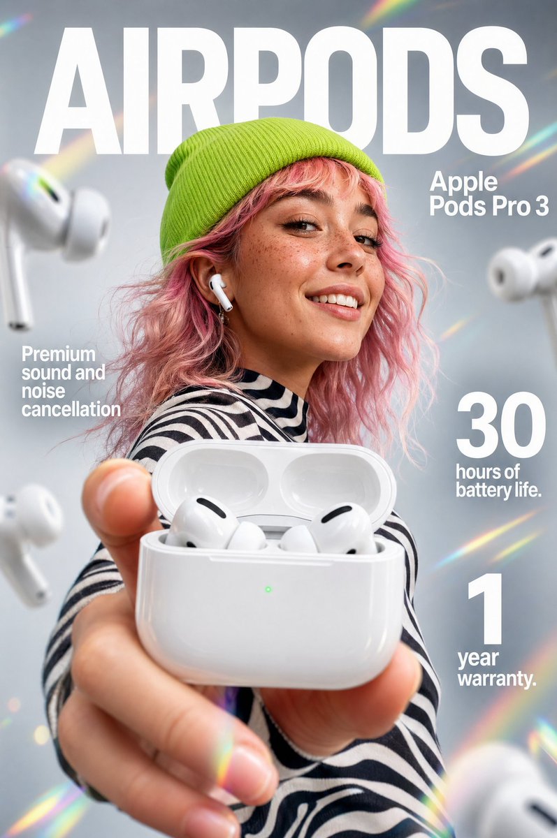
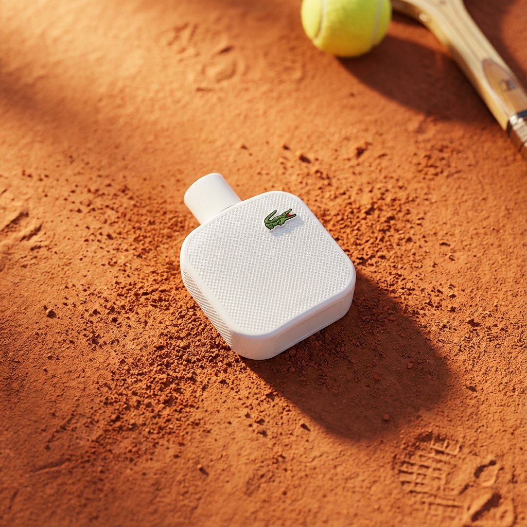
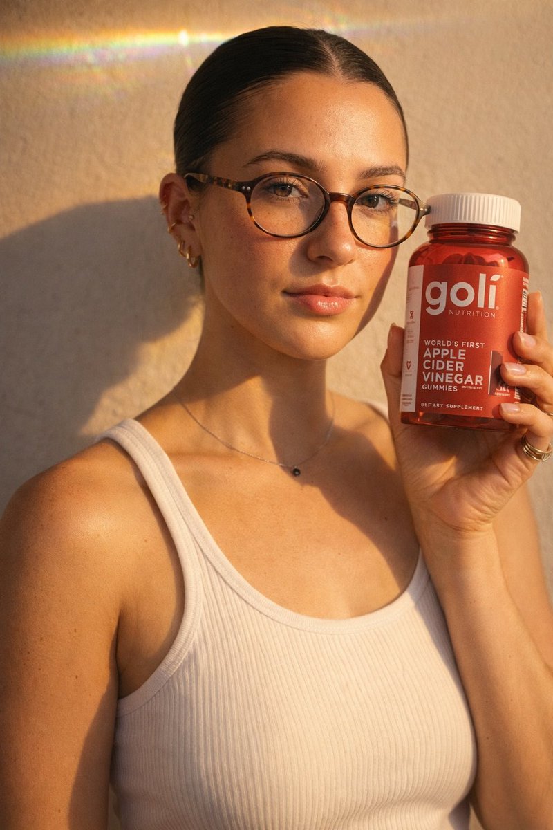
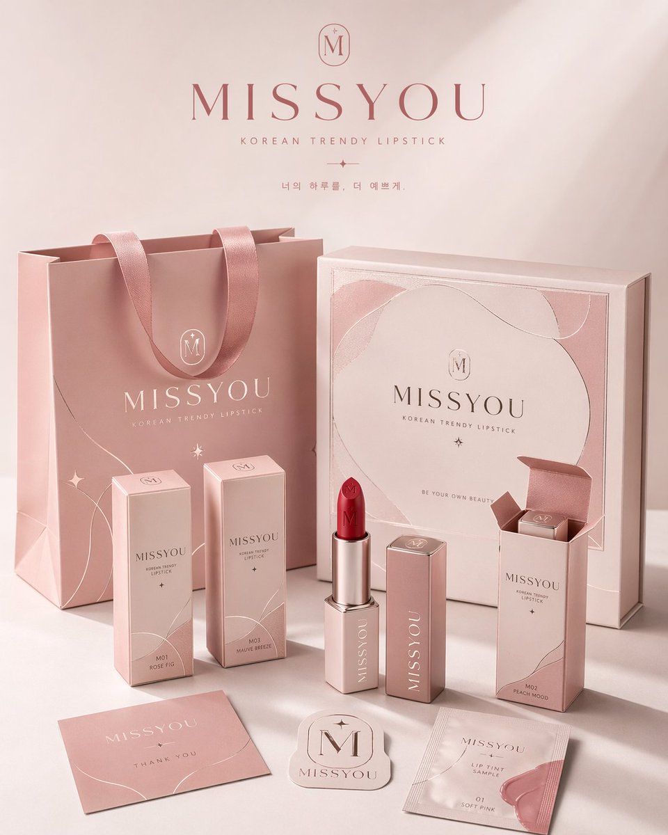
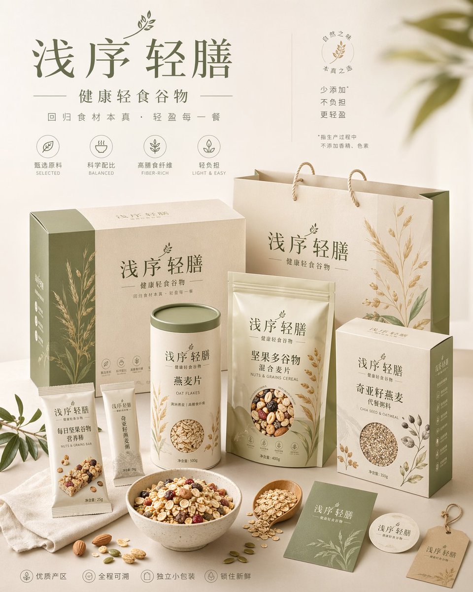
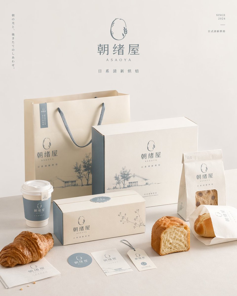
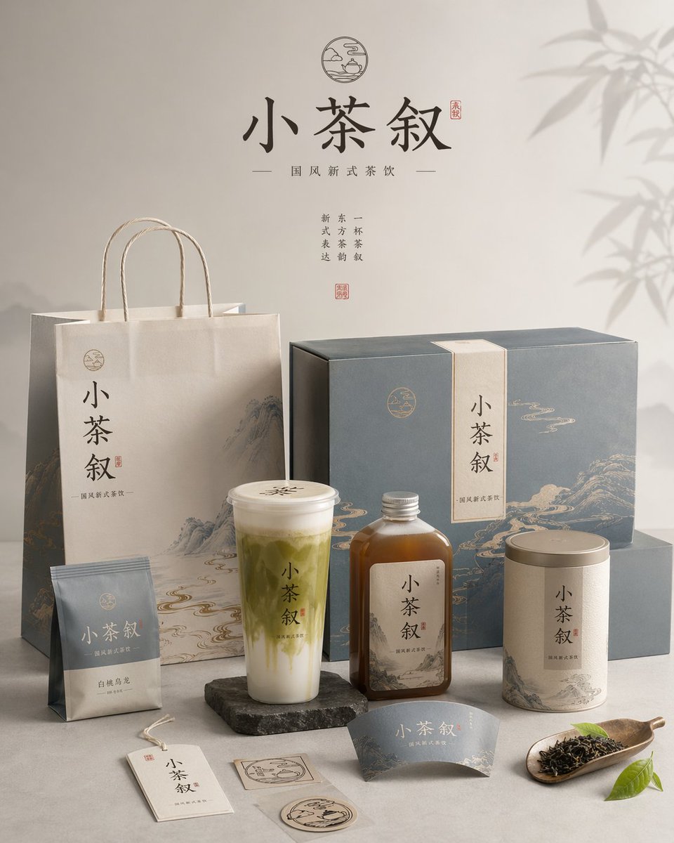
Poster espositivo della famiglia di packaging di un brand in 4:5
Un poster verticale da studio che presenta l'intera famiglia di packaging di un brand, dalle shopper e scatole a bottiglie, etichette e al prodotto stesso. Ogni elemento condivide lo stesso logo, la stessa palette e la stessa finitura di stampa, così che il set appaia come un sistema curato in ogni dettaglio.

- Modello
- GPT Image 2
- Tipo
- 4 immagini
- Proporzioni
- 4:5
- Condiviso
- 23 apr 2026
- Mi piace su X
- 90
Nome del brandCategoria del brand
Prompt per immagini
7,339 caratteriFor the brand 【brand name】, category 【brand category】, create a high-aesthetic, high-finish "brand packaging system display image." This is not an ordinary white-background e-commerce shot nor a single-product photo, but a packaging-family display image with a brand-pitch feel, a visual identity system feel, and commercial-photography quality. The image must convey "the unified rollout of one brand across multiple packaging carriers," presenting the complete packaging system of a mature consumer brand. 【Format】The whole must be a fixed 4:5 vertical poster composition, clearly portrait-oriented; do not generate horizontal composition, wide desktop layouts, or overly scattered horizontal displays. The composition must follow poster reading logic: breathing space at the top, the packaging system's main visual focus in the middle, and auxiliary packaging, labels, and the product itself at the bottom; a concentrated center of gravity, suitable to publish directly as a brand display poster. 【Core requirement】Automatically match the most reasonable and natural packaging combination and product forms based on 【category】, and build a unified brand visual system around 【brand name】. Choose few but representative packaging forms to compose a complete yet refined system; do not pursue quantity, but emphasize hierarchy, brand unity, and display aesthetics. Depending on the category, choose some of these types: tote bag / shopping bag; carton / gift box / outer box; long box / single-item box / set box; pouch / sleeve / sample sachet / soft pouch; cup / bottle / jar / tube container / spray bottle / pump bottle; label / sticker / seal / hang tag / small card; plus the real product corresponding to the category. 【Category-fit logic】Packaging and product forms must match 【category】 automatically, without being confined to one direction. Reference: if the category is food / bakery / snacks / beverages, favor paper bags, cartons, pouches, cups, food containers, stickers, seals, and the real product; if tea drinks / coffee / beverages, favor cups, bottles, cans, tote bags, cup sleeves, lid seals, gift boxes; if beauty / skincare / makeup / perfume, favor bottles, jars, tubes, boxes, gift boxes, tote bags, sample packaging; if fragrance / home / lifestyle, favor aroma bottles, candle cups, boxes, gift boxes, tote bags, hang cards, label cards; if apparel / accessories / art toys / creative goods, favor boxes, drawer boxes, dust bags, tote bags, stickers, tags, accessory packaging; if digital accessories / tools / small consumer goods, favor hard boxes, outer boxes, storage bags, instruction cards, stickers, sleeves, labels. Overall it must convey "reasonable category, unified brand, systematized packaging." 【Quantity and density control】Control the number of objects; do not overstack, and do not display every possible packaging form. The whole should read as "few but fine, complete but not crowded." Suggested: large packaging 1–2, medium 2–3, small or auxiliary items 2–4, real products 1–3, total visible elements kept to 6–10. Packaging types should show tiered variation and a systematic feel, without repeating too many similar items. There must be enough white space and breathing room, each package clearly visible, hierarchy clear, arranged with ease; better few and fine than overstuffed for "completeness." 【Brand visual system requirement】All packaging must belong to the same brand system, uniformly using 【brand name】 as the core brand identifier. There should be consistent logo / mark presentation, font style, graphic language, illustration language or pattern system, layout logic, color system, and material and print quality. Brand tone, color direction, pattern elements, auxiliary graphics, and visual atmosphere should match 【category】 automatically and diverge reasonably, not confined to any fixed style. The overall style should be unified, harmonious, and recognizable: minimalist premium, natural organic, modern fashion, light-luxury refined, young and fresh, artistic, trendy, or classic elegant, but must fit 【category】 and show a mature brand's design finish. 【Color mechanism requirement】Do not fix the palette to one set combination, and do not repeatedly output highly similar main color systems. Each generation should actively form different main color schemes and relationships based on 【category】 and brand temperament, using "controlled divergence" to develop color. Colors may be low-saturation natural, modern neutral, light retro, bright and fresh, light-luxury dark, or artistic mixed systems, but must stay premium, unified, restrained, and brand-like. A different visual temperament is allowed each time, e.g. cream white and caramel brown, misty gray-blue and warm white, olive green and linen beige, wine red and cream white, cocoa brown and ivory, charcoal and straw gold, misty pink-gray and off-white, navy blue and warm gray — only as reference directions, not fixed templates. No fluorescent colors, no cheap high saturation, no chaotic uncontrolled multicolor collage. 【Composition and display requirement】Use a brand packaging-family display logic, not messy piling. The whole is a commercial studio scene, using a slight 3/4 top-down angle or a slightly perspectival frontal display angle, forming a layered, orderly, hierarchical packaging display. Reference: in the back, place 1–2 larger packages as visual support (tote bag, large gift box, large outer box); in the middle, arrange the brand's core packaging or hero item as the main visual focus; in the front, place smaller packaging, auxiliary packaging, labels, stickers, and the real product; at least one real product interacts naturally with the packaging (half-revealed, placed in front of the packaging, displayed in combination); overall a balanced, design-minded triangular or staggered composition. The image is clean, with white space, uncrowded, rich but restrained, expressing a complete brand packaging ecosystem with a limited but precise packaging combination. 【Visual style requirement】Overall a high-end commercial-photography quality and brand-pitch feel, background a clean studio environment: white, warm white, light gray, or a minimalist background auto-matched to brand tone. Emphasize real packaging material rendering: clear paper creases, box structure, bottle/jar contours, label details, print quality, embossing / foil stamping / matte / tissue-paper texture / kraft-paper texture, plus a unified premium color pairing, a refined, modern, clean brand visual language, and a strong sense of "this is a whole brand packaging system." 【Lighting requirement】Use real commercial-photography-level lighting, either soft studio light or slightly directional natural side light. Clear but restrained shadows are needed to enhance dimensionality, spatial feel, and premium quality. Overall light is translucent, bright, and clean; no dimness, no cheap feel, no messy background. 【Final effect requirement】The final image should look like a mature brand's packaging system display poster, packaging-family pitch, or brand visual rollout mockup, not a scattered product collage. Emphasize: fixed 4:5 vertical poster feel, brand unity, packaging-family completeness, commercial-photography feel, design-pitch feel, category fit, and high aesthetics and visual finish.
Come usarlo
Se vuoi usarlo per la tua etichetta, cambia prima il nome del brand e la categoria, poi lascia che il modello scelga le forme di packaging più adatte. È stato condiviso come prompt per GPT Image 2, quindi mantieni l'inquadratura verticale 4:5 e l'istruzione che limita il numero di elementi visibili per tenere la composizione ordinata. I risultati migliori si ottengono lasciando invariato il linguaggio sull'unità del brand e sugli spazi vuoti.
Condiviso pubblicamente su X il 23 apr 2026. Tutto il merito di questo prompt e del suo risultato va al creatore. È tuo? Chiedi un aggiornamento o la rimozione.