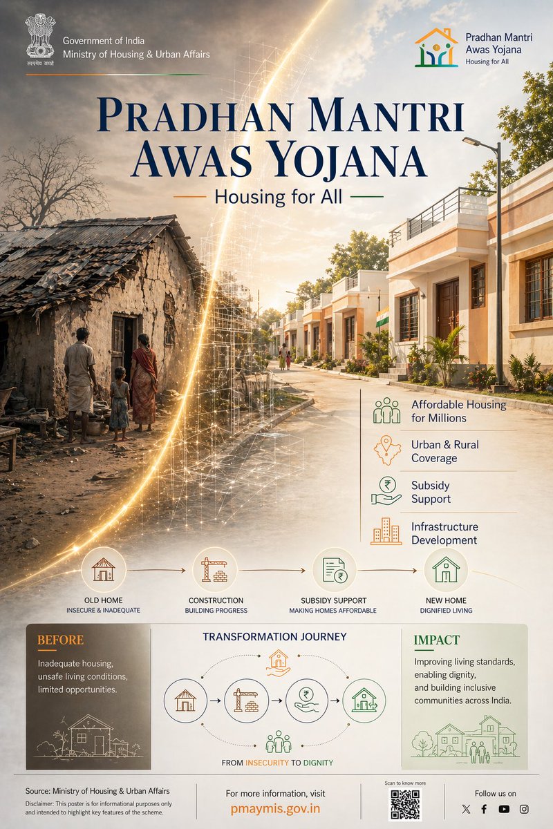
Prompt d'image Branding et UI Personnalisables
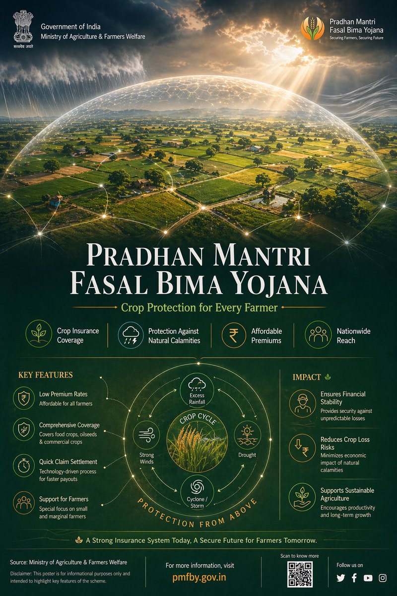
Affiche infographique de programme gouvernemental avec dôme protecteur
Une affiche éditoriale verticale montre des terres agricoles indiennes sous un dôme faiblement lumineux, tandis que la pluie et la lumière du soleil se rencontrent à sa surface. La mise en page du haut vers le bas passe de la protection aux cultures, avec un titre en serif et une grille d'icônes bien ordonnée en dessous.

- Modèle
- GPT Image 2
- Type
- 4 images
- Format d'image
- 2:3
- Partagé
- 24 avr. 2026
- J'aime sur X
- 80
Nom du programmeNom de la sourceSlogan
Prompt d'image
3,889 caractèresUltra-premium Indian Government infographic poster, 4:5 vertical format, concept-driven design titled "PRADHAN MANTRI FASAL BIMA YOJANA – Securing Farmers, Securing Future", designed in high-end editorial government communication style --- CORE CONCEPT: "PROTECTION FROM ABOVE" Agriculture visualized as being safeguarded by an invisible environmental protection system The entire layout follows a TOP → DOWN visual narrative: Protection originates from above and flows downward to farmers and crops --- LAYOUT STRUCTURE (CINEMATIC TOP-DOWN COMPOSITION): TOP 40% (DOMINANT VISUAL ZONE): Cinematic aerial view of Indian farmland - patchwork agricultural fields (green crops, golden harvest tones) - subtle rural elements (narrow pathways, irrigation lines, small huts) - realistic Indian geography (NOT western farmland) Above farmland: A semi-transparent protective dome (very subtle, premium execution) - dome edge defined by faint glowing contour lines - slight refraction effect (like glass/energy shield) - extremely controlled glow (no sci-fi exaggeration) ENVIRONMENTAL ELEMENTS interacting with dome: - rain clouds releasing water → diffused across dome surface - sunlight rays hitting dome → softly scattered - wind flow visualized using soft directional streaks These elements visually communicate: "risks are present but controlled" --- MID TRANSITION ZONE (SOFT BLEND): Gradient transition from farmland into information layer Add: - faint data lines emerging from farmland - small glowing nodes connecting different plots This creates subtle connection between agriculture and insurance system --- BOTTOM 60% (INFORMATION ARCHITECTURE): Structured like "support layers" --- TITLE BLOCK (UPPER BOTTOM SECTION): PRADHAN MANTRI FASAL BIMA YOJANA Subheading: Crop Protection for Every Farmer Typography: - Serif headline (Playfair Display style), tight kerning, high contrast - Subheading in clean sans-serif (Lato/Open Sans) --- DATA STRIP (HORIZONTAL): Minimal stat highlights: - Crop Insurance Coverage - Protection Against Natural Calamities - Affordable Premiums - Nationwide Reach Each separated with thin dividers, no heavy boxes --- FEATURE SYSTEM (ICON GRID): 4–6 minimal monoline icons: - crop - rain/weather - insurance shield - farmer - financial support Icons connected subtly with thin organic lines (not rigid tech lines) --- CENTER VISUAL (INFOGRAPHIC ELEMENT): Circular diagram inspired by crop cycle + protection - inner circle: crops - outer ring: risk factors (rain, drought, storm) - outermost layer: protection boundary Very clean, minimal, high breathing space --- IMPACT SECTION (BOTTOM RIGHT / FINAL BLOCK): Short refined text: "Ensuring financial stability for farmers, reducing crop loss risks, and enabling sustainable agricultural growth across India" --- FOOTER: Source: Ministry of Agriculture & Farmers Welfare Minimal disclaimer Optional QR placeholder --- COLOR SYSTEM (NATURE-LED PREMIUM): Primary: Deep Earth Green (#2E7D32) Secondary: Soil Brown (#6D4C41) Golden Harvest (#D4A373) Accents: Saffron (#FF9933) Soft Sky Blue (for climate elements) Background: Muted dark green / deep navy blend --- MATERIAL & FINISH: - matte textured background (paper grain subtle) - soft light gradients - minimal glow (only for dome + nodes) - no harsh contrast - realistic lighting balance --- DESIGN PRINCIPLES: - no clutter - no heavy UI boxes - organic flow, not rigid grid - emotional + informative balance - everything visually connected to farmland --- QUALITY: 8K resolution photorealistic + vector hybrid ultra sharp typography award-winning infographic aesthetic Behance feature-level quality --- NEGATIVE PROMPT: no futuristic city elements no neon glow no western farms no clutter no overdesigned UI no heavy gradients no unrealistic sci-fi shield --ar 4:5 --v 6 --style raw --q 2
Prompt d'image
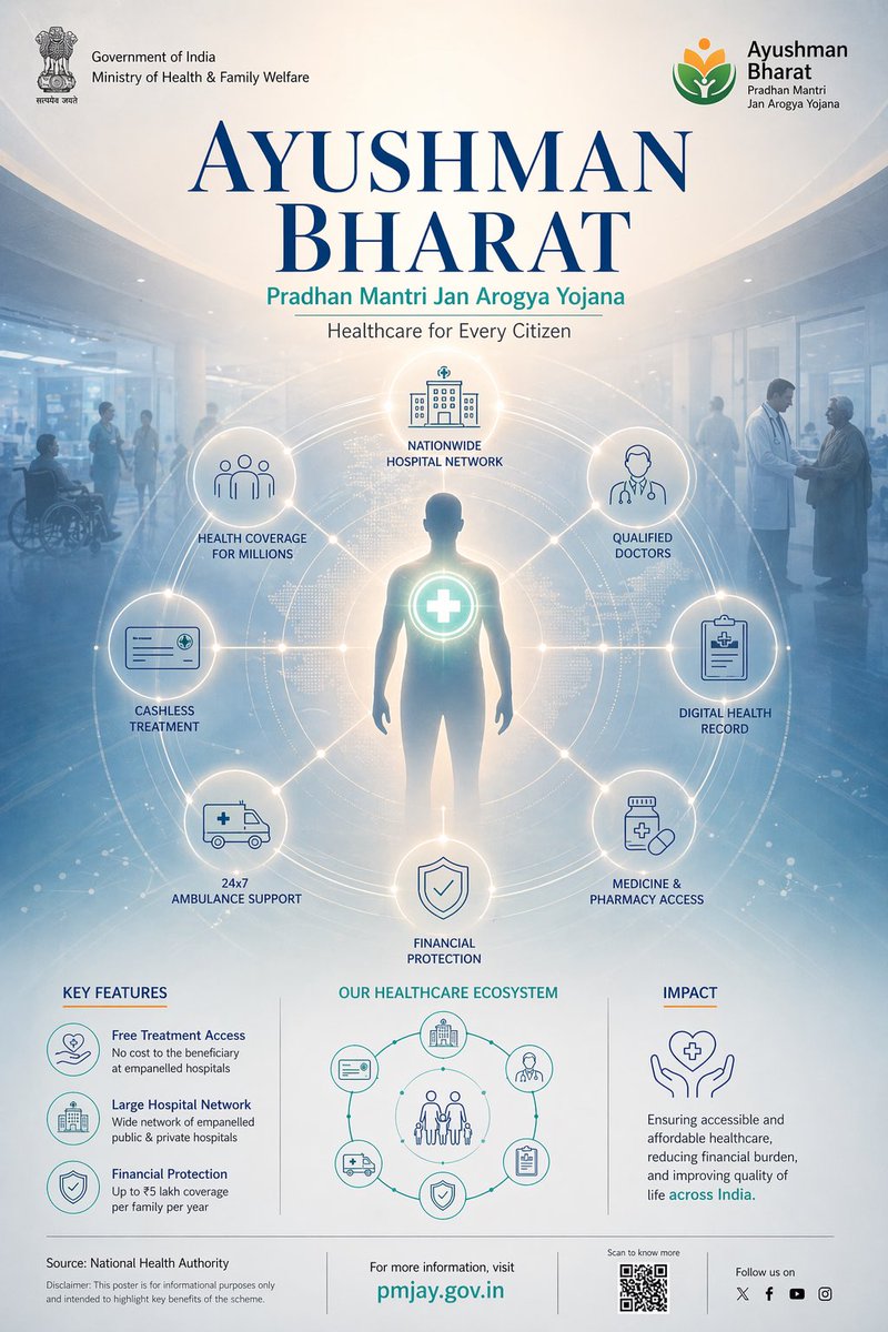
3,644 caractèresUltra-premium Indian Government infographic poster, 4:5 vertical format, concept-driven design titled "AYUSHMAN BHARAT – Healthcare for Every Citizen", designed in high-end editorial government communication style --- CORE CONCEPT: "HUMAN AT THE CENTER OF CARE" The entire design revolves around a central human figure connected to a nationwide healthcare network Visual narrative flows from: CENTER → OUTWARD → SYSTEM → IMPACT --- LAYOUT STRUCTURE (RADIAL + HUMAN-CENTERED COMPOSITION): CENTER CORE (PRIMARY FOCUS – 35%): A subtle, respectful human silhouette (not overly detailed, semi-realistic) - positioned centrally - soft glow around figure (symbolizing protection & care) - neutral expression, inclusive representation At chest/heart level: A glowing medical cross / health node This acts as the "core healthcare access point" --- RADIAL NETWORK SYSTEM (AROUND CENTER): Circular ecosystem radiating outward: Connected nodes arranged symmetrically: - hospital building - doctor figure - insurance card - ambulance - digital health record - pharmacy All nodes connected with ultra-thin glowing lines forming a perfect radial system Lines should feel: - soft - precise - not overly tech-heavy --- BACKGROUND ENVIRONMENT: Blend of hospital + community: - soft hospital interior lighting - faint silhouettes of people in background - subtle gradient from light (center) to darker edges Add very light depth blur for realism --- TOP TITLE SECTION: AYUSHMAN BHARAT Subheading: Pradhan Mantri Jan Arogya Yojana Typography: - Serif headline (Playfair Display style), high contrast, tight kerning - Sans-serif subheading (Lato/Open Sans), clean and modern Spacing: Generous, editorial feel --- DATA PANELS (ORBITAL PLACEMENT – NOT BOXED): Instead of rigid boxes: Place data points around radial system like orbiting labels Content: - Health Coverage for Millions - Cashless Treatment - Nationwide Hospital Network - Financial Protection Each connected subtly to network nodes --- MIDDLE SUPPORT SYSTEM (SOFT STRUCTURE): Add faint circular rings (like medical scan / ripple effect) These rings: - reinforce radial structure - guide eye movement - add premium visual depth --- BOTTOM SECTION (CLEAN + REFINED): LEFT: Key Features: - free treatment access - large hospital network - financial protection CENTER: Minimal circular healthcare diagram (echoing main radial system, simplified) RIGHT: Impact statement: "Ensuring accessible and affordable healthcare, reducing financial burden, and improving quality of life across India" --- FOOTER: Source: National Health Authority Minimal disclaimer Optional QR placeholder Clean separator line --- COLOR SYSTEM (MEDICAL + TRUST): Primary: Deep Medical Blue (#0D47A1) Secondary: Soft Teal / Medical Green (#26A69A) Neutral: White (#FFFFFF) Light Grey (#F5F7FA) Accent: Very subtle saffron (#FF9933) --- LIGHTING & MATERIAL: - soft diffused lighting - no harsh contrast - gentle glow around nodes - matte finish background - slight glassmorphism for depth (very subtle) --- ICON STYLE: Ultra-thin monoline icons Perfect stroke consistency Minimal detail, high clarity --- DESIGN PRINCIPLES: - human-first composition - no clutter - no heavy UI boxes - smooth radial symmetry - everything connected to center --- QUALITY: 8K resolution ultra sharp typography photorealistic + vector hybrid award-winning infographic aesthetic premium editorial layout --- NEGATIVE PROMPT: no dark dramatic tones no neon cyberpunk no clutter no random icons no western-only visuals no harsh lighting no over-complex UI --ar 4:5 --v 6 --style raw --q 2
Comment l'utiliser
Elle a été partagée comme prompt GPT Image 2. Remplacez le nom du programme dans la ligne de titre et la mention de la source ministérielle par ceux de votre propre politique, et conservez la palette de couleurs inspirée de la nature ainsi que le sens de lecture du haut vers le bas, car ce sont eux qui portent le style. Utilisez-la comme modèle de mise en page pour un avis communautaire ou une diapositive d'information, et vérifiez chaque chiffre et chaque avertissement auprès de sources officielles avant publication.
Partagé publiquement sur X le 24 avr. 2026. Tout le mérite de ce prompt et de son résultat revient à son créateur. Ce prompt est le vôtre ? Demandez une mise à jour ou un retrait.