Prompt εικόνας Branding & UI Προσαρμόσιμα
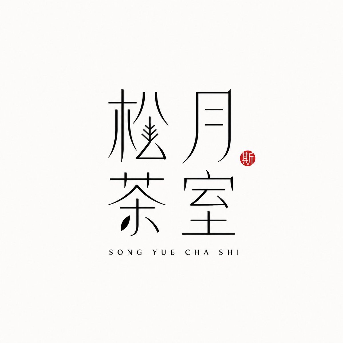
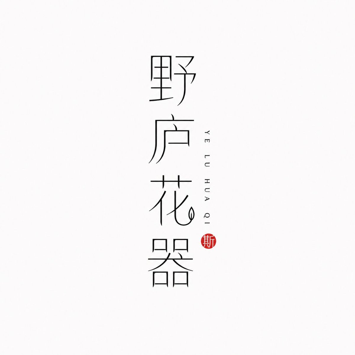
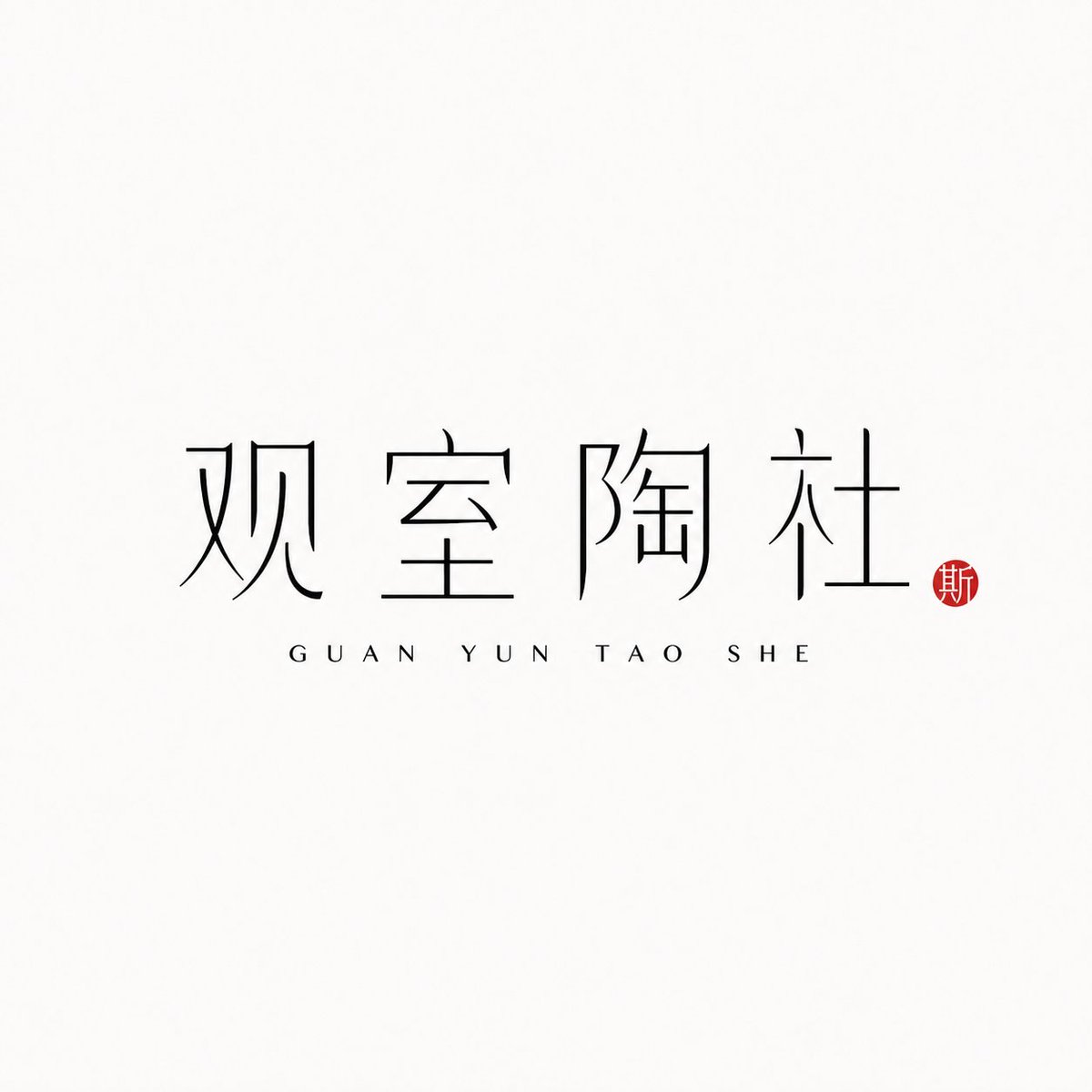
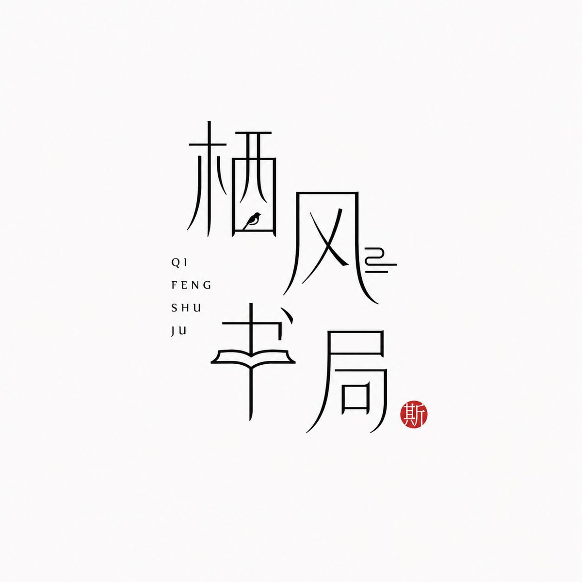
Λογότυπο μάρκας με κινεζικό χαρακτήρα σε λεπτή γραμμή
Το ίδιο το κινεζικό όνομα της μάρκας γίνεται το σήμα, σχεδιασμένο με λεπτές μαύρες γραμμές σε σχεδόν λευκό φόντο. Δίπλα του το pinyin στέκεται διακριτικά, ενώ μια μικρή σφραγίδα κόκκινου κινναβάρι προσθέτει ένα μοναδικό ζεστό accent, δίνοντας μια ήρεμη, σύγχρονη ανατολίτικη αισθητική.

- Μοντέλο
- GPT Image 2
- Τύπος
- 4 εικόνες
- Αναλογία διαστάσεων
- 1:1
- Κοινοποιήθηκε
- 25 Ιουν 2026
- Likes στο X
- 97
Όνομα μάρκαςPinyinΔιάταξη
Prompt εικόνας
1,778 χαρακτήρες[Brand name]: [Auxiliary pinyin]: [Brand direction]: tea house / flower vessel / ceramics / bookstore / fragrance / objects / guesthouse / Oriental lifestyle brand [Layout structure]: 2×2 grid / vertical / horizontal / staggered interweaving [Mood keywords]: cool-serene / restrained / refined / whitespace / modern Oriental / thin-line typography Generate a "Thin-Line Oriental Typographic Logo." The whole is a minimalist Chinese typographic logo on a white or very light gray-white background with abundant whitespace. The main subject is neither an illustration nor a graphic, but the Chinese brand name itself designed as a visual mark. The main Chinese characters use black thin-line strokes — slender, light, restrained, and cool, with a modern Oriental feel. Some strokes may receive slight geometric reconstruction, elongation, broken strokes, displacement, or whitespace treatment, but the whole must keep readability and consistency and must not become illegible scrambled characters. The core is "typography as logo": the Chinese brand name itself is the main visual, while pinyin or English serve only as auxiliary layout. The pinyin can be placed below, to the side, vertically, or interwoven beside the main characters, with wide letter spacing, staying refined, quiet, and restrained. Add a small vermilion seal-carving-style stamp; its content can be a single character in an antique style or an abstract ancient seal symbol. The seal is only a finishing touch — it must not be too large nor steal the main visual. The overall effect should look like a real brand's modern Chinese typographic logo: clean, flat, design-driven, with a sense of series, suitable for brand proposals, storefronts, packaging, social media avatars, and visual system extension.
Πώς να το χρησιμοποιήσετε
Κοινοποιήθηκε ως prompt για το GPT Image 2. Αντικαταστήστε τα πεδία του ονόματος μάρκας και του pinyin, που βρίσκονται σε αγκύλες, με τα δικά σας στοιχεία και διατηρήστε την τυπογραφία λεπτής γραμμής, τα γενναιόδωρα κενά και τη μικρή σφραγίδα, καθώς αυτές οι λεπτομέρειες καθορίζουν την εμφάνιση. Επιλέξτε μια κατεύθυνση μάρκας, όπως τσαγιερί ή άρωμα, για να καθοδηγήσετε τη διάθεση, και μια διάταξη, όπως κάθετη στοίβα ή πλέγμα 2x2. Το τελικό σήμα ταιριάζει σε πινακίδα καταστήματος, μπροστινή όψη συσκευασίας ή avatar σε social media.
Κοινοποιήθηκε δημόσια στο X στις 25 Ιουν 2026. Όλα τα credits για αυτό το prompt και το αποτέλεσμά του ανήκουν στον δημιουργό του. Είναι δικό σας; Ζητήστε ενημέρωση ή αφαίρεση.












