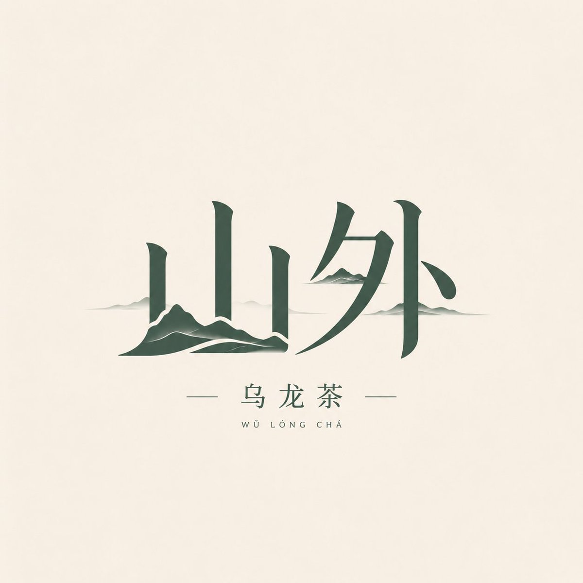
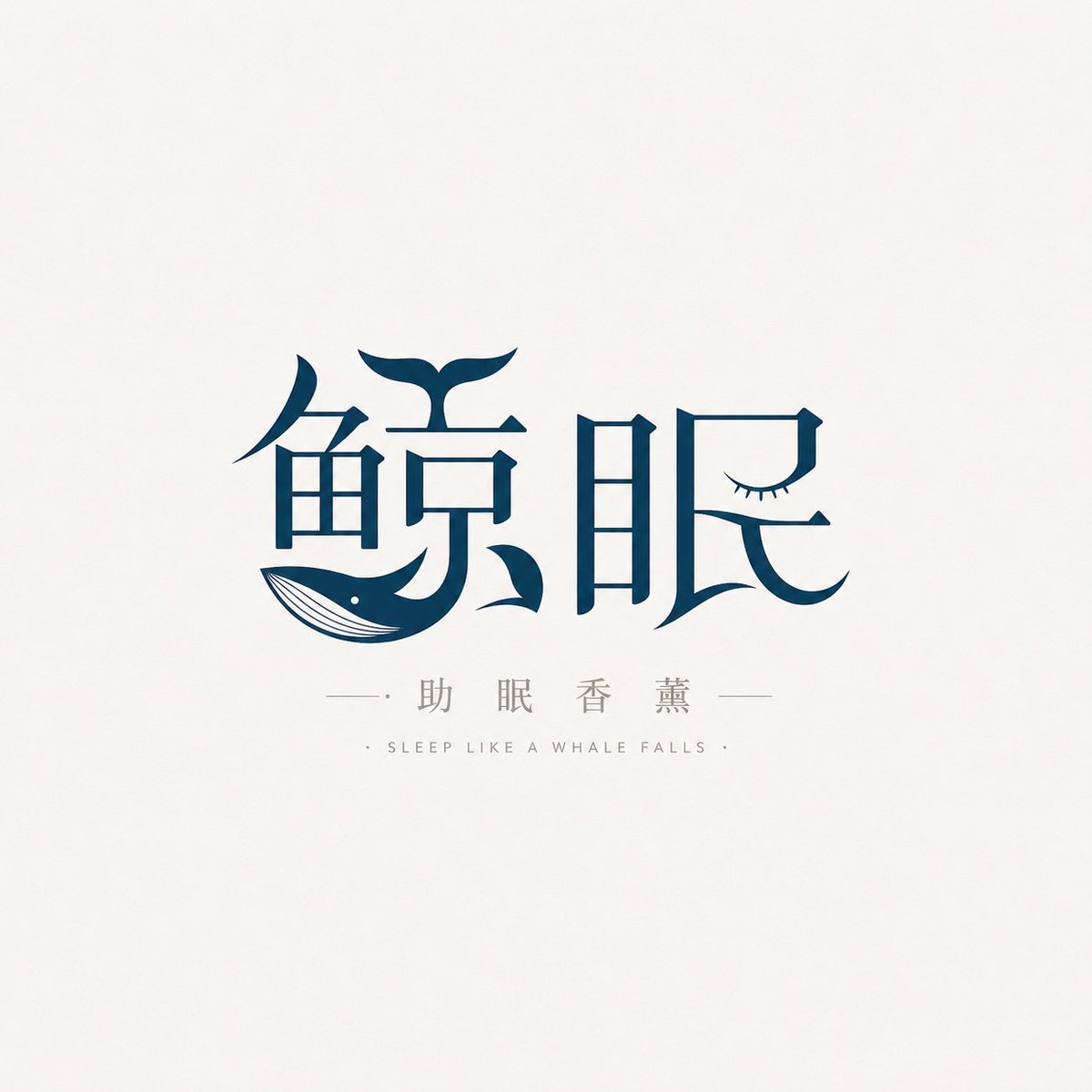
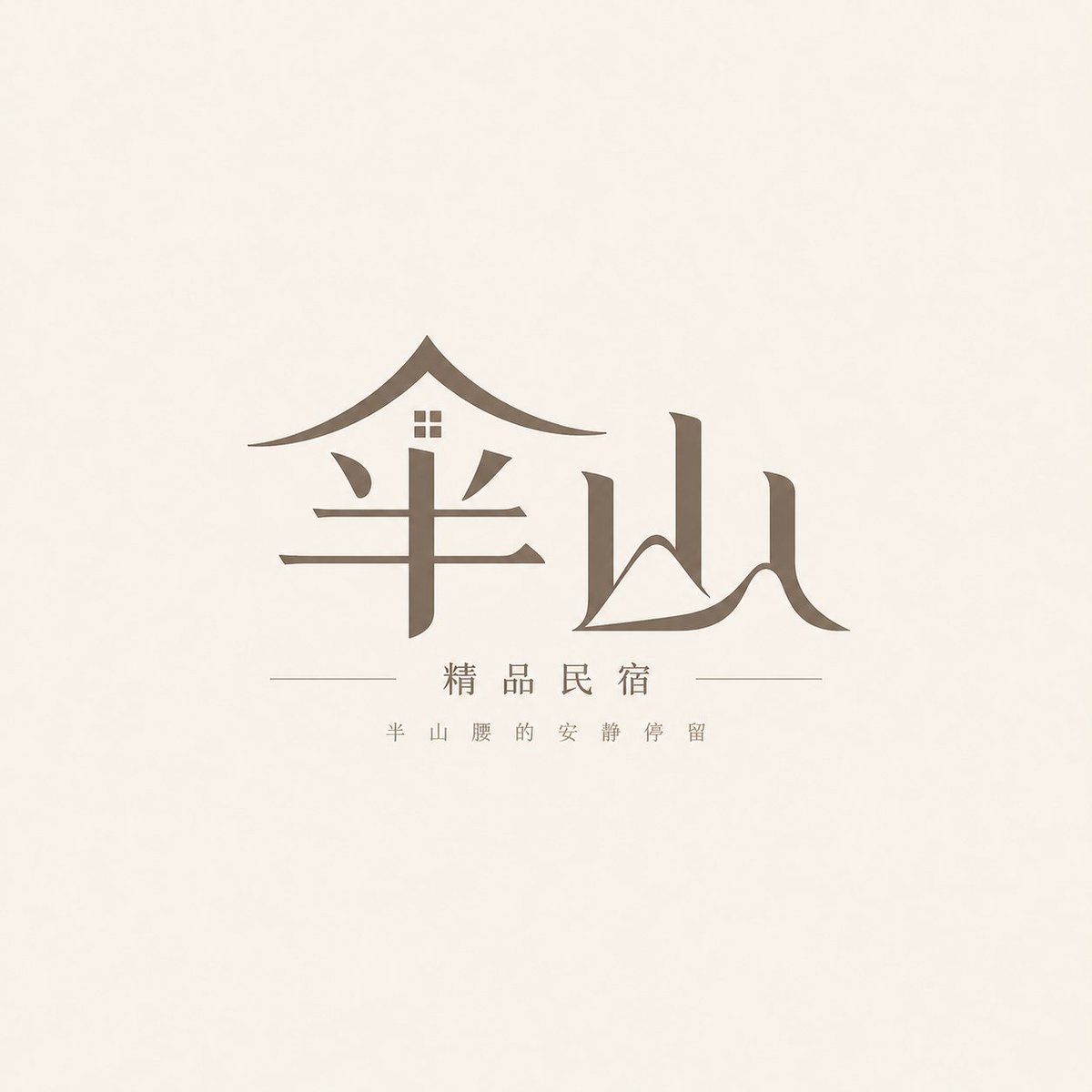
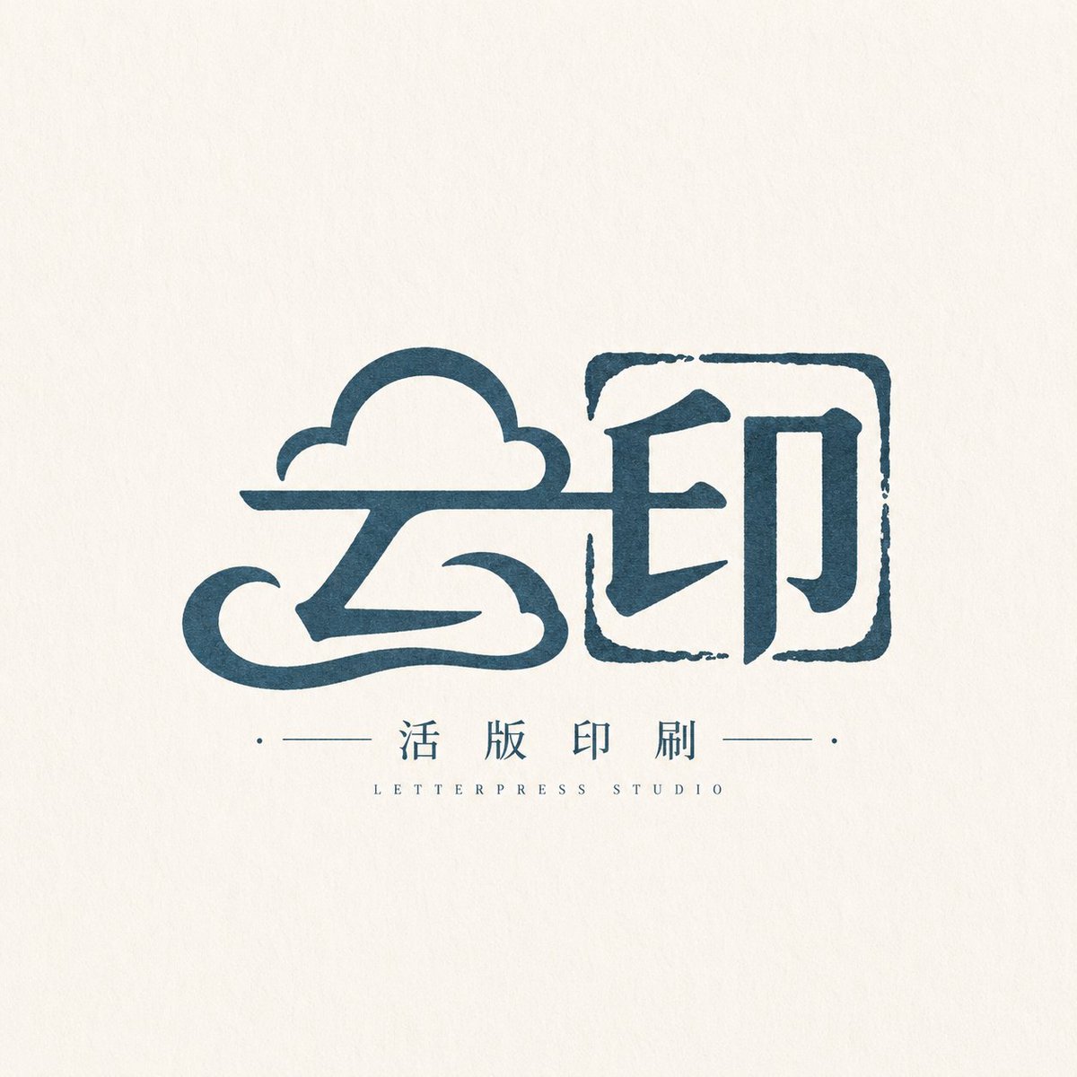
Prompt εικόνας Branding & UI Προσαρμόσιμα
Πρότυπο λογότυπου wordmark με συγχώνευση κειμένου και εικόνας
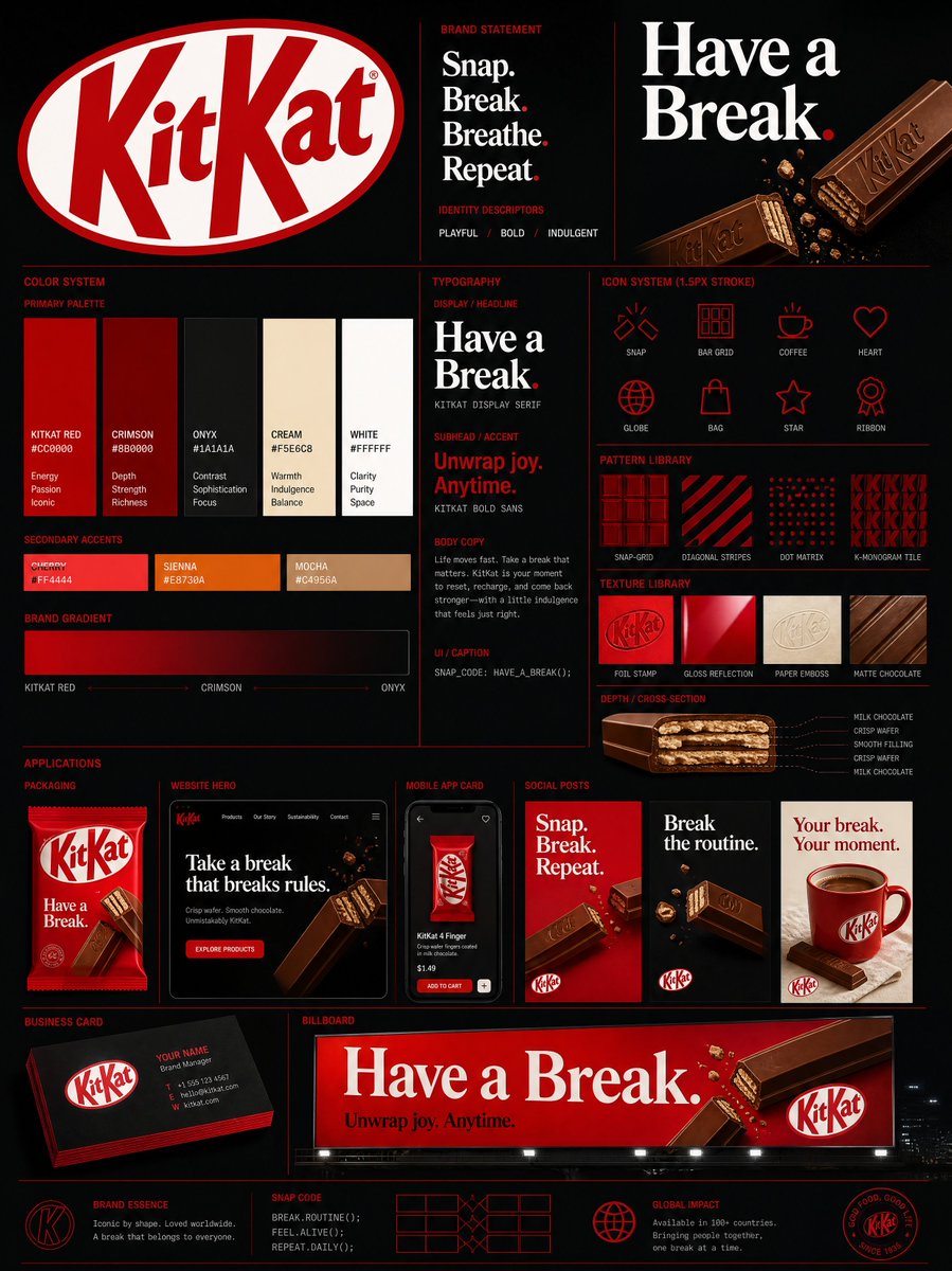
Ένα wordmark με έμφαση στο λογότυπο, όπου η γραφική εικόνα είναι ενσωματωμένη στα σχήματα των γραμμάτων αντί να βρίσκεται δίπλα τους. Το σήμα στέκεται μόνο του σε καθαρή επιφάνεια και όσο πιο κοντά το κοιτάζετε, τόσο περισσότερο τα γράμματα και η εικόνα αποκαλύπτονται ως ένα ενιαίο σχήμα.

- Μοντέλο
- GPT Image 2
- Τύπος
- 4 εικόνες
- Αναλογία διαστάσεων
- 1:1
- Κοινοποιήθηκε
- 6 Μαΐ 2026
- Likes στο X
- 138
Όνομα μάρκαςΒασική εικόναΚύριο χρώμα
Prompt εικόνας
6,698 χαρακτήρεςBased on the user inputs [Brand / project name] [Subtitle / product name] [Type / industry] [Brand positioning] [Core keywords] [Core imagery] [Emotional temperament] [Primary color] [Secondary color] [Aspect ratio], design a high-quality "Symbol-Integrated Wordmark Logo." [User inputs] Brand / project name: [Brand / project name] Subtitle / product name: [Subtitle / product name] Type / industry: [Type / industry] Brand positioning: [Brand positioning] Core keywords: [Core keywords] Core imagery: [Core imagery] Emotional temperament: [Emotional temperament] Primary color: [Primary color] Secondary color: [Secondary color] Aspect ratio: [Aspect ratio] [Core goal] What must be designed is a real logo: a text-led brand mark that naturally fuses graphic imagery inside the wordmark — not an ordinary icon-plus-text, nor a sticker, illustration, poster, or packaging page. Design around the [Brand / project name] so the logo shows the effect of "image within the letters, letters within the image, text and image co-constructed." The point is not to hang an extra icon beside the text, but to inherently embed graphic imagery, symbolic elements, or semantic visual signs into the letterforms, stroke relationships, contour composition, and the whole mark system, forming a complete, unified, independently usable logo. [Design essence] This kind of logo is neither mere lettering nor simply adding an icon; with text as the axis, it turns the letters into a complete visual mark through graphic imagery, lines, partial patterns, structural composition, white space, and micro-typography. The whole must first be a logo, and only second express the cleverness of text-image fusion. [Most important principles] 1. This must first be a logo. 2. It must look like a mark genuinely usable for branding, storefronts, packaging, social-media avatars, and brand materials. 3. Text is the axis; graphic imagery must serve the text and fuse with it into one whole. 4. Do not make an ordinary combination logo of "icon on top, text below." 5. Do not just paste a small illustration beside the letters — make the graphic truly participate in the wordmark structure. 6. Do not lose the logo's clarity, recognizability, and standalone usability. [Text-image fusion requirements] Design mainly through "text-image co-construction." You may use, among others, these fusion methods: 1. Turn a stroke directly into a graphic element related to the [Core imagery]; 2. Let a character's structural contour evolve naturally into a semantic shape; 3. Make the graphic a part of the letter, not an attached ornament; 4. Let graphic and text share the same contour, line system, or compositional language; 5. Use negative space / white space to hide the imagery inside the letterforms; 6. Use partial substitution, embedding, and extension to organically link graphic and letter; 7. The graphic may be a natural object, utensil, symbol, brand object, spatial outline, or industry element, but must be highly related to the [Core imagery] and brand attributes. [Understanding the core imagery] Decide the most suitable graphic imagery for fusion based on [Brand positioning] [Type / industry] [Core keywords] [Core imagery]. Imagery may come from: - Nature: mountain, water, wind, cloud, tree, flower, whale, fish, bird, moon, ripples - Space: house, door, window, shop outline, eaves, street, bridge - Objects: cup, book, paper plane, film, record, lamp, tea set, packaging shape - Food / product: cherry, dumpling, bread, coffee bean, fish, fruit - Abstract: trajectory, echo, flow, light, vortex, imprint, seal, path Whatever imagery you choose, avoid direct illustration and translate it into a concise graphic language suited to a logo. [Wordmark design requirements] 1. Make the [Brand / project name] the absolute primary visual core. 2. The text must be custom-designed; do not directly use ordinary computer fonts. 3. Optimize strokes, proportions, center of gravity, density, and connections according to the brand temperament. 4. The graphic fusion must be natural, not stiff, not collage-like. 5. It may be mainly Chinese, or include a little English / pinyin / subtitle, but the body must be the fused core wordmark. 6. Balance legibility and memorability: at a glance it reads as a standalone logo, and up close one finds the cleverness of the graphic fusion. [Auxiliary composition requirements] A small amount of auxiliary structure may be added around the logo body to enhance completeness, but restrainedly: 1. A few auxiliary lines 2. Small geometric shapes 3. Minimalist divider lines 4. Small captions, English name, pinyin, subtitle 5. Very few partial patterns or fills These elements serve only the logo presentation, must not overshadow it, and must not turn the result into a complex poster. [Visual presentation requirements] 1. The image should look like a "logo presentation sheet / logo proposal page," not a poster or packaging page. 2. The background must be simple, clean, and low-presence, to highlight the logo body. 3. Use neutral backgrounds: white, off-white, light gray, light warm paper tones. 4. The focus is showing the logo body and the details of the text-image fusion, not rendering scene atmosphere. [Color requirements] 1. Color must serve the logo body, not create atmosphere via the background. 2. Prioritize the [Primary color] and [Secondary color]. 3. Do not use too many colors; keep it mark-like, clear, and brandable overall. 4. Depending on temperament, choose a monochrome, two-color, or low-count multicolor system. 5. Avoid complex gradients, heavy texture reliance, excessive aging, and poster-like palettes. 6. If depth is needed, build it through partial fills, lines, black-white contrast, and white space, not complex backgrounds. [Style keywords] logo-first, wordmark-led, text-image fusion, imagery expression, image within letters, letters within image, symbol-integrated wordmark, semantic graphic, cleverness, high recognizability, simple, brandable, complete, refined. [Acceptance criteria] Ensure the final result meets: 1. With the background removed, the mark still stands on its own; 2. At a glance it is a complete logo, not an icon plus text; 3. The imagery and wordmark truly fuse rather than simply being spliced; 4. It has recognizability, cleverness, and a visual memory point; 5. It looks like a mark a mature brand could use, not a design exercise. [Output requirements] Finally output a high-quality "Symbol-Integrated Wordmark Logo." It must first be a mature, standalone, brandable logo; second, through the natural fusion of text and graphic imagery, it should show a vivid thematic expression and design cleverness.
Πώς να το χρησιμοποιήσετε
Ξεκινήστε αντικαθιστώντας τα σημάδια στις αγκύλες με το δικό σας όνομα μάρκας, τη γραμμή προϊόντων, τον κλάδο και τα βασικά σας εικονίδια, ώστε το μοντέλο να έχει συγκεκριμένες επιλογές. Κρατήστε τις ενότητες για τη μέθοδο συγχώνευσης και τα κριτήρια αποδοχής, γιατί αυτές απομακρύνουν το αποτέλεσμα από ένα απλό σύνθεμα εικονιδίου και κειμένου. Κοινοποιήθηκε ως prompt για το GPT Image 2, πράγμα που το καθιστά καλή πρώτη δοκιμή για οποιοδήποτε σήμα μάρκας, και το αποτέλεσμα λειτουργεί καλύτερα ως φύλλο πρότασης που μπορείτε να βελτιώσετε.
Κοινοποιήθηκε δημόσια στο X στις 6 Μαΐ 2026. Όλα τα credits για αυτό το prompt και το αποτέλεσμά του ανήκουν στον δημιουργό του. Είναι δικό σας; Ζητήστε ενημέρωση ή αφαίρεση.