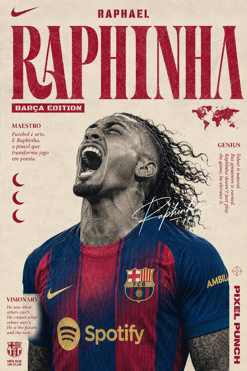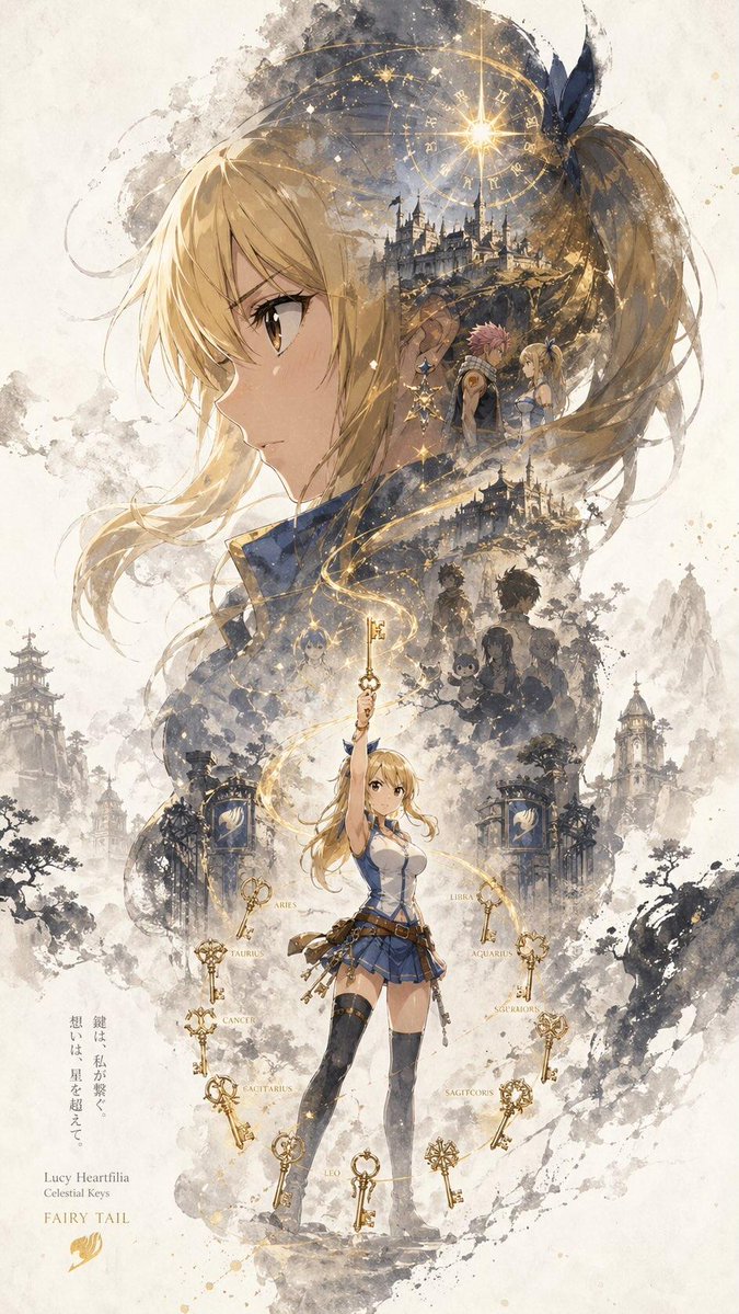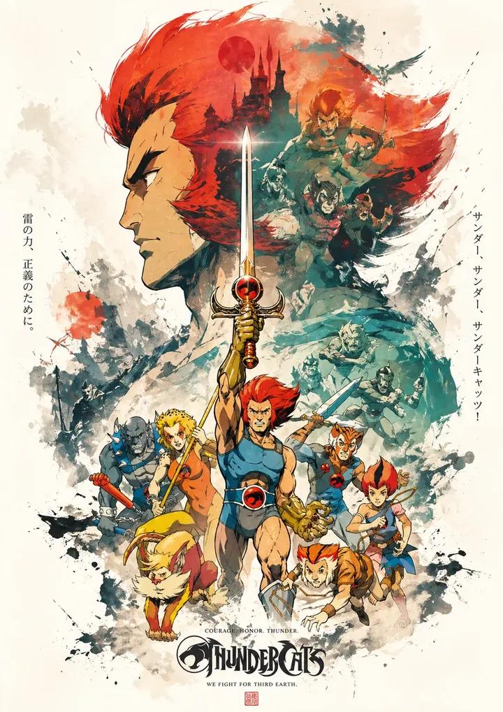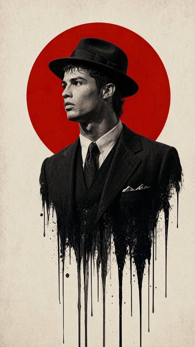
Prompt εικόνας Αφίσες και τυπογραφία Προσαρμόσιμα Προσθέστε τη φωτογραφία σας
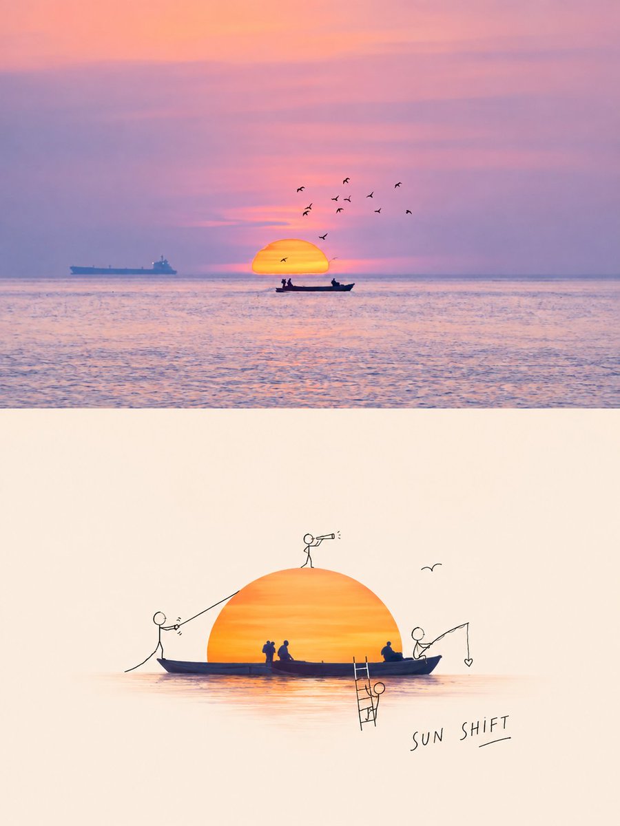
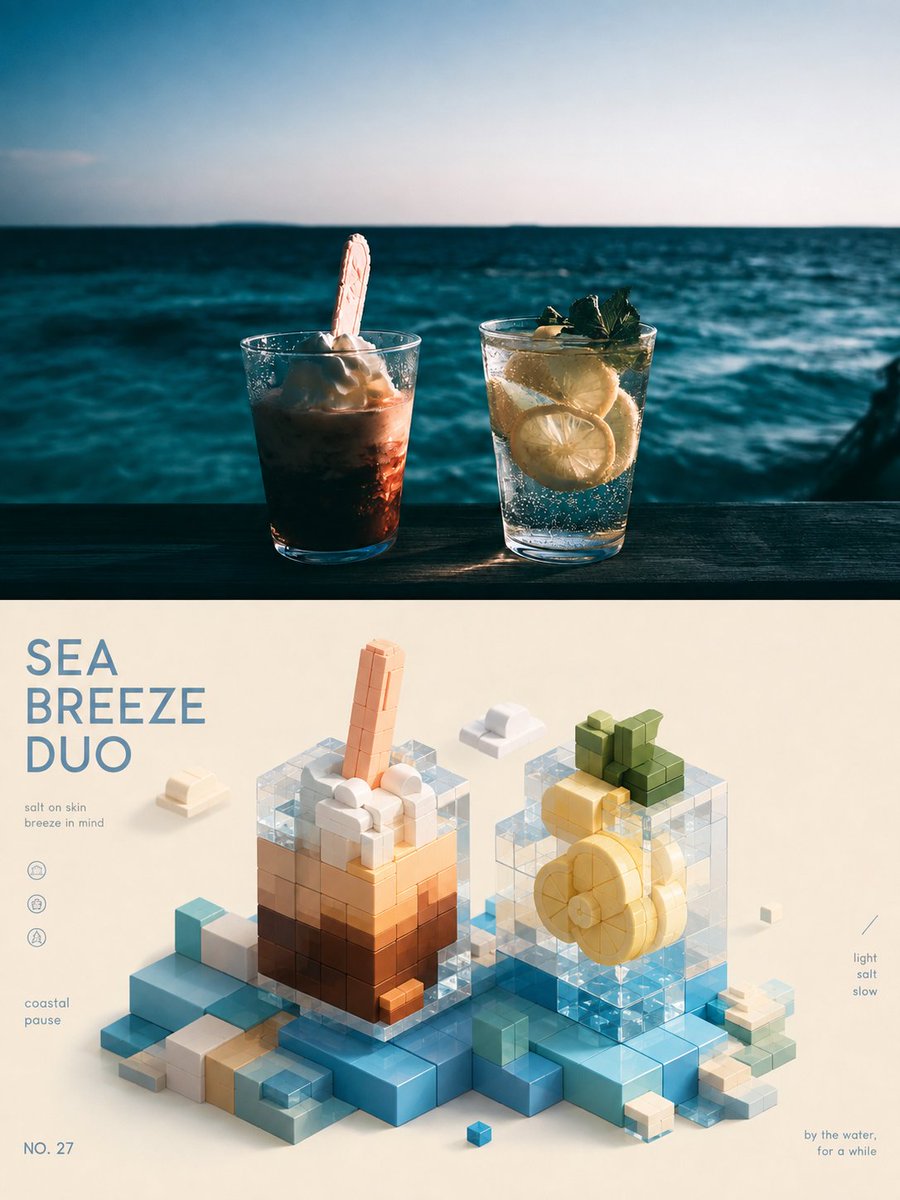
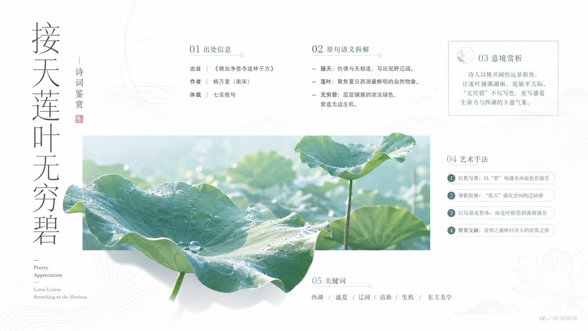
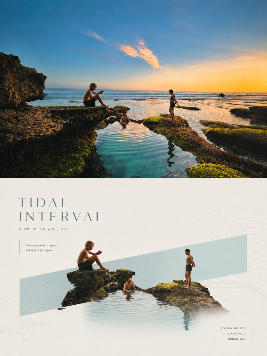
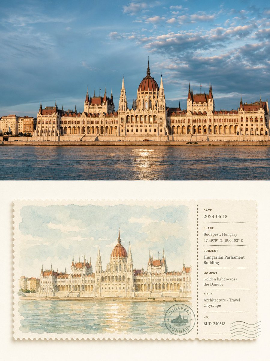
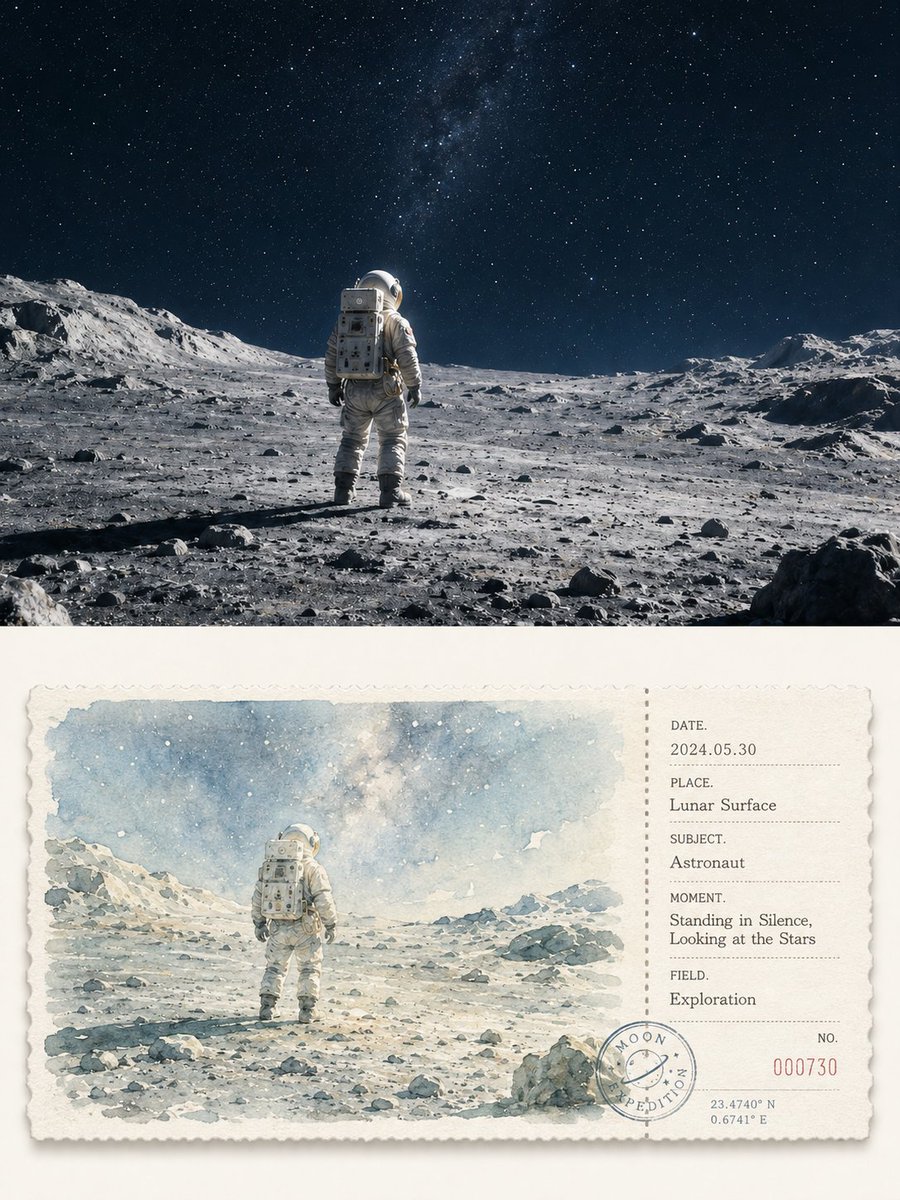
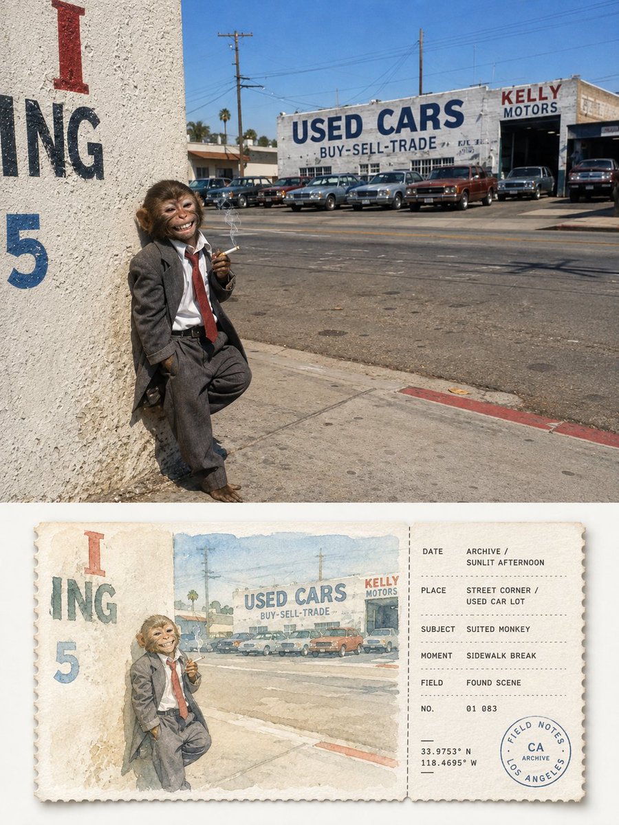
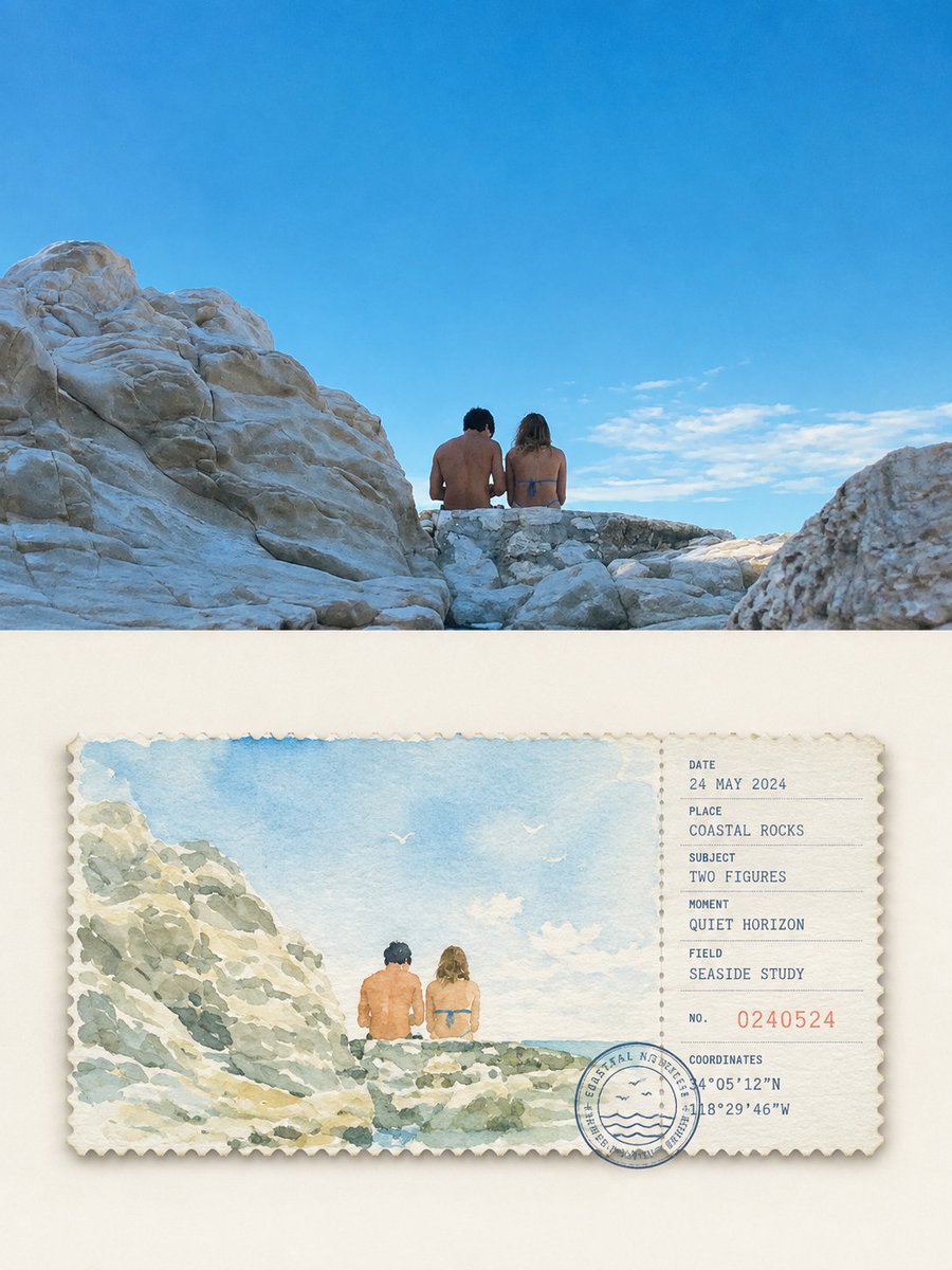
Χωρισμένη αφίσα φωτογραφίας με σκίτσο ταξιδιού σε ακουαρέλα
Το πάνω μισό διατηρεί τη φωτογραφία σας με ένα ελαφρύ ύφος περιοδικού, ενώ το κάτω μισό ξαναφαντάζει το θέμα ως απαλό σκίτσο σε ακουαρέλα πάνω σε ένα κομμάτι εισιτηρίου. Ωχρές αποχρώσεις φασκόμηλου και γαλάζιας ομίχλης συναντούν ένα τακτικό πάνελ πληροφοριών στα δεξιά.

- Μοντέλο
- GPT Image 2
- Τύπος
- 4 εικόνες
- Αναλογία διαστάσεων
- 3:4
- Κοινοποιήθηκε
- 19 Αυγ 2026
- Likes στο X
- 6
Αριθμός εισιτηρίου
Prompt εικόνας
4,049 χαρακτήρεςTurn each photo I uploaded into a separate high-end design poster, no multi-image collage; each photo is output individually. Use an overall 3:4 vertical composition, with the top and bottom areas strictly 1:1 in height, each occupying 50% of the frame. The top half keeps the original photo, preserving the subject structure, real texture, natural light and shadow, and original color atmosphere, applying only a light high-end photographic grade to give it the quality of an art magazine, travel publication, and exhibition photography. To fit the frame, the sky, ground, or environmental background may be naturally extended, but the subject must not be stretched, distorted, or altered. The bottom half extracts the most recognizable **subject, contour, posture, and narrative relationship** from the photo, reconceiving the original scene as a horizontal watercolor ticket stub that fuses postcard and receipt forms. Do not draw an isolated object, but preserve the most memorable relationship between the subject and the necessary environment, reorganized with simple watercolor strokes, so the image corresponds to the photo above at a glance and looks like a carefully collected travel sketch receipt. The ticket body is centered, suspended in a large ivory-white blank area, using a strict **left-large/right-small geometric division**: about 74% on the left for the watercolor image, about 26% on the right for the information stub, precisely separated in the middle by a vertical dashed line, perforation, or tear line; uniform top and bottom margins, with image, text, postmark, and numbering all obeying the same implicit grid and alignment lines, forming a regular, quiet, professional editorial order. The card is thick matte watercolor paper with finely serrated edges and a very light natural shadow. The watercolor on the left reharmonizes the original colors with a **healing palette of high brightness and low-to-medium saturation**, without directly copying dirty gray values. Prioritize the freshest, most vital colors from the original, then uniformly translate them into a soft natural color system like sage green, mist blue, light blue-gray, cream yellow, warm sand, light terracotta; use 2–4 close colors to build a sense of air, with only minimal warm contrast color to brighten the subject. Overall bright, clean, translucent, soft, avoiding murky gray, yellowing, heavy brown, garish color clashes, and cheap vintage filters. The watercolor strokes are clear and thin, preserving the paper's translucent white, soft bleeding, wet-dry variation, and slight grain, the subject slightly sharper, the distant background and secondary environment naturally weakened, with no realistic light/shadow or complex detail, giving the image a quiet, relaxed, gentle picture-book and travel-journal feel. The stub on the right uses a restrained **geometric information layout system**, flexibly generating a few fields like DATE, PLACE, SUBJECT, MOMENT, FIELD, NO. based on the photo content, with date, numbering, short dashes, dot lists, coordinate-style numbers, and a circular stamp. All text is strictly aligned to the same left line, baseline, and spacing, with clear size hierarchy and ample white space; the postmark may slightly overlap the dividing line or bottom grid, creating a clever relationship between the information elements and the ticket structure rather than being scattered randomly. If it is not a city or travel theme, the location field can naturally transform into object name, state, project, chapter, season, or mood record. Overall, reference **high-end travel postcards, vintage receipts, artist journals, watercolor publications, and modern editorial design**, emphasizing healing colors, geometric order, paper texture, and a collectible feel, presenting a fresh, gentle, quiet, orderly, refined, and not over-designed visual character. Avoid dirty old tones, loose layout, floating information, complex decoration, realistic illustration, e-commerce template feel, and cheap vintage effects.
Πώς να το χρησιμοποιήσετε
Κοινοποιήθηκε ως prompt για το GPT Image 2 και χρειάζεται μια ανεβασμένη φωτογραφία, επειδή το πάνω μισό διατηρεί την αρχική σας εικόνα. Κρατήστε τις ενότητες περίπου 50/50, τη διαίρεση 74/26 του κομματιού και την ήρεμη, θεραπευτική παλέτα χρωμάτων, καθώς αυτές οι λεπτομέρειες δίνουν τάξη στην αφίσα. Αλλάξτε την ημερομηνία, τον τόπο και τα κείμενα των πεδίων ώστε να ταιριάζουν στη δική σας φωτογραφία και εκτυπώστε το αποτέλεσμα ως σουβενίρ ή κάρτα δώρου.
Κοινοποιήθηκε δημόσια στο X στις 19 Αυγ 2026. Όλα τα credits για αυτό το prompt και το αποτέλεσμά του ανήκουν στον δημιουργό του. Είναι δικό σας; Ζητήστε ενημέρωση ή αφαίρεση.