Prompt εικόνας Αφίσες και τυπογραφία Προσαρμόσιμα Προσθέστε τη φωτογραφία σας
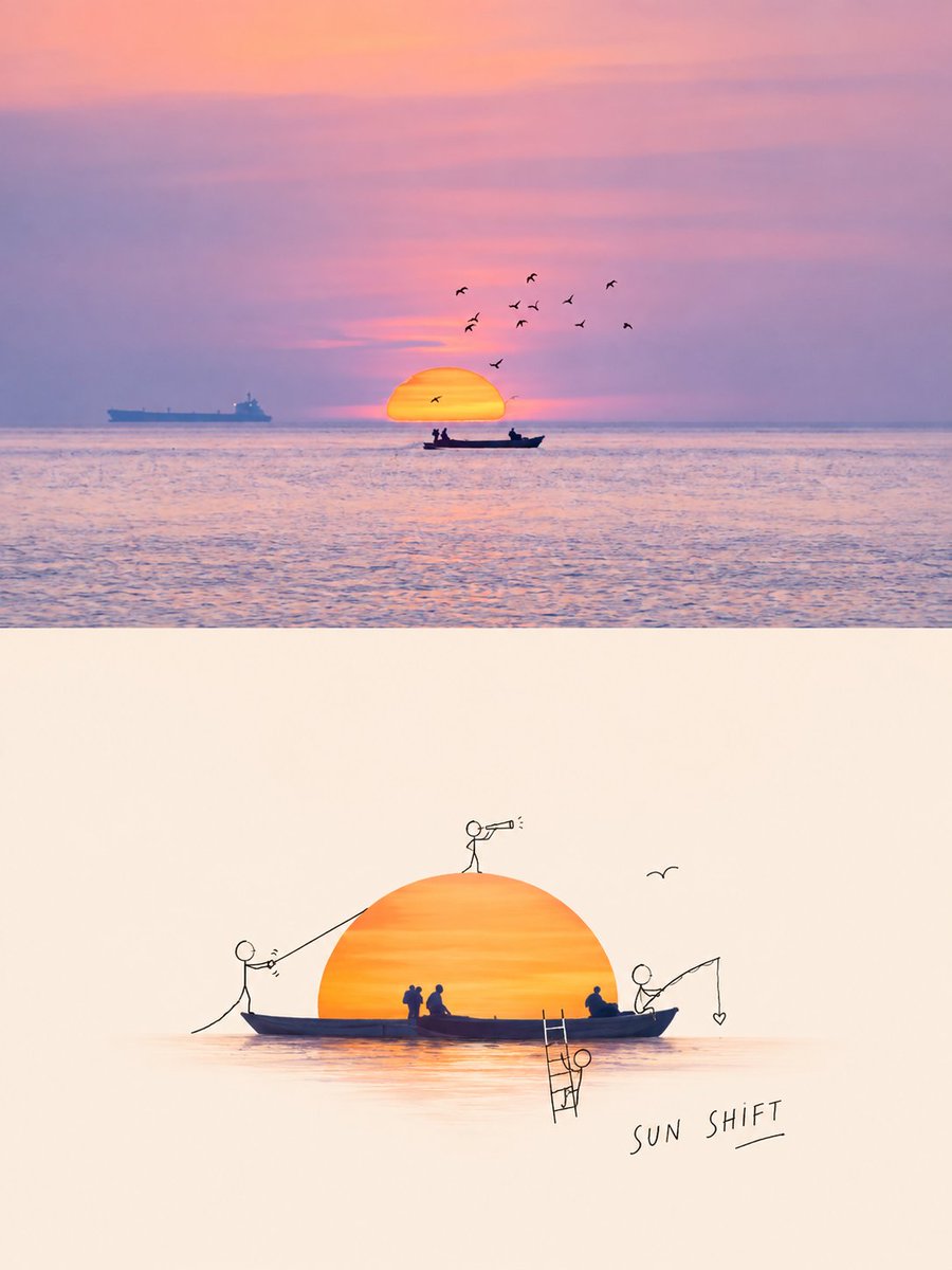
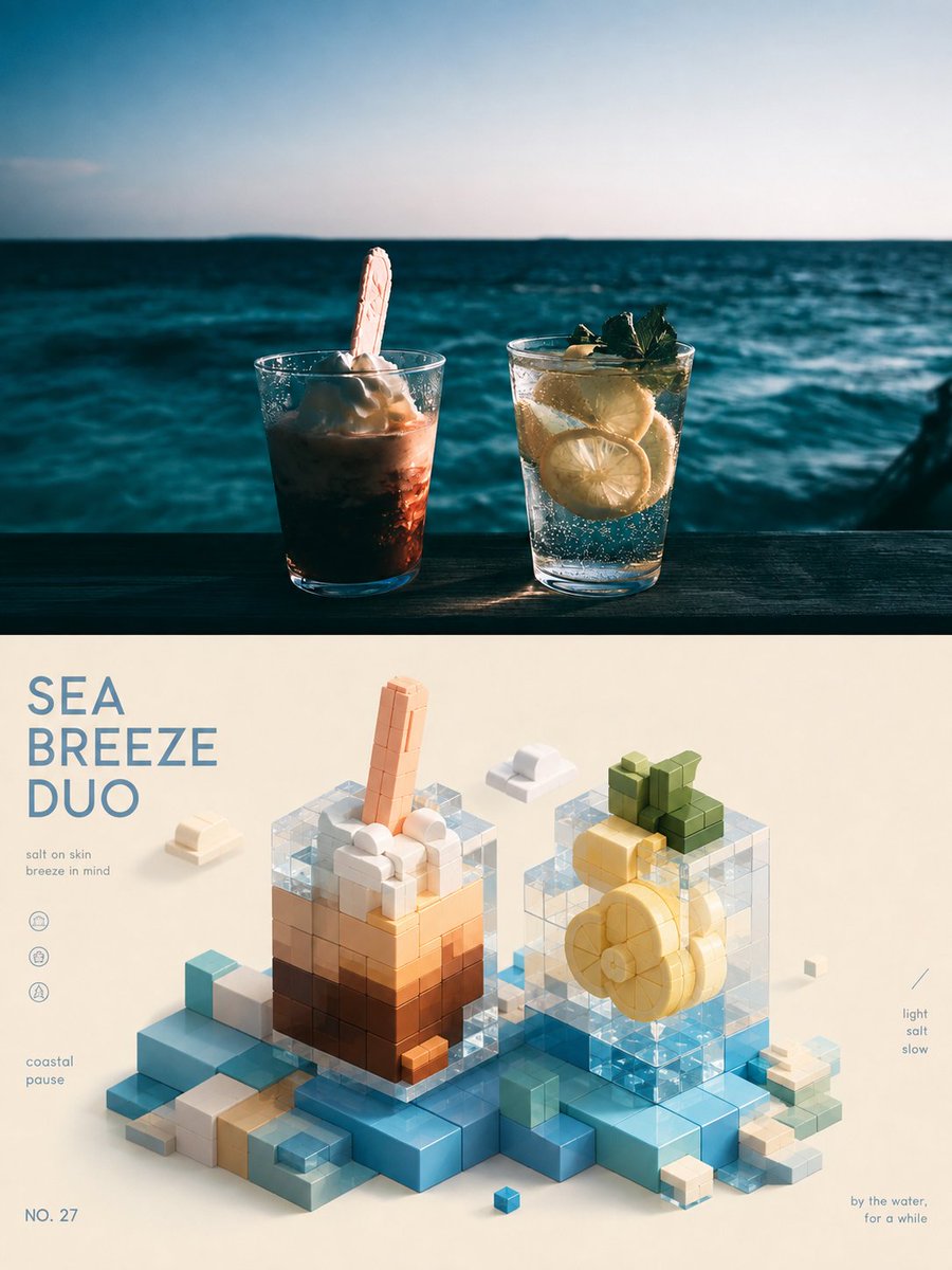
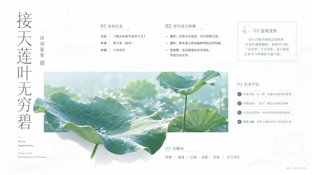
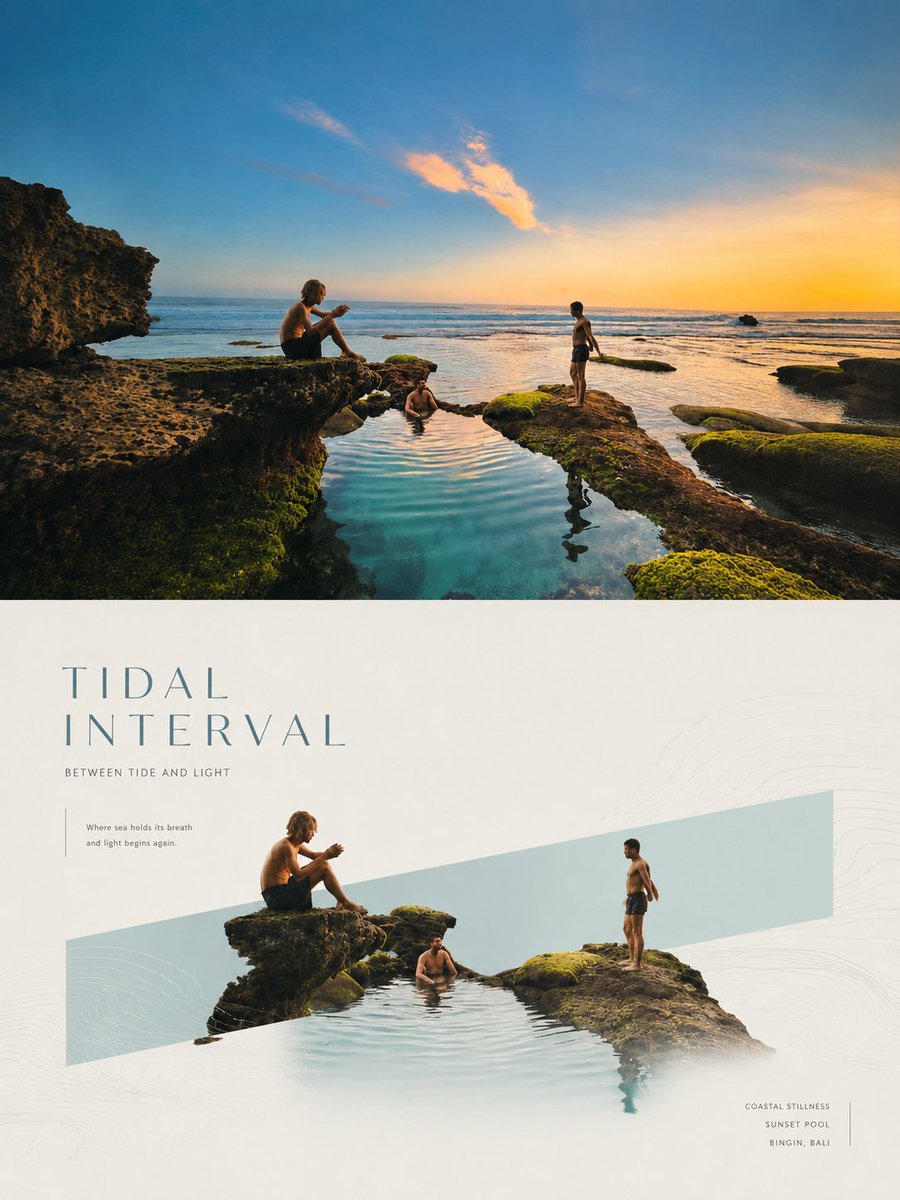
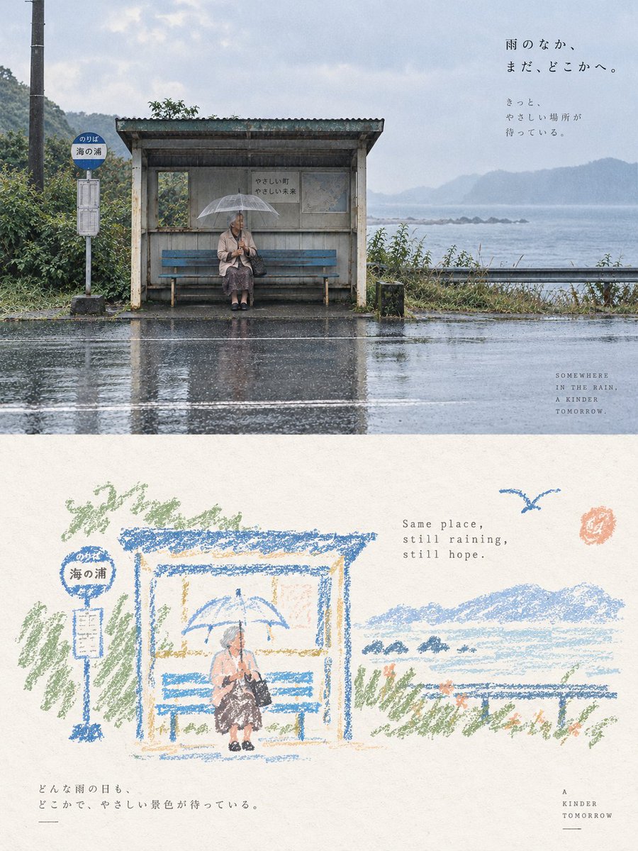
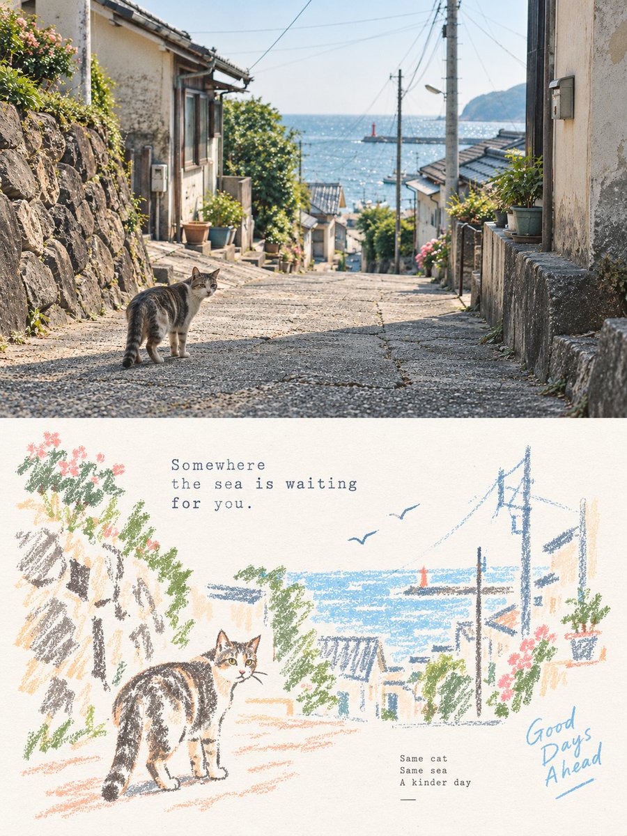
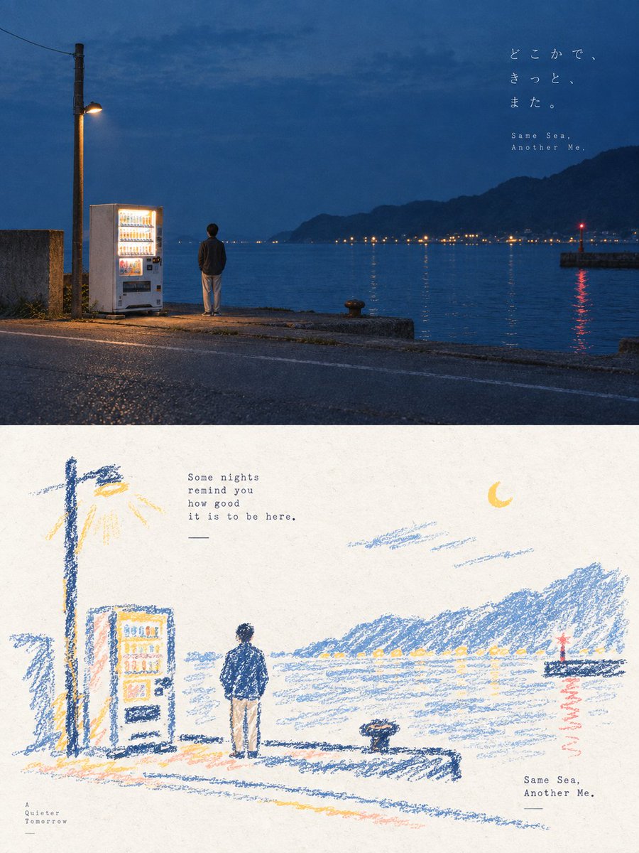
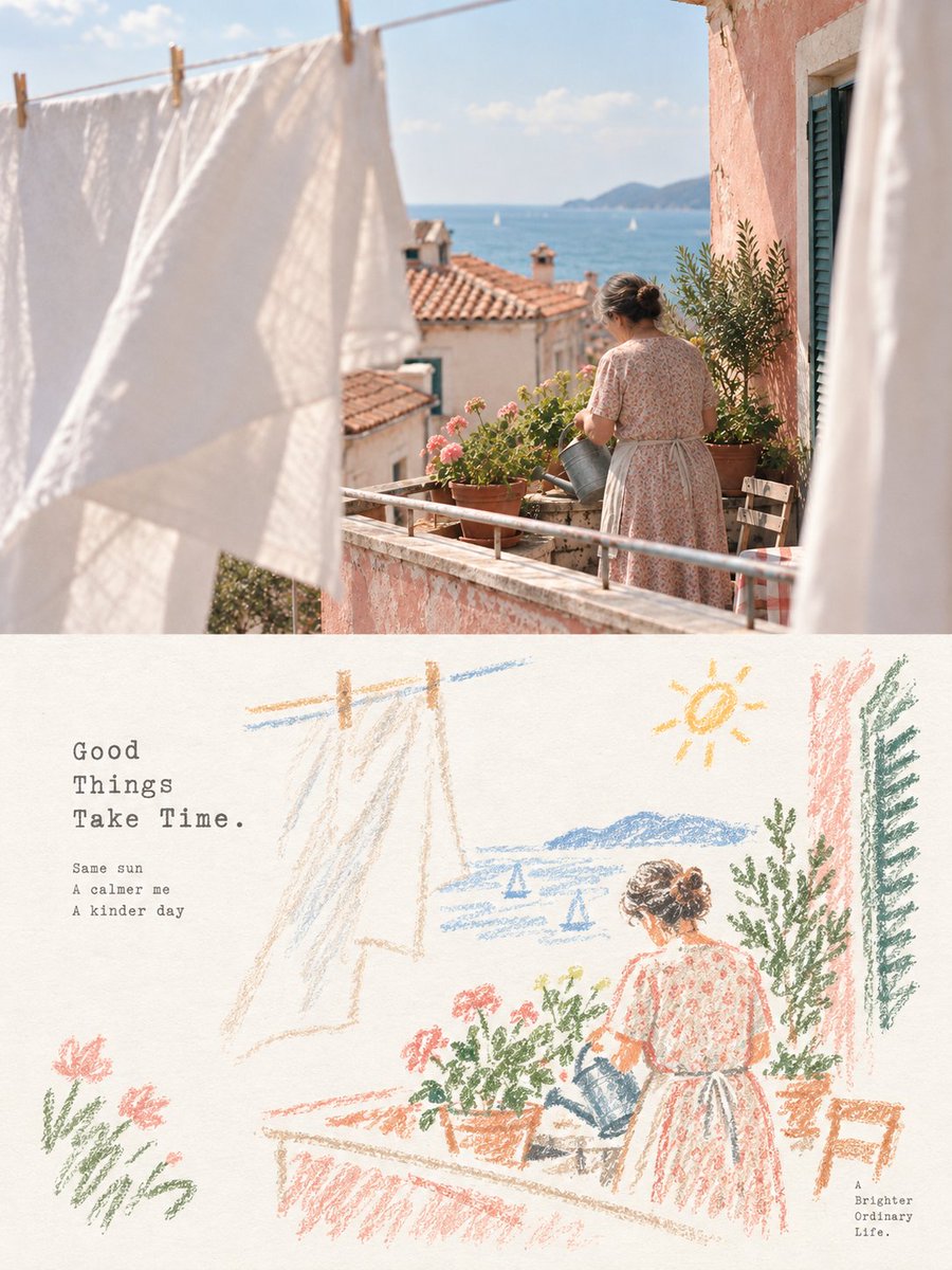
Μετατροπή φωτογραφίας σε αφίσα με pastel κραγιόν και σκίτσα, σε διαχωρισμένη διάταξη
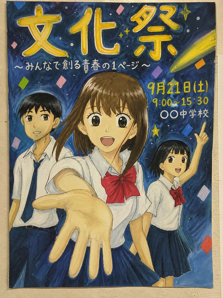
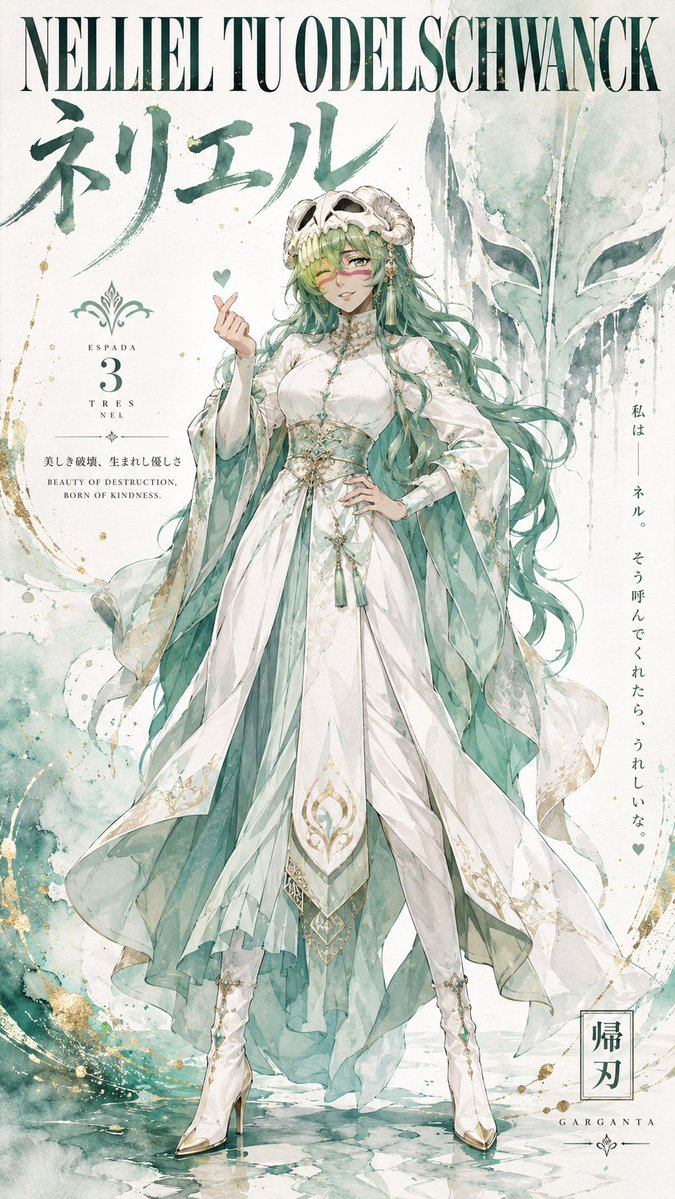
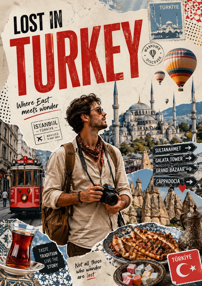
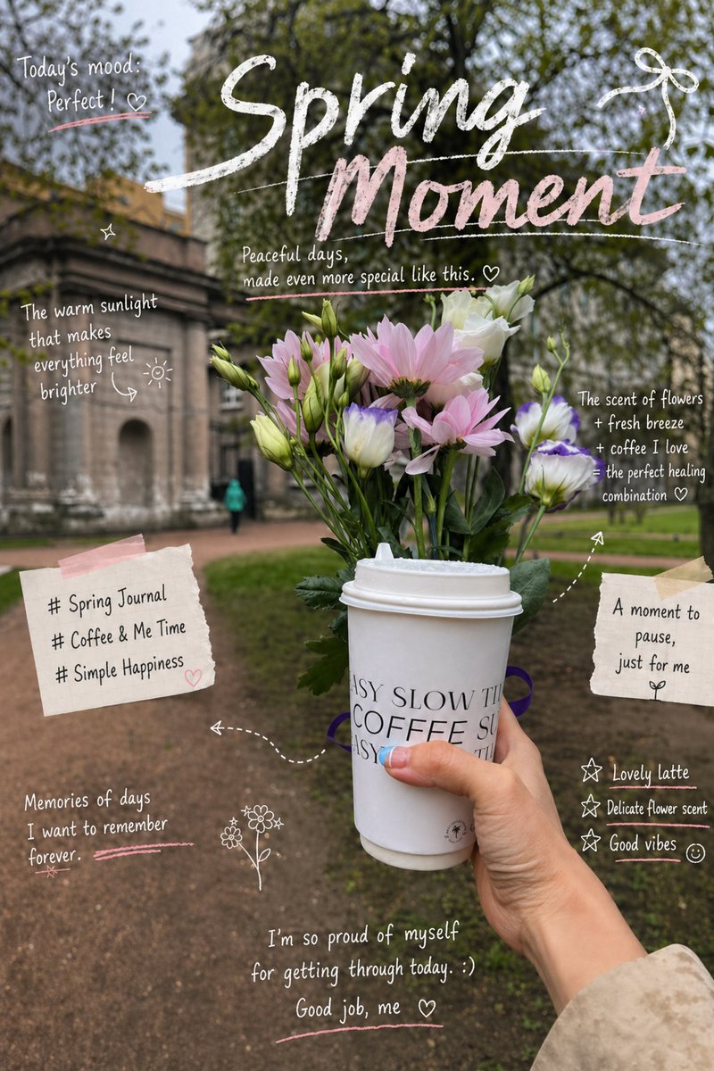
Κάθε φωτογραφία γίνεται αφίσα δύο μερών: η αρχική εικόνα πάνω και ένα χαλαρό ξανασχέδιο με παστέλ κραγιόν από κάτω, σε ανοιχτόχρωμο χαρτί με άφθονο ελεύθερο χώρο. Διατηρούνται μόνο τα βασικά περιγράμματα και τα συναισθηματικά στοιχεία, ώστε το κάτω μισό να διαβάζεται ως ένας σχηματικός απόηχος του πάνω.

- Μοντέλο
- GPT Image 2
- Τύπος
- 4 εικόνες
- Αναλογία διαστάσεων
- 3:4
- Κοινοποιήθηκε
- 5 Σεπ 2026
- Likes στο X
- 186
Λόγος διαστάσεων
Prompt εικόνας
5,435 χαρακτήρεςTurn each photo I upload into a separate, high-end design poster—no multi-image collage; output each photo individually. Use an overall 3:4 vertical composition, with the top and bottom regions strictly 1:1 in height, each occupying 50% of the frame. The top half keeps the original photo, preserving the subject's identity, structure, pose, real texture, natural light and shadow, and original color atmosphere, applying only slight high-end color grading to give it the quality of an art magazine, independent publication, and exhibition image. To fit the aspect ratio, the environmental background may be naturally expanded, but the subject must not be stretched, distorted, or altered. The bottom half first understands the most memorable **core theme, subject relationships, structural flow, emotion, and visual metaphor** of the original photo, then reconstructs it as a **pastel crayon doodle illustration with vintage paper texture**. Do not copy the photo object by object, nor fully re-render all content; keep only the most representative contours, poses, directions, and visual memory points, and through reduction, generalization, slight exaggeration, and recombination, make the correspondence to the photo above felt at a glance. The subject uses **coarse-grained chalk / crayon-style hand-drawn contours**: lines slightly thick, loose, and dry, with powdery grain, intermittent color loss, slight wobble, and not-fully-closed edges, with naturally rounded tips. Inside the subject, add only very few pastel color patches, simple grids, stripes, dots, or casual scribbles, hinting at structure with minimal information, without realistic volume or complete detail. The surrounding small elements use **the same line language** as the subject, but further compressed into doodle symbols recognizable in one or a few strokes. Stars, flowers, plants, objects, environmental cues, or abstract symbols should all be simple, naive, open, and not fully closed, mainly single-line contours with very little fill. Do not draw them as refined icons, stickers, or standalone small illustrations. The composition keeps the relationship of **small-scale stamps and large areas of white space**, freely arranging placement according to the subject's own direction, proportion, and visual center of gravity—may be off-center, edge-hugging, suspended, or partially cropped. The subject and very few doodle symbols form a loose but clear visual cluster, with the rest of the space deliberately left empty. **The white space itself is the main compositional element**, creating breathing room, distance, and pause through emptiness and fullness, concentration and dispersion, size contrast, and asymmetrical relationships; better to draw less than to fill everything. The background must use **an extremely pale, bright, clean paper base color**, such as cream white, ivory white, light beige white, pale apricot white, very light grayish white, or a near-white paper color intelligently matched to the original's overall color temperature. The paper retains only very slight fibers and grain, and must not lean brown, yellow, gray, or look aged. **The background brightness must be clearly higher than the subject's lines and color patches, ensuring all crayon contours, small symbols, and text are clearly visible and do not blur into the background.** The palette extracts **2–4 of the most vivid, most approachable colors that best represent the image's spirit** from the photo above, re-blending them into bright, soft pastel crayon colors. Light colors such as peach pink, apricot orange, cream yellow, mint green, sky blue, and pale purple may naturally emerge; the subject's lines prioritize tones clearer than the background, such as coral pink, soft blue, teal, warm orange, pale purple, or dark cream tones, and small elements repeat these colors only sparingly to create echoes. Overall, maintain the contrast relationship of **pale background + clear colored lines + a few soft color patches**, bright, healing, relaxed, and with a sense of life. Avoid darkness, dirty brown, dull faded Morandi-fication, low contrast, fluorescent colors, and cheap candy feel. Text intervenes in small amounts, with no language restriction. Short phrases or text fragments may be freely extracted from the subject, action, emotion, memory, or metaphor, using a **light, airy typeset typewriter font with slight uneven letter spacing and old-style mechanical printing errors**, in colors that are clear but not harsh, such as gray-brown, soft black, dark blue-gray, or dark tones echoing the subject, ensuring sufficient legibility on the pale paper. The text scatters naturally in the white space areas, forming a text-image mix with the subject and doodles, with no fixed title template. Overall, present a high-end healing visual composed of **extremely pale paper, coarse-grained crayon contours, a small amount of pastel fill, minimalist doodle symbols, a small-scale subject, and abundant artistic white space**. The key is to make the subject and small elements clearly emerge on the pale paper while maintaining a loose, innocent, gentle, and mature editorial compositional sense. Avoid dark kraft paper, dark brown backgrounds, low-contrast lines, background and subject blurring together, fine outlining, realistic re-rendering, complex small icons, filled background, smooth vectors, 3D feel, and commercial template look.
Πώς να το χρησιμοποιήσετε
Ανεβάστε τη φωτογραφία που θέλετε να μετασχηματίσετε, καθώς το πάνω μισό διατηρεί την πραγματική του υφή και το φως του. Μοιράστηκε ως prompt για το GPT Image 2, οπότε κρατήστε τις φράσεις για το πάνω και το κάτω μισό, τα κιμωλιώδη περιγράμματα και το ανοιχτό χαρτί, καθώς αυτά δίνουν το στυλ. Αντικαταστήστε τα αποσπάσματα κειμένου και την παλέτα χρωμάτων ώστε τα γραπτά και τα χρώματα να ταιριάζουν με τη δική σας φωτογραφία· μια λογική χρήση είναι για εκτύπωση ή ανάρτηση στα social media με μια σύντομη λεζάντα.
Σε συλλογέςPrompts σε στυλ doodle και κηρομπογιάς
Κοινοποιήθηκε δημόσια στο X στις 5 Σεπ 2026. Όλα τα credits για αυτό το prompt και το αποτέλεσμά του ανήκουν στον δημιουργό του. Είναι δικό σας; Ζητήστε ενημέρωση ή αφαίρεση.