Στούντιο prompt
Κάντε το «Αφίσα μουσείου με ασύμμετρη ανατολίτικη διάταξη» δικό σας
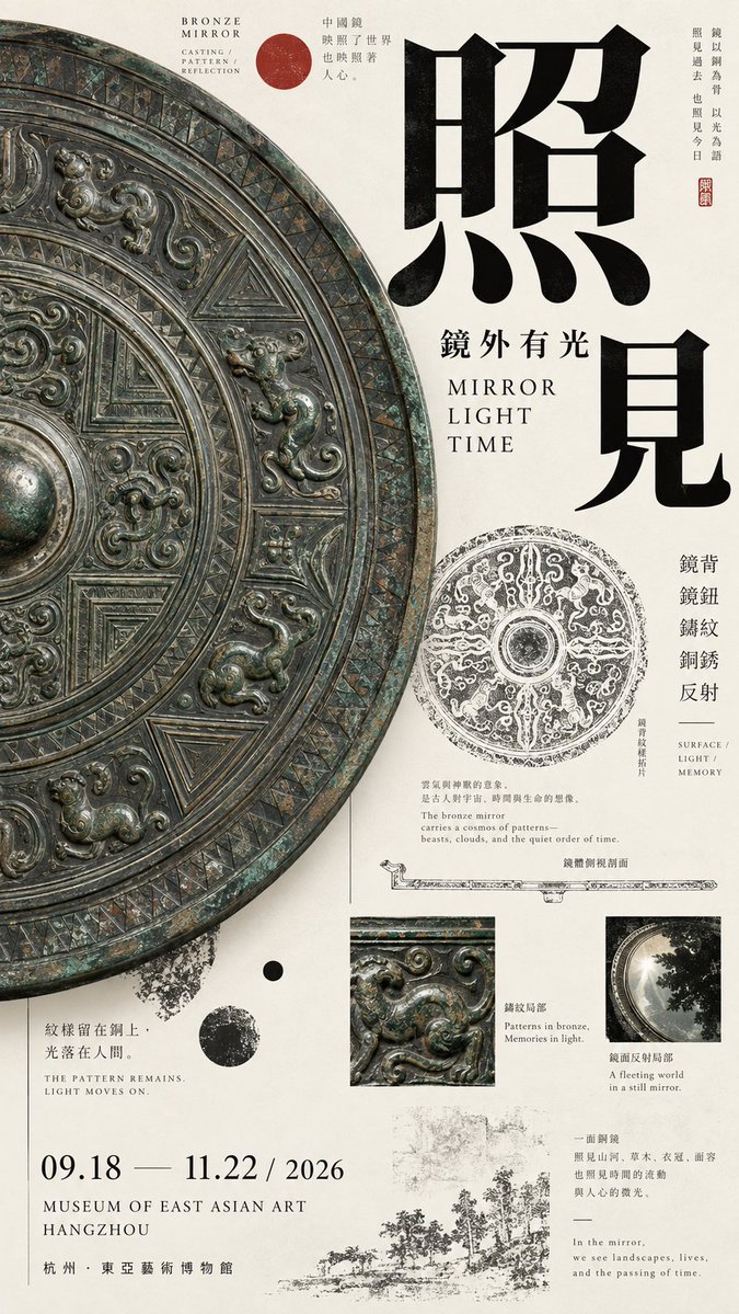
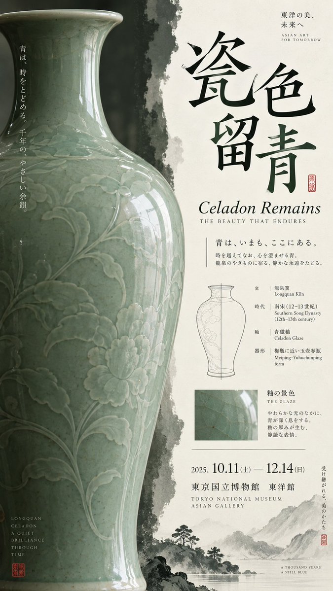
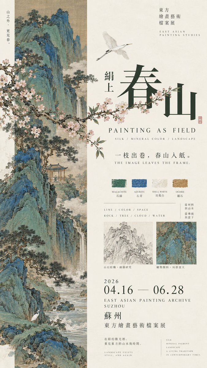
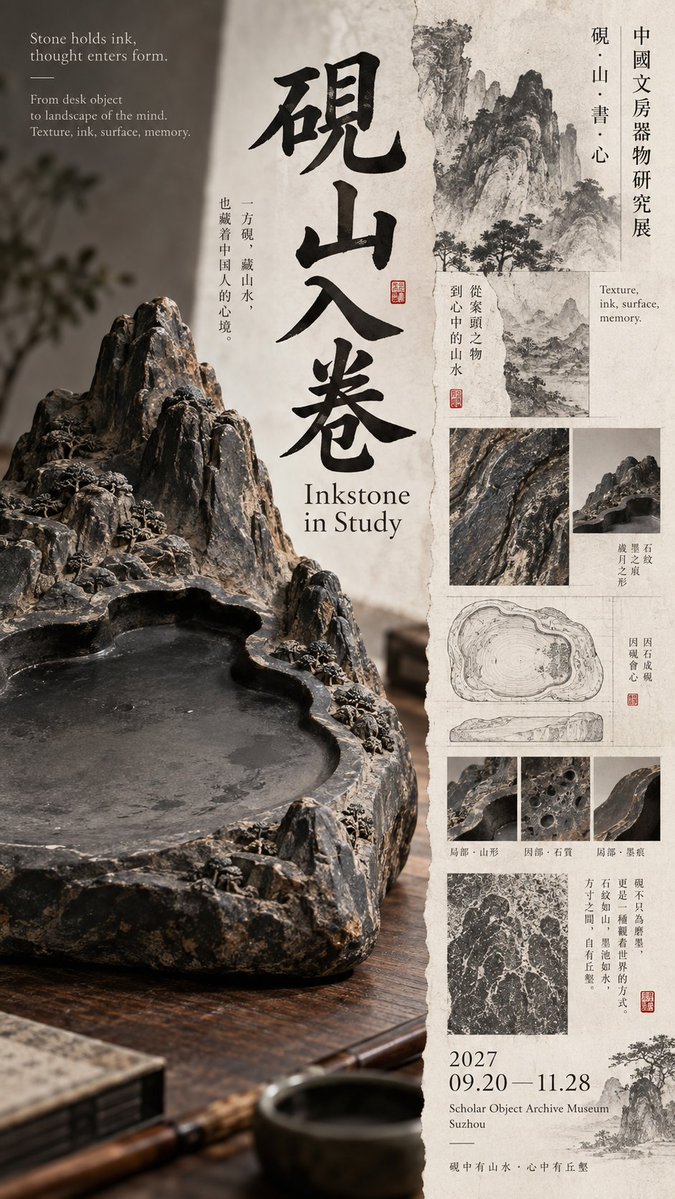
Μια διχοτομημένη σύνθεση όπου η μία πλευρά φιλοξενεί ένα μεγάλο, περικομμένο αντικείμενο και η άλλη έναν στοιβαγμένο τίτλο, λεπτές γραμμές έρευνας και στοιχεία έκθεσης. Το μελάνι, το λευκό του οστού και ένα μικρό κόκκινο στοιχείο διατηρούν την ισορροπία.
 Prompt από @MrLarus
- Συμπληρώστε τα πεδία παρακάτω.
- Δείτε το prompt να ενημερώνεται στα δεξιά.
- Αντιγράψτε το ή ανοίξτε το σε ένα εργαλείο εικόνας.
Prompt εικόνας
Prompt: 【Theme】: 【Chinese title】: 【English title】: 【Core subject】: 【Left-right relationship】: dominant giant object / narrow image band × wide text field / subject × archive / image crossing over / dense × empty / other 【Left-side content】: 【Right-side content】: 【Boundary-crossing elements】: object outline / foliage / large letters / line drawing / pattern / other 【Main color】: 【Accent color】: 【Date / Venue】: 【Aspect ratio】: 9:16 Generate a high-aesthetic, high-information-density Oriental culture exhibition poster using a "left-right composition / asymmetric dual-zone composition." Do not split left and right 50/50; use flexible ratios like 35/65, 40/60, 45/55 based on the subject's volume, text density, and empty-space relationship. The point is not equal area on both sides, but achieving visual balance among image weight, typography, and information density. Choose the method flexibly by theme: Dominant giant object: one side enlarges a large-scale object, artifact, or art piece, allowing bold cropping, occupying the main visual weight; the other side builds reading hierarchy with title, English, small text, structural line drawings, and exhibition info. Narrow image band × wide text field: one side uses an elongated ancient painting, photography, or pattern slice, the other keeps more paper and typography. Foliage, flying birds, clouds, or the subject's outline in the image may actively cross out of the picture core into the text area. Subject × archive: one side keeps a single strong subject, the other combines form line drawings, material macros, rubbings, pattern studies, dimensions, era, and a little explanatory text, forming an art-catalogue feel. Dense × empty: one side forms high-density visuals with images, archive fragments, and research content, the other keeps large controlled empty space, using only a few large letters and key exhibition info. Empty space cannot just be "no content"; it must be precisely designed through letter spacing, thin lines, position, and proportion. The left-right boundary should not be too mechanical. Let object edges, large letters, flower branches, patterns, or research lines cross the divide by about 3%–10%, reconnecting the two sides, but avoid random collage. Typography must be redesigned per each image's subject. Use huge single characters, two staggered characters, a full horizontal title, a mid-scale title, cross-column text, or local color inversion. Maintain the scale contrast "big letters very big, small letters very small," reducing meaningless medium-size letters. Do not fixedly use four vertical characters, nor repeat the "two horizontal + two vertical" template. Information density should reference mature museum posters, Japanese Editorial Design, and Art Catalogue. It may include English subtitle, era, material, craft, venue, date, curatorial short line, and 1–3 research nodes directly related to the theme, such as form line drawings, glaze macro, ancient-painting materials, pattern rubbings, stone-grain studies, or local enlargement. This auxiliary information must serve the theme, not pile up random small text to "look professional." Control color to 3–5 main colors. Prefer restrained colors like bone white, ink black, celadon green, mineral blue-green, dark gray, ochre, then add one clear but very small-area cinnabar red or another accent color. Keep the paper clean, no dirty-yellow antiquing filter. At first glance see the large subject and the left-right weight relationship; second glance see the title and main color blocks; third glance discover how objects, ancient paintings, or foliage break the left-right boundary; finally read material, structure, era, and exhibition archive. Core principle: one side anchors the visual, one side carries the reading; empty space is also weight, information density is also weight; left and right are unequal, but the whole must be balanced. Overall requirements: 9:16, high-definition, sharp, clean paper, real subject texture, sharp typography, thin lines and small text as clear as possible, rich in information but not chaotic, with the finish of a mature museum poster and art publication. Avoid: mechanical 50/50 split, simple image-left text-right, two similar subjects on each side, subject too small, info area like a manual, fixed title template, PPT info boxes, complex UI, random English, severe antiquing, mottled noise, frame numbering, copyright marks, four-pointed starbursts, sparkle, and low-finish AI-poster feel.
Prompt που κοινοποιήθηκε στο X από @MrLarus. Όλα τα credits ανήκουν στον δημιουργό του.
Περισσότερα prompts που μπορείτε να προσαρμόσετε
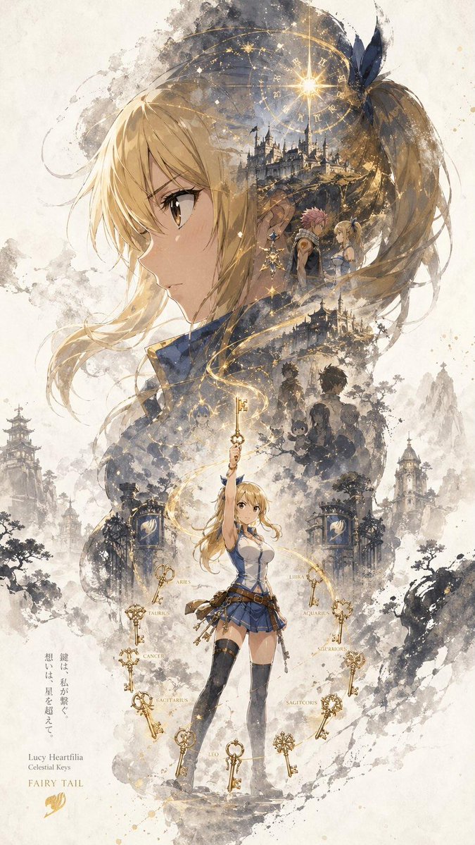 Κάθετη αφίσα χαρακτήρα με μελανιά σιλουέτα
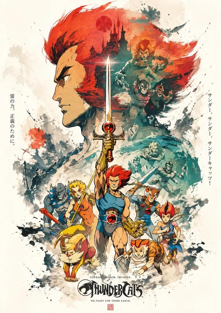 Αφίσα προπαγάνδας με διπλή έκθεση και στρωματοποιημένο κολάζ μελάνης
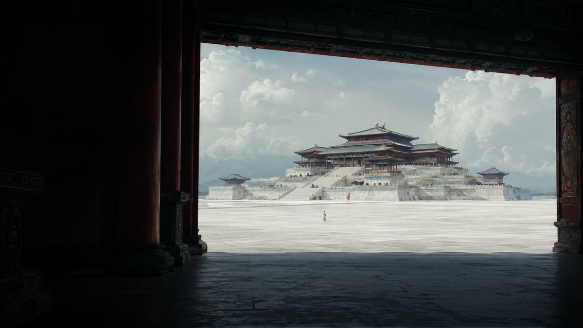 Αφίσα παλατιού σε στιλ Tang πάνω από τα σύννεφα
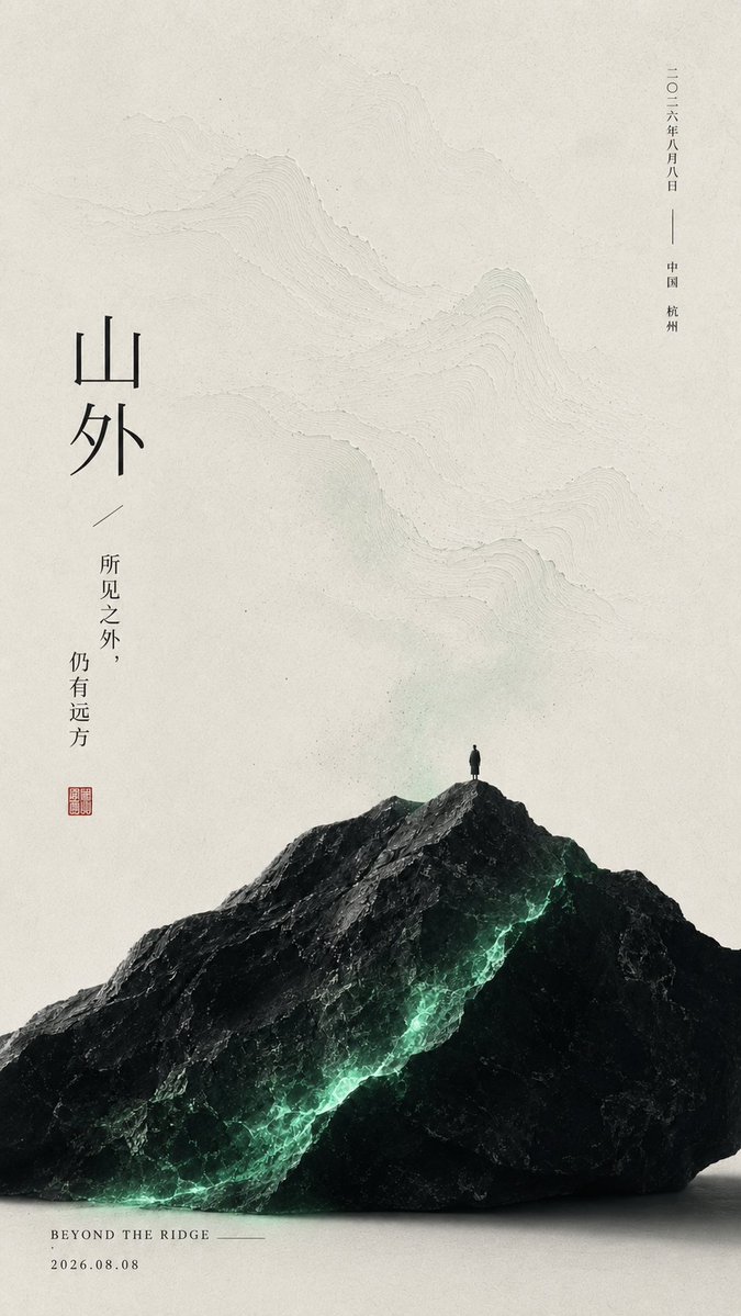 Ανατολίτικη αφίσα με υφή χειροποίητου χαρτιού
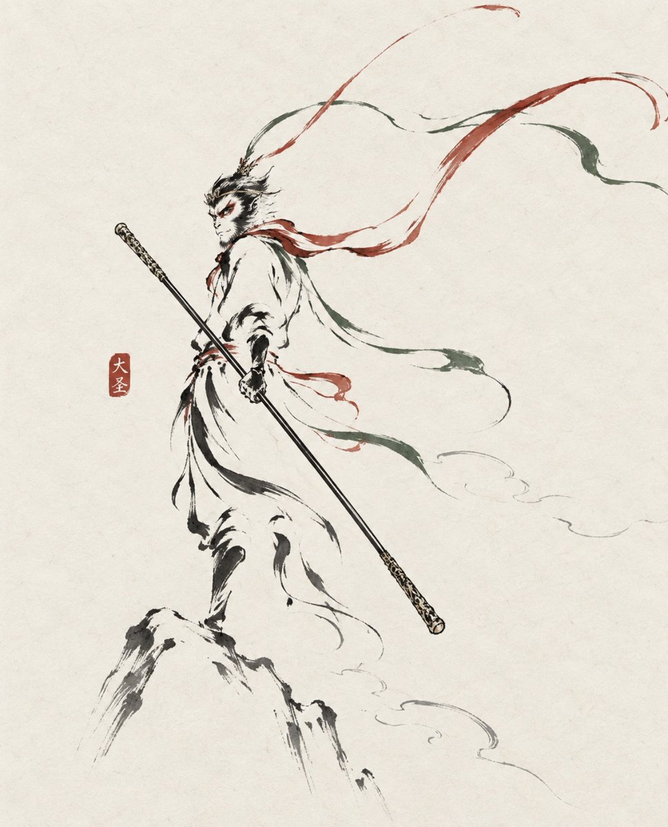 Προσθέστε τη φωτογραφία σαςΜινιμαλιστικό πορτρέτο με πινελιές μελανιού ως αφίσα
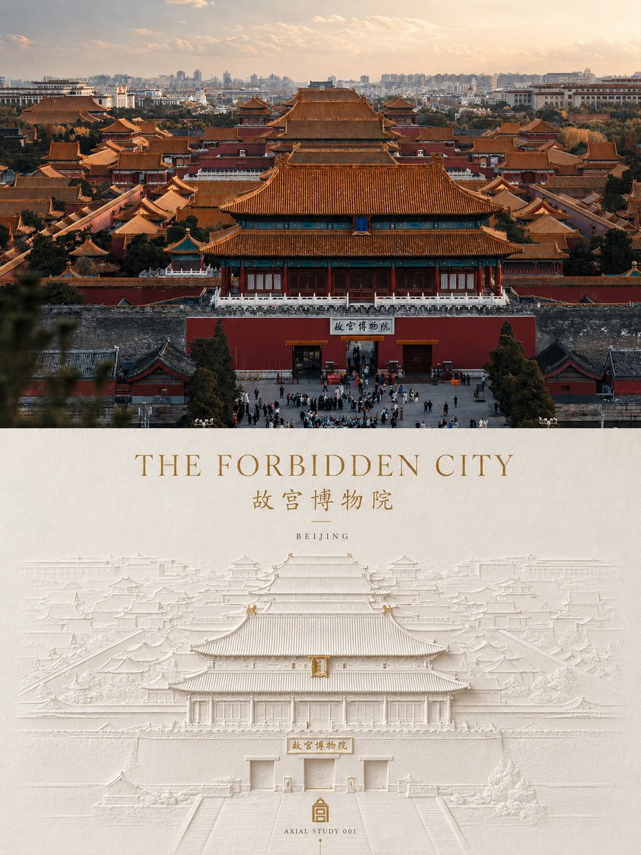 Προσθέστε τη φωτογραφία σαςΑφίσα ανάγλυφου από πιεσμένο χαρτί από φωτογραφία
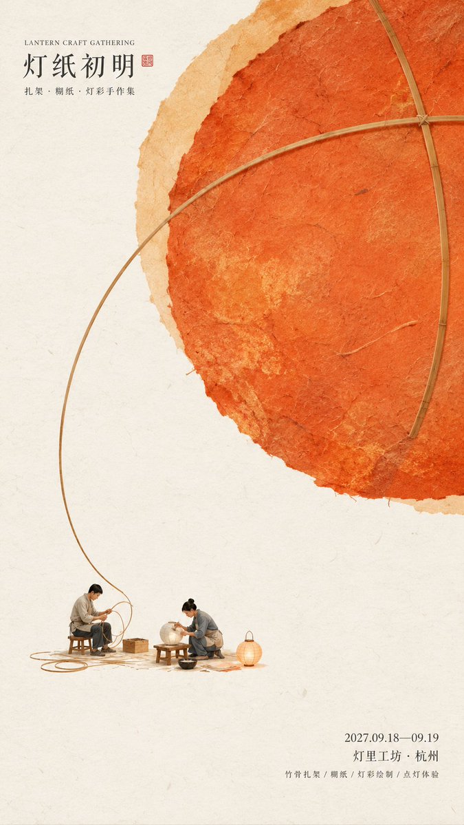 Αφίσα πολιτιστικής εκδήλωσης ανατολίτικου στιλ με υφή χειροποίητου χαρτιού
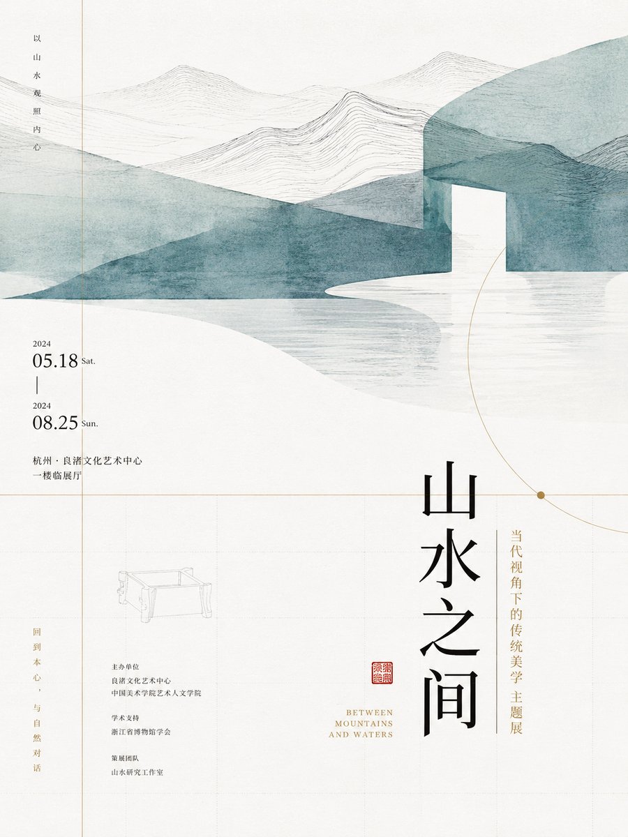 Μινιμαλιστικός σχεδιασμός αφίσας με ανατολίτικο λευκό χώρο