Στούντιο prompt
Κάντε το «Οριζόντια χωρισμένη αφίσα έκθεσης με στρωματοποιημένη τυπογραφία» δικό σας
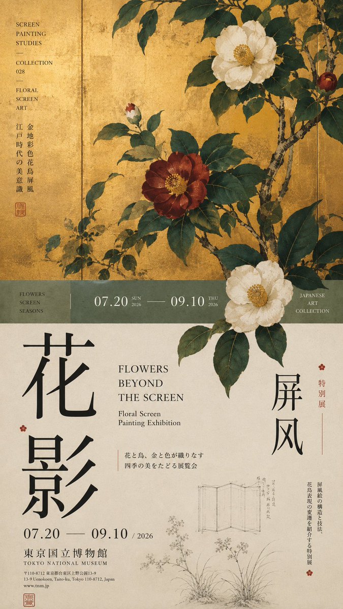
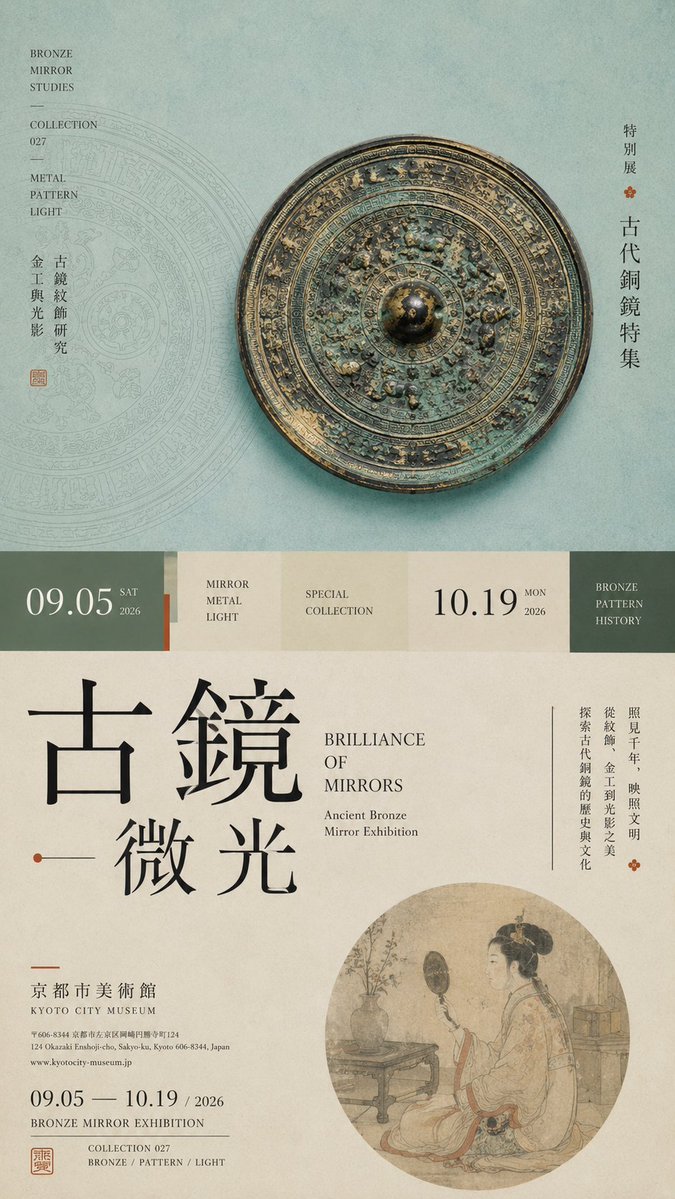
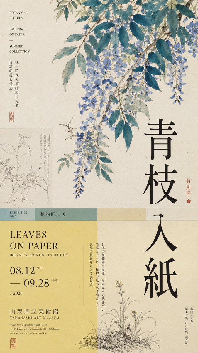
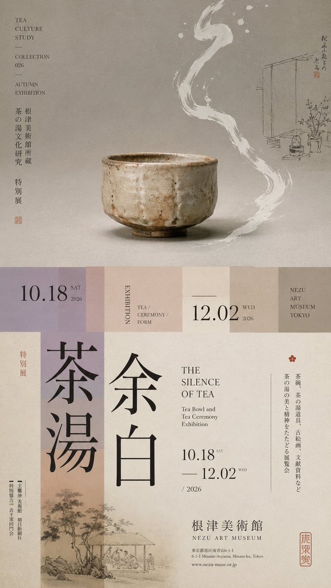
Μια ψηλή αφίσα έκθεσης 9:16, χωρισμένη σε άνισες ζώνες, με ένα κύριο οπτικό στοιχείο, μια στενή ζώνη μετάβασης και υπερμεγέθη κάθετη τυπογραφία. Το θέμα διασχίζει τη γραμμή κοπής, ώστε το πάνω και το κάτω μισό να διαβάζονται ως μία σελίδα περιοδικού.
 Prompt από @MrLarus
- Συμπληρώστε τα πεδία παρακάτω.
- Δείτε το prompt να ενημερώνεται στα δεξιά.
- Αντιγράψτε το ή ανοίξτε το σε ένα εργαλείο εικόνας.
Prompt εικόνας
Prompt: 【Theme】: ____ 【Main visual】: ____ 【Chinese title】: ____ 【English title】: ____ 【Auxiliary visual】: ____ 【Main color】: ____ 【Secondary color】: ____ 【Date / Institution】: ____ 【Ratio】: 9:16 Generate a "horizontal-split" poster with a sophisticated Editorial Design and cultural-exhibition character. Don't simply make it "image on top, text on bottom." Divide the layout into 2–3 vertical zones of unequal proportions: main visual zone about 50%–65%, central transition cut about 8%–15%, lower information zone about 25%–40%. Keep only one primary visual core 【main visual】, then add a few low-weight details, such as line art, partial painting, patterns, study diagrams, small collection info, or vertical text, so the whitespace has design density without stealing focus from the subject. In the middle, use low-saturation color blocks, narrow color bands, or information modules to connect the upper and lower zones. The main title participates in the composition through enlargement, vertical setting, offset, or crossing zones; allow the subject to partially cross the cut boundary, creating front-back layers between the zones. Establish a clear text hierarchy: large Chinese title → English title / date → small subtitle → tiny institutional info. Group the small text together, don't scatter it. Keep colors to 3–5 tones, building hierarchy through zone proportions, visual weight, cross-zone relationships, and typography. Key point: the horizontal split is not about cutting the image into two blocks, but about giving the different zones clear roles while reconnecting them through the subject and the text. Museum Exhibition Poster × Editorial Graphic Design—rich but not chaotic, spacious but not empty, with the finish of a real museum poster and art catalogue.
Prompt που κοινοποιήθηκε στο X από @MrLarus. Όλα τα credits ανήκουν στον δημιουργό του.
Περισσότερα prompts που μπορείτε να προσαρμόσετε
 Πίνακας σχεδιασμού ιαπωνικού web studio σε σκανδιναβικό στιλ
 Προσθέστε τη φωτογραφία σαςΑφίσα συστήματος ταυτότητας brand από λογότυπο
 Μεταφορά στυλ folk doodle επίπεδης εικονογράφησης
 Επίπεδη λαϊκή εικονογράφηση με doodles από φωτογραφία
 Προσθέστε τη φωτογραφία σαςΑφίσα συστήματος ταυτότητας μάρκας σε σκούρο φόντο
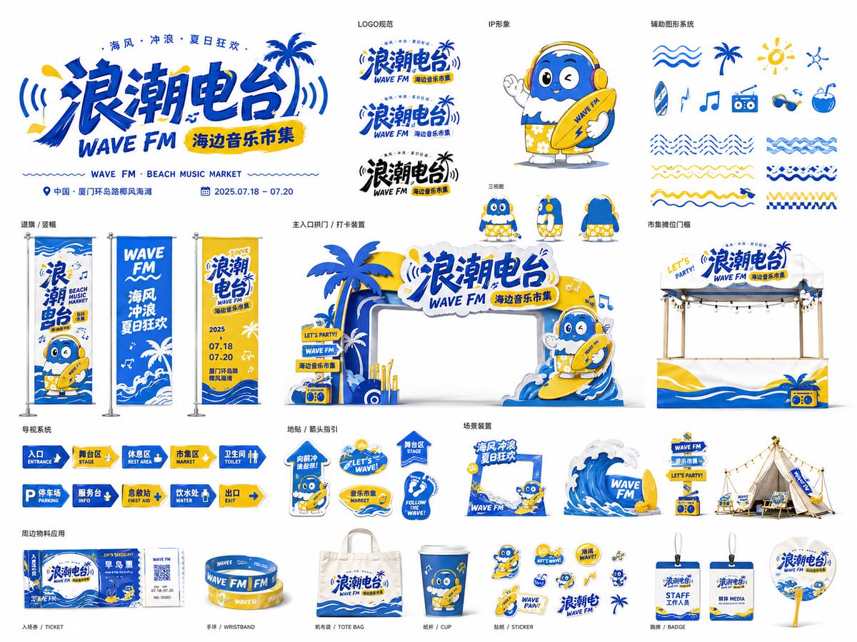 Πίνακας οπτικής ταυτότητας εκδήλωσης για φεστιβάλ και pop-up
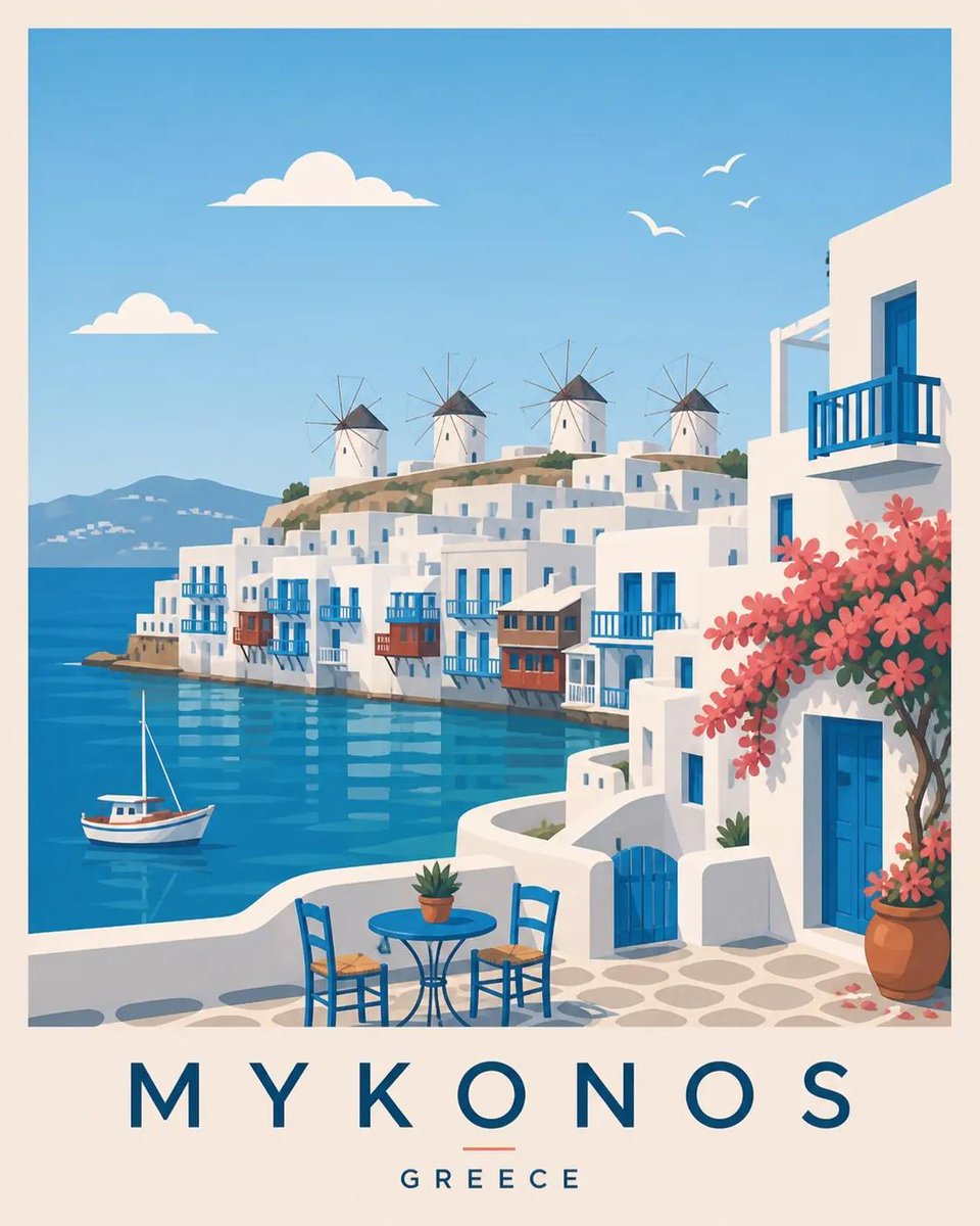 Σκανδιναβική ταξιδιωτική αφίσα επίπεδη διανυσματική απεικόνιση
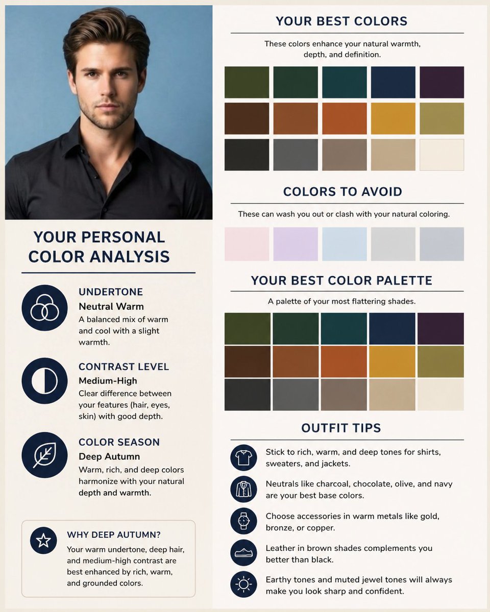 Προσθέστε τη φωτογραφία σαςΠίνακας εποχής χρωμάτων και κάρτα παλέτας από selfie