Prompt εικόνας Branding & UI Προσαρμόσιμα
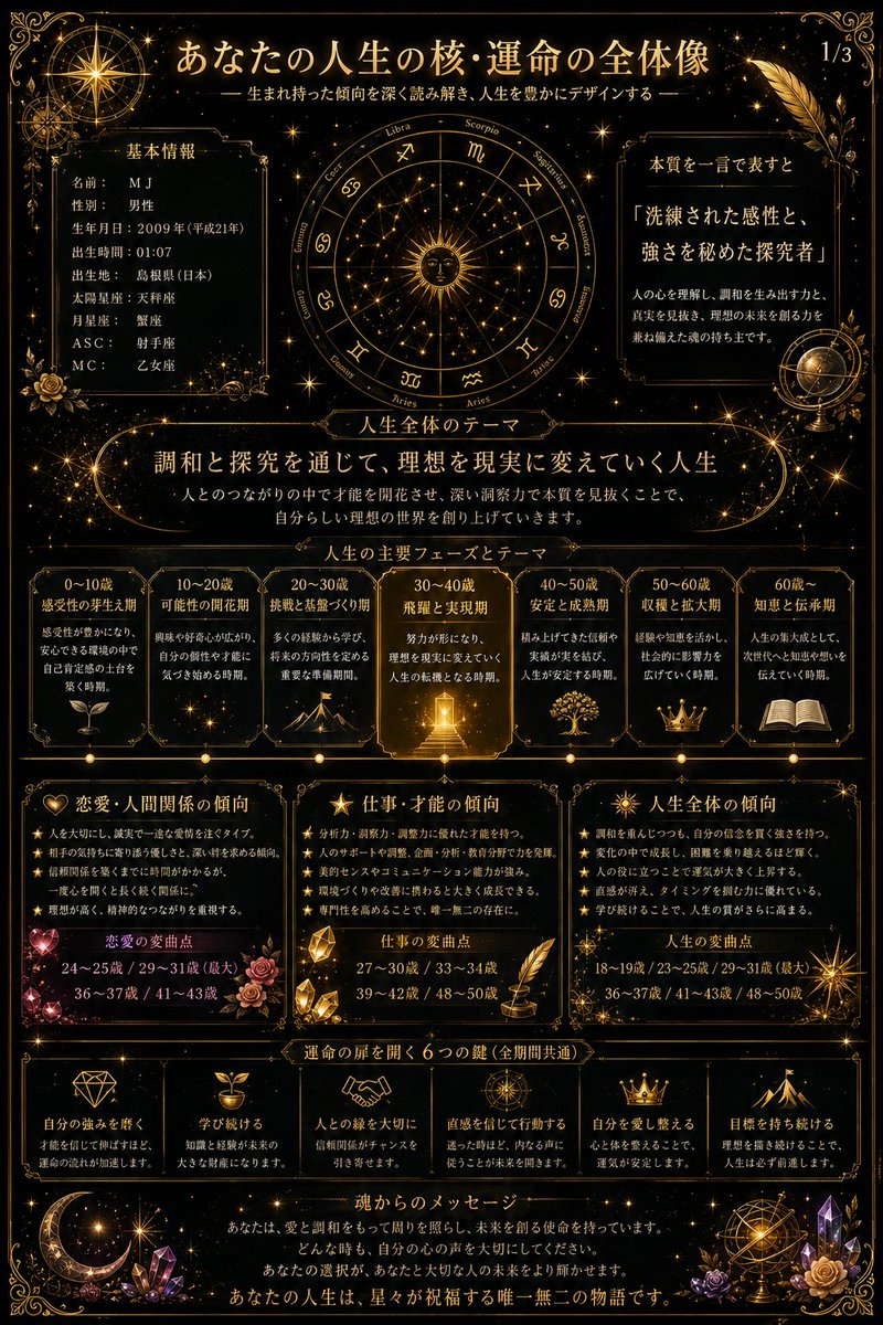
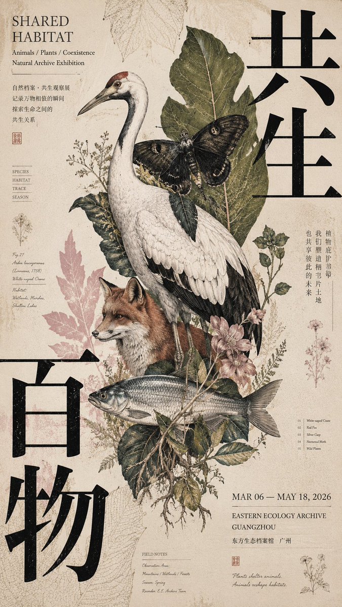
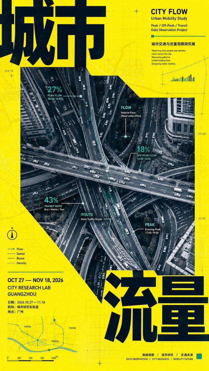
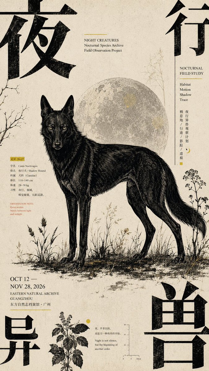
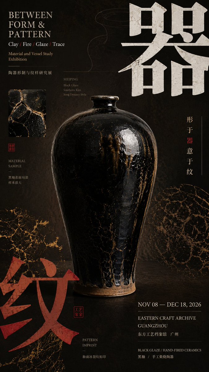
Σχέδιο αφίσας πολιτιστικής έκθεσης με πίεση από τις γωνίες
Μια κάθετη εντυπωσιακή αφίσα όπου τα υπερμεγέθη γράμματα και τα χρωματικά μπλοκ πιέζουν από τις άκρες, κρατώντας στη θέση του ένα ήρεμο κεντρικό θέμα. Η ένταση ανάμεσα στις βαριές γωνίες και στη γαλήνια μέση της δίνει μια τυπωμένη, σαν κατάλογο έκθεσης αίσθηση.

- Μοντέλο
- GPT Image 2
- Τύπος
- 4 εικόνες
- Αναλογία διαστάσεων
- 9:16
- Κοινοποιήθηκε
- 28 Αυγ 2026
- Likes στο X
- 23
Κεντρικό θέμαΚύριος τίτλοςΑγγλικός τίτλοςΗμερομηνία και οργανισμός
Prompt εικόνας
3,365 χαρακτήρες【Theme】: ____ 【Chinese main title】: ____ 【English title】: ____ 【Central subject】: ____ 【Corner-pressure method】: four-corner text pressure / opposing two-corner pressure / three-corner encirclement + one-corner release / single-corner heavy pressure + diagonal response 【Corner elements】: large Chinese characters / color blocks / information zone / pattern 【Auxiliary motif】: ____ 【Main color】: ____ 【Accent color】: ____ 【Date / Institution】: ____ 【Ratio】: 9:16 Generate a "corner-pressure composition" poster with the mature air of a cultural exhibition and Editorial Graphic Design. The core is not simply placing text in the four corners, but using large typography, color blocks, information zones, or patterns at the edges of the frame to exert inward visual pressure, naturally "squeezing" the central subject out. The central subject stays complete, stable, and with clear visual weight; do not deliberately tilt or deform it to fit the composition. The subject carries about 40%–60% of the visual weight. Organize the layout according to the【corner-pressure method】: Four-corner text pressure: All four corners have visual elements, but there must be clear primary-secondary hierarchy; 1–2 corners carry the main weight and the rest are only auxiliary — do not make all four corners the same size. Opposing two-corner pressure: Choose two diagonal corners as the main pressure points, letting large titles or color blocks clamp the subject from two directions; the other two corners hold only small information. Three-corner encirclement + one-corner release: Three corners form a visual encirclement, and the fourth corner is deliberately kept lighter, giving the image room to breathe. Single-corner heavy pressure + diagonal response: One corner uses giant text or a strong color block to carry the main pressure; the opposite corner responds with smaller elements, and the central subject stays stable. The large Chinese title must genuinely participate in the composition — it may be partially cropped, set against the edge, and lightly overlap the subject, but stay clearly legible. The English title, date, institution, theme description, and other small text concentrate in 2–3 zones, forming a clear size hierarchy among the giant Chinese, mid-size title, and tiny information. The background cannot be entirely blank; add very faint patterns, archival information, structural diagrams, material textures, or caption remnants related to the theme, so the white space "has content" without stealing focus from the subject. The whole poster uses only one set of main auxiliary motif, which must have a real relationship with the theme; control colors to 3–5 main colors, with a clear chromatic stance for a single poster. Information density is medium-high, but the visual hierarchy is clear: at first glance, the subject and the corner-pressure relationship; at second glance, the large Chinese title; at third glance, the English, date, and auxiliary information. Each poster needs a complete theme and real content expression, without lots of meaningless placeholder words. Even with the small text removed, it should still be a valid visual work. Overall effect: cultural exhibition poster, magazine editorial design, a sense of mature printed publication, with pressure at the edges and focus at the center, rich but not chaotic.
Πώς να το χρησιμοποιήσετε
Αντικαταστήστε το θέμα, τον κινεζικό κύριο τίτλο, τον αγγλικό τίτλο, το κεντρικό θέμα και τον οργανισμό με δικό σας περιεχόμενο και διατηρήστε τη μέθοδο πίεσης από τις γωνίες και τα χρωματικά μπλοκ, ώστε η διάταξη να παραμένει εστιασμένη στις άκρες. Κοινοποιήθηκε ως prompt για το GPT Image 2, οπότε ορίστε την αναλογία 9:16 και χρησιμοποιήστε ένα καθαρό, φωτογραφημένο ή εικονογραφημένο κεντρικό θέμα. Χρησιμοποιήστε το αποτέλεσμα ως αφίσα ή εξώφυλλο για έκθεση, σειρά διαλέξεων ή πολιτιστική εκδήλωση.
Κοινοποιήθηκε δημόσια στο X στις 28 Αυγ 2026. Όλα τα credits για αυτό το prompt και το αποτέλεσμά του ανήκουν στον δημιουργό του. Είναι δικό σας; Ζητήστε ενημέρωση ή αφαίρεση.