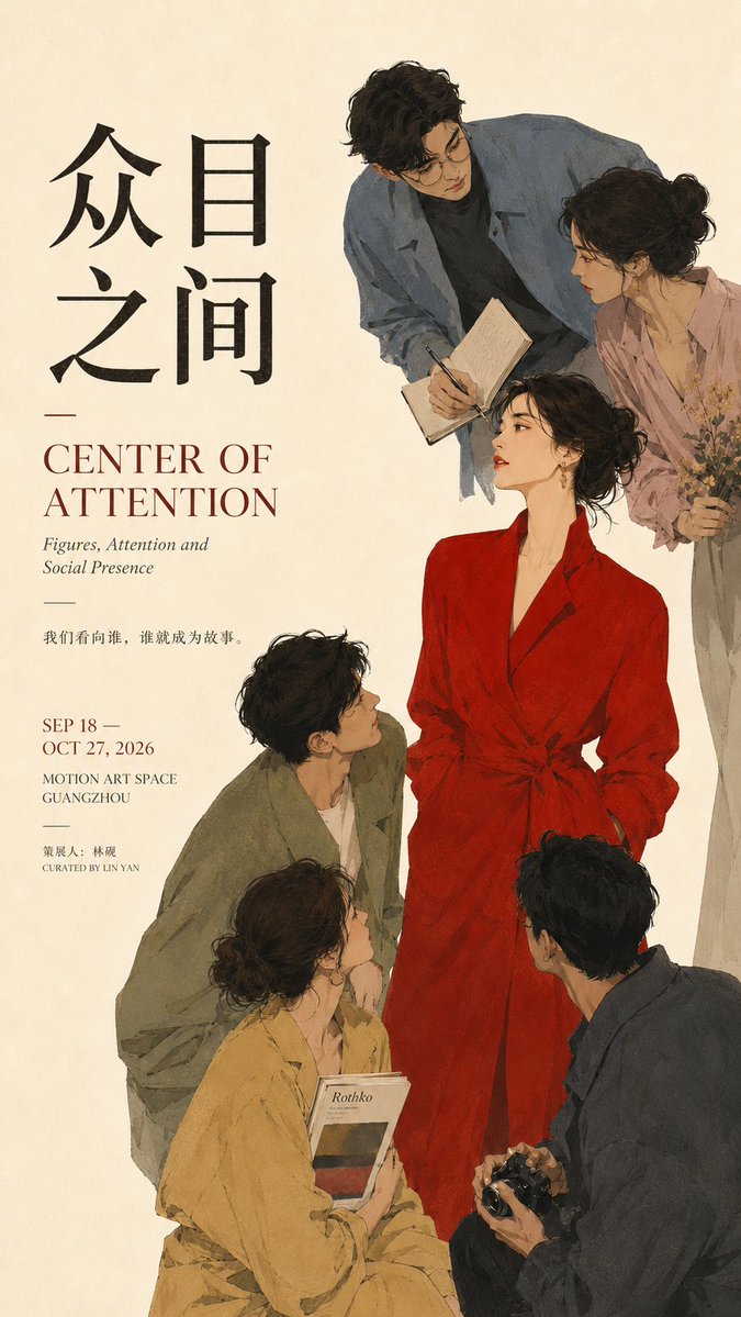


Στούντιο prompt
Κάντε το «Prompt σχεδίασης κεντρομόλου αφίσας για editorial layouts» δικό σας
Ένα μοναδικό κεντρικό σημείο εστίασης τραβά όλα τα υπόλοιπα στοιχεία προς το μέρος του, είτε μέσω βλεμμάτων, φωτός, ανακατανομής κολάζ είτε πυκνής τυπογραφίας. Το αποτέλεσμα μοιάζει με ολοκληρωμένη editorial αφίσα εκθεσιακού στιλ, με καθαρή ιεραρχία και σκόπιμο αρνητικό χώρο.
 Prompt από @MrLarus
- Συμπληρώστε τα πεδία παρακάτω.
- Δείτε το prompt να ενημερώνεται στα δεξιά.
- Αντιγράψτε το ή ανοίξτε το σε ένα εργαλείο εικόνας.
Prompt εικόνας
Prompt: 【Theme / Work title】: ____ 【Core subject】: ____ 【Convergence method】: figures' gaze / light and space / element reflow / Typography density / other 【Chinese title】: ____ 【English title】: ____ 【Visual style】: ____ 【Primary color】: ____ 【Secondary color】: ____ 【Aspect ratio】: 9:16 Generate a poster with the quality of mature Editorial Graphic Design and the visual feel of an art exhibition. First establish one absolute visual core, then let all the other forces in the image actively send the eye back to that core. The point is not simply to place the subject in the center, but to build a clear "centripetal relationship". Choose the convergence method according to the content: Figures: through the figures' gaze, head orientation, body posture, gestures, and the direction of props all pointing toward the central figure, turning the invisible line of sight into a guiding line. Space: through architectural perspective, wall cross-sections, light-and-shadow relationships, and the direction of light, gather multiple spatial forces into a single focus; even if the subject is small, it becomes the first thing seen. Paper / collage: let pages, images, text strips, and layout fragments form a continuous reflow path; peripheral elements vary in size, density, and direction, but ultimately all return to the central text block or core object. Typography: create the centripetal relationship through variation in type size, weight, tracking, density, and direction; the closer to the core, the stronger and denser the type, while the periphery is lighter and sparser. The text itself becomes image, not ordinary informational layout. Keep only one main visual core in the entire image. Auxiliary elements may only surround, point to, support, or balance it, and must not form a second visual center of equal weight. Typography must relate to the work's theme itself; do not include template placeholder text like "visual core", "composition case", or "design study". Each poster should first stand as an independent work, hiding the compositional method inside the design. Control the information hierarchy: the main title carries the primary textual visual; subtitles and short lines establish the content's mood; date, institution, and similar details are concentrated in a few areas. Avoid scattering small text evenly across the whole layout. Preserve sufficient negative space. You may use cropping, overlapping, perspective, reflow, density variation, and asymmetrical balance to heighten tension, but do not rely on arrows, obvious guide lines, or meaningless decoration to explain the composition. Overall requirement: clear focus, clear hierarchy, rich but not chaotic, with a sense of being a finished work and the quality of mature visual design, suitable for posters, exhibition visuals, Editorial Design, and cover design.
Prompt που κοινοποιήθηκε στο X από @MrLarus. Όλα τα credits ανήκουν στον δημιουργό του.
Περισσότερα prompts που μπορείτε να προσαρμόσετε
 Πίνακας σχεδιασμού ιαπωνικού web studio σε σκανδιναβικό στιλ
 Αφίσα ταξιδιού με μονοκόμματη γραμμή της πόλης σε στιλ line art
 Ζωή στους δρόμους του Τόκιο, αφίσα ταξιδιού με γραμμικό σχέδιο
 Ασπρόμαυρη διάταξη αναφοράς ομορφιάς προσώπου
 Οδηγός ανάγνωσης παλάμης σε ασπρόμαυρο περίγραμμα
 Προσθέστε τη φωτογραφία σαςΑφίσα συστήματος ταυτότητας μάρκας σε σκούρο φόντο
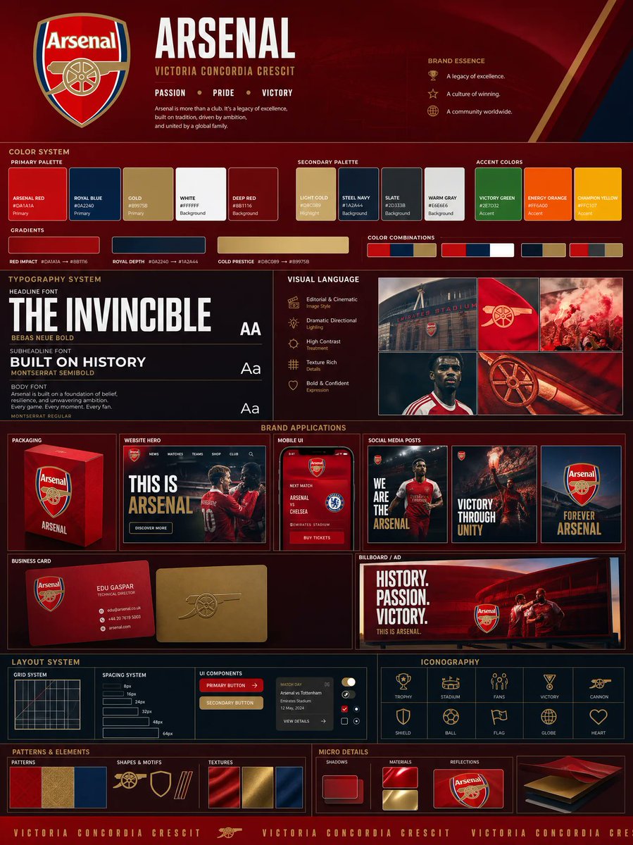 Προσθέστε τη φωτογραφία σαςΠίνακας ταυτότητας μάρκας με βάση το λογότυπο, παλέτα και mockups
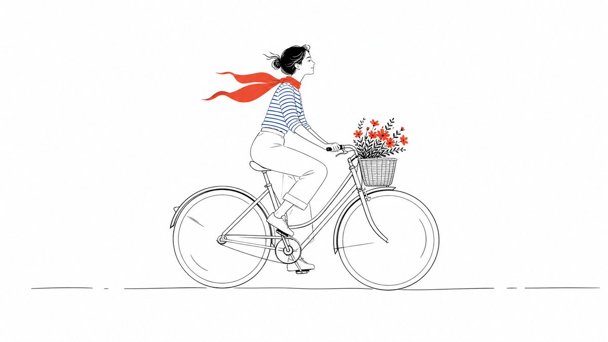 Minimal εικονογράφηση με γραμμές και έντονα χρωματικά στοιχεία